AI chat
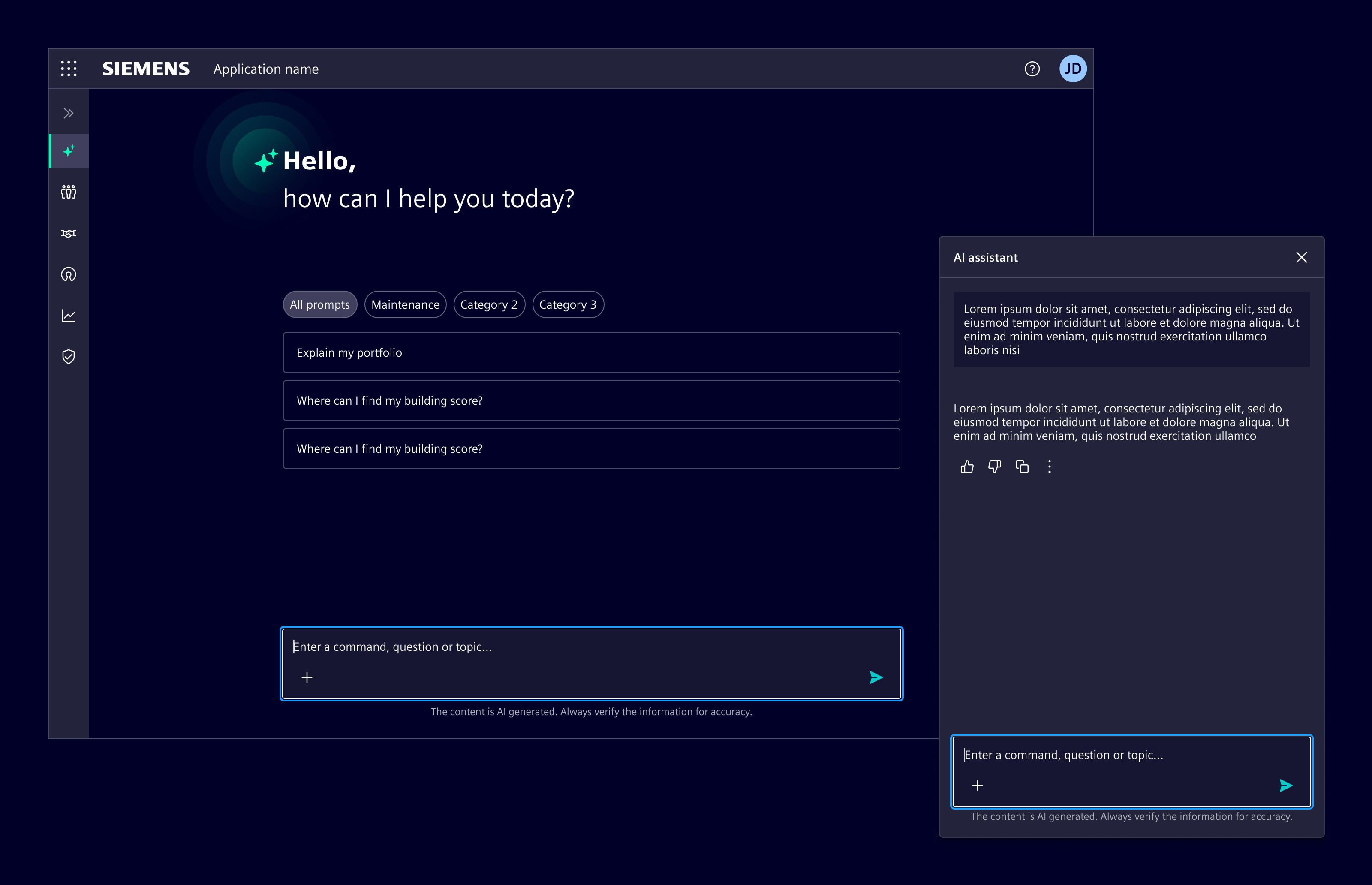
AI chat enables users to interact with the product using natural language. It supports tasks that benefit from suggestions, step-by-step help, or open-ended input.
Usage
AI chat is useful when users describe tasks in their own words and expect structured responses or guidance.
When to use
- For tasks that are complex, open-ended, or benefit from iteration.
- When natural language input improves user experience.
- When users need help without navigating multiple UI elements.
Best practices
- Refer to conversational design guidelines.
- Always allow users to review, edit, or retry.
- Keep the conversation focused, avoid unnecessary messages.
- Place the AI in a clearly defined visual space.
- Output can be styled as needed using the typography system.
- Use follow-up prompts after AI responses to help users continue the conversation without formulating the next message from scratch.
Design
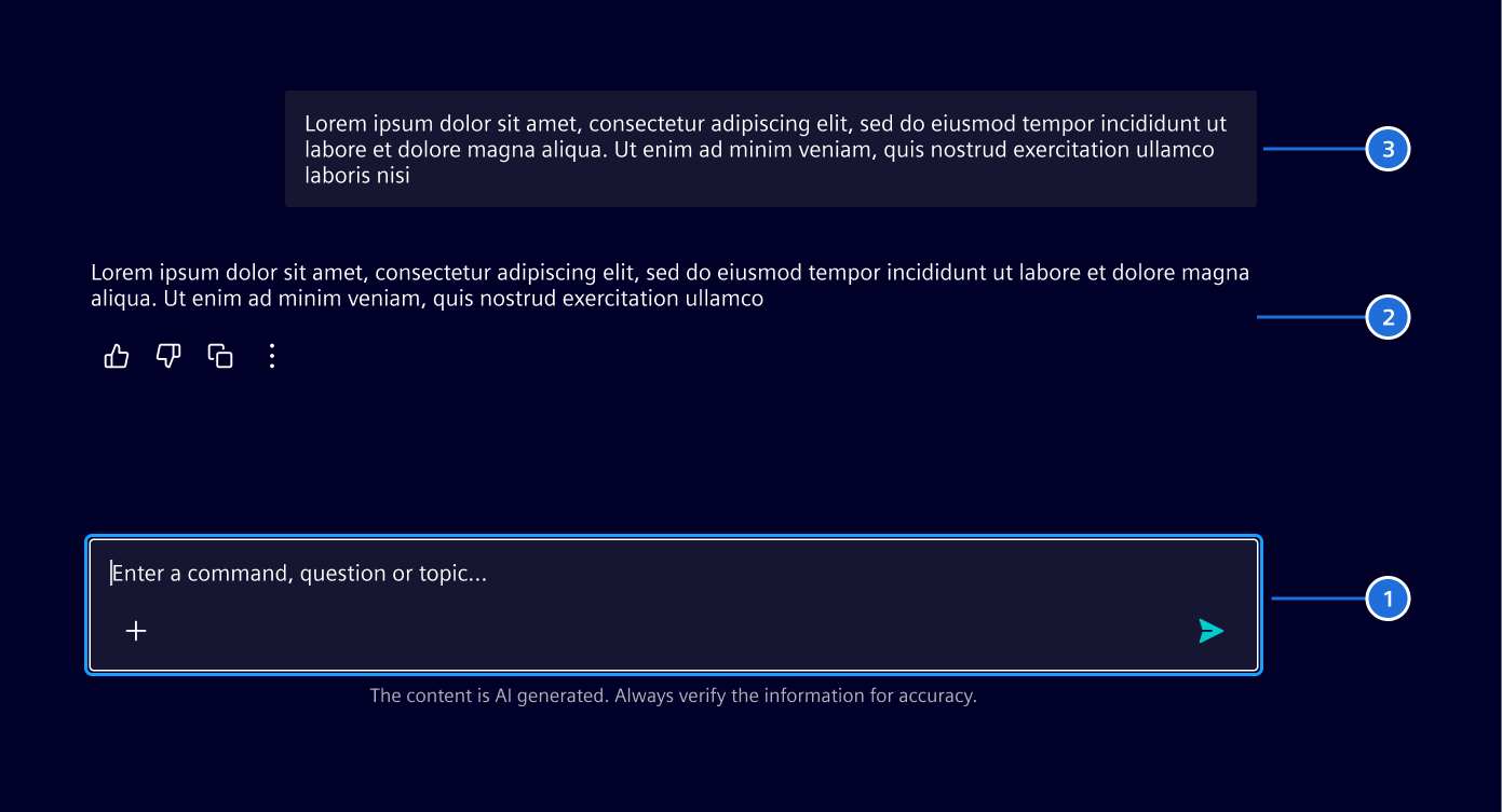
Elements
Layouts
Full page layout
Use it when AI is the main feature. Typically triggered from a dedicated navigation item, this layout makes AI functionality easily accessible as a primary experience.
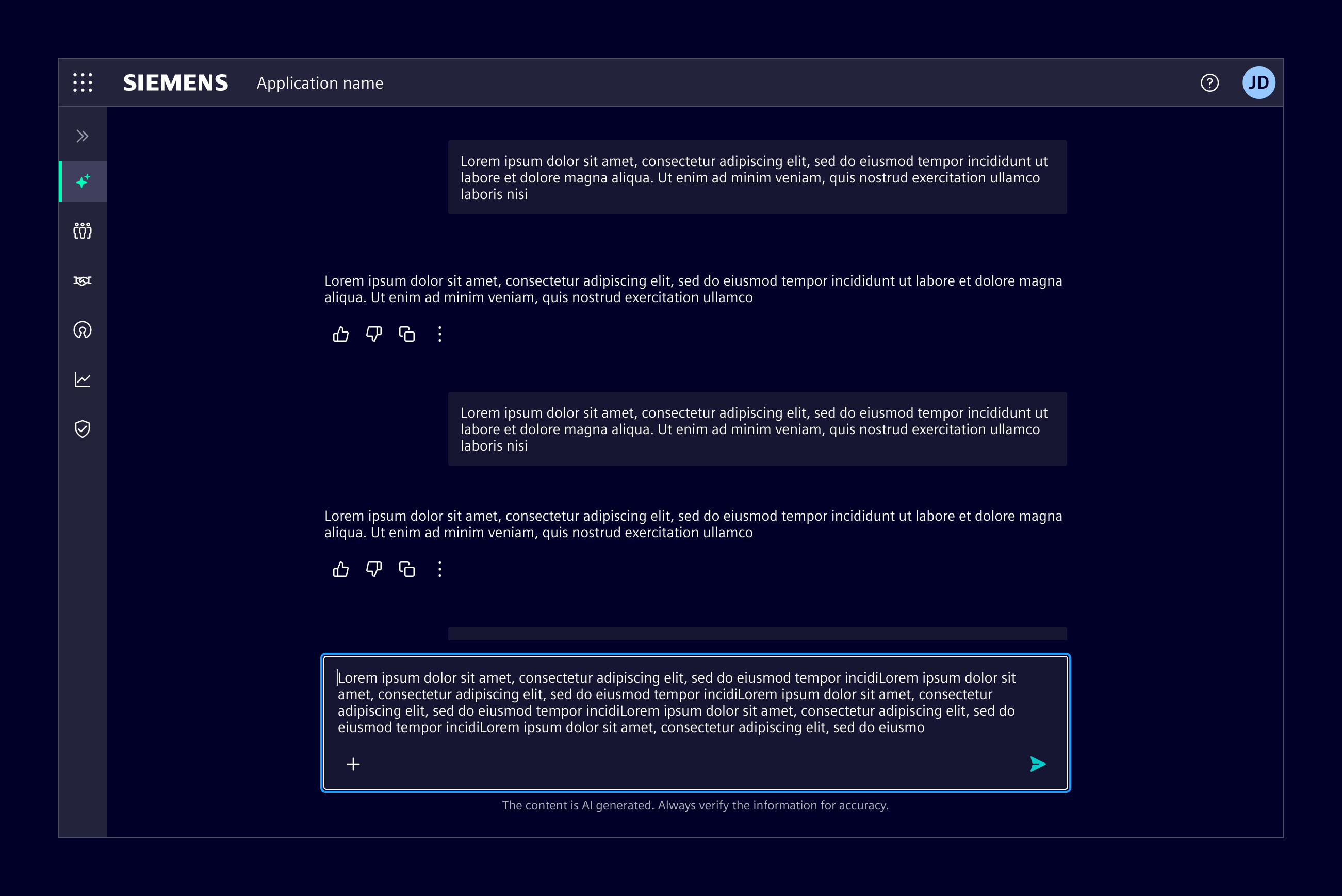
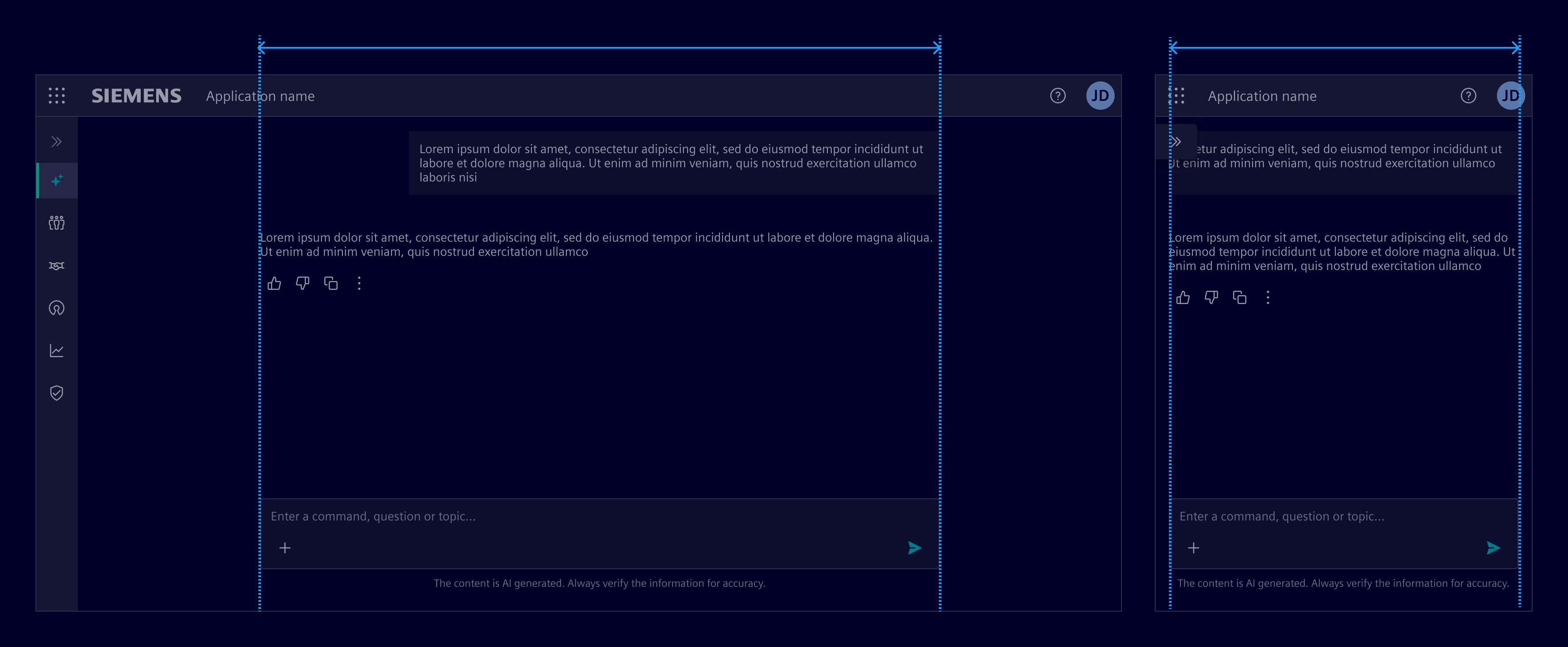
The chat content area has a maximum width of 720px. It scales fluidly on smaller screens and remains centered on larger ones to maintain readability and visual balance.
Side panel layout
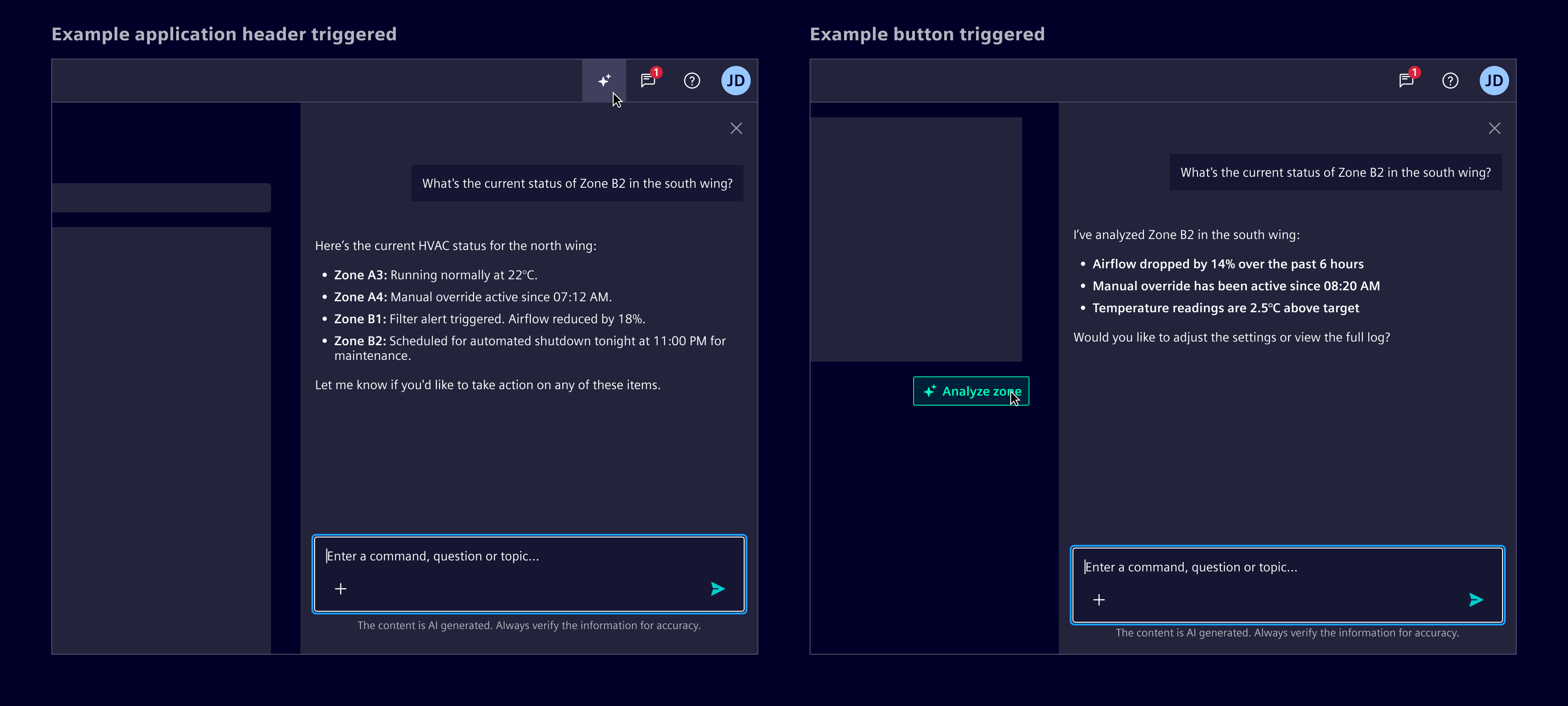
Use it when AI supports tasks within the current view. In this case, the AI appears as an on-demand assistant without disrupting the workflow in a side panel.
- When the AI feature is globally accessible, the side panel can be triggered from the application header, ensuring consistent entry across all screens.
- For contextual use, place the trigger near the related feature or content.
Initial screen
Before the first message, show an initial screen to set expectations and explain what the AI can do. As soon as the user prompts a message, the initial screen should disappear.
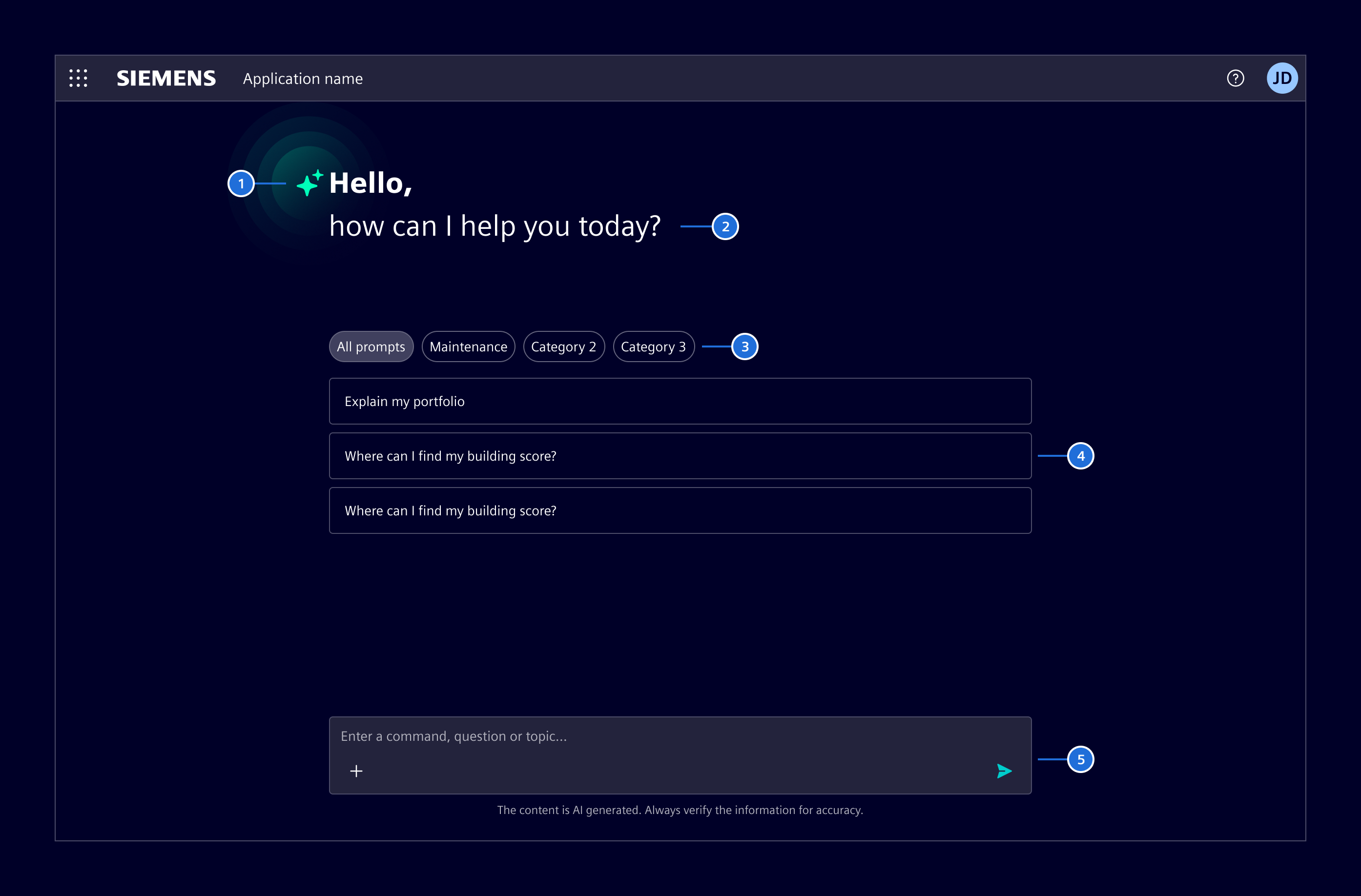
- AI icon
- Salutation: A brief, welcoming message that sets a conversational tone.
- Prompt categories (optional): When suggestions exceed a manageable number, group them by topic or function using summary chips
- Prompt suggestions (optional): Curated prompts or example questions that reflect common or relevant actions.
- Chat input
Errors and AI limitations
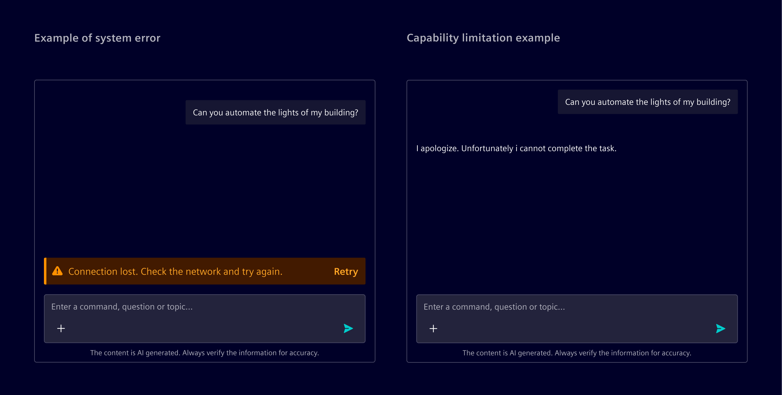
System errors, such as timeouts or backend crashes, occur outside the AI’s reasoning. These should be represented with inline notifications, placed above the input prompt.
When the AI cannot complete a task due to a known limitation, it should respond within the conversation. These are not treated as errors and do not require a separate notification.
Follow-up prompts
Follow-up prompts are 2-4 suggested actions based on the AI’s last response. They guide users toward deeper or related questions.
Show follow-up prompts only after relevant AI responses, and clear them as soon as the user sends a new message.
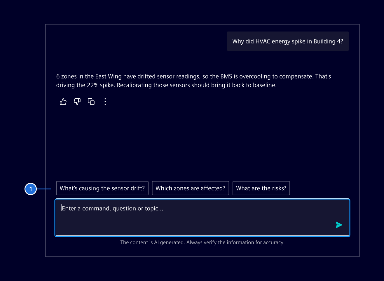
- Follow-up prompts
Code
The si-ai-chat component provides a complete AI chat interface, it should be inserted into a layout with fixed height, if no fixed height is provided, please set a height in pixels.
SiAiChatComponent API Documentation
si-ai-chat A model-driven chat container component for displaying an AI chat interface with automatic scroll-to-bottom behavior.
This component provides an AI chat interface, managing scrolling behavior to keep the newest messages visible while respecting user scrolling actions. It automatically scrolls to the bottom when new content is added, unless the user has scrolled up to view older messages.
Required content projection: - si-chat-input : Input controls for composing messages
See - ChatMessage for the chat message model - AiChatMessage for the AI chat message model - UserChatMessage for the user chat message model - TemplateChatMessage for the template chat message model - SiChatInputComponent for the chat input component - SiChatContainerComponent for the base chat container component - SiAiMessageComponent for the used AI message component - SiUserMessageComponent for the used user message component - SiChatMessageComponent for the base wrapper chat message component used by AI and user message components
Input Properties
| Name | Type | Default | Description |
|---|---|---|---|
| activityInputArgumentsLabel ¶ | TranslatableString | $localize`:@@SI_AI_CHAT_CONTAINER.INPUT_ARGUMENTS:Input arguments` | Label for activity input arguments. |
| activityOutputLabel ¶ | TranslatableString | $localize`:@@SI_AI_CHAT_CONTAINER.OUTPUT:Output` | Label for activity output. |
| activityReasoningLabel ¶ | TranslatableString | $localize`:@@SI_AI_CHAT_CONTAINER.REASONING:Reasoning` | Default name for reasoning activities. |
| aiIcon ¶ | string | 'element-ai' | Custom AI icon name, used for empty state |
| autoExpand ¶ | boolean | true | Whether the latest activity details are expanded automatically. |
| colorVariant ¶ | BackgroundColorVariant | 'base-0' | Color to use for component background. |
| disableInterrupt ¶ | boolean | false | Whether to disable the interrupt functionality |
| greeting ¶ | TranslatableString | $localize`:@@SI_AI_CHAT_CONTAINER.WELCOME_GREETING:Hello,` | The greeting text for the welcome screen |
| interrupting ¶ | boolean | false | Whether the system is currently interrupting an operation. When true, forces interruptible mode and shows sending state on the input. |
| loading ¶ | boolean | false | Whether a pending loading AI message should be shown (e.g. while waiting for response). If you also want to prevent the user from sending new messages, set sending to true as well. |
| markdownOptions ¶ | SiMarkdownOptions | makeSiMarkdownOptions() | Options used to render chat message markdown. |
| messages ¶ | ChatMessage[] | List of chat messages to display. Messages can contain either content (string) or a template (TemplateRef) for custom rendering. When both content and template are provided, the template takes precedence. | |
| noAutoScroll ¶ | boolean | false | Disable auto-scroll to bottom when new messages are added |
| promptSuggestions ¶ | (PromptSuggestion[] | Record<string, PromptSuggestion[]>) | [] | The list of prompt suggestions for the welcome screen, either as an array or a record mapping category labels to suggestion arrays |
| secondaryActionsLabel ¶ | TranslatableString | $localize`:@@SI_AI_CHAT_CONTAINER.SECONDARY_ACTIONS:More actions` | More actions button aria label |
| sending ¶ | boolean | false | Whether a message is currently being sent, disables input and shows a loading state in the input area. If you want to show a loading state for the latest AI message, set loading to true instead. |
| show ¶ | ActivityDetailsDisplay | 'auto' | Which activity input and output parts are shown. |
| statusAction ¶ | { href: string, target: string, title: string } | Status notification action link | |
| statusHeading ¶ | string | Status notification heading | |
| statusMessage ¶ | string | Status notification message | |
| statusSeverity ¶ | ("info" | "warning" | "success" | "danger" | "caution" | "critical") | Status notification severity | |
| welcomeMessage ¶ | TranslatableString | $localize`:@@SI_AI_CHAT_CONTAINER.WELCOME_MESSAGE:how can I help you today?` | The welcome message text for the welcome screen |
Output Properties
| Name | Type | Description |
|---|---|---|
| messageSent ¶ | { attachments: ChatInputAttachment[], content: string } | Emitted when a new message is sent |
Attributes and Methods
| Name | Type | Default | Description |
|---|---|---|---|
| focus() ¶ | () => void | Focuses the chat input component if it exists. | |
| (readonly) inputInterruptible ¶ | Signal<boolean> | ... | |
| (readonly) inputSending ¶ | Signal<boolean> | ... | |
| onInputSend() ¶ | () => void | ||
| scrollToBottom() ¶ | () => void | Scrolls to the bottom of the messages container immediately. This method forces a scroll even if the user has scrolled up. |
Use type: 'activity' for tool calls, progress, and reasoning. input accepts a string, a list of short inputs, or a record of labeled inputs. output accepts a string. These values are rendered as activity message parts, while content is rendered directly as markdown. Prefer content when the activity does not need separate input and output sections.
Use type: 'activity-trace' to group related or nested activity messages. By default, the latest activity or trace stays expanded until a newer activity or user message is added. Set the container's autoExpand input to change this globally, or set autoExpand on a trace, activity, or nested activity to override it. Use autoExpandInputs and autoExpandOutputs for part-level overrides; autoExpandInputs also accepts an array of record keys.
The container's show input controls which parts are rendered. It accepts auto, inputs, outputs, or both. The default auto mode shows inputs when output is empty and otherwise shows the output.
Initial Screen
The AI chat container includes a built-in initial welcome screen component that displays when there are no messages. It can be slotted into the si-chat-container component. It accepts prompt suggestions as an input.
SiAiWelcomeScreenComponent API Documentation
si-ai-welcome-screen AI welcome screen component for displaying initial state in AI chat interfaces.
The AI welcome screen component provides an engaging initial state for AI chat interfaces, featuring a welcome message, optional prompt categories for filtering, and suggested prompts that users can click to start conversations.
The component includes: - Welcome header with AI branding and customizable greeting - Optional category pills for filtering prompt suggestions - Clickable prompt suggestion cards - Optional refresh button to regenerate suggestions
See - SiAiChatComponent for the AI chat container which uses this component - SiChatContainerComponent for the base chat container
Input Properties
| Name | Type | Default | Description |
|---|---|---|---|
| categories ¶ | PromptCategory[] | [] | The list of prompt categories |
| promptSuggestions ¶ | PromptSuggestion[] | [] | The list of prompt suggestions as an array, update this when the selected category changes. |
| selectedCategory ¶ | string | undefined | The currently selected category ID |
Output Properties
| Name | Type | Description |
|---|---|---|
| promptSelected ¶ | PromptSuggestion | Emitted when a prompt suggestion is clicked |
| selectedCategoryChange ¶ | string | The currently selected category ID |
Prompt Suggestions
Prompt suggestions can be provided as either:
- A simple array of suggestions (no categories)
- A record mapping category labels to arrays of suggestions
When using a record, categories are automatically displayed as filter pills.
// Simple array (no categories)
promptSuggestions = [
  { text: 'How do I optimize performance?' },
  { text: 'What are best practices?' }
];

// Record with categories
promptSuggestions = {
  'All prompts': [{ text: 'How do I optimize performance?' }, { text: 'What are best practices?' }],
  'Maintenance': [{ text: 'Schedule preventive maintenance' }, { text: 'Track equipment downtime' }]
};
Base Chat Container
Use this base container with the chat messages to build custom chat message interfaces.
The si-chat-container component is a wrapper component, it has slots for chat messages and a chat input.
The slots are:
- default -> chat messages or initial screen (
si-welcome-screen) si-chat-input/siChatContainerInput (helper directive)-> For the input (whether default or custom).si-inline-notification-> Slotted above the input for displaying the status.
SiChatContainerComponent API Documentation
si-chat-container A declarative container component for displaying a chat interface with automatic scroll-to-bottom behavior.
This component provides the layout and styling for a chat interface, managing scrolling behavior to keep the newest messages visible while respecting user scrolling actions. It automatically scrolls to the bottom when new content is added, unless the user has scrolled up to view older messages.
Use via content projection: - Default content: Chat messages displayed in the scrollable messages container or a welcome screen (empty state). - si-inline-notification selector: Notification component displayed above the input area - si-chat-input or [siChatContainerInput] selector: Input controls for composing messages
See - SiChatInputComponent for the chat input wrapper component - SiChatContainerInputDirective for other input controls to slot in - SiAiMessageComponent for AI messages to slot in - SiUserMessageComponent for user messages (in AI chats) to slot in - SiChatMessageComponent for the chat message wrapper component to slot in other messages
Input Properties
| Name | Type | Default | Description |
|---|---|---|---|
| colorVariant ¶ | string | 'base-0' | The color variant to apply to the container. |
| noAutoScroll ¶ | boolean | false | Disables automatic scrolling to the bottom when new content is added. |
Attributes and Methods
| Name | Type | Default | Description |
|---|---|---|---|
| focus() ¶ | () => void | Focuses the messages container element. | |
| scrollToBottom() ¶ | () => void | Scrolls to the bottom of the messages container immediately. This method forces a scroll even if the user has scrolled up. | |
| scrollToTop() ¶ | () => void | Scrolls to the top of the messages container immediately. |
Initial Screen
When initially displaying a chat interface use the initial si-welcome-screen component that displays when there are no messages. It can be slotted into the si-chat-container component. It accepts prompt suggestions as an input.
SiAiWelcomeScreenComponent API Documentation
si-ai-welcome-screen AI welcome screen component for displaying initial state in AI chat interfaces.
The AI welcome screen component provides an engaging initial state for AI chat interfaces, featuring a welcome message, optional prompt categories for filtering, and suggested prompts that users can click to start conversations.
The component includes: - Welcome header with AI branding and customizable greeting - Optional category pills for filtering prompt suggestions - Clickable prompt suggestion cards - Optional refresh button to regenerate suggestions
See - SiAiChatComponent for the AI chat container which uses this component - SiChatContainerComponent for the base chat container
Input Properties
| Name | Type | Default | Description |
|---|---|---|---|
| categories ¶ | PromptCategory[] | [] | The list of prompt categories |
| promptSuggestions ¶ | PromptSuggestion[] | [] | The list of prompt suggestions as an array, update this when the selected category changes. |
| selectedCategory ¶ | string | undefined | The currently selected category ID |
Output Properties
| Name | Type | Description |
|---|---|---|
| promptSelected ¶ | PromptSuggestion | Emitted when a prompt suggestion is clicked |
| selectedCategoryChange ¶ | string | The currently selected category ID |
Types Documentation
| Chat message type union of all supported message types in the AI chat container. See - UserChatMessage for user messages - AiChatMessage for AI messages - ActivityChatMessage for individual activities - ActivityTraceChatMessage for grouped activities - TemplateChatMessage for template-based messages - BaseChatMessage for the base chat message interface - SiAiChatComponent for the AI chat container where this is used |
|---|
| AI chat message See SiAiChatComponent for the AI chat container where this is used | |||||
|---|---|---|---|---|---|
|
| User chat message for AI chats See SiAiChatComponent for the AI chat container where this is used | ||||||
|---|---|---|---|---|---|---|
|
| Render custom chat message via template, consider using SiChatMessageComponent inside the template for consistent styling See - SiAiChatComponent for the AI chat container where this is used - SiChatMessageComponent for the chat message wrapper component which can be used inside the template | |||
|---|---|---|---|
|
| Represents a translatable string. This can either be a translation key, e.g. ACTIONS.EDIT that will be automatically translated when displayed on the UI or a pre-translated string, e.g. Edit . Equivalent to a normal string in usage and functionality. |
|---|
| Use this type with filter components colorVariant to render component variants based on background of container |
|---|
| Options for the markdown renderer. This holds all configuration and allows installing extensions. A number of extensions are already ready to use and shipped with Element. Example: | ||||||||||||||||||||||||||||||
|---|---|---|---|---|---|---|---|---|---|---|---|---|---|---|---|---|---|---|---|---|---|---|---|---|---|---|---|---|---|---|
| ||||||||||||||||||||||||||||||
| ||||||||||||||||||||||||||||||
|
| | ||
|---|---|---|
|
| |
|---|
| Progress or intermediate activity shown between chat messages. | ||||||||||||||
|---|---|---|---|---|---|---|---|---|---|---|---|---|---|---|
|
| Related activities grouped under a shared collapsible heading. The latest trace stays expanded until a user message follows it. | |||||
|---|---|---|---|---|---|
|
| Base interface for all chat messages. Messages can be rendered either with content or with a custom template for advanced styling and functionality. See - ChatMessage for the chat message type union - UserChatMessage for user messages - AiChatMessage for AI messages - TemplateChatMessage for template-based messages | ||||
|---|---|---|---|---|
|
| Parent contract used by SiChatInputComponent when it is projected into a chat container. | |||
|---|---|---|---|
| |||
|
| | ||||||||||
|---|---|---|---|---|---|---|---|---|---|---|
|
| Attachment item interface for file attachments in chat messages, used by SiAttachmentListComponent and inside SiUserMessageComponent as well as SiChatInputComponent . See - SiAttachmentListComponent for the attachment list component - SiUserMessageComponent for the user message - SiChatInputComponent for the chat input component | |||
|---|---|---|---|
|
| Attachment item interface for file attachments in chat messages, extension of Attachment for SiAttachmentListComponent to use within SiChatInputComponent . Adds the action file information. Can be used within SiChatContainerComponent . See - Attachment for base attachment interface - SiAttachmentListComponent for the attachment list component - SiChatInputComponent for the chat input component - SiChatContainerComponent for the base chat container component where this can be used - SiAiChatComponent for the AI chat container where this needs to be used | ||||||
|---|---|---|---|---|---|---|
|
| | ||||||||
|---|---|---|---|---|---|---|---|---|
|
| Implement and provide this to an SiMenuFactoryComponent to receive trigger events. | |||||||
|---|---|---|---|---|---|---|---|
| |||||||
|
| Definition of a single source | |||||
|---|---|---|---|---|---|
|
| Type handler for a named type. This can be an AST node type, a code type, a directive name | ||||
|---|---|---|---|---|
|
| |
|---|
| Combination of unified plugin with options | |||
|---|---|---|---|
|
| | ||||||||
|---|---|---|---|---|---|---|---|---|
|
| | ||||||||
|---|---|---|---|---|---|---|---|---|
|
| A combination of a component and options passed to it during run-time | |||
|---|---|---|---|
|
| Interface an extension component must implement | ||||
|---|---|---|---|---|
|
| Interface a code highlighter component must implement | |||||
|---|---|---|---|---|---|
|
| Processor import imported from unified |
|---|
| import imported from @types/mdast |
|---|
| Extended root with references |
|---|
| |
|---|
| An extension to the si-markdown component | |||||
|---|---|---|---|---|---|
|
| Options passed to makeProcessor() | ||
|---|---|---|
|
| |
|---|
| import imported from @types/mdast |
|---|
| import imported from @types/mdast |
|---|
| Plugin import imported from unified |
|---|
| Transformer import imported from unified |
|---|
| Preset import imported from unified |
|---|
| PluggableList import imported from unified |
|---|
| | |||||||||||
|---|---|---|---|---|---|---|---|---|---|---|---|
|
| | |||||||||||
|---|---|---|---|---|---|---|---|---|---|---|---|
|
| | ||||||||||
|---|---|---|---|---|---|---|---|---|---|---|
|
| Represents a menu item that navigates using the Angular Router. Requires a configured Angular Router. | |||||||||||
|---|---|---|---|---|---|---|---|---|---|---|---|
|
| | |||||||||||
|---|---|---|---|---|---|---|---|---|---|---|---|
|
| | |||
|---|---|---|---|
|
| | |||
|---|---|---|---|
|
| | ||
|---|---|---|
|
| Reference to a modal dialog | ||||||||||||
|---|---|---|---|---|---|---|---|---|---|---|---|---|
| ||||||||||||
| ||||||||||||
| ||||||||||||
|
| |
|---|
| Citation metadata associated with a markdown response. | |||||||
|---|---|---|---|---|---|---|---|
|
| Used in events emitted from SiLinkActionService | |||
|---|---|---|---|
|
| | ||||||||||||
|---|---|---|---|---|---|---|---|---|---|---|---|---|
|
| import imported from @types/mdast |
|---|
| Extra node for collecting all footnotes | |||||
|---|---|---|---|---|---|
|
| Container for one or more adjacent citation nodes. | |||||
|---|---|---|---|---|---|
|
| AST node created by remark-directive . | |||||||
|---|---|---|---|---|---|---|---|
|
| | ||||
|---|---|---|---|---|
|
| import imported from @types/mdast |
|---|
| import imported from @types/mdast |
|---|
| | ||||||||||
|---|---|---|---|---|---|---|---|---|---|---|
|
| import imported from @types/mdast |
|---|
| import imported from @types/unist |
|---|
| Inline node that references an item in the source citation array. | ||||||
|---|---|---|---|---|---|---|
|
| | ||
|---|---|---|
|
| A model-driven chat container component for displaying an AI chat interface with automatic scroll-to-bottom behavior. This component provides an AI chat interface, managing scrolling behavior to keep the newest messages visible while respecting user scrolling actions. It automatically scrolls to the bottom when new content is added, unless the user has scrolled up to view older messages. Required content projection: - si-chat-input : Input controls for composing messagesSee - ChatMessage for the chat message model - AiChatMessage for the AI chat message model - UserChatMessage for the user chat message model - TemplateChatMessage for the template chat message model - SiChatInputComponent for the chat input component - SiChatContainerComponent for the base chat container component - SiAiMessageComponent for the used AI message component - SiUserMessageComponent for the used user message component - SiChatMessageComponent for the base wrapper chat message component used by AI and user message components | |||||||||||||||||||||||||||||||||||
|---|---|---|---|---|---|---|---|---|---|---|---|---|---|---|---|---|---|---|---|---|---|---|---|---|---|---|---|---|---|---|---|---|---|---|---|
| |||||||||||||||||||||||||||||||||||
| |||||||||||||||||||||||||||||||||||
| Chat input component for composing and sending messages in conversational interfaces. The chat input component provides a text area for users to compose messages, supporting text, attachments, and contextual actions. It appears as a textarea with buttons for adding attachments and sending messages, as well as an optional disclaimer. The component automatically handles: - Styling for chat input and actions. - Dynamic resizing of the textarea based on content. - Uploading of and displaying of attachments above the input area. - Displaying primary and secondary actions. Additionally to the inputs and outputs documented here, the component supports content projection via the following slots: - Default content: Custom action buttons to display inline, prefer using the actions input for buttons, can be used in addition. - siChatInputDisclaimer selector: Custom disclaimer content to display below the input area, prefer using the disclaimer input for simple text disclaimers.See - SiAttachmentListComponent for the base attachment component - SiChatInputDisclaimerDirective to slot in custom disclaimer content | ||||||||||||||||||||||||||||||||||||||||||||||||||||||||||||||||||
|---|---|---|---|---|---|---|---|---|---|---|---|---|---|---|---|---|---|---|---|---|---|---|---|---|---|---|---|---|---|---|---|---|---|---|---|---|---|---|---|---|---|---|---|---|---|---|---|---|---|---|---|---|---|---|---|---|---|---|---|---|---|---|---|---|---|---|
| ||||||||||||||||||||||||||||||||||||||||||||||||||||||||||||||||||
| ||||||||||||||||||||||||||||||||||||||||||||||||||||||||||||||||||
|
| AI message component for displaying AI-generated responses in conversational interfaces. The AI message component renders AI-generated content in chat interfaces, supporting text, loading states, and contextual actions. It appears as text (no bubble) aligned to the left side without any avatar/icon slot. Can be used within SiChatContainerComponent . The component automatically handles: - Styling for AI messages distinct from user or generic chat messages - Showing loading states with skeleton UI during generation - Displaying primary and secondary actions See - SiChatMessageComponent for the base message wrapper component - SiUserMessageComponent for the user message component - SiChatContainerComponent for the chat container to use this within | |||||||||
|---|---|---|---|---|---|---|---|---|---|
| |||||||||
|
| User message component for displaying the user's messages in conversational interfaces. The user message component renders user-submitted content in (AI) chat interfaces, supporting text, attachments, and contextual actions. It appears as a text bubble aligned to the right side. Can be used within SiChatContainerComponent . The component automatically handles: - Styling for user messages distinct from AI or generic chat messages - Displaying attachments above the message bubble - Displaying primary and secondary actions See - SiChatMessageComponent for the base message wrapper component - SiAiMessageComponent for the AI message component - SiAttachmentListComponent for the base attachment component - SiChatContainerComponent for the chat container to use this within | ||||||||
|---|---|---|---|---|---|---|---|---|
| ||||||||
|
| Base declarative chat message component that provides the layout structure for chat messages. This component handles the core message layout including avatar positioning, loading states, and action button as well as attachment list placement. It serves as the foundation for more specialized message components like SiUserMessageComponent and SiAiMessageComponent . Can be used within SiChatContainerComponent . The component provides: - Flexible alignment (start/end) for different message types - Avatar/icon slot for message attribution - Loading state with skeleton UI - Action buttons positioned on the side or bottom - Attachment list display slot - Responsive behavior that adapts to container size This is a low-level component designed for slotting in custom content, it provides slots via content projection: - Default content: Main message content area (consider using si-markdown for markdown support) - si-avatar/si-icon/img selector: Avatar or icon representing the message sender - si-chat-message-action selector: Action buttons related to the message - si-attachment-list selector: Attachment list component for displaying file attachmentsSee - SiUserMessageComponent for user message display - SiAiMessageComponent for AI message display - SiAttachmentListComponent for attachment list to slot in - SiChatMessageActionDirective for action buttons to slot in - SiChatContainerComponent for the chat container to use this within | ||||
|---|---|---|---|---|
| ||||
|
| Attachment list component for displaying file attachments in chat messages. This component renders a list of file attachments with icons, names, and optional preview and remove functionality. It's designed to work with chat message components to show files that have been uploaded or shared in conversations. This component provides: - A list of pills showing each attachment's name and an icon - Optional preview modal for attachments - Optional remove functionality for editable messages The component is included within SiUserMessageComponent , SiAiMessageComponent and SiChatInputComponent but can also be used inside custom chat messages with SiChatMessageComponent See - SiUserMessageComponent for user message display - SiAiMessageComponent for AI message display - SiChatMessageComponent for custom chat message display - SiChatInputComponent for chat input with attachment support - Attachment for attachment data structure | |||||||||||||||||
|---|---|---|---|---|---|---|---|---|---|---|---|---|---|---|---|---|---|
| |||||||||||||||||
| |||||||||||||||||
|
| Directive to mark content as chat input disclaimer into SiChatInputComponent . Apply this directive to content that should be slotted into the disclaimer area. Example: See SiChatInputComponent for the chat input wrapper component | ||
|---|---|---|
|
| A directive to mark elements as input controls within a SiChatContainerComponent . This directive is used to identify and style input elements that belong to the chat container component, typically applied to form inputs or textareas used for composing chat messages. Example: See SiChatContainerComponent for the chat container wrapper component | ||
|---|---|---|
|
| Directive to mark content as chat message actions into SiChatMessageComponent . Apply this directive to e.g. buttons that should be slotted into the message actions area. Example: See SiChatMessageComponent for the chat message wrapper component | ||
|---|---|---|
|
| Directive for handling file uploads with validation for file type and size. Example: | |||||||||||||||||||||||||||||||||||||||||||||
|---|---|---|---|---|---|---|---|---|---|---|---|---|---|---|---|---|---|---|---|---|---|---|---|---|---|---|---|---|---|---|---|---|---|---|---|---|---|---|---|---|---|---|---|---|---|
| |||||||||||||||||||||||||||||||||||||||||||||
| |||||||||||||||||||||||||||||||||||||||||||||
|
| | |||||||||||||||||||||||||||
|---|---|---|---|---|---|---|---|---|---|---|---|---|---|---|---|---|---|---|---|---|---|---|---|---|---|---|---|
| |||||||||||||||||||||||||||
| |||||||||||||||||||||||||||
|
| | |||||||||||||||||||||||||
|---|---|---|---|---|---|---|---|---|---|---|---|---|---|---|---|---|---|---|---|---|---|---|---|---|---|
| |||||||||||||||||||||||||
| |||||||||||||||||||||||||
|
| | |||||||
|---|---|---|---|---|---|---|---|
| |||||||
| |||||||
|
Except where otherwise noted, content on this site is licensed under MIT License.