Shapes
A shape is the form of an object. Shapes are used to identify components, direct attention to them, and express brand.
Usage
Element is primarily comprised of circles and rounded rectangles. A set of standard shapes and sizes is used across the system. Shapes are an essential component of the Element brand.
Rounded rectangles
Rounded rectangles maintain a rectangular shape with softened corners. The corner radius varies depending on the element:
2px radius: Used for subtle softness while retaining a rectangular look, such as in buttons and inputs.4px radius: The default for container elements like cards.100% radius(fully rounded): Used for pill-shaped elements, like badges.

Circles
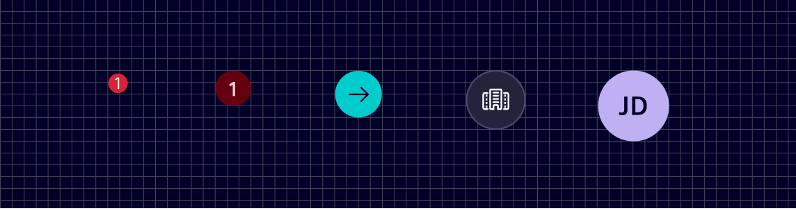
Circle shapes are used in multiple places like lists, notifications, and avatars.
Specification
Tokens
| Token | Radius |
|---|---|
$element-radius-0 | 0px |
$element-radius-1 | 2px |
$element-radius-2 | 4px |
$element-radius-3 | 8px |
Radius is set for all 4 sides unless specified otherwise.
Code
All Element shape variants are accessible as rounded- CSS utility classes, see border radius.
Sass variables
The shape tokens for each Element shape can also be alternatively used as SCSS variables within stylesheets.
@use '@siemens/element-theme/src/styles/variables';

border-radius: variables.$element-radius-0;
border-radius: variables.$element-radius-1;
border-radius: variables.$element-radius-2;
border-radius: variables.$element-radius-3;
Except where otherwise noted, content on this site is licensed under MIT License.