Toast notification
Toasts are short, time based notifications that slide in and out of a page. These are best to use for providing system level feedback and status.
Usage

When to use
- Useful to show system or application level feedbacks and status. For example, lost network, number of items exceeded etc.
- Toasts display time based short and clear messages to user.
- Use these to give feedback based on
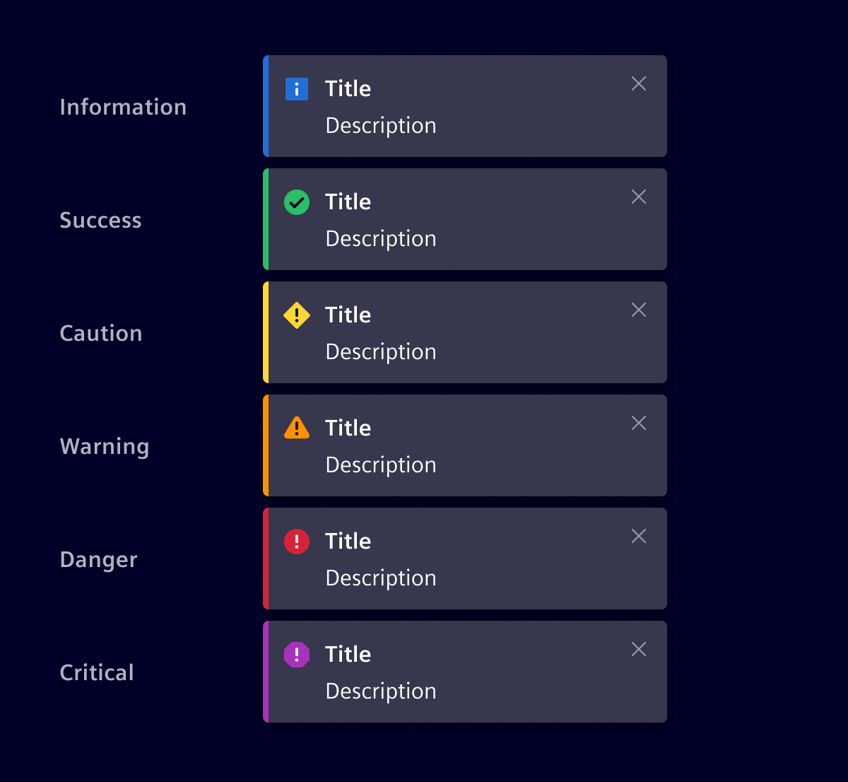
information,success,caution,warning,dangerandcritical.
Best practices
- Keep the message context-based and under two lines.
- Appearance should be on the bottom right corner.
- Make toasts last for minimum 4-5 seconds.
- Toast notifications have a fixed width.
- Do not use for critical feedbacks.
- Do not use toasts for synchronous/co-occurring tasks like showing progress.
- Success toasts should not be used for every minor level use cases.
Design
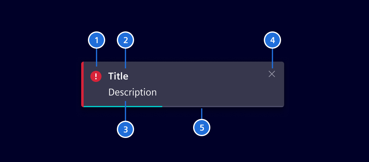
- Icon: Informs users about the severity of a notification.
- Title: Provides user with a quick overview about notification. Avoid words like
Information,Success,Caution,Warning,DangerorCriticalin the title, use a real subject as a label. - Content: Provides additional details of the notification.
- Close: A button to manually dismiss the notification (optional).
- Timer: Timer visualization until the notification disappears (with timer variant).
Notification types
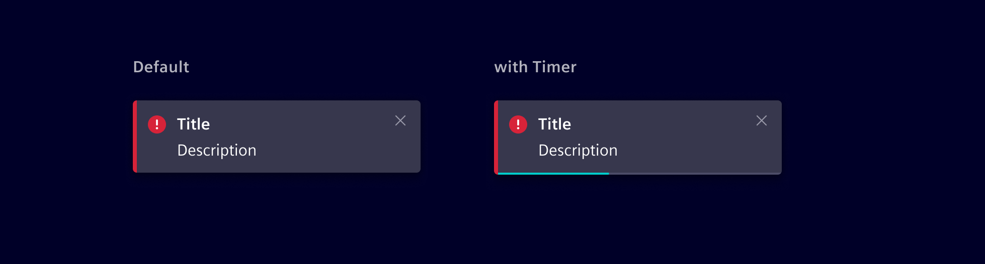
Notification variants
Code
Used to display a notification as a toast that pops up from the bottom-right corner of the screen.
Usage
In any component the following steps need to be taken in order to display a toast notification:
- An instance of the
SiToastNotificationServiceneeds to get imported and instantiated in your component'sconstructor. - A variable of type
SiToastneeds to get created. - The
SiToastNotificationServicehas a method calledshowToastNotification. Call this method, and pass the previously createdSiToastas the argument.
Toast notification drawer
It is not needed anymore to insert the si-toast-notification-drawer manually into a main template as this is now automatically appended to the <body> tag by the SiToastNotificationService.
See the comments below for an example component that satisfies the above criteria. Notice the showToast method that gets called when the Show Toast button is clicked.
SiToastNotificationService API Documentation
Attributes and Methods
| Name | Type | Default | Description |
|---|---|---|---|
| (readonly) activeToasts ¶ | SiToast[] | List of currently active toasts to see details or close them. | |
| hideToastNotification(...) ¶ | (toast: SiToast) => void | Hide a toast notification Parameters
| |
| queueToastNotification(...) ¶ | (state: StatusType, title: string, message: string, disableAutoClose: boolean, disableManualClose: boolean, action: Link, translationParams: { [ key: string ]: any } }) => SiToast | Queue a new toast to be shown. Returns the toast object Parameters | |
| showToastNotification(...) ¶ | (toast: SiToast) => SiToast | Show a toast notification Parameters
|
Types Documentation
| | |||||||||||
|---|---|---|---|---|---|---|---|---|---|---|---|
|
| |
|---|
| | ||||||||||
|---|---|---|---|---|---|---|---|---|---|---|
|
| Represents a translatable string. This can either be a translation key, e.g. ACTIONS.EDIT that will be automatically translated when displayed on the UI or a pre-translated string, e.g. Edit . Equivalent to a normal string in usage and functionality. |
|---|
Except where otherwise noted, content on this site is licensed under MIT License.