System banner
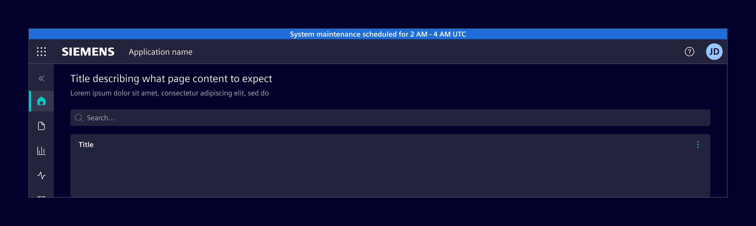
The system banner is a prominent message displayed at the top of the screen to communicate system-wide updates, status changes, or information about the environment.
Usage
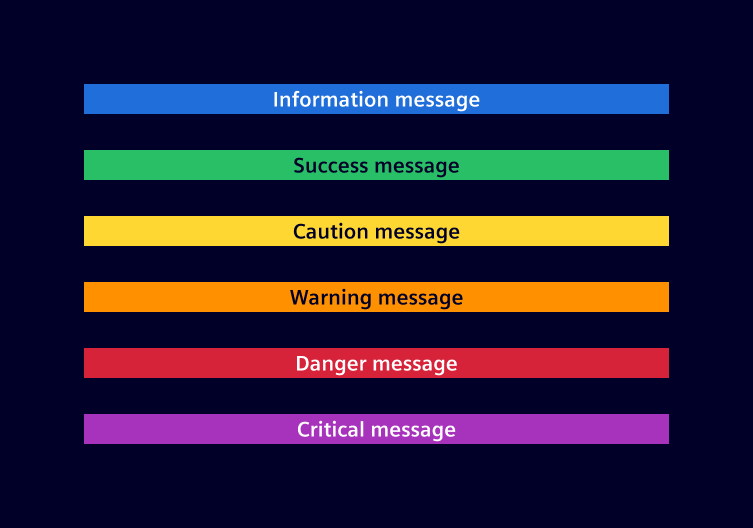
The system banner is placed above the application header to highlight important system-wide messages. It supports various status types, including information, success, caution, warning, danger and critical.
When to use
- To inform users about critical updates or changes.
- To notify users of any errors or issues.
- To provide important notifications, such as maintenance schedules or security alerts.
Best practices
- Keep messages brief and easy to understand.
- Use clear, simple language. Avoid jargon and technical terms.
- Limit system banners to essential information to prevent clutter.
- Display system banners only when relevant to the user's context.

Code
Usage
import { SiSystemBannerComponent } from '@siemens/element-ng/system-banner';

@Component({
  imports: [SiSystemBannerComponent, ...]
})
<si-system-banner message="This is an information" [status]="'info'" />
To display a system banner above the application header, apply these classes:
.fixed-toponsi-system-bannerplaces the banner at the top of the viewport..has-system-banneron the outer layout container makes the application header, vertical navigation and side panel leave room for the banner. All affected components must be inside this container..has-application-headeror.has-navbar-fixed-topon the page-content wrapper adds padding so the content is not covered by the fixed header and banner.
If si-side-panel is the outer layout container, put .has-system-banner on si-side-panel itself, not just on its inner content wrapper:
<si-side-panel class="has-system-banner">
  <div class="has-navbar-fixed-top">
    <si-system-banner class="fixed-top" message="Scheduled maintenance" status="info" />
    <si-application-header>...</si-application-header>
    <!-- Page content -->
  </div>
  <si-side-panel-content heading="Details">...</si-side-panel-content>
</si-side-panel>
When the banner is hidden, remove .has-system-banner as well. For a conditional banner, use the same visibility condition for rendering the banner and applying this class.
System banner with different statuses
SiSystemBannerComponent API Documentation
si-system-banner The system banner component displays a message with specific status as background. Use this component for displaying system level messages on top of the page.
Input Properties
| Name | Type | Default | Description |
|---|---|---|---|
| message ¶ | TranslatableString | Message to be displayed in the system banner. | |
| status ¶ | ExtendedStatusType | 'info' | Status of the system banner. Possible values are 'info', 'success', 'warning', 'caution', 'danger', 'critical'. |
Types Documentation
| Represents a translatable string. This can either be a translation key, e.g. ACTIONS.EDIT that will be automatically translated when displayed on the UI or a pre-translated string, e.g. Edit . Equivalent to a normal string in usage and functionality. |
|---|
| |
|---|
| |
|---|
Except where otherwise noted, content on this site is licensed under MIT License.