Summary widget
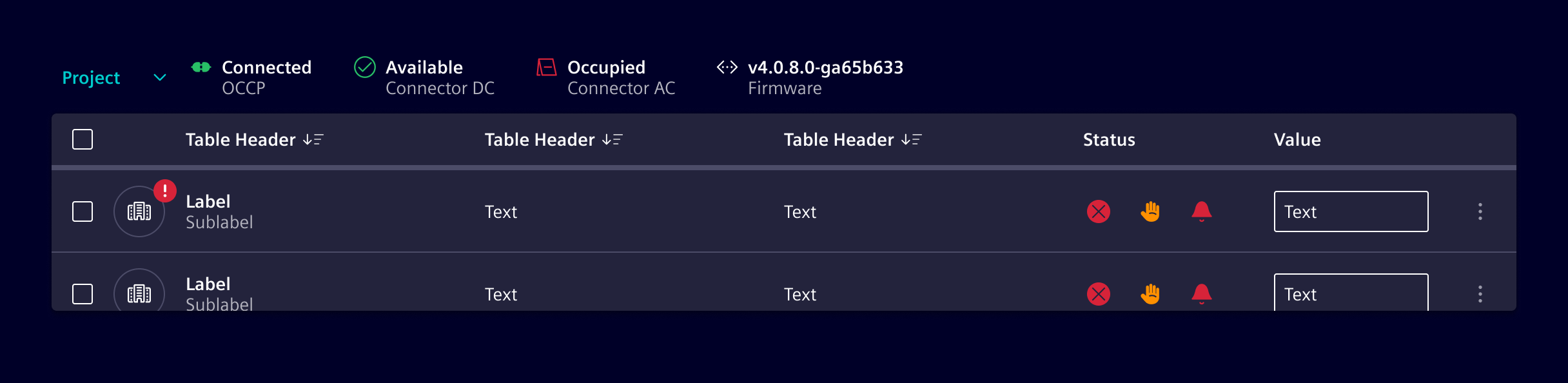
Summary widgets are more detailed than summary chips and can include an optional icon (representing a category or state), a value, and a label. These components are versatile and can be used to display various types of information, from summarizing data to visualizing current states or conditions.
Usage
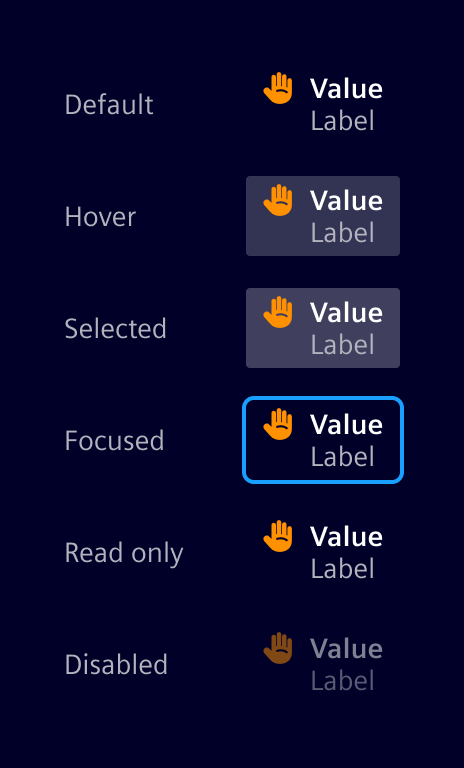
Summary widgets can be either selectable or read-only. They may include an icon to visually represent the state or category of the displayed value. Additionally, labels can be added to provide extra context or clarification.
Example: Overview of categories:

Example: Overview of states:

- Visual state representation: Incorporate icons in summary widgets to visually represent the state or category of the displayed value.
- Detailed summary: Use summary widgets to provide more detailed summaries, including labels and additional context.
- Readonly information: Present detailed read-only information with clear labels and values.
When to use
Use container component to organize a number of summary widgets or other elements such as buttons, links, and badges. The container can have a background of None, background-0, or background-1.
Design
Elements
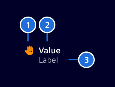
- Category icon or composite icon (optional), 2. Value, 3. Label
- Icon: The summary widget can hold an icon or a composite icon representing a state.
- Value: The primary numerical or textual value being summarized.
- Label: A short text label providing context or description of the value.
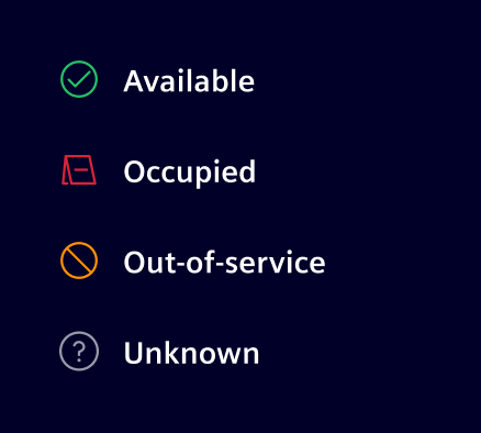
Here an idea of icons representing states:
States
Code
SiSummaryWidgetComponent API Documentation
si-summary-widget Input Properties
| Name | Type | Default | Description |
|---|---|---|---|
| color ¶ | string | Color class, see https://element.siemens.io/fundamentals/typography/#color-variants-classes . | |
| disabled ¶ | boolean | false | Disabled state. |
| icon ¶ | string | Icon token, see https://element.siemens.io/icons/element . | |
label ¶ | TranslatableString | The label. | |
| readonly ¶ | boolean | false | Readonly state. |
| selected ¶ | boolean | false | Selected state, will change when clicked. |
| stackedColor ¶ | string | Color class, see https://element.siemens.io/fundamentals/icons/ . | |
| stackedIcon ¶ | string | Icon token, see https://element.siemens.io/fundamentals/icons/ . | |
| status ¶ | ExtendedStatusType | Status. Alternatively, use icon and color . | |
| value¶ | TranslatableString | Value to display. |
Output Properties
| Name | Type | Description |
|---|---|---|
| selectedChange ¶ | boolean | Selected state, will change when clicked. |
Types Documentation
| Represents a translatable string. This can either be a translation key, e.g. ACTIONS.EDIT that will be automatically translated when displayed on the UI or a pre-translated string, e.g. Edit . Equivalent to a normal string in usage and functionality. |
|---|
| |
|---|
| |
|---|
| | ||||||||
|---|---|---|---|---|---|---|---|---|
|
Except where otherwise noted, content on this site is licensed under MIT License.