Status toggle
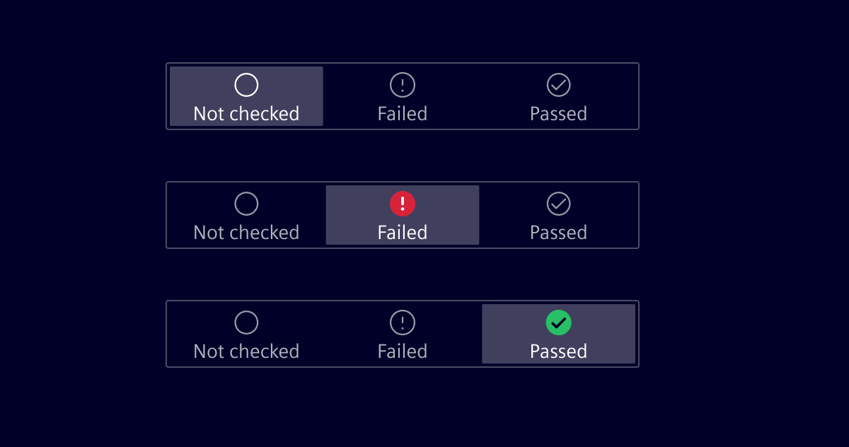
A status toggle allows a user to quickly set a status by tapping (primary action) on the desired status. Tap and drag to change the status (secondary-action) is also supported.
Usage
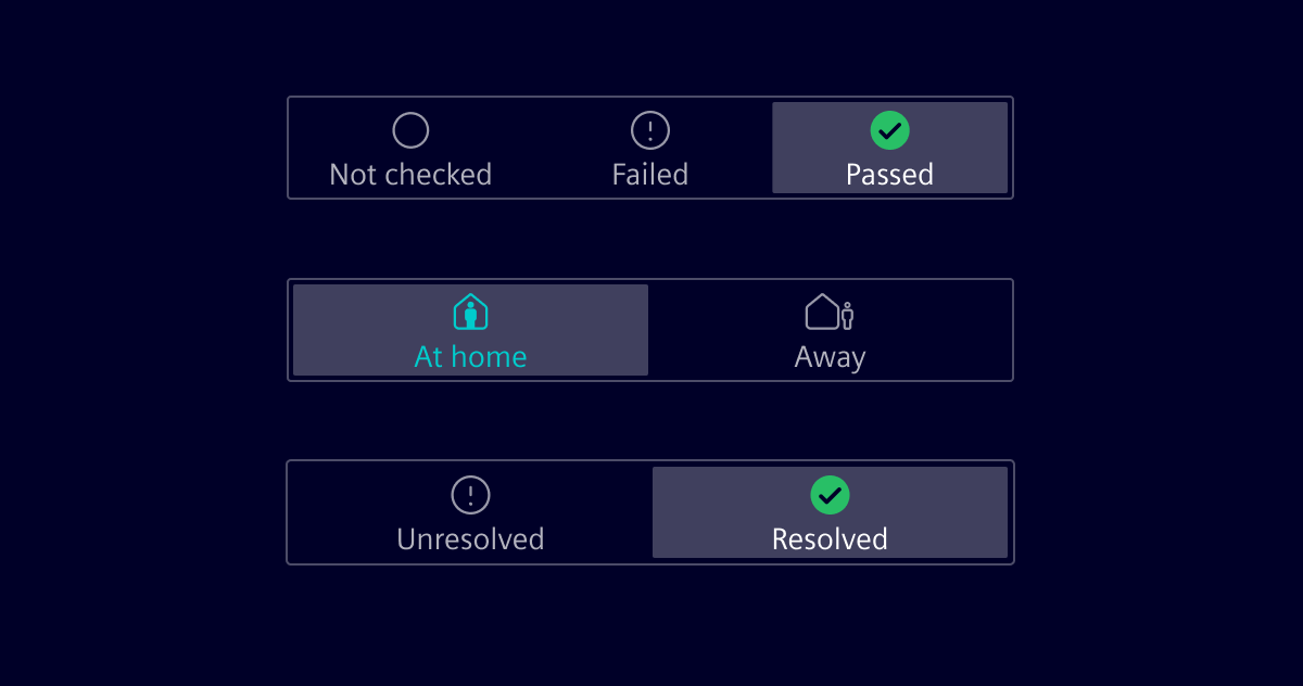
A status toggle is a good way to directly set a status on a screen, e.g. the result of a datapoint-test, home/away state, etc.
Best practices
- In order to access it quickly, a status toggle should remain visible on the screen and not be part of the scrolling area.
- A status toggle can only hold 2 or 3 states.
Design
Elements
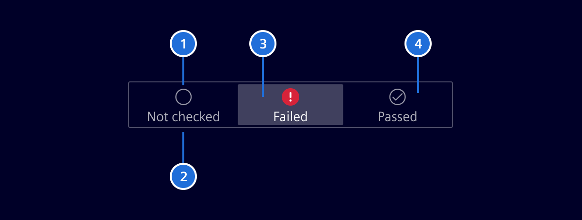
- Icon, 2. Label, 3. Selected state, 4. Unselected state
Label
- The label describes the state.
- Labels are concise and use no more than two words.
- The label will be truncated with 3 dots, if there is not enough space.
- The width of a label depends on the number of states.
Code
SiStatusToggleComponent API Documentation
selector
si-status-toggle Input Properties
| Name | Type | Default | Description |
|---|---|---|---|
| disabled ¶ | boolean | false | Disabled state for the whole component. |
items ¶ | StatusToggleItem[] | List of status items. | |
| value ¶ | (string | number) | Value of currently selected status item. |
Output Properties
| Name | Type | Description |
|---|---|---|
| itemClick ¶ | (string | number) | Emitted when an item is clicked. |
| valueChange ¶ | (string | number) | Value of currently selected status item. |
Types Documentation
| An item for si-status-toggle. | ||||||||||
|---|---|---|---|---|---|---|---|---|---|---|
|
| Represents a translatable string. This can either be a translation key, e.g. ACTIONS.EDIT that will be automatically translated when displayed on the UI or a pre-translated string, e.g. Edit . Equivalent to a normal string in usage and functionality. |
|---|
Except where otherwise noted, content on this site is licensed under MIT License.