Status bar
The status bar is used to convey crucial and system-wide information to users. Different severity symbols help users to quickly evaluate and recognize the current system status, providing the required information to take appropriate actions.
Usage
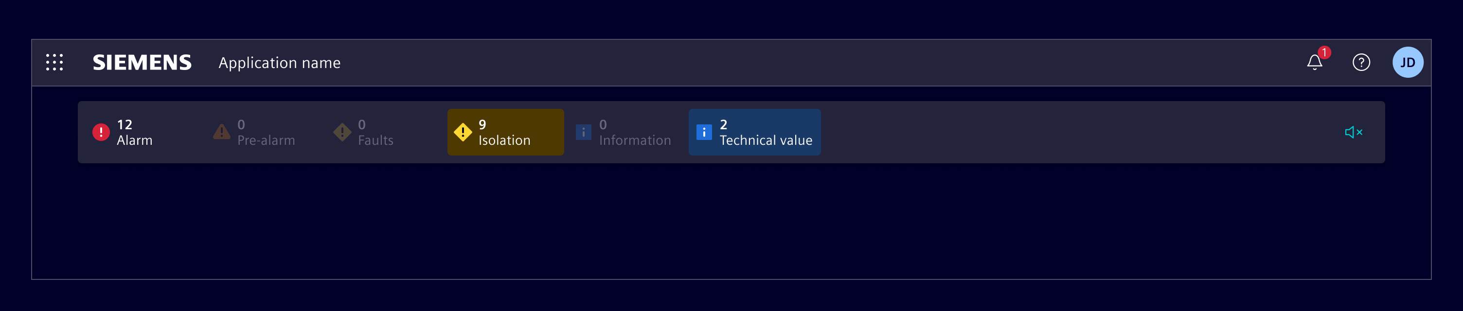
The status bar component informs a user about events or actions that requires their attention and provides an easily accessible and summarized overview of all ongoing events.
It is located just beneath the main horizontal navigation and is always visible on all pages. If needed, each item can be a link to a page with detailed information, containing all necessary means to identify and further analyze a problem or specific status.
The status bar is not part of the scrollable content area, it stays at the same position at all times.
When to use
- Use it when some important status information has to be visible at all times, regardless of how deep the user navigated within an application.
- Use it to provide quick access to critical information that users need to be aware of at all times.
- Use it in combination with the circle status component.
Best practices
- Only include the most relevant status information.
- Do not include more than
10status categories.
Design
Elements
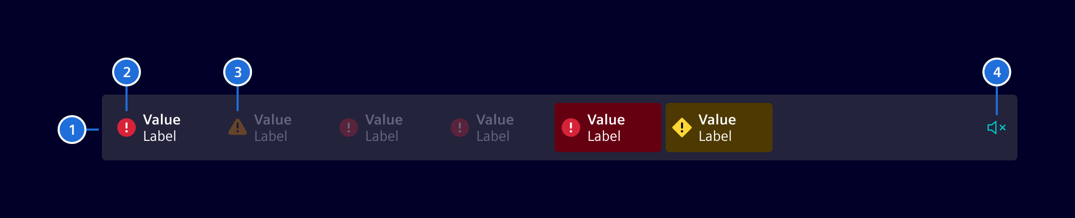
- Container, 2. Status item active, 3. Status item inactive, 4. Mute button (optional)
Status items provide users with a quick way to see how many active events are associated with each event category.
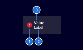
- Event severity indicator, 2. Event category name, 3. Event counter
Variants
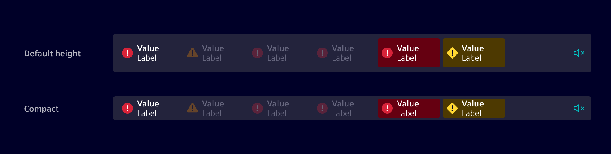
If required, the status bar can be configured in a reduced height/compact mode.
Responsive behavior
The responsive behavior of the component ensures access to all information regardless of the available screen size.
- If there are no active events, the status bar will display the message
All ok. - If there are more active items than can fit within the designated space, items will be moved to a collapsed menu and a summary indicator will be shown to indicate that more items are available.
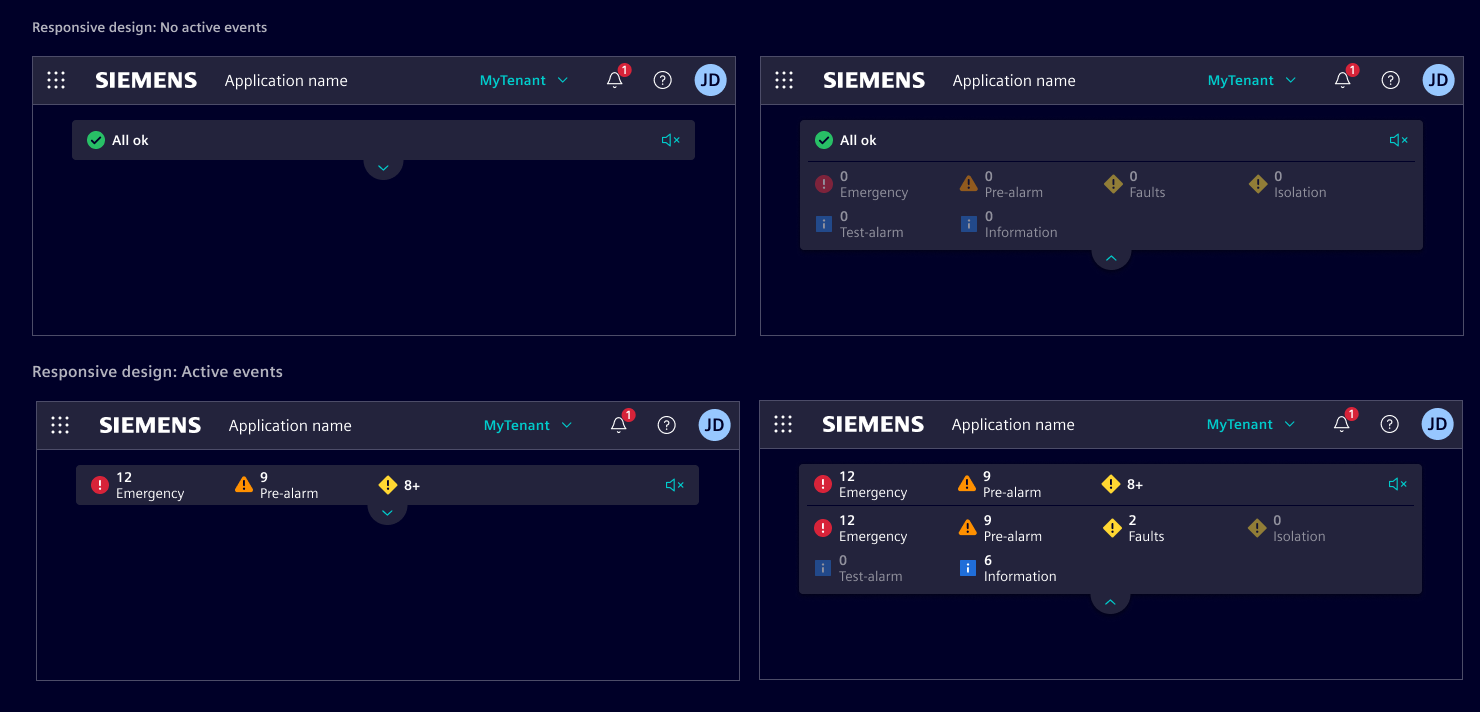
Pulsating state (optional)
To steer a user's attention to new and unhandled events in the status bar, the status items support a blinking feature, which fades the background opacity.

Code
Component for showing various status indicators and should be used below si-application-header.
Items in the status bar are clickable and will emit details of the item when clicked.
Usage
import { SiStatusBarComponent } from '@siemens/element-ng/status-bar';

@Component({
  imports: [SiStatusBarComponent, ...]
})
SiStatusBarComponent API Documentation
si-status-bar The status bar is the main component within an application to inform users at all times about important status information.
Input Properties
| Name | Type | Default | Description |
|---|---|---|---|
| allOkText ¶ | TranslatableString | $localize`:@@SI_STATUS_BAR.ALL_OK:All OK` | Text/translation key for "All OK" status in mobile |
| blink ¶ | boolean | false | When true, items with a value have a blinking background |
| blinkPulse ¶ | Observable<boolean> | blink pulse generator for synchronized blinking with other components | |
| compact ¶ | boolean | false | compact mode |
items ¶ | StatusBarItem[] | Array of status bar items. | |
| muteButton ¶ | boolean | State of the mute button. Set to undefined for no button. | |
| muteButtonText ¶ | TranslatableString | $localize`:@@SI_STATUS_BAR.MUTE:Mute/unmute` | Text/translation key on mute button for screen reader |
| toggleButtonText ¶ | TranslatableString | $localize`:@@SI_STATUS_BAR.TOGGLE:Toggle` | Text for the toggle button that expands/collapses the status bar. Required for a11y. The expanded/collapsed state is communicated separately via aria-expanded . |
Output Properties
| Name | Type | Description |
|---|---|---|
| muteToggle ¶ | void | Emitted when the mute toggle button is clicked |
Types Documentation
| Represents a translatable string. This can either be a translation key, e.g. ACTIONS.EDIT that will be automatically translated when displayed on the UI or a pre-translated string, e.g. Edit . Equivalent to a normal string in usage and functionality. |
|---|
| | |||||||
|---|---|---|---|---|---|---|---|
|
| |
|---|
| |
|---|
Except where otherwise noted, content on this site is licensed under MIT License.