Popover
A popover is a temporary overlay that displays above other content when users activate a trigger element.
Usage
Popovers are used for brief, contextual information or temporary functionality that requires little screen space. They appear when users select a specific control or interactive area and automatically close when users select outside of them or complete an action within the popover.
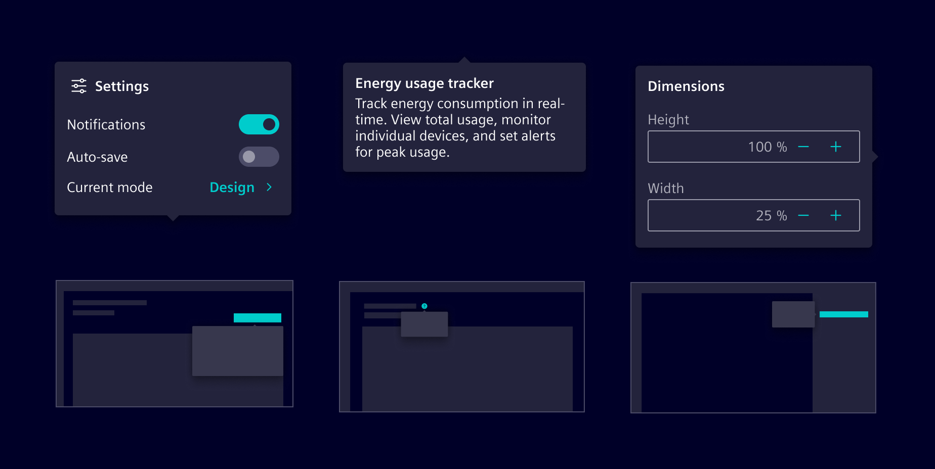
When to use
- To provide short, contextual information or additional functionality related to a control.
- For temporary content that doesn’t require a full page or modal view.
- To provide contextual help, guiding users with explanations or assistance specific to their current task.
Best practices
- Limit functionality to a few related tasks or brief information.
- Avoid placing critical actions or decisions within a popover.
- Display only one popover at a time.
- Popovers should be just large enough to accommodate their content.
Design
Elements
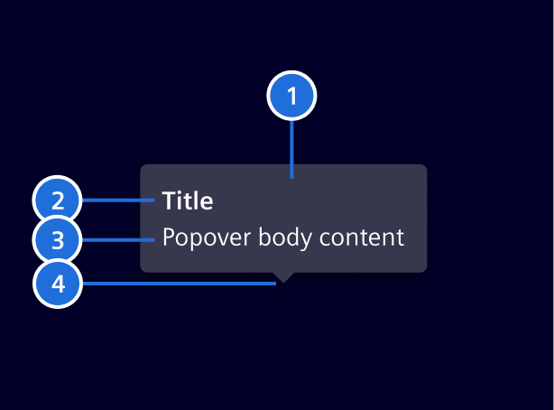
- Container, 2. Title (optional), 3. Body content, 4. Tip
Placement
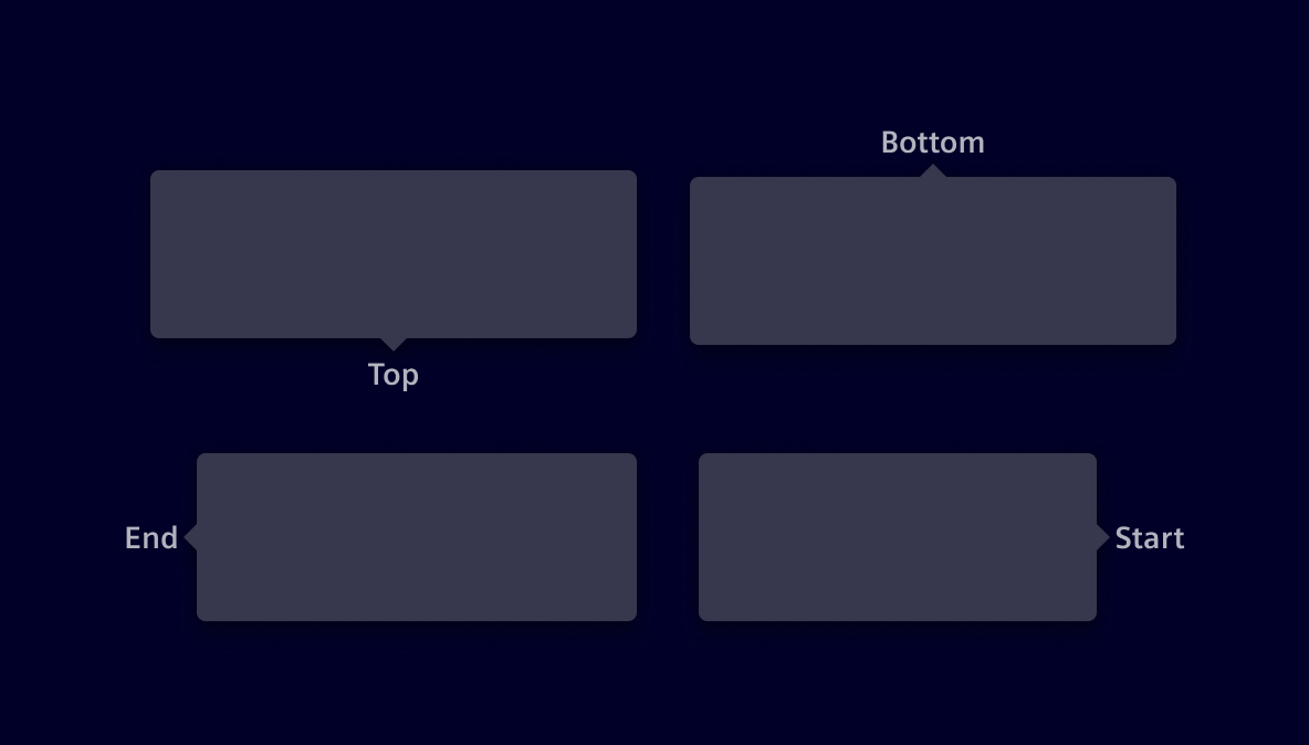
Four position options are available: top, end, bottom and start. Besides that, auto option may be used to detect a position that fits the component on the screen. They should not cover too much of the screen or obscure important content.
Content
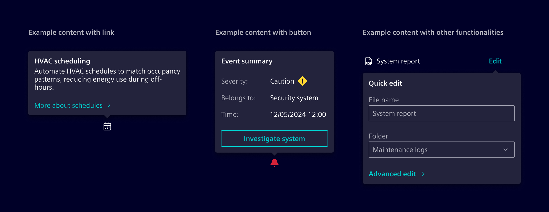
Popovers can include text, links, buttons, and other interactive elements relevant to the task at hand.
Tooltips vs. popovers
Tooltips are meant for supplementary, non-essential information. They’re limited to brief, non-interactive text and appear on hover, making them inaccessible on touch devices.
Popovers provide more comprehensive contextual information or functionality. They open upon user selection.
| Component | Tooltip | Popover |
|---|---|---|
| Purpose | Provides supplementary, non-essential information. | Displays contextual information or interactive elements. |
| Interaction | Appears on hover. | Opens on selection. |
| Dismissal | Disappears when the cursor moves away. | Requires user interaction to close. |
| Interactivity | Non-interactive, only displays text. | Can contain buttons, links, and inputs. |
Code
The si-popover is meant to hold contextual content for a specific element. It is implemented as a role="dialog", thus following a common pattern for such elements.
Popover trigger
The siPopover directive must always be attached to a button, the so-called trigger. A popover trigger MUST NOT have any other actions attached to it. The trigger button must have a descriptive label, such as More information about component xyz. Do not provide generic labels like more or here as users may tab through the page without reading the context.
Use the siPopover directive to create a popover trigger.
<button siPopover="..." type="button" class="btn btn-secondary">
  More information about component xyz
</button>
Popover content
A popover always has a body and a title. A popover will receive the focus when it's opened and the focus will be returned to the trigger when it's closed. So the content may contain interactive elements, such as links or buttons.
The content can be provided in the following ways:
- using the inputs
siPopoverandsiPopoverTitle
<button
  siPopover="Details Lorem ipsum ..."
  siPopoverTitle="Component xyz"
  type="button"
  class="btn btn-secondary"
>
  More information about component xyz
</button>
- using a template
<button siPopover="popoverContent" type="button" class="btn btn-secondary">
  More information about component xyz
</button>
<ng-template #popoverContent>
  <si-popover-title>Component xyz</si-popover-title>
  <si-popover-body> Details Lorem ipsum ... </si-popover-body>
</ng-template>
- using a template and the title input
<button
  siPopover="popoverContent"
  siPopoverTitle="Component xyz"
  type="button"
  class="btn btn-secondary"
  >More information about component xyz</button
>
<ng-template #popoverContent>
  <!-- If siPopoverTitle is set, the content must NOT be wrapped in a si-popover-body element. -->
  Details Lorem ipsum ...
</ng-template>
Container styling
Use siPopoverContainerClass to add custom CSS classes to the popover container. Element also provides two built-in classes:
.auto-width: Removes the default max-width limit so the popover grows to fit its content..no-content-padding: Removes the default body padding, which is useful when placing lists, tables, or other full-width content.
These classes can be used individually or combined:
<button
  [siPopover]="popoverContent"
  siPopoverContainerClass="auto-width no-content-padding"
  type="button"
  class="btn btn-secondary"
>
  More information about component xyz
</button>
Usage
Add the required imports to your component:
import {
  SiPopoverDirective,
  SiPopoverTitleDirective,
  SiPopoverBodyDirective
} from '@siemens/element-ng/popover';

@Component({
  imports: [SiPopoverDirective, SiPopoverTitleDirective, SiPopoverBodyDirective, ...]
})
SiPopoverDirective API Documentation
[siPopover] si-popover Input Properties
| Name | Type | Default | Description |
|---|---|---|---|
| id ¶ | string | __popover-trigger_${this.popoverCounter} | The ID of the trigger element. |
| siPopover ¶ | (TranslatableString | TemplateRef<unknown>) | The popover text to be displayed | |
| siPopoverContainerClass ¶ | string | '' | The class that will be applied to container of the popover |
| siPopoverContext ¶ | unknown | undefined | The context for the attached template |
| siPopoverIcon ¶ | string | undefined | The icon to be displayed besides popover title |
| siPopoverPlacement ¶ | ("auto" | "end" | "start" | "top" | "bottom") | 'auto' | The placement of the popover. One of 'top', 'start', 'end', 'bottom' |
| siPopoverScrollStrategy ¶ | ScrollStrategy | defaultConnectedOverlayScrollStrategy() | CDK scroll strategy used for the popover overlay. |
| siPopoverTitle ¶ | TranslatableString | undefined | The title to be displayed on top for the popover |
Output Properties
| Name | Type | Description |
|---|---|---|
| siPopoverVisibilityChange ¶ | boolean | Emits true when the popover is shown, false when the popover is hidden. |
Attributes and Methods
| Name | Type | Default | Description |
|---|---|---|---|
| hide() ¶ | () => void | Hides the popover and emits 'hidden' event. | |
| (readonly) placementInternal ¶ | Signal<("auto" | "end" | "start" | "top" | "bottom")> | ... | |
| show() ¶ | () => void | Displays popover and emits 'shown' event. | |
| updatePosition() ¶ | () => void | Updates the position of the popover based on the position strategy. |
Types Documentation
| Represents a translatable string. This can either be a translation key, e.g. ACTIONS.EDIT that will be automatically translated when displayed on the UI or a pre-translated string, e.g. Edit . Equivalent to a normal string in usage and functionality. |
|---|
Except where otherwise noted, content on this site is licensed under MIT License.