Notification item
Usage
Notifications keep users updated on changes, prompt timely responses to important updates, and guide them through interactions. They can be delivered through various channels, such as push notifications, emails, or texts.
Element provides guidance on in-app notifications, which deliver updates and feedback within the application experience.
Notification anatomy
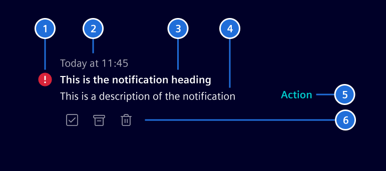
Each notification typically consists of the following elements:
- Indicator: Indicates priority and/or type using a color and icon.
- Timestamp: Shows when the event occurred.
- Heading: A concise phrase that quickly conveys what happened.
- Description: Provides details if needed.
- Primary action: The main action related to the notification. It can be a single button or a menu with multiple options.
- Quick actions: Allows users to take quick action, such as dismissing or responding.
Except for the notification title and timestamp, all elements are optional.
Notification indicators
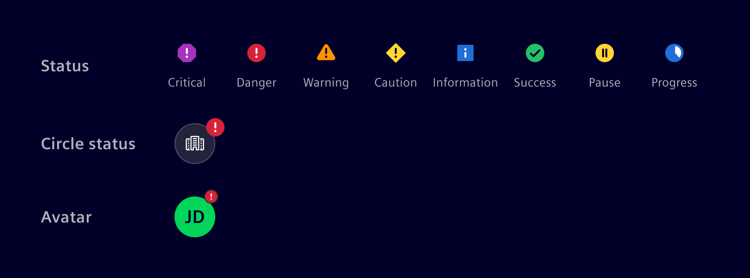
The notification indicators reflect the state or condition of the notification, helping users understand its relevance.
-
When differentiation is needed, severity-based indicators provide a clear response hierarchy. Each severity level is paired with a color and icon to ensure consistency.
-
If needed, a circle status or avatars can be used to provide further context.
-
If the content itself provides enough context, no visual indicator is needed.
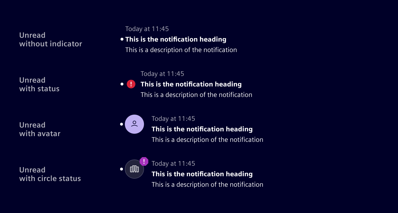
When a notification has read and unread states, the unread state is indicated by a dot and bold title text.
Actions
The main purpose of a notification is to redirect users to the relevant page, task, or item it highlights. Depending on the notification's design, additional actions may also be available.
Global actions affect all notifications at once or adjust system-wide settings (e.g., settings, show all, dismiss all).
Notification-level actions apply to individual notifications for quick management. Common examples include:
- Dismiss: Removes the notification from the current view (e.g., popover, side panel, etc.) but keeps it in the notification center for future reference. Dismiss does not change the read and acknowledge states.
- Delete: Permanently deletes the notification from the system.
- Acknowledge: Confirms receipt, indicating that the user is informed and may take further action.
- Resolve: Used when the system can fix the issue automatically or the user is guided through a resolution process.
Best practices
- Deliver notifications at the right moment to avoid unnecessary distractions.
- Categorize notifications to prioritize critical events.
- Allow users to manage notification settings where possible.
- Define clear thresholds for timestamps. Use relative time for recent events (e.g., "Just now", "5 minutes ago", "09:42", "Yesterday") and switch to absolute dates (e.g., "10/01/2024") for older events.
- Consider setting an expiration timeframe for transient notifications, but allow critical ones to persist until the issue is resolved.
Code
Usage
import { SiNotificationItemComponent } from '@siemens/element-ng/notification-item';

@Component({
  imports: [SiNotificationItemComponent]
})
Examples
SiNotificationItemComponent API Documentation
si-notification-item This component represents a single notification that can be used within notification centers, popovers, or other containers. It supports various action types including router links, standard links, action buttons, and menus.
Input Properties
| Name | Type | Default | Description |
|---|---|---|---|
| description ¶ | TranslatableString | Optional translatable description. | |
heading ¶ | TranslatableString | The heading of the notification item. | |
| itemLink ¶ | (NotificationItemRouterLink | NotificationItemLink) | Link to the source or relevant information of the notification, which triggers when clicking on the notification item text area. | |
| primaryAction ¶ | NotificationItemPrimaryAction | Action that is displayed on the right side of the notification. | |
| quickActions ¶ | NotificationItemQuickAction[] | Actions that are displayed below the text of the notification. | |
| timeStamp¶ | TranslatableString | The timestamp of the notification item. | |
| unread ¶ | boolean | false | Unread messages are emphasized with a bolder font. |
Types Documentation
| Represents a translatable string. This can either be a translation key, e.g. ACTIONS.EDIT that will be automatically translated when displayed on the UI or a pre-translated string, e.g. Edit . Equivalent to a normal string in usage and functionality. |
|---|
| Interface for a router link in a notification item. @param: The type of the link, always 'router-link'. @param: The router link to navigate to. @param: Optional navigation extras for the router. | ||||
|---|---|---|---|---|
|
| Interface for a standard link in a notification item. @param: The type of the link, always 'link'. @param: The URL to navigate to. @param: Optional target attribute for the link. | ||||
|---|---|---|---|---|
|
| Union type for primary actions in a notification item. |
|---|
| Union type for quick actions in a notification item. |
|---|
| Interface for an action circle button in a notification item. @param: The type of the action, always 'action-circle-button'. @param: Optional custom CSS class for styling. @param: The action to perform when the button is clicked. Deprecated: Use NotificationItemActionIconButton instead. This will be removed in a future release. | ||||||
|---|---|---|---|---|---|---|
|
| Interface for an action icon button in a notification item. @param: The type of the action, always 'action-icon-button'. @param: Optional custom CSS class for styling. @param: The action to perform when the button is clicked. | ||||||
|---|---|---|---|---|---|---|
|
| Interface for a standard link with an icon in a notification item. @param: The type of the link, always 'link'. @param: The URL to navigate to. @param: Optional target attribute for the link. | ||||||
|---|---|---|---|---|---|---|
|
| Interface for a router link with an icon in a notification item. @param: The type of the link, always 'router-link'. @param: The router link to navigate to. @param: Optional navigation extras for the router. | ||||||
|---|---|---|---|---|---|---|
|
| Interface for a menu in a notification item. @param: The type of the action, always 'menu'. @param: The menu items to display in the menu. | |||
|---|---|---|---|
|
| Interface for an action button in a notification item. @param: The type of the action, always 'action-button'. @param: The label to display on the button. @param: The action to perform when the button is clicked. | ||||
|---|---|---|---|---|
|
| Base interface for notification item actions. @param: The ARIA label for accessibility. @param: The icon to display for the action. | |||
|---|---|---|---|
|
| |
|---|
| | ||||||||||
|---|---|---|---|---|---|---|---|---|---|---|
|
| | ||||||||||
|---|---|---|---|---|---|---|---|---|---|---|
|
| Represents a menu item that navigates using the Angular Router. Requires a configured Angular Router. | |||||||||||
|---|---|---|---|---|---|---|---|---|---|---|---|
|
| | |||||||||||
|---|---|---|---|---|---|---|---|---|---|---|---|
|
| | |||
|---|---|---|---|
|
| | |||||||||||
|---|---|---|---|---|---|---|---|---|---|---|---|
|
| | |||||||||||
|---|---|---|---|---|---|---|---|---|---|---|---|
|
| | |||
|---|---|---|---|
|
| | ||
|---|---|---|
|
| | ||||||||
|---|---|---|---|---|---|---|---|---|
|
| Implement and provide this to an SiMenuFactoryComponent to receive trigger events. | |||||||
|---|---|---|---|---|---|---|---|
| |||||||
|
| Used in events emitted from SiLinkActionService | |||
|---|---|---|---|
|
| | ||||||||||
|---|---|---|---|---|---|---|---|---|---|---|
|
| | |||||||||||||||||||||||||||
|---|---|---|---|---|---|---|---|---|---|---|---|---|---|---|---|---|---|---|---|---|---|---|---|---|---|---|---|
| |||||||||||||||||||||||||||
| |||||||||||||||||||||||||||
|
| | |||||||
|---|---|---|---|---|---|---|---|
| |||||||
| |||||||
|
Except where otherwise noted, content on this site is licensed under MIT License.