Inline notification
Inline notifications show up in the task flow to provide feedback or the status of an action. These notifications are task generated. They are persistent in nature and vanish after the issue is resolved by user.
Usage
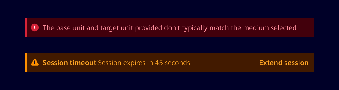
When to use
- Use inline notifications to show quick and precise feedback or status during the task flows.
- Use to notify status or feedback based on information, warning, success and danger.
- Usual places its usage are input fields like forms to show errors etc.
Best practices
- Messaging should be context-based, short and concise.
- Do not overlap rest of the content.
- These are scrollable along with the other content on the screen.
Formatting
The notification width varies based on the context and page layout. Their height is based on the content length, which should not exceed two lines of text. Some examples of layouts are form, right pane, banner etc.
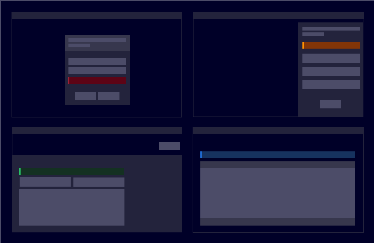
Design
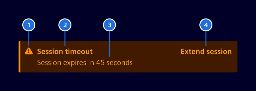
- Icon: Informs users about the severity of a notification.
- Heading: Gives users a quick overview of the notification (optional).
- Message: Provides additional details of the notification.
- Action: Area to take actions like canceling or resolving a notification (optional).
Action button
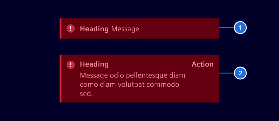
- No action: Information only.
- Action: Provides an action button.
Notification types
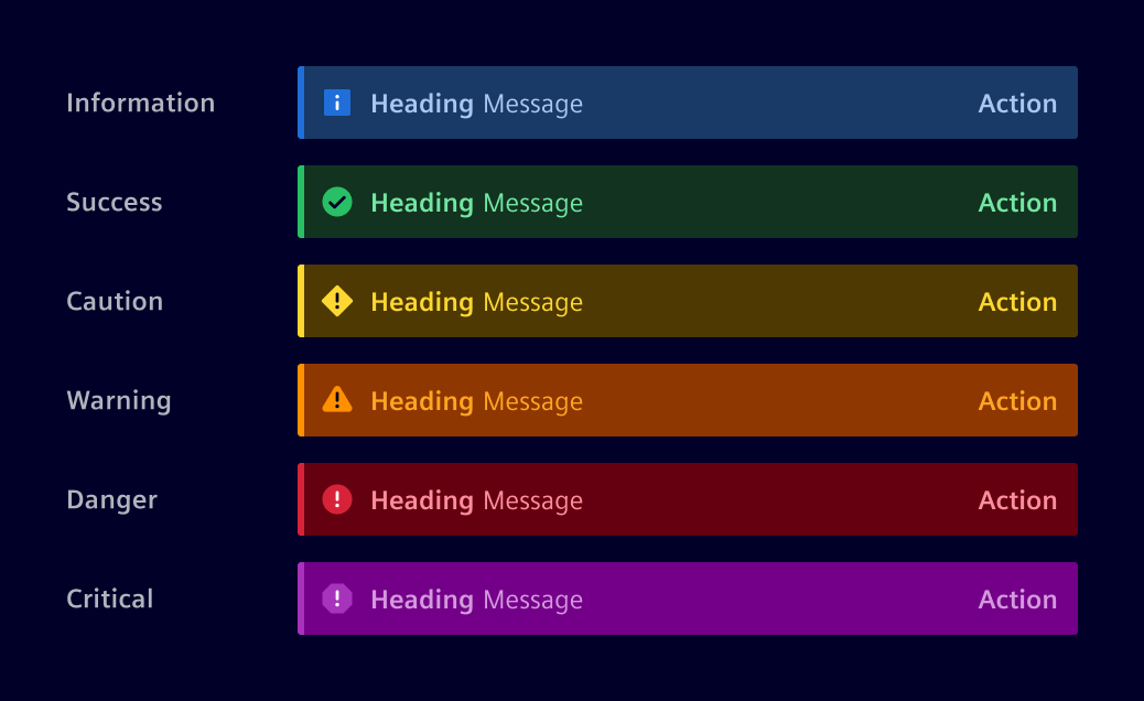
Code
This component is used to bring attention of users to a result of some action. There are multiple options of what is the notification level: information, success, caution, warning, danger and critical.
Usage
import { SiInlineNotificationComponent } from '@siemens/element-ng/inline-notification';

@Component({
  imports: [SiInlineNotificationComponent, ...]
})
SiInlineNotificationComponent API Documentation
selector
si-inline-notification Input Properties
| Name | Type | Default | Description |
|---|---|---|---|
| action ¶ | Link | Optional link action for inline notification events. | |
| embedded ¶ | boolean | false | Displays in embedded style, w/o radius and indicator bar |
| heading ¶ | TranslatableString | Heading of the message. | |
message ¶ | TranslatableString | Main message of this inline notification. | |
| severity¶ | StatusType | Status of inline notification. | |
| translationParams ¶ | ({ [ key: string ]: any } } | undefined) | {} | Params passed to the translation pipe |
Types Documentation
| | ||||||||||
|---|---|---|---|---|---|---|---|---|---|---|
|
| Represents a translatable string. This can either be a translation key, e.g. ACTIONS.EDIT that will be automatically translated when displayed on the UI or a pre-translated string, e.g. Edit . Equivalent to a normal string in usage and functionality. |
|---|
| |
|---|
Except where otherwise noted, content on this site is licensed under MIT License.