Empty state
Use the si-empty-state component in places where you would normally display data, but there is none available. For example, in lists with filters/search when no data is left after filtering. You can customize the icon and text to your needs.
Design
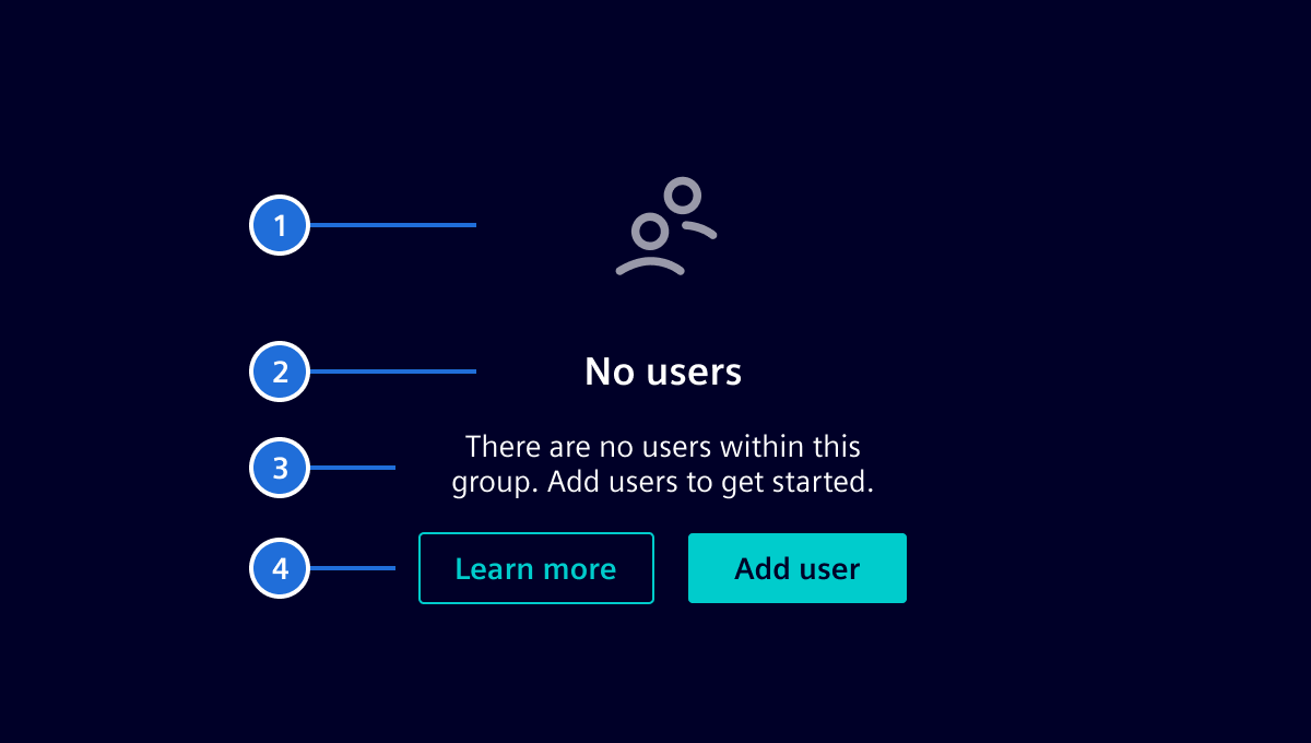
An empty state component consists of the following elements:
- Icon: The object icon associated with the current view.
- Title: A short and concise title to describe the state. A simple wording should be used (e.g.
No devices) and full sentences shall be avoided. - Text: A more detailed explanation of the state, outlining the reasoning for it and how a user can resolve it (optional).
- Actions: Allows the user to take actions to resolve the issue (optional).
Code
Usage
import { SiEmptyStateComponent } from '@siemens/element-ng/empty-state';

@Component({
  imports: [SiEmptyStateComponent, ...]
})
Responsive behavior
The responsive behavior can be adjusted to adapt the empty state to the available container height. Use the playground settings to explore this behavior, toggle actions, and resize the container.
Enable responsiveMode in a container with a defined height to progressively hide the icon and then the description at fixed height breakpoints. These breakpoints provide approximate layout tiers rather than measuring whether all supplied content fits.
When responsiveMode is enabled, the heading and description are each limited to one line and truncated with an ellipsis. Without responsive mode, text keeps its normal wrapping behavior.
SiEmptyStateComponent API Documentation
si-empty-state Input Properties
| Name | Type | Default | Description |
|---|---|---|---|
| content ¶ | TranslatableString | Description of empty state content. | |
heading ¶ | TranslatableString | Heading of empty state content. | |
| icon ¶ | string | CSS class name of the desired icon. | |
| responsiveMode ¶ | boolean | false | Enables automatic adaptation to the available height. Heading and description are truncated to one line. When disabled, all supplied elements remain visible. |
Types Documentation
| Represents a translatable string. This can either be a translation key, e.g. ACTIONS.EDIT that will be automatically translated when displayed on the UI or a pre-translated string, e.g. Edit . Equivalent to a normal string in usage and functionality. |
|---|
Except where otherwise noted, content on this site is licensed under MIT License.