Circle status
Circle status indicates states on a table or list.
Usage
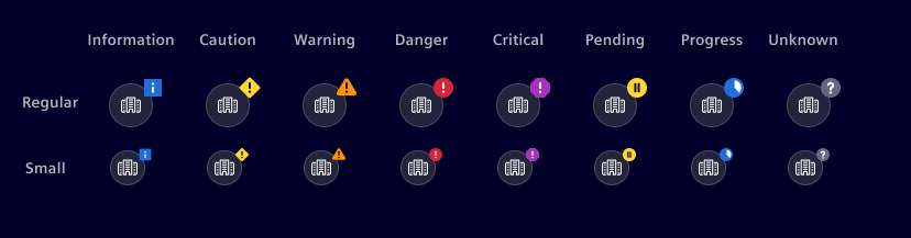
The circle status shows a type icon with a status indicator overlay. The status can be a simple indication or a severity symbol: Information, Caution, Warning, Danger, Critical, Pause, Progress or Unknown. Circle status is available in two sizes: Regular or Small.

- Circle status indication, 2. Status icon
When to use
Best practices
- Badge on circle status shall be colored according definition for the status colors
- Use it with severity symbols when there is a need to identify different severities
- The color of the icon should remain constant according definition in UI colors
Design
There are some variations in the representation of the circle status.
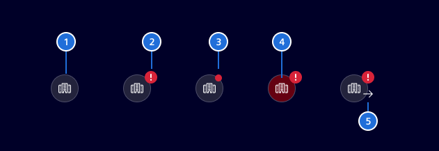
- Default state, 2. Variant with status symbol, 3. Variant with dot, 4. Pulsating state, 5. Supporting icon
Variant: status symbol
Use a circle status with status symbols when there is a need to identify different severities or states.
Variant: dot
Use the circle status with dot for simple indications, with one specific status color (critical, danger, ...) per viewport only. The status is indicated by a dot on top right of the circle. To ensure accessibility, the circle status a severity symbol is the better choice.
Pulsating
The pulse feature is adding a circle on the badge, which fades the opacity. The rhythm and the fading must be in synch with the status bar.
The pulse feature (blinking) is used to indicate places on the screen, where the user has to take immediate action.
The pulse feature (blinking effect) is used to highlight areas where the user needs to take immediate action. It is intended specifically for event lists. Using it in other contexts or too frequently can reduce its effectiveness.
Supporting icon
Add a supporting icon when needed to provide extra context, such as indicating an 'in and out' event. While any icon can be assigned, ensure it adds meaningful context.
Code
No news are good news
The component does not implement the status success. Reason being a status should only be used when something has happened.
Usage
import { SiCircleStatusComponent } from '@siemens/element-ng/circle-status';

@Component({
  imports: [SiCircleStatusComponent, ...]
})
SiCircleStatusComponent API Documentation
si-circle-status Input Properties
| Name | Type | Default | Description |
|---|---|---|---|
| ariaLabel ¶ | TranslatableString | Aria label for icon and status combo. Needed for a11y | |
| blink ¶ | boolean | false | Whether the status should appear with a pulsing circle around the badge. |
| blinkPulse ¶ | Observable<boolean> | Blink pulse generator for synchronized blinking with other components | |
| eventIcon ¶ | string | Custom icon class for event out | |
| eventOut ¶ | boolean | false | event direction is out |
| icon ¶ | string | Set a domain type icon (e.g. element-door ) for which the status shall be shown. Leave undefined for visualizing the status without an icon. | |
| size ¶ | ("small" | "regular") | 'regular' | Set the size using either regular or small only works when used together with icon |
| status ¶ | EntityStatusType | The status (success, info, warning, danger) to be visualized. | |
color ¶ | string | A custom color (e.g. #fefefe ) for exceptional cases.Deprecated: use the semantic status input instead. |
Types Documentation
| Represents a translatable string. This can either be a translation key, e.g. ACTIONS.EDIT that will be automatically translated when displayed on the UI or a pre-translated string, e.g. Edit . Equivalent to a normal string in usage and functionality. |
|---|
| |
|---|
| |
|---|
| |
|---|
Except where otherwise noted, content on this site is licensed under MIT License.