Badges
A badge is a small, non-interactive indicator attached to another element. It can show a status, category, or count for the item it accompanies.
Usage
Badges can display short text, numbers, or an icon. Place them close to the item they describe so the meaning stays clear.
When to use
- To label the state or category of an item.
- To count new, unread, or pending items on an icon, tab, or navigation entry.
- To signal that something changed since the user last looked.
Best practices
- Keep badge text short and specific.
- Use whole numbers for counts.
Design
Badge label
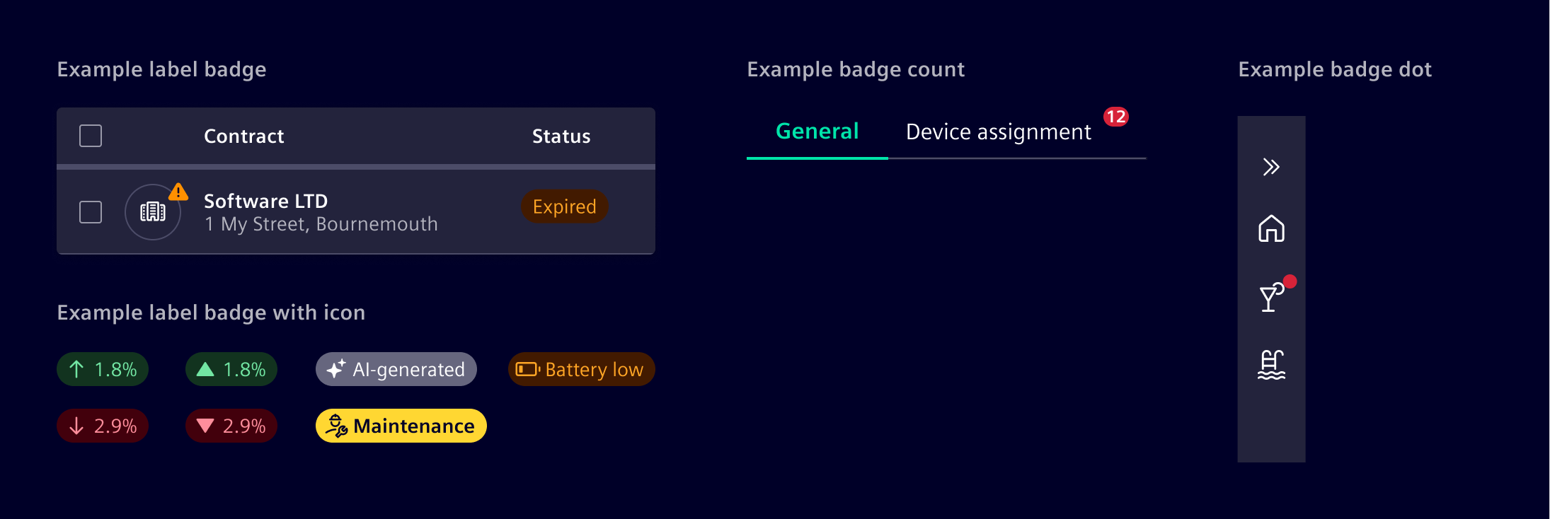
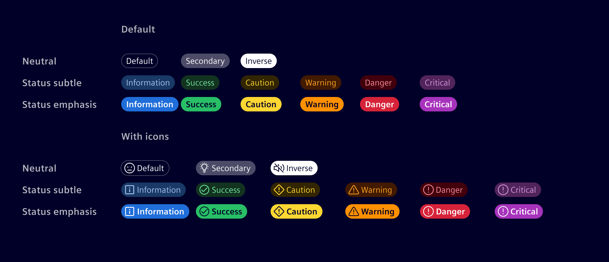
A label badge shows the state or category of a single object, such as Active or Draft. It is available in neutral or status colors (success, danger, etc).
Every status color comes in two styles.
- Use the subtle style by default.
- Use the emphasis style when the badge needs to stand out.
Badge count
A badge count shows how many items need the user's attention, such as unread messages or pending requests. Use it when the exact quantity of new items matters. Keep counters to three characters or fewer, such as 99+.

Badge dot
A badge dot signals change without showing a count. It tells the user that something changed since they last looked.

Code
Usage
import { SiBadgeComponent } from '@siemens/element-ng/badge';

@Component({
  template: `<si-badge type="success" icon="element-validation-success">Success</si-badge>`,
  imports: [SiBadgeComponent, ...]
})
Background colors
To set a badge's background color, choose between the following status tokens:
| Status | Bolder status |
|---|---|
default | |
inverse | |
primary | |
secondary | |
info | info-emphasis |
success | success-emphasis |
caution | caution-emphasis |
warning | warning-emphasis |
danger | danger-emphasis |
critical | critical-emphasis |
For a more prominent appearance use tokens with the -emphasis postfix.
<!-- Angular component -->
<si-badge type="critical-emphasis">Critical</si-badge>
Native HTML markup
There are also various badge CSS classes you can use on native HTML elements: badge, badge-dot, and badge-text.
To set a badge's background color, apply the .bg-{status token} utility classes:
<div role="status" class="badge bg-critical-emphasis">Critical</div>
The badge-dot class provides a smaller dot that can be placed at the side of an icon:
<i role="status" aria-label="notifications" class="icon element-alarm-filled badge-dot"></i>
The badge-text class provides the ability to apply a short text at the side of an icon:
<div role="status" aria-label="More than 99 notifications">
  <i class="icon element-alarm-filled"></i>
  <span class="badge-text" aria-hidden="true">99+</span>
</div>
Accessibility considerations
Badges can confuse users of screen readers and other assistive technologies because these users only hear the badge's content, not its visual styling. To a screen reader, a badge may sound like a random word or number tacked onto the end of a sentence, link, or button, which obscures its intended purpose.
Unless the context is clear - you should add extra, descriptive text that is visually-hidden but available to screen readers.
Examples
SiBadgeComponent API Documentation
si-badgeInput Properties
| Name | Type | Default | Description |
|---|---|---|---|
| icon ¶ | string | '' | Optional icon |
| type ¶ | BadgeType | 'default' | Badge display type. |
Types Documentation
Except where otherwise noted, content on this site is licensed under MIT License.