Avatar
Avatars use images, icons or initials to visually represent an individual or an organization. They can be a valuable tool for creating a more engaging and personalized user experience.
Usage
Avatars may appear in any number of places. The key is for the same image, initials or icon to appear for a given object instance throughout the application. The size of an avatar may vary.
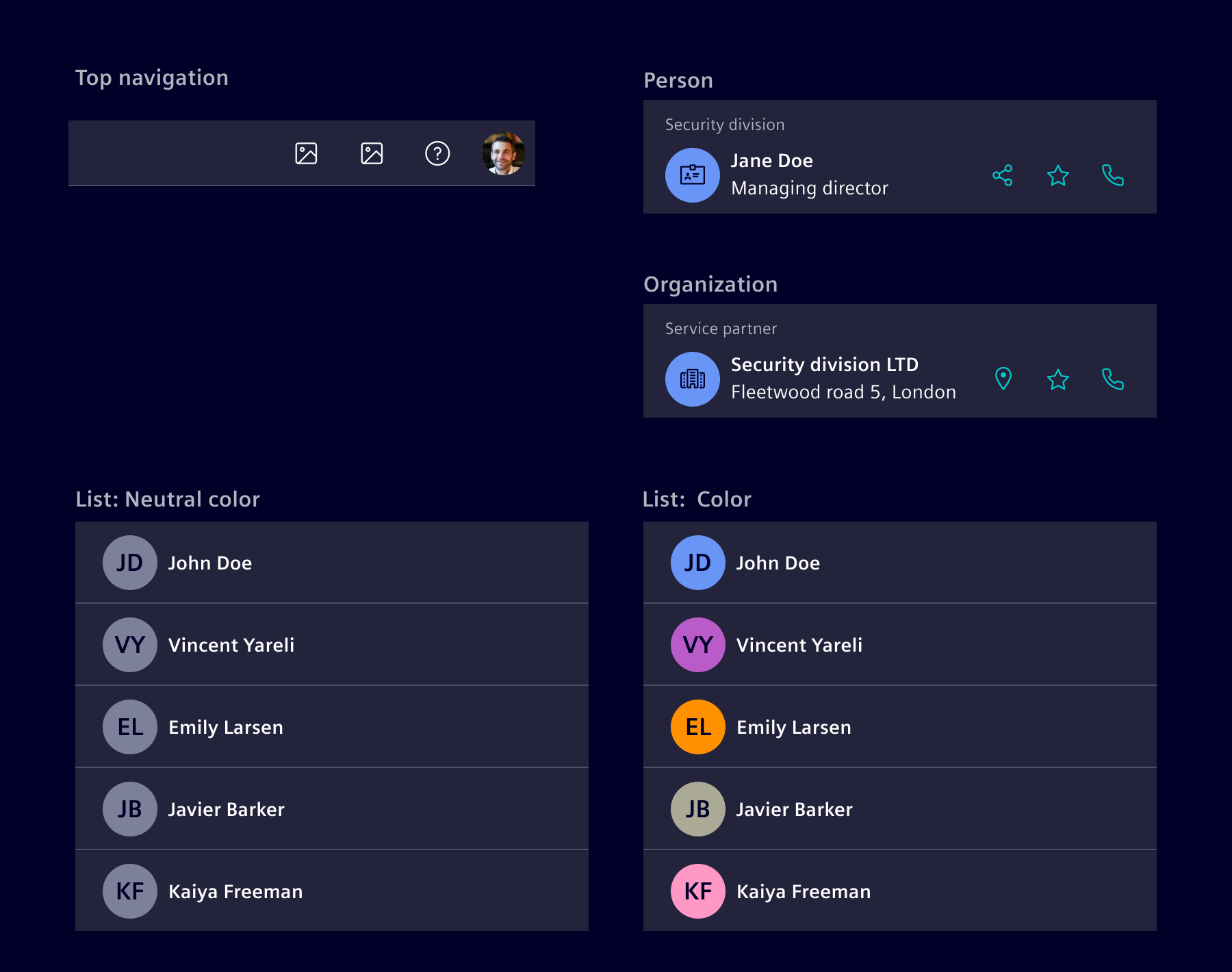
They are typically used in cards, lists, horizontal navigation and account page:
When to use
- Use an avatar to help people efficiently identify another person or organization in the application visually.
- Use a profile avatar to represent an individual and an account avatar for an organization.
- Use an avatar to distinguish people.
- Use it to personalize the user experience: Avatars can be used to give users a sense of ownership and control over their accounts or profiles.
Design
Variants
The Avatar can show the content as image, initials or icon.

Generic rule of usage:
-
Image: Use an image if the application offers the service for customization and an image is available.
-
Initials: If no image is available, use up to two letters instead. If the record name contains two words, like first and last name, use the first capitalized letter of each. For records that only have a single word name, use the first two letters of that word.
-
Icon: If neither image nor initials are available, use the icon as fallback.
Appearance
Depending on the situation, you can use a variety of options for the color. The avatar color system presents 15 tokenized colors, each showcasing a distinct appearance in both light and dark themes.
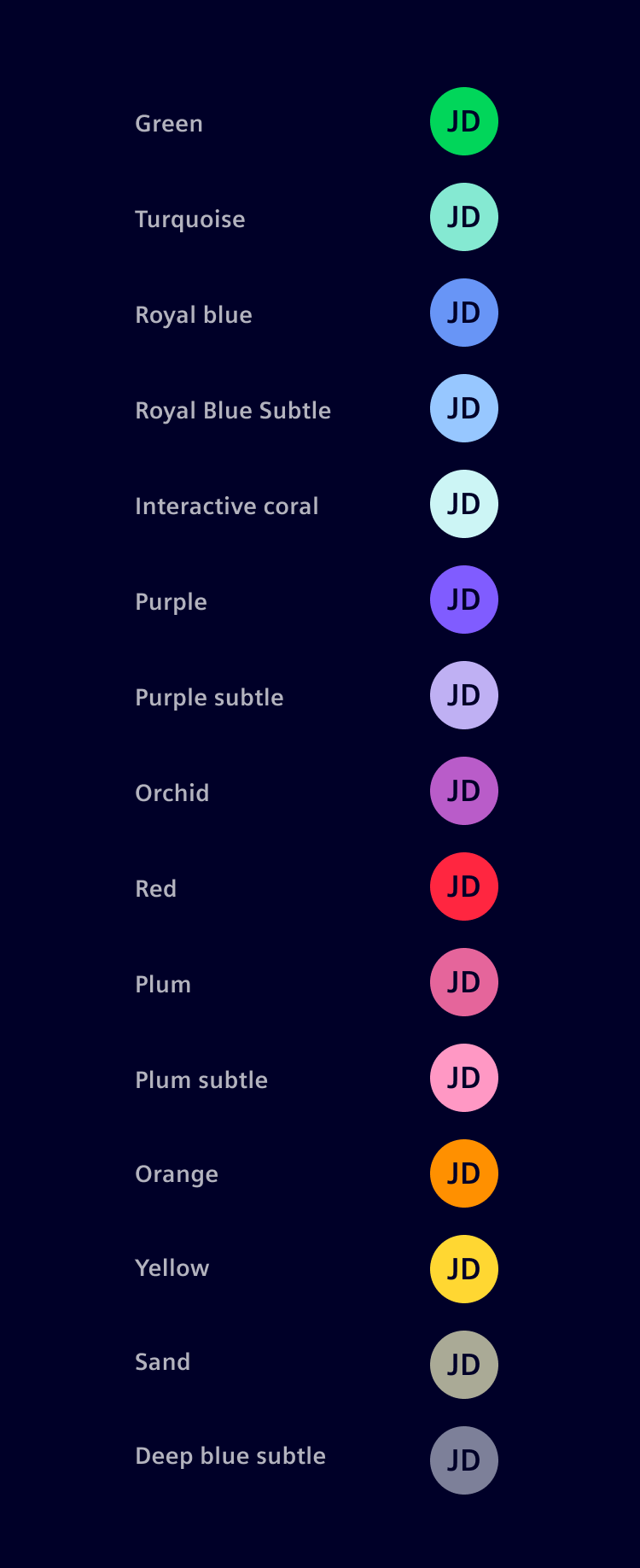
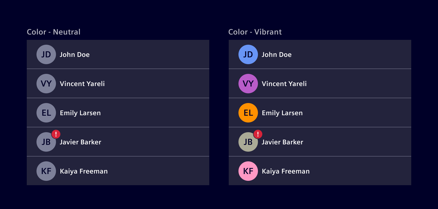
Avatars can be colored with 'neutral' or 'vibrant' colors, depending on the needs of the application and the desired visual focus.
Status
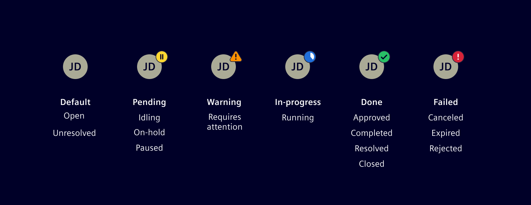
The component allows a colored indicator to be displayed in the top right corner.
Sizes
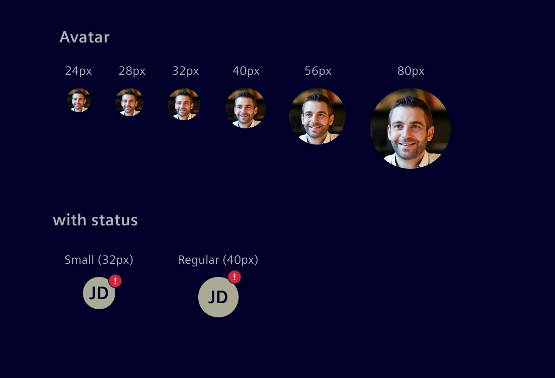
The avatar component can be sized according to the project needs. Use a size which fits to the standard spacing and grid requirements.
- 24–40 px avatars are designed for headers, Horizontal Navigation, etc.
- 40–48 px avatars are often used in content blocks or lists.
- 56+ px avatars should be used in templates, such as profile, settings, etc.
Avatars with a status work best with the following sizes Regular (40px) or Small (32px).
Code
Usage
import { SiAvatarComponent } from '@siemens/element-ng/avatar';

@Component({
  imports: [SiAvatarComponent, ...]
})
SiAvatarComponent API Documentation
si-avatar Input Properties
| Name | Type | Default | Description |
|---|---|---|---|
altText ¶ | string | The alt text for image, title for other modes. | |
| autoColor ¶ | boolean | false | Automatically calculates the background color. If set, color will be ignored. |
| color ¶ | number | undefined | The desired color index from $element-data-* color tokens. This can be set to any kind of positive integer that is then mapped to a color index. A better way to set a pseudo-random color is to set * autoColor to true . |
| icon ¶ | string | Icon name when using an icon. | |
| imageUrl ¶ | string | Image src URL when using an image. | |
| initials ¶ | string | Initials to be displayed as default avatar if no icon or imageUrl are provided. If also no initials are provided, they will be automatically calculated from the altText . The value will be used to calculate the background color when autoColor is true. | |
| size ¶ | AvatarSize | 'regular' | Size of the component. |
| status ¶ | EntityStatusType | The status (success, info, warning, caution, danger, critical, pending, progress) to be visualized. | |
| statusAriaLabel ¶ | TranslatableString | aria-label for status |
Types Documentation
| |
|---|
| |
|---|
| Represents a translatable string. This can either be a translation key, e.g. ACTIONS.EDIT that will be automatically translated when displayed on the UI or a pre-translated string, e.g. Edit . Equivalent to a normal string in usage and functionality. |
|---|
| |
|---|
| |
|---|
| Property The desired color index from $si-sys-color-data-categorical-* color tokens. This can be set to any kind of positive integer that is then mapped to a color index. A better way to set a pseudo-random color is to set autoColor to true . |
|---|
Except where otherwise noted, content on this site is licensed under MIT License.