Search bar
The search bar allows users to quickly find content using free text.
Usage

When to use
- Use it if a full text search is required.
Best practices
- Ignore punctuation within searches.
- Combine with the typeahead behavior to assist users when searching.
- Don't use wildcard encoding for more complex search statements.
- Consider adding other search capabilities according to project needs (e.g. use quotes to search for exact matches).
- The placement of the Search Bar depends on the layout of the viewport. See the list-details for placement guidance. See data table for search placement within a data table.
Design
Elements
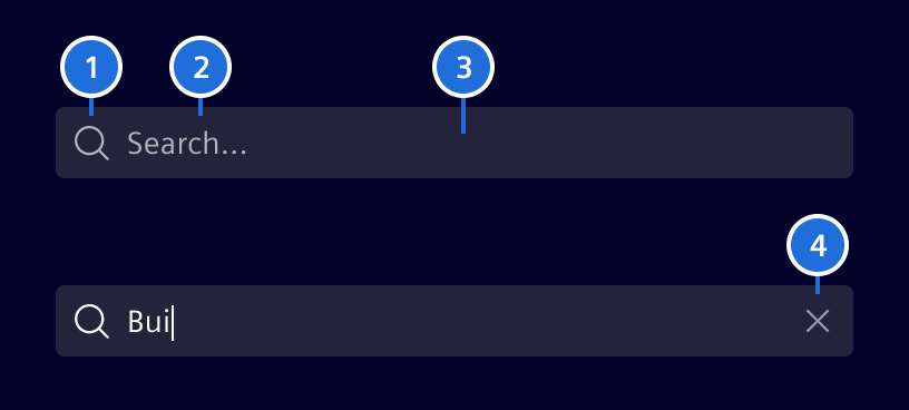
- Search icon, 2. Content, 3. Container, 4. Clear button
Interaction states
The search bar container color should always be in contrast with its surrounding background. Use background-2 or background-1 accordingly.

Code
Use a native input with siSearchBarInput inside si-search-bar. Bind a reactive FormControl or a Signal Forms field to the input to manage its value, validation, and disabled state. Observe form value changes to trigger searches and debounce them in application code when needed.
Set [showIcon]="true" on si-search-bar to display a search icon. The icon is hidden by default.
Usage
import {
  SiSearchBarComponent,
  SiSearchBarInputDirective
} from '@siemens/element-ng/search-bar';

@Component({
  imports: [SiSearchBarComponent, SiSearchBarInputDirective, ...]
})
Projected input
Apply input settings directly to the projected input. Keep appearance settings, such as showIcon and colorVariant, on si-search-bar:
<si-search-bar [showIcon]="true">
  <input
    siSearchBarInput
    aria-label="Search users"
    placeholder="Search users"
    maxlength="40"
    [readonly]="readonly"
    [disabled]="disabled"
  />
</si-search-bar>
Provide an accessible name with aria-label or an associated <label>; the placeholder does not replace a label. Native attributes such as autocomplete can also be set directly on the input.
Migrate deprecated inputs and outputs
Run the following schematic to migrate the deprecated inputs and outputs of si-search-bar to a projected input. Use --path to limit the migration to a directory.
ng g @siemens/element-ng:migrate-search-bar
The schematic:
- Moves
placeholder,maxlength,readonly,disabled, andvalue, as well as form, typeahead, andaria-*bindings, to a projected<input siSearchBarInput>. - Replaces
(searchChange)with a Signal Forms field in the component class. Thedebouncerule replacesdebounceTime, thepatternrule replacesprohibitedCharacters, and aneffectcalls the former handler when the search term changes. - Adds
SiSearchBarInputDirective, andFormFieldif needed, to the imports of the component or NgModule.
By default, the search bar debounces form value changes by 400 ms. A projected input updates its form value immediately, so the schematic logs each migrated search bar with a form binding that loses this debounce. Debounce the value changes in your code where needed.
The schematic also logs search bars that need a manual migration, for example if the (searchChange) handler uses template variables or is inside a @for block or conditional control flow (@if, @switch, or *ngIf). Conditional handlers stay unchanged to preserve template type narrowing.
Search Bar - Input Value
Set the initial value on the projected input's FormControl or Signal Forms model. The clear button resets the bound form value to an empty string.
SiSearchBarComponent API Documentation
si-search-bar Input Properties
| Name | Type | Default | Description |
|---|---|---|---|
| clearButtonAriaLabel ¶ | TranslatableString | $localize`:@@SI_SEARCH_BAR.CLEAR_BUTTON:Clear` | Aria label for the clear button. |
| colorVariant ¶ | BackgroundColorVariant | 'base-1' | Color to use for component background |
| showIcon ¶ | boolean | false | Display search icon before search input. |
debounceTime ¶ | number | 400 | Time unit change of search input takes effect. Deprecated: Use a content-projected input and debounce its form value changes in application code, for example with RxJS debounceTime on FormControl.valueChanges : <si-search-bar> <input siSearchBarInput [formControl]="searchControl"> </si-search-bar> typescript searchControl.valueChanges.pipe(debounceTime(400)); |
| disabled¶ | boolean | false | Whether the input is disabled. Deprecated: Use a content-projected input with disabled applied directly to it: <si-search-bar> <input siSearchBarInput disabled> </si-search-bar> |
| maxlength¶ | number | undefined | Defines the maximum length of the search input. Deprecated: Use a content-projected input with maxlength applied directly to it: <si-search-bar> <input siSearchBarInput maxlength="100"> </si-search-bar> |
| placeholder¶ | string | '' | Define search input placeholder. Deprecated: Use a content-projected input with placeholder applied directly to it: <si-search-bar> <input siSearchBarInput placeholder="Search"> </si-search-bar> |
| prohibitedCharacters¶ | string | Prohibited characters restricting search. Deprecated: Use a reactive FormControl or Signal Forms on a content-projected input to validate prohibited characters: <si-search-bar> <input siSearchBarInput [formControl]="searchControl"> </si-search-bar> Or with Signal Forms: <si-search-bar> <input siSearchBarInput [formField]="searchForm.search"> </si-search-bar> | |
| readonly¶ | boolean | false | Whether the input can be focused but not edited. Deprecated: Use a content-projected input with readonly applied directly to it: <si-search-bar> <input siSearchBarInput readonly> </si-search-bar> |
| value¶ | string | Define search input content. Deprecated: Use a content-projected input with value applied directly to it: <si-search-bar> <input siSearchBarInput value="Search term"> </si-search-bar> |
Output Properties
| Name | Type | Description |
|---|---|---|
| searchChange¶ | string | Output callback event will provide you with search term if search input changes. Deprecated: Use a content-projected input and observe FormControl.valueChanges or the field value signal with Signal Forms: <si-search-bar> <input siSearchBarInput [formControl]="searchControl"> </si-search-bar> Or with Signal Forms: <si-search-bar> <input siSearchBarInput [formField]="searchForm.search"> </si-search-bar> |
Types Documentation
| Represents a translatable string. This can either be a translation key, e.g. ACTIONS.EDIT that will be automatically translated when displayed on the UI or a pre-translated string, e.g. Edit . Equivalent to a normal string in usage and functionality. |
|---|
| Use this type with filter components colorVariant to render component variants based on background of container |
|---|
Except where otherwise noted, content on this site is licensed under MIT License.