Filtered search
Filtered search enables to search for free text in combination with structured search criteria. The criteria are any numbers of criterion objects with a name and a value.
Usage

When to use
- When users may not know exactly what they are looking for and want to explore options by selecting different filters.
- Use it when free-text search alone isn't enough, and structured criteria add value to the search process.
- Use it to create filter formulas by adding or excluding conditions.
- Use it where there is enough horizontal space to display filter options without cluttering the interface.
- If users need to apply many filters, especially with nested or hierarchical structures, consider other filter patterns.
Best practices
- Use filtered Search with simple filter patterns (e.g. string, enumeration, integer, date/time) only.
- Always use strict criteria functionality and provide an explicit list of criteria.
- Ignore punctuation within searches.
- Consider adding other search capabilities according to project needs (e.g. use quotes to search for exact matches).
Design
Elements
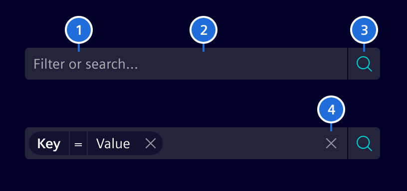
- Placeholder, 2. Container, 3. Search button, 4. Clear button
Interaction states
The filtered search container color should always be in contrast with its surrounding background. Use background-2 or background-1 according to that.
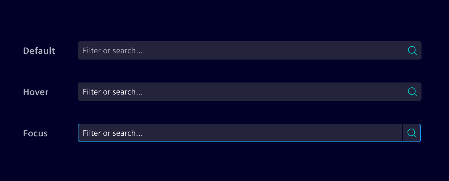
Filter anatomy
Filtered Search is used in combination with the Filter Pills. The filter can be composed of three different elements:
- Key: Targeted property or category.
- Value: Specific value of the property you are looking for.
- Operator: The intended relation between Key and Value (
=,>,<, etc).
Combine the elements according to the complexity needed.
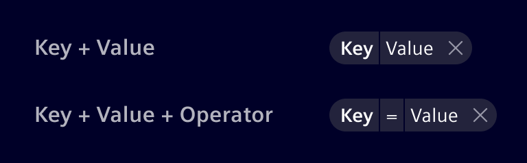
Filter patterns
Character value (string)
It allows to input text to find content without a predefined set of options.

Numeric value (integer / float)
It allows to input numbers. Usually has an operator and allows range filtering.

Enumeration
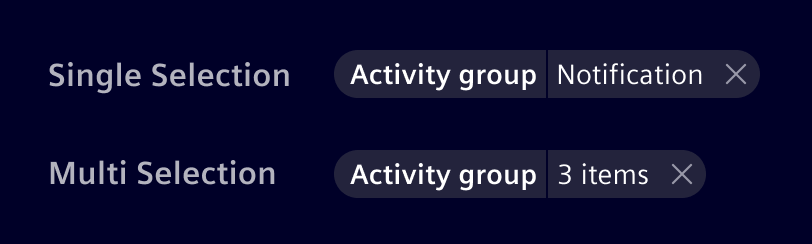
Enumeration contain a predefined set of values, from which the user can select one option (single selection) or many (multi-selection). Combine with a typeahead behavior so users can enter the search value.
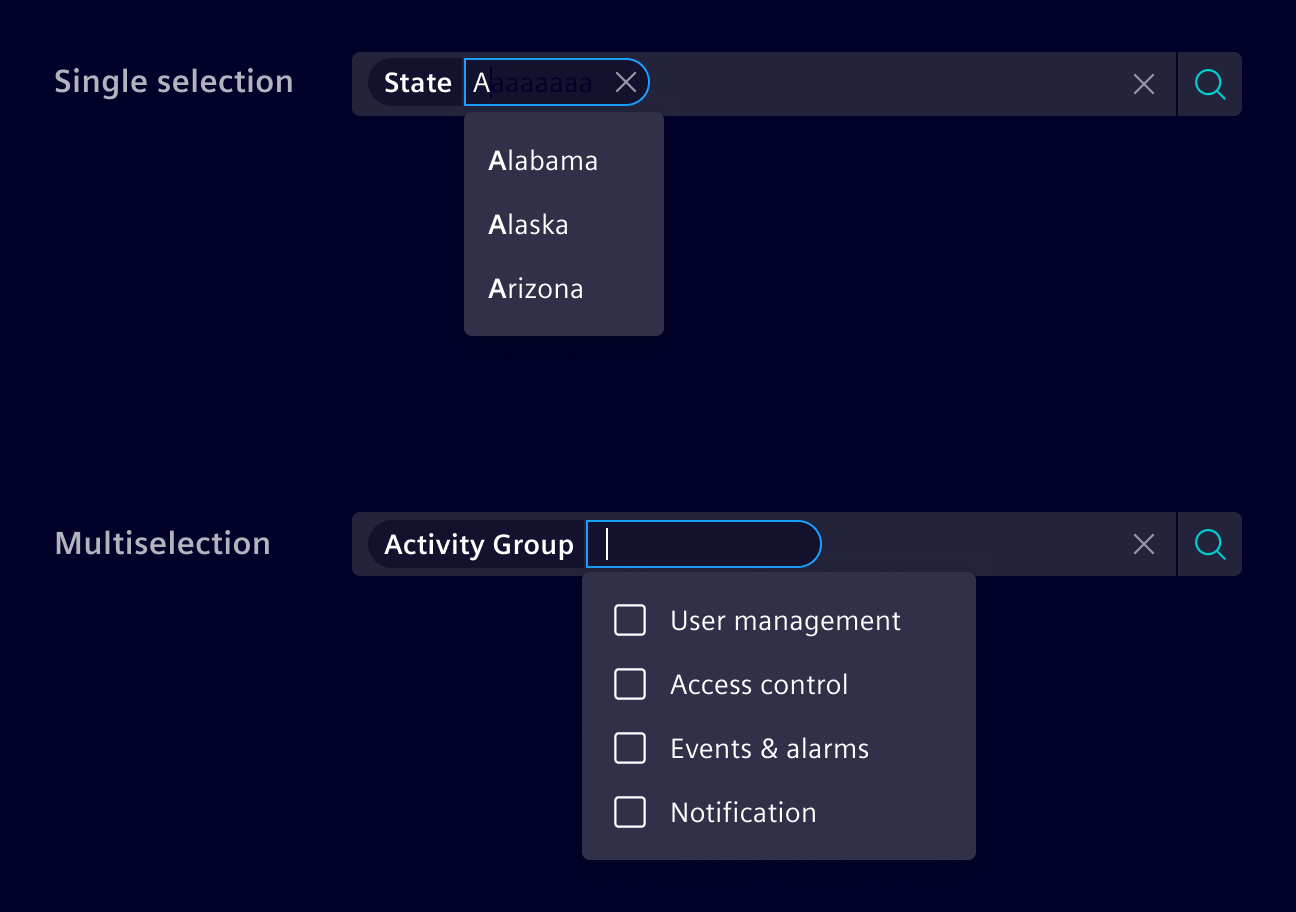
If more than one value is selected, an item count shall be shown in the filter pill.
Code
Assume you are searching for a person of a specific company and location. Company and location are criteria with possible options like Siemens, Maximago or Munich, Zug, etc. You can define possible search criteria by providing these criteria with the input [criteria] as one object. On pressing return, the (doSearch) output callback event will provide you with an object describing the selected criteria and the additional string, the user entered.
The Criterion type is used as input and output data type for this component. It always has a name and optionally a label that is used for displaying to the UI. As an input object, the options property is used to specify, which options the users can select as value for the criterion. These options can be an array of strings or an array of OptionCriterion which allows to specify a value for the label and different value for doing the search. When search is activated, the callback sets the selected option (the value itself or the value property if OptionCriterion is used) as value in the Criterion object.
For more advanced use cases, custom comparison operators (e.g. > or !=) can be used besides of the standard equal operator, while also restricting the input to match a certain data type (e.g. string or integer). See the custom operators example for details.
By default, the user is allowed to enter additional criteria and criterion values than initially configured. Additional criteria can be created by adding a : after the written criteria (e.g. additional:).
Also good to know is that Criterion values are editable after they're created. So you don't have to drop the whole Criterion.
This component uses CSS Variables to make sizes and colors adjustable on the fly. Use the variable --filtered-search-font-size in combination with --filtered-search-line-height to adjust the size of the component.
Usage
import { SiFilteredSearchComponent } from '@siemens/element-ng/filtered-search';

@Component({
  imports: [SiFilteredSearchComponent, ...]
})
Filtered search - Basic
The following provides a basic example with pre-configured criteria and their options. At a minimum, you must define the criteria. Other optional parameters to define are:
(doSearch)output for handling when user submits search criteria[placeholder]input for placeholder (empty string by default)[submitText]input for configurable 'submit' text ('Apply search criteria' by default)
Filtered search - Basic with predefined search criteria
This sample extends the first one by preselecting criteria.
Filtered search - Lazy loaded criteria values
In many cases, your application defines the criteria, but the values need to be loaded from a server. In this case you can provide an function that returns the possible criterion options as an Observable.
Filtered search - Lazy loaded criteria and category values
In addition to lazy loaded value, you can also lazy load the criteria itself.
Filtered Search - Strict criteria
If you only allow the criteria defined, use [strictCriterion] to specify it.
Filtered search - Strict category values
If you only allow the criteria options defined, use [strictValue] to specify it.
[strictValue] enforces [strictCriterion] to true automatically.
Filtered search - Trigger search value input
[doSearchOnInputChange] filters not applied explicitly ("Apply search criteria") only but implicitly while typing or selecting the search criteria.
You can use [searchDebounceTime] to change the delay between the key stroke and the search emission.
Filtered search - Custom operators
For more advanced use cases, the Criterion type also allows to specify custom comparison operators via the operators property. The operators are an array of strings like !=, <, >, etc. The selected operator is then saved in the operator property. To restrict the type of value, the validationType property can be set to any of these values: string, integer, or float. See the following example on how these properties can be used to filter for a certain temperature range:
Filtered search - DatePicker
The following example shows the datepicker's use:
Filtered search - Multi Select
The following example shows the use of multi select criterion:
SiFilteredSearchComponent API Documentation
si-filtered-search Input Properties
| Name | Type | Default | Description |
|---|---|---|---|
| clearButtonLabel ¶ | TranslatableString | $localize`:@@SI_FILTERED_SEARCH.CLEAR:Clear` | Clear button aria label. Needed for a11y |
| colorVariant ¶ | BackgroundColorVariant | 'base-1' | Color variant to determine component background |
| criteria ¶ | CriterionDefinition[] | [] | Predefine criteria options. |
| disabled ¶ | boolean | false | Disable any interactivity. |
| disableFreeTextSearch ¶ | boolean | false | Disables the free text search to only use the criterion for filtering. |
| disableSelectionByColonAndSemicolon ¶ | boolean | false | By default, the Filtered Search will treat : as a special character to submit the current input in the freetext and immediately create a criterion. Use this input to disable this behavior. |
| doSearchOnInputChange ¶ | boolean | false | If this is set to true , the search triggers for each input (implicit search). By default, the search is triggered when the user submits by pressing the search button or by pressing enter. |
| exclusiveCriteria ¶ | boolean | false | Opt-in to search for each criterion only once. |
| freeTextCriterion ¶ | CriterionDefinition | Criterion definition for free-text pills. When set, free-text values will be added as a pill with this criterion. If not set, free-text pills are disabled. Enabling this will only emit valueChange events when the free-text pill is created. When the text input is blurred and there is text inside, a free-text pill will be created. | |
| itemCountText ¶ | TranslatableString | $localize`:@@SI_FILTERED_SEARCH.ITEM_COUNT:{{itemCount}} selected` | Items count text appended to the count in case of multi-selection of values. Translation key, {{itemCount}} in the translation will be replaced with the actual value. |
| lazyCriterionProvider ¶ | (typed: string, searchCriteria: SearchCriteria) => Observable<CriterionDefinition[]> | In addition to lazy loaded value, you can also lazy load the criteria itself | |
| lazyLoadingDebounceTime ¶ | number | 500 | Custom debounce time for lazy loading of criteria data. |
| lazyValueProvider ¶ | (criterionName: string, typed: (string | string[])) => Observable<OptionType[]> | In many cases, your application defines the criteria, but the values need to be loaded from a server. In this case you can provide a function that returns the possible criterion options as an Observable. | |
| maxCriteria ¶ | number | undefined | Limit the number of possible criteria. The default is undefined so that any number of criteria can be used. For example, setting the value to 1 let you only select one criterion that you need to remove before being able to set another one. |
| maxCriteriaOptions ¶ | number | 20 | Defines the maximum options within one criterion. The default is 20 and 0 means unlimited. |
| onlySelectValue ¶ | boolean | false | Limit criterion options to the predefined ones and prevent typing. [onlySelectValue] enforces [strictValue] and [strictCriterion] to true automatically. |
| optionsInScrollableView ¶ | number | 10 | Defines the number of criteria, criteria values and operators visible at once. |
| placeholder ¶ | string | '' | The placeholder for input field. |
| scrollStrategy ¶ | () => ScrollStrategy | defaultConnectedOverlayScrollStrategyFactory() | Factory for CDK scroll strategies used by filtered-search overlays. |
| searchCriteria ¶ | SearchCriteria | { criteria: [], value: '' } | The current selected search criteria and entered search text. |
| searchDebounceTime ¶ | number | 0 | Custom debounce time (in mills) to delay the search emission. (Default is 0 as in most cases a users manually triggers a search. Recommended to increase a bit when using doSearchOnInputChange=true) |
| searchForFreeTextLabel ¶ | TranslatableString | $localize`:@@SI_FILTERED_SEARCH.SEARCH_FOR_FREE_TEXT:Search for "{{query}}"` | The value to be shown for creating free-text pills. Use the {{query}} placeholder to show the user input in the label. |
| searchLabel ¶ | TranslatableString | $localize`:@@SI_FILTERED_SEARCH.SEARCH:Search…` | Search input aria label, Needed by a11y |
| strictCriterion ¶ | boolean | false | Limit criteria to the predefined ones. |
| strictValue ¶ | boolean | false | Limit criterion options to the predefined ones. [strictValue] enforces [strictCriterion] to true automatically. |
| submitButtonLabel ¶ | TranslatableString | $localize`:@@SI_FILTERED_SEARCH.SUBMIT_BUTTON:Apply search criteria` | The accessible label of the search button. |
| typeaheadOptionsLimit ¶ | number | 20 | Limit on the number of criteria/criteria value to be displayed by the typeahead |
Output Properties
| Name | Type | Description |
|---|---|---|
| doSearch ¶ | SearchCriteria | Output callback event that provides an object describing the selected criteria and additional filter text. |
| interceptDisplayedCriteria ¶ | DisplayedCriteriaEventArgs | The interceptor is called when the list of criteria is shown as soon as the user starts typing in the input field. The interceptor's DisplayedCriteriaEventArgs.allow method can be used to filter the list of displayed criteria. Note: The interceptor is called as long as the searchCriteria does not exceed maxCriteria . Further, the interceptor is not called when using the lazyCriterionProvider . Example: <si-filtered-search [criteria]="[{ name: 'foo', label: 'Foo' }, { name: 'bar', label: 'Bar' }]" (interceptDisplayedCriteria)="$event.allow( $event.searchCriteria.criteria.some(s => s.name === 'foo') ? $event.criteria.filter(c => c !== 'foo') : $event.criteria )"> </si-filtered-search> |
| searchCriteriaChange ¶ | SearchCriteria | The current selected search criteria and entered search text. |
Attributes and Methods
| Name | Type | Default | Description |
|---|---|---|---|
| deleteAllCriteria(...) ¶ | (event: MouseEvent) => void | Deletes all currently selected criteria and effectively resets the filtered search. Parameters
|
Types Documentation
| Represents a translatable string. This can either be a translation key, e.g. ACTIONS.EDIT that will be automatically translated when displayed on the UI or a pre-translated string, e.g. Edit . Equivalent to a normal string in usage and functionality. |
|---|
| Use this type with filter components colorVariant to render component variants based on background of container |
|---|
| A CriterionDefinition is the definition of criteria in the SiFilteredSearchComponent . It defines the type and based this further attributes like multiselect and available options. | ||||||||||
|---|---|---|---|---|---|---|---|---|---|---|
|
| On search, the filtered search component emits a SearchCriteria object. It consists of all user selected criteria and the free text input value. | |||
|---|---|---|---|
|
| Event allows to intercept and change the displayed criteria before shown in typeahead. | |||||||
|---|---|---|---|---|---|---|---|
| |||||||
|
| | ||||||||||||||||||||||||||||||||||||||
|---|---|---|---|---|---|---|---|---|---|---|---|---|---|---|---|---|---|---|---|---|---|---|---|---|---|---|---|---|---|---|---|---|---|---|---|---|---|---|
|
| Type for options |
|---|
| |
|---|
| A CriterionValue is the input/output value of the SiFilteredSearchComponent , containing the user input. | |||||
|---|---|---|---|---|---|
|
| | ||||||||||||||||||||||||||||||||||||
|---|---|---|---|---|---|---|---|---|---|---|---|---|---|---|---|---|---|---|---|---|---|---|---|---|---|---|---|---|---|---|---|---|---|---|---|---|
|
| It allows to specify a different value between the one which is rendered and the one which is used for the search. | |||||
|---|---|---|---|---|---|
|
| Function |
|---|
| |
|---|
| |
|---|
| Wrapper around an actual translation framework which is meant to be used internally by Element. Applications must not use this service. Use injectSiTranslateService to get an instance of the translation service. | |||||||||||||||||||||||||||||||||||||||||
|---|---|---|---|---|---|---|---|---|---|---|---|---|---|---|---|---|---|---|---|---|---|---|---|---|---|---|---|---|---|---|---|---|---|---|---|---|---|---|---|---|---|
| |||||||||||||||||||||||||||||||||||||||||
| |||||||||||||||||||||||||||||||||||||||||
| |||||||||||||||||||||||||||||||||||||||||
|
Except where otherwise noted, content on this site is licensed under MIT License.