Filter bar
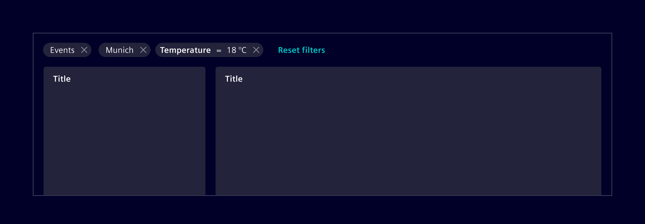
A Filter bar is a horizontal collection of non-editable pills used to represent the currently applied filters.
Usage
The filter bar is placed above specific parts of the page, making it clear that only those parts will reflect the applied filters.
When to use
- Use it to represent the currently applied filters. The filters themselves must be set or changed using separate functionality.
- Use it if the filter doesn't have to be inline editable.
- Use it if more than 2-3 filter criteria need to be applied at the same time.
Best practices
- Use one filter pill per filter category.
- If only one option is selected, show the value (e.g.
Munich). - If more than one option is selected, show the criteria name in plural with a counter (e.g.
7 cities). - Don't use a filter bar if you need to provide inline filter editing functionality. Use the filtered search component instead.
- Use an alternative text like
Applied filtersto make it accessible for visually impaired people and screen readers.
Design
Elements
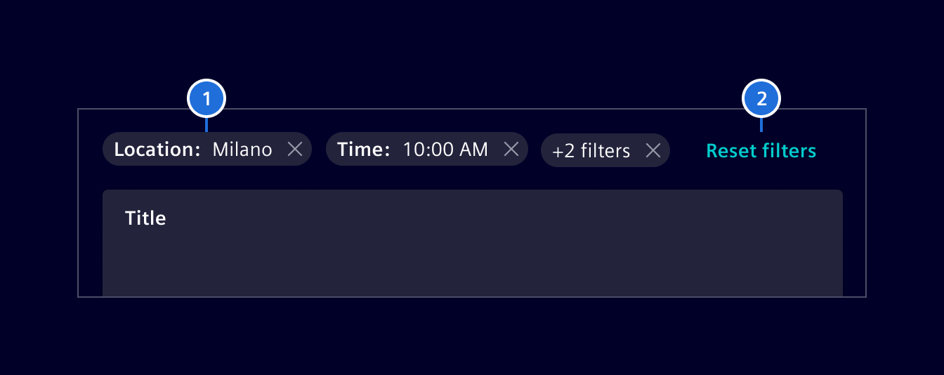
- Filter pills, 2. Reset filters button
Interaction states
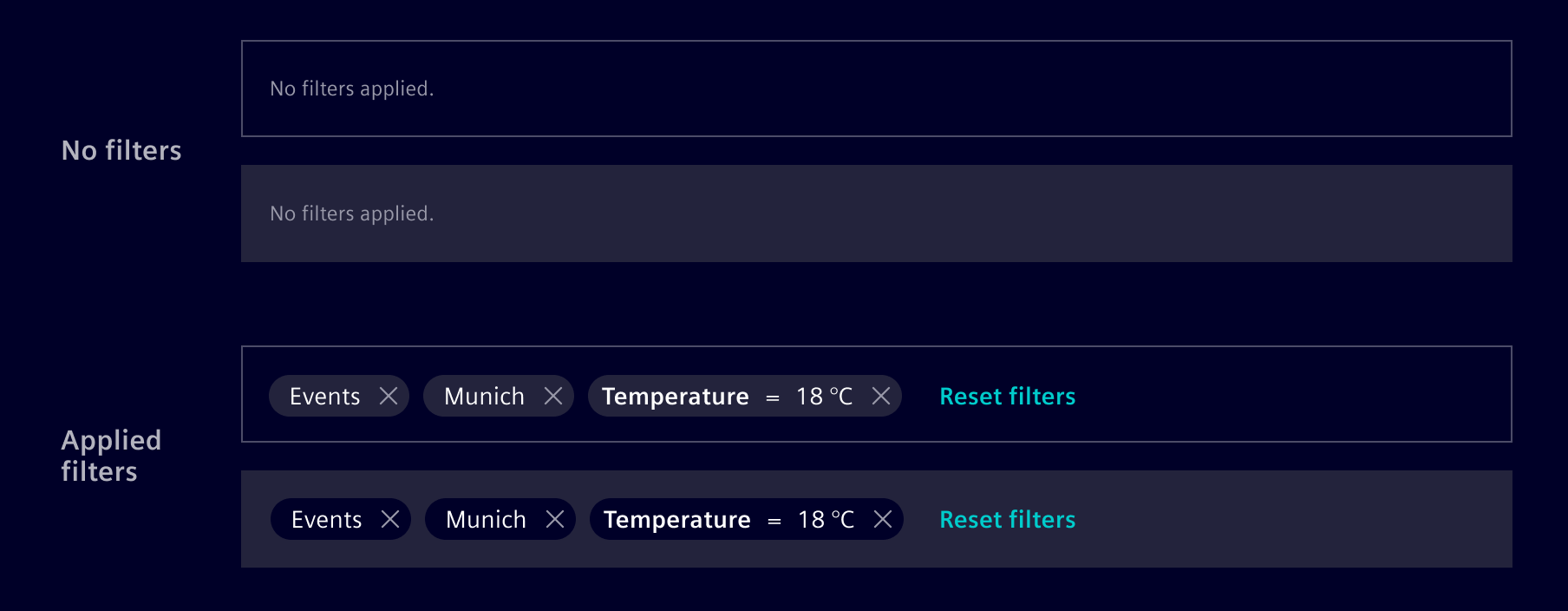
As the filter bar does not have a representation on its own, all interaction states correspond to the filter pills and the reset button.
The filter pills container color should always be in contrast with its surrounding background. Use background-0 or background-1 according to that.
The filter bar can be hidden completely, if no filter is applied.
Responsive design
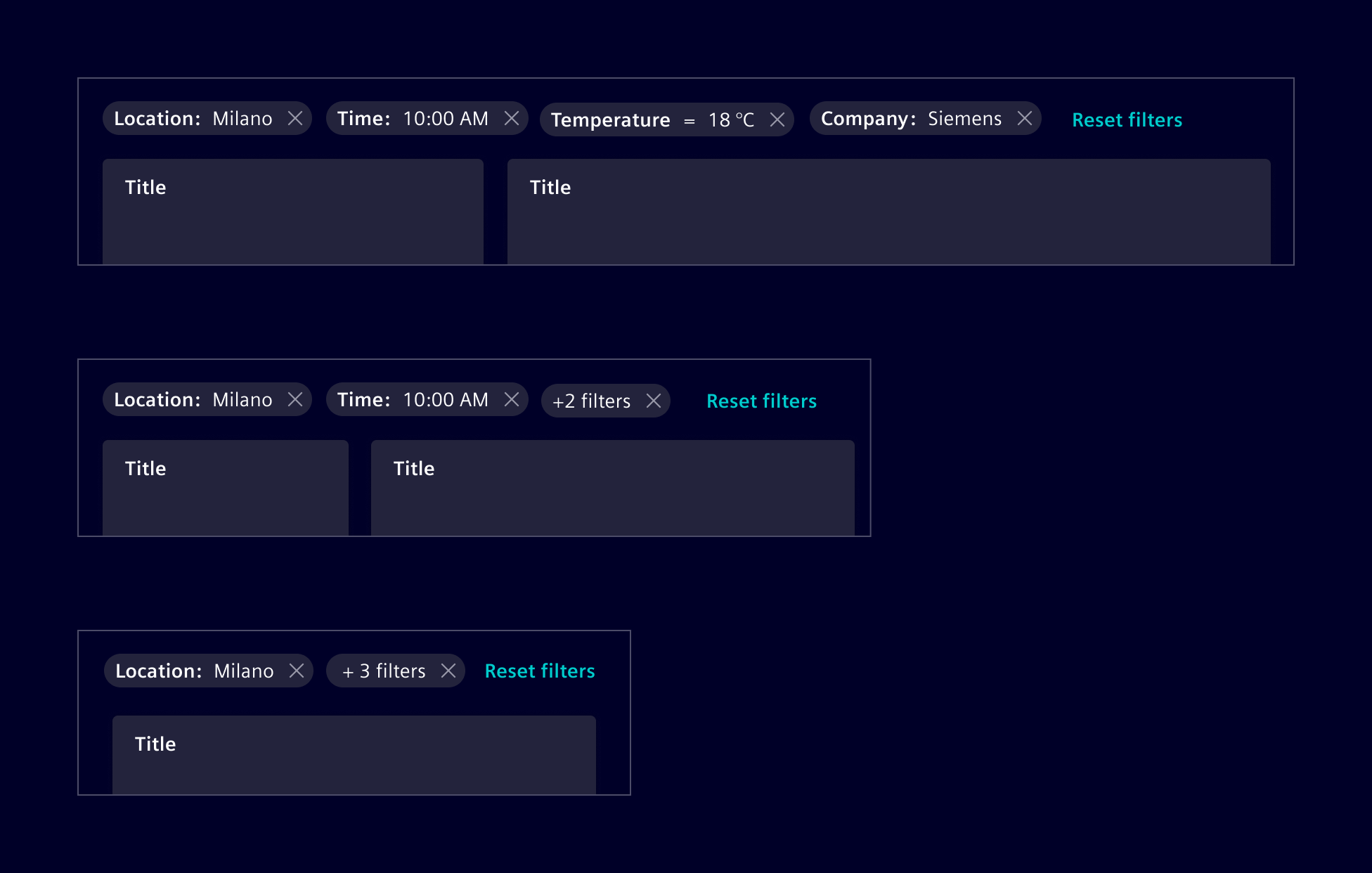
When reducing the viewport width, the filter pills should be grouped/combined dynamically. The filter bar must not have a scroll bar and should never hide the applied filters.
Code
The filter bar is created for the purpose of user filtering and should be used in combination with tables, lists, etc. This component serves as a visual component, and always maintains the state of current active filters returned by filtersChange output event, which triggers every time a user removes an item from a filter. A two-way data-binding is also possible, e.g. [(filters)]="myFilters".
Usage
import { SiFilterBarComponent } from '@siemens/element-ng/filter-bar';

@Component({
  imports: [SiFilterBarComponent, ...]
})
SiFilterBarComponent API Documentation
si-filter-bar Input Properties
| Name | Type | Default | Description |
|---|---|---|---|
| allowReset ¶ | boolean | true | Set false to hide reset filters button |
| collapsedFiltersDescription ¶ | TranslatableString | $localize`:@@SI_FILTER_BAR.COLLAPSED_FILTERS_DESCRIPTION:+ {{count}} criteria` | Custom text for the collapsed filters. |
| colorVariant ¶ | BackgroundColorVariant | 'base-1' | Color to use for component background |
| disabled ¶ | boolean | false | Set to true to disable component |
| filterDefaultText ¶ | TranslatableString | $localize`:@@SI_FILTER_BAR.NO_FILTERS:No filters applied` | Custom text if no filters are selected. |
| filters ¶ | Filter[] | [] | Array of filter items to show |
| resetText ¶ | TranslatableString | $localize`:@@SI_FILTER_BAR.RESET_FILTERS:Reset filters` | Text for reset button |
Output Properties
| Name | Type | Description |
|---|---|---|
| filtersChange ¶ | Filter[] | Array of filter items to show |
| resetFilters ¶ | void | Output callback to be executed when the reset filter is clicked |
Types Documentation
| Represents a translatable string. This can either be a translation key, e.g. ACTIONS.EDIT that will be automatically translated when displayed on the UI or a pre-translated string, e.g. Edit . Equivalent to a normal string in usage and functionality. |
|---|
| Use this type with filter components colorVariant to render component variants based on background of container |
|---|
| | |||||
|---|---|---|---|---|---|
|
| Deprecated: FilterStatusType has been deprecated as it no longer has any visual effect on filter pills. This type will be removed in the next major version. Please remove any usage of the status property from your Filter objects as it is now ignored by the component. |
|---|
Except where otherwise noted, content on this site is licensed under MIT License.