Result details list
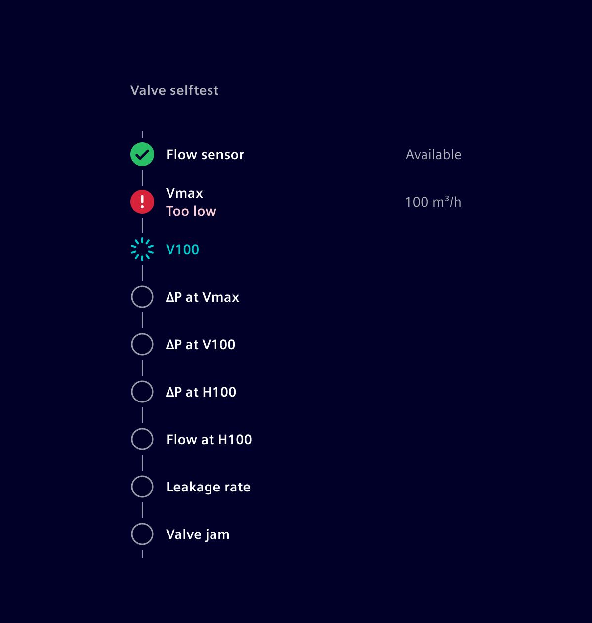
The result details list component allows to visualize a set of steps as part of a procedure or process as well as their current status.
Usage
It helps to visualize and communicate the steps (including status and results) of a procedure or process. This can be used for scenarios like self-test procedures, onboarding processes and more.
When to use
- To visualize test procedures which require multiple steps that need to be performed in a specific order.
- For clear and effective communication of the current status and results.
- To communicate a timeline.
Design
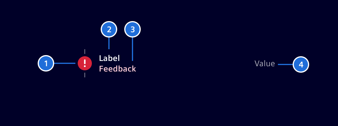
- Icon, 2. Label, 3. Feedback (Optional), 4. Result value (Optional)
Icon
- Icons give a visual cue about the current state or the kind of step.
- Basic icons are offered for the following steps:
Open,In Progress,Done,IssueorUnsupported. - The component allows also to use customized icons.
Variations
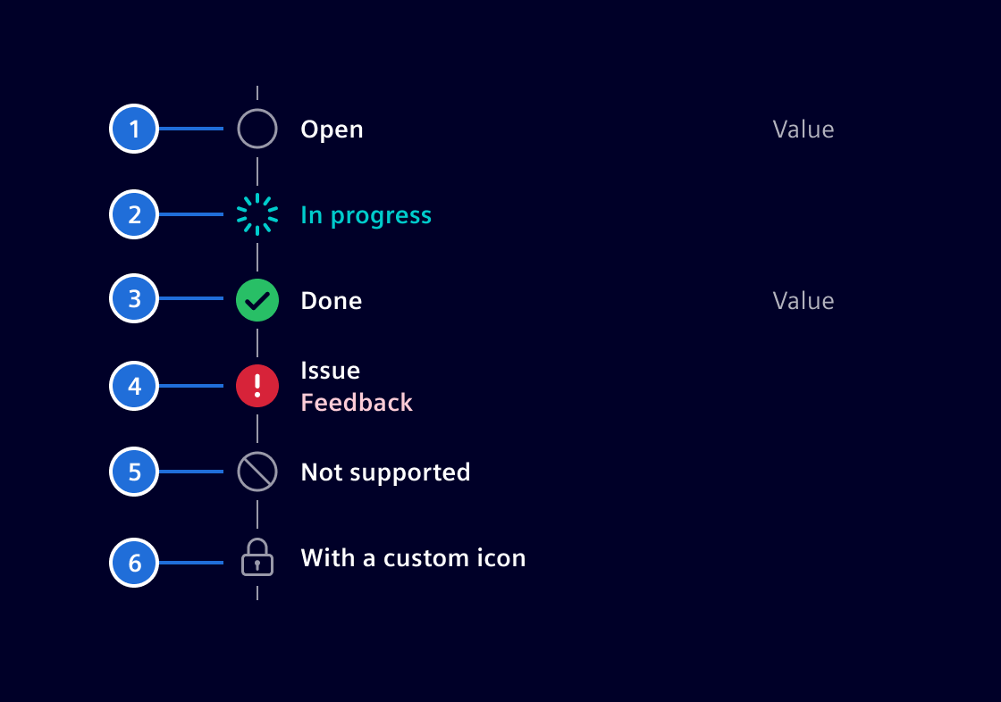
- Open step, 2. In progress, 3. Done, 4. Issue with optional feedback, 5. Unsupported step, 6. Customized icon
Code
This component can be used to display a list of chronological steps for a specific process.
Each step contains a description and a state. Optionally a step can have a value as well as an error message. Each step can also define a custom icon to be displayed.
This component requires an array of ResultDetailStep objects as an input. The possible states are defined in the enum ResultDetailStepState. More information can be found below.
Usage
import { SiResultDetailsListComponent } from '@siemens/element-ng/result-details-list';

@Component({
  imports: [
    SiResultDetailsListComponent, ...
  ]
})
SiResultDetailsListComponent API Documentation
si-result-details-list Input Properties
| Name | Type | Default | Description |
|---|---|---|---|
| steps ¶ | ResultDetailStep[] | [] | Array of steps to show in the list. |
Types Documentation
| | ||||||||
|---|---|---|---|---|---|---|---|---|
|
| Represents a translatable string. This can either be a translation key, e.g. ACTIONS.EDIT that will be automatically translated when displayed on the UI or a pre-translated string, e.g. Edit . Equivalent to a normal string in usage and functionality. |
|---|
| This type defines the state that a detailed result step can have. |
|---|
Except where otherwise noted, content on this site is licensed under MIT License.