Skip to content

Tree view

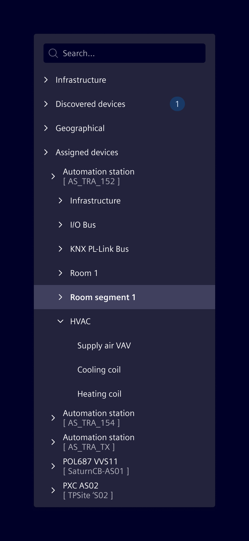
The tree component is used to display hierarchical data and supports a wide range of configurable options and features.

Usage

Tree view

When to use

  • Data in hierarchical form can be represented in a tree structure. Examples include directory, organization and location structures.
  • Apply a tree view to large data sets that can be categorized into two or more levels.

Best practices

  • A tree view should not have more than four sub-levels (not including the root node).
  • The most commonly accessed objects should appear in the first two levels.
  • Use a natural hierarchical structure that is familiar to most users. Balance discoverability with a predictable user model that minimizes confusion.
  • A tree view should be supported by a breadcrumb within the content area.
  • Use nodes with icons only if you have meaningful icons available.
  • Don't mix nodes with icons and nodes with just a label within the same hierarchy.

Design

Elements

A tree view consists of the following elements:
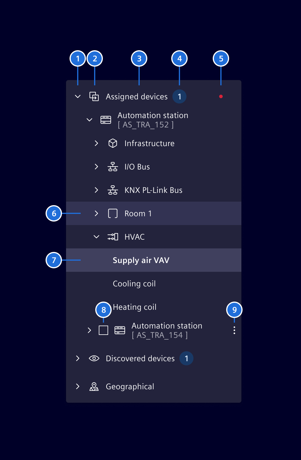
Tree view elements

  1. Expand/collapse icon
  2. Node icon (optional)
  3. Label
  4. Badge (optional)
  5. Indicator (optional)
  6. Node: Hover state
  7. Node: Selected state
  8. Checkbox and/or option box per node (optional)
  9. Options menu (e.g. additional commands) (optional)

Item representation

The standard tree view component supports 2 different node representations:
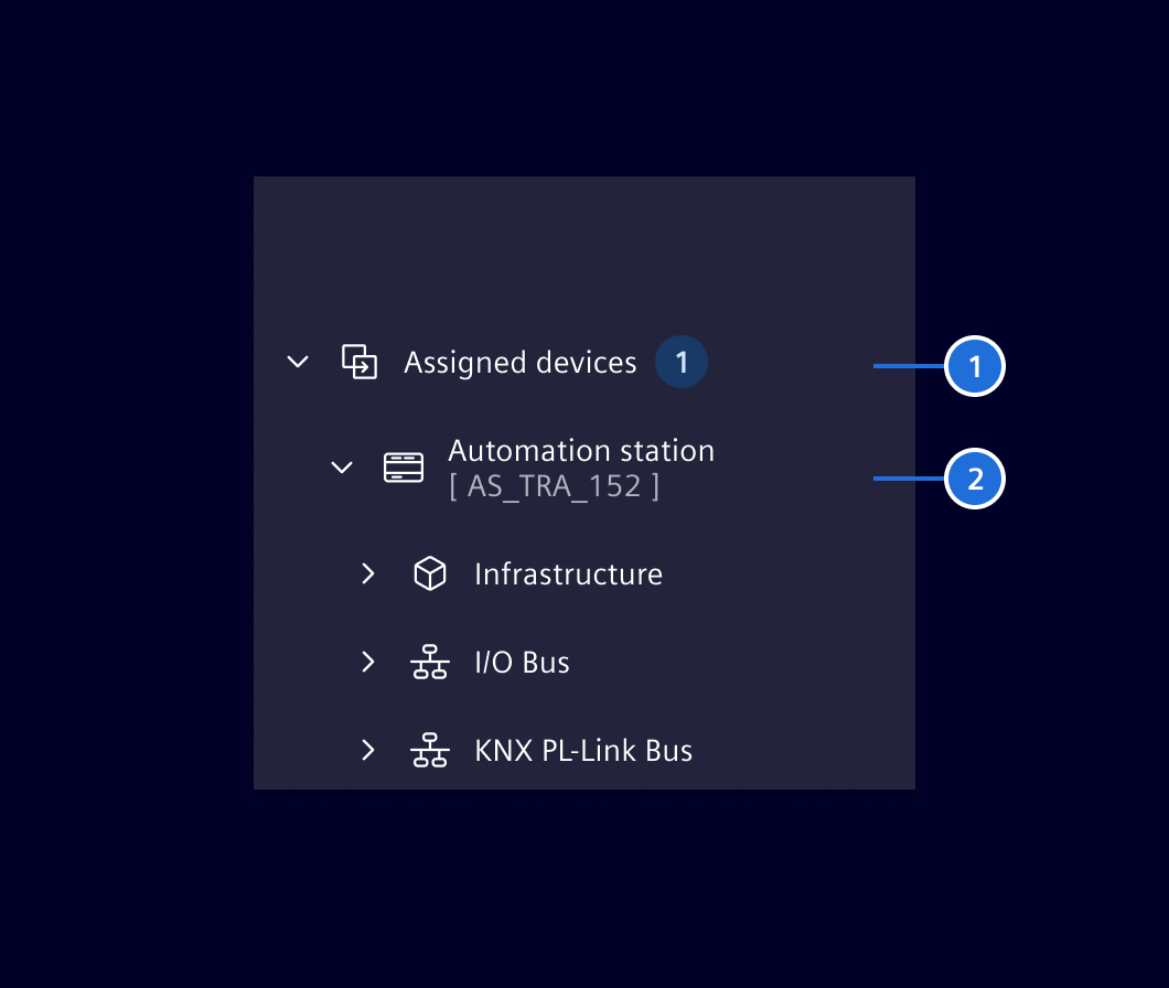
Tree view item representation

  1. Node with main-label
  2. Node with main-label and sub-label

Features

The tree view component has the following features:

  • Showing multiple trees in a list.
  • Showing the trees in a flat mode with navigation/breadcrumb on top.
  • Children of parent nodes are lazy loaded upon request (in case they are not yet available in the model).
  • Menu support via command pattern; the commands can be set via input properties.
  • Multi selection and focus support.
  • Checkbox and/or option box per node.
  • Virtualization support: Input properties allow to set the page size and the number of pages to be virtualized. Current limitation is roughly half a million of tree items. This is due to some strange behavior with flex containers.
  • Grouped list support.
  • Support of templating, if templates are present.
  • Support of expand and collapse of all child elements.

Expand / collapse all

The tree view component supports expanding and collapsing of all child elements:
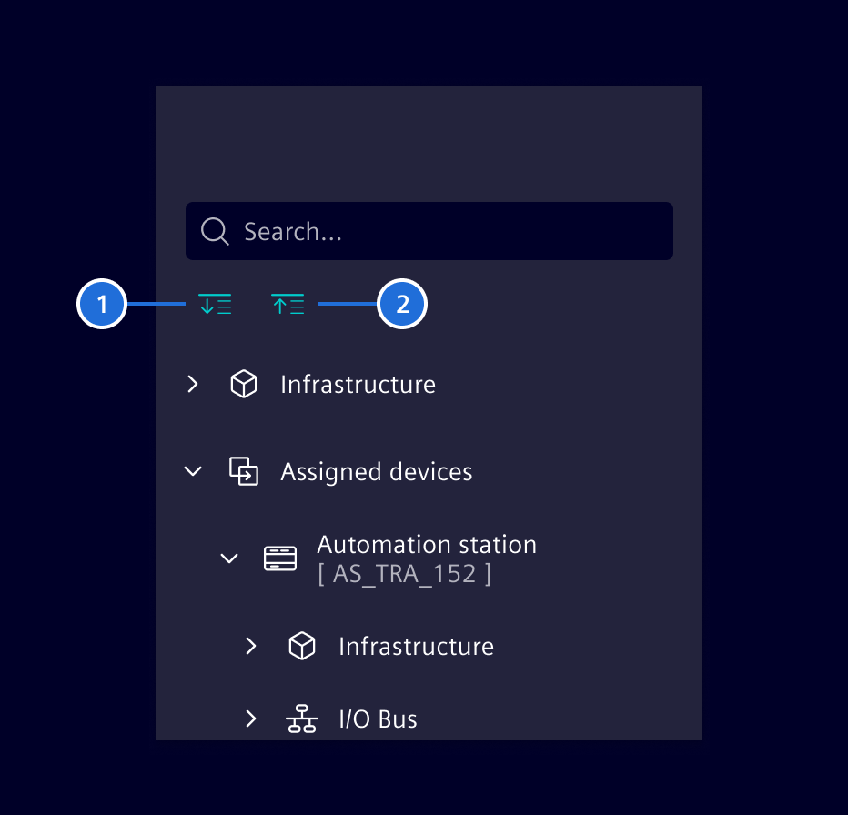
Tree view expanse/collapse

  1. Expand all
  2. Collapse all

Position of tree view

If the tree view is the main navigation of a page, then it's placed to the left.
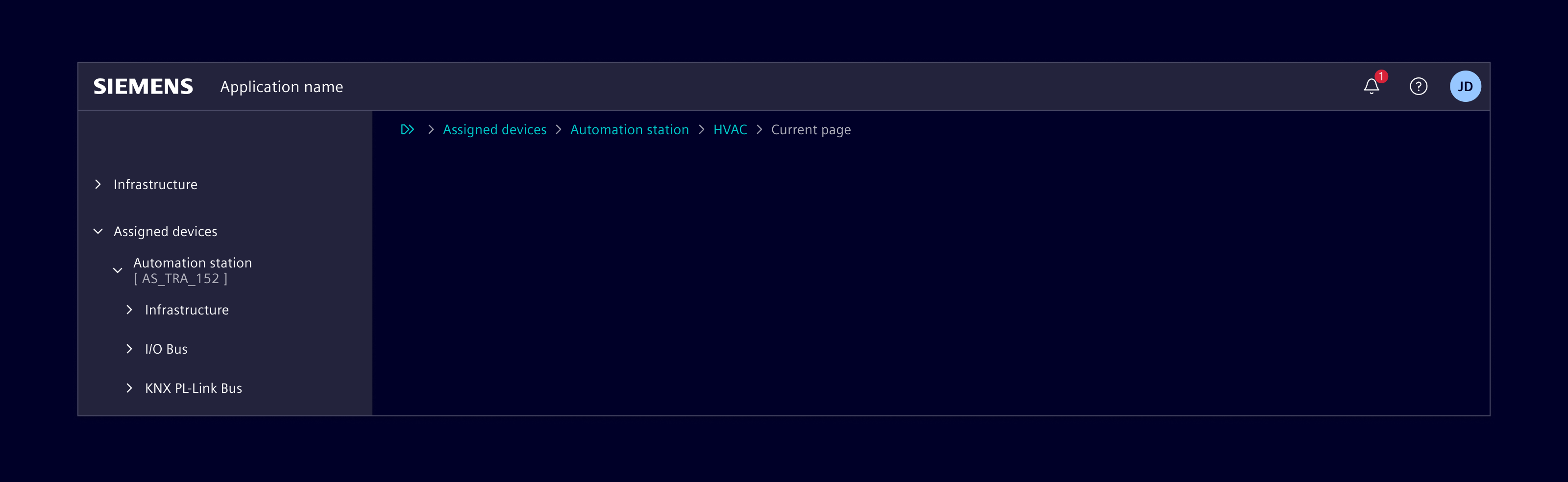
Tree view main navigation

If the tree view is part of a page then it will be represented as a card.

Note: This pattern is still work in progress and might therefore be subject to change.
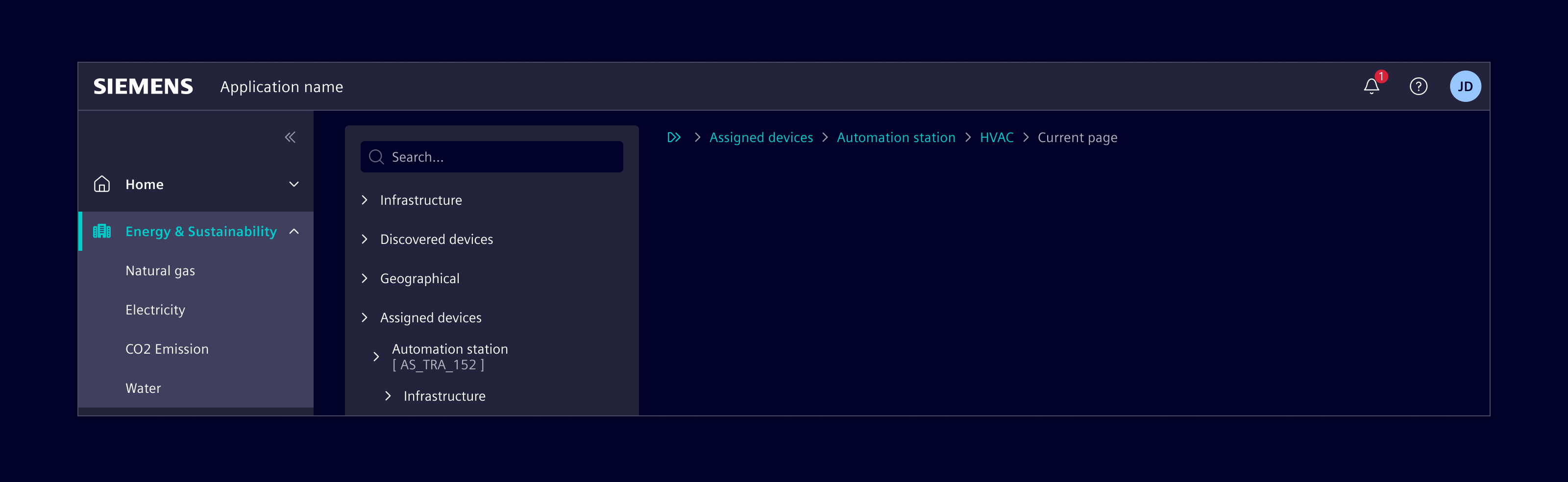
Tree view in a card

Responsive behavior

The tree view has a default width 300px to give enough space for the labels. If the height is not enough to show all the navigation items, a scrollbar will be available.

Menu labels have to be short and concise with a maximum of two words. They share the same space with all items, like labels, icons, badges, etc. The label will be truncated at the end with 3 ..., if there is no sufficient space.

Variant

Showing the tree in flat mode with back-navigation on top:
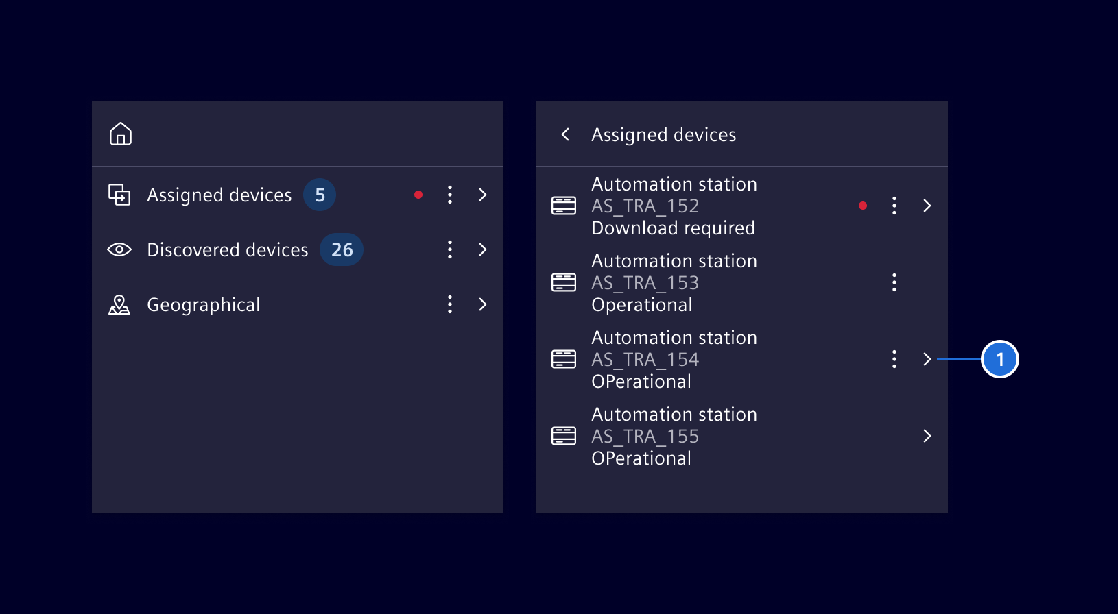
Tree view flat mode

In flat mode, a node also offers a third node representation format with (1) item with main-label, sub-label and value.

Code

Usage

Within a module

import { SiTreeViewModule } from '@siemens/element-ng/tree-view';

@NgModule({
  imports: [SiTreeViewModule, ...]
})

or as a standalone component

import {
  SiTreeViewComponent,
  SiTreeViewItemComponent,
  SiTreeViewItemDirective,
  SiTreeViewItemTemplateDirective
} from '@siemens/element-ng/tree-view';

@Component({
  imports: [
    SiTreeViewComponent,
    SiTreeViewItemComponent,
    SiTreeViewItemDirective,
    SiTreeViewItemTemplateDirective
  ]
})

The items property is the most important property of the si-tree-view component. It is used to provide an array of TreeItem objects to be displayed.

Note that all properties of the TreeItem interface are optional. This allows you to directly feed a JSON structure (e.g. from an API) to the tree view.

Defines the data for a tree item. All properties are optional.
Properties
Indicates if the item is active, the last clicked item is active always; only one item can be active.
active?: boolean
Defines the content of the optional badge. Should be a number or something like "100+". If undefined or empty string, no badge is displayed.
badge?: (string | number)
Defines the background color of the badge. Use the status color names as inputs.
See https://element.siemens.io/components/status-notifications/badges/

badgeColor?: string
The state of the checkbox/optionbox.
checked?: CheckboxState
The child tree items.
children?: TreeItem<T>[]
Any custom data that can be used in custom templates. Not shown by default.
customData?: T
The text shown for the tree item data field 1.
dataField1?: TranslatableString
The text shown for the tree item data field 2.
dataField2?: TranslatableString
The web font icon class name (e.g. element-building). The icon is shown on the left (in LTR) side of the label.
icon?: string
The text shown for the tree item label (header).
label?: TranslatableString
The hierarchy level of the node. This will be auto-calculated by the tree view control.
level?: number
The parent tree item. This will be automatically set by the tree view control.
parent?: TreeItem<T>
Indicates if the tree item is selectable or not.
selectable?: boolean
If the item is selected (note that the tree view component supports single and multi-selection).
selected?: boolean
If the tree item shall show a checkbox.
showCheckbox?: boolean
If the tree item shall show an optionbox.
showOptionbox?: boolean
The folder state of the tree item.
state?: TreeItemFolderState
The color of the state pipe; formatted as CSS value ('red' or '#FF0000' or 'rgb(255, 0, 0)').
stateIndicatorColor?: string
The name of the template to apply.
templateName?: string

Expand/Collapse

Expand and collapsing of all nodes can be enabled via the expandCollapseAll property.

Dynamic Context Menu

The context menu can be dynamically constructed using the MenuItemsProvider.

Custom Templates

The tree also supports custom templates for tree items. The TreeItem object model supports the property templateName to apply a custom template.

As you can see in the example below, you can create a ng-template structured as follows where the templateName of the model has to match the siTreeViewItemTemplate value:

<ng-template let-item siTreeViewItemTemplate="yourTemplateName">
  <!-- your template -->
</ng-template>

The following example demonstrates the use of two templates to render the root and child nodes differently.

Adding, removing, updating tree items

Due to the way change detection works, mutations on the tree item structure assigned to the items property might not be detected by the tree view. Thus, the UI will not reflect the changes in the model.

Depending on the use case, there are different ways to trigger the change detection mechanism of the tree view:

  • Create and assign a new reference, e.g. this.items = [...this.items];
  • Call refresh() function on the tree component
  • Use addChildItems() function on the tree component

For bulk updates, pass all new items to a single addChildItems() call, or update the model and call refresh() once. The tree applies each batch before checking the rendered item views.

Note: If items should be lazy-loaded when expanding a parent, consider using the loadChildren event which allows to append children while properly handling change detection.

The following example shows how to use addChildItems() to dynamically add tree items as root elements or as children of an existing tree item:

@Component({
  selector: 'app-sample',
  template: `
    <button type="button" class="btn btn-primary" (click)="addItemToRoot()">
      Add item to Root
    </button>
    <button type="button" class="btn btn-primary" (click)="addItemToCompany1()">
      Add item to Company1
    </button>
    <si-tree-view class="vh-100" [items]="items"></si-tree-view>
  `,
  imports: [SiTreeViewModule]
})
export class SampleComponent {
  @ViewChild(SiTreeViewComponent, { static: true })
  private treeViewComponent!: SiTreeViewComponent;
  private count = 0;
  protected items: TreeItem[] = [{ label: 'Company1' }];

  protected addItemToRoot() {
    this.treeViewComponent.addChildItems([
      { label: `new root item ${++this.count}`, state: 'leaf' }
    ]);
  }

  protected addItemToCompany1() {
    this.treeViewComponent.addChildItems(
      [{ label: `new root item ${++this.count}`, state: 'leaf' }],
      this.items[0]
    );
  }
}

Playground with various options

SiTreeViewComponent API Documentation

selector
si-tree-view

Implements a tree view with the following main capabilities:
Showing multiple trees. The data of the trees is set via the input property 'items'.
Showing the trees in a flat mode with navigation/breadcrumb on top.
A tree/list item is composed of a 'folder' icon, any item icon, the label, two additional datafields and a context menu button.
Children of parent nodes are lazy loaded upon request (in case they are not yet available in model.)
Context menu support via context menu item: the context menu items can be set via input properties.
Multi selection and focus support.
Checkboxes and / or option boxes per tree node.
Virtualization support: Input properties allow to set the page size and the number of pages to be virtualized.
Current limitation is roughly half a million of nodes. This is due to some 'strange' behavior with flex containers.
Set the input properties 'pageSize' and 'pagesVirtualized' to a reasonable amount of virtualized items.
The number of virtualized items is the product of the pageSize and the pagesVirtualized (number of pages virtualized).
Choose a value in the area of 50 virtualized items, dependent on the screen size. Check at runtime if appropriate!
Grouped List support: The component does also support grouped lists.
See the test client implementation of this package for all functionality.

Input Properties

Name Type Default Description
ariaLabel
TranslatableString Aria label for the tree view. Needed for a11y, alternatively use ariaLabelledBy .
ariaLabelledBy
string Aria labelled by for the tree view. Needed for a11y, alternatively use ariaLabel .
childrenIndentation
number DEFAULT_CHILDREN_INDENTATION The indentation in pixel for the children in respect to its parent.
collapseAllTooltip
TranslatableString $localize`:@@SI_TREE_VIEW.COLLAPSE_ALL:Collapse all` Tooltip text shown for the collapse all icon.
compactMode
boolean false Enable the compact mode, making it more vertically compact.
contextMenuItems
((MenuItem | MenuItem)[] | MenuItemsProvider) [] The context menu items which are bound to the context menu of all tree items, or a menu item provider function that is invoked for each tree item once.
deleteChildrenOnCollapse
boolean false Sets if children are deleted upon collapsing tree items. This feature might be used, if children shall be lazy loaded always upon expanding a tree item.
enableCheckbox
boolean false Sets if the tree items shall show a checkbox.
enableContextMenuButton
boolean true Shows or hides context menu button and also controls context menu visibility on right click.
enableDataField1
boolean false Shows or hides additional information below the label.
enableDataField2
boolean false Shows or hides additional information below the label.
enableIcon
boolean true Shows or hides icon
enableOptionbox
boolean false Sets if the tree items shall show an optionbox.
enableSelection
boolean false Allows / disabled selecting of tree items by clicking on them.
enableStateIndicator
boolean true Shows or hides state pipe.
expandAllTooltip
TranslatableString $localize`:@@SI_TREE_VIEW.EXPAND_ALL:Expand all` Tooltip text shown for the expand all icon.
expandCollapseAll
boolean false Enable buttons for collapse and expand all. Does not work when flatTree is enabled.
expandOnClick
boolean false Sets if the tree items should expand/collapse when clicking on them. Does not work when flatTree is enabled or the tree item is not selectable.
flatTree
boolean false Sets if the tree view shall be displayed as flat tree list with a breadcrumb. A flat tree only shows the one level at the time and lists the tree items of the current level as a list.
folderStateStart
boolean true Sets if the folder state icon shall be shown on the left (in LTR) or on the right (in LTR) side of the tree item. Per default the icon will be shown on the left (in LTR). Has no effect if flatTree is enabled.
groupedList
boolean false Sets if the tree view is displayed as a grouped list. Important: In this mode, only the first two hierarchies of the tree model are considered!
horizontalScrolling
boolean false Enable horizontal scrolling. When disabled (the default), an ellipsis is used for overflowing text
icons
TreeViewIconSet Customize icons for treeview.
inheritChecked
boolean true Sets if the checkbox state of a tree item is inherited to its children/parent.
isVirtualized
boolean true Sets if the tree list shall virtualize the tree items. This input field must be set at startup and shall not be changed afterwards.
items
TreeItem<any>[] [] Sets the root tree items of all the trees (Required).
noActionsString
string 'No actions available' String to be shown when there are no content actions.
pageSize
number 10 Number of rows per page. Used for the virtualization of rows (number of rows per page).
pagesVirtualized
number 6 Number of pages which are virtualized.
selectedItem
(TreeItem<any> | TreeItem<any>[]) Sets the tree item to be selected.
singleSelectMode
boolean false Sets if the tree shall force single tree item selection.
trackBy
TrackByFunction<TreeItem<any>> (_index, item) =​> item Identifies tree items when the items input is replaced. Provide a stable key to retain rendered item views for immutable data updates.

Output Properties

Name Type Description
itemsVirtualizedChanged
ItemsVirtualizedArgs Triggered upon virtualization (or unvirtualization) of a tree item.
loadChildren
LoadChildrenEventArgs Triggered upon the request of loading the children of a tree item.
treeItemCheckboxClicked
CheckboxClickEventArgs Triggered upon clicking the checkbox of a tree item.
treeItemClicked
TreeItem<any> Triggered upon clicking the label of a tree item.
treeItemFolderClicked
FolderStateEventArgs Triggered upon clicking the folder of a tree item.
treeItemFolderStateChanged
FolderStateEventArgs Triggered upon a state change of the folder of a tree item.
treeItemsSelected
TreeItem<any>[] Triggered upon the selection of a tree item (multi selection supported).

Attributes and Methods

Name Type Default Description
addChildItems(...)
(children: TreeItem<any>[], parent: TreeItem<any>, position: number) => void Add tree items as root elements or as children of an existing tree item.

Parameters
  • children: TreeItem<any>[]  Tree items to add.
  • parent: TreeItem<any>  Optional parent tree item to which the items shall be added.
  • position: number  Optional position where to insert the tree items among their siblings.
collapseAll(...)
(items: TreeItem<any>[]) => void Collapses all tree items.

Parameters
  • items: TreeItem<any>[]  Optional param for recursion, will collapse these items. If empty, all tree items will be collapsed.
collapseTreeItem(...)
(item: TreeItem) => void Collapses the provided tree item.

Parameters
  • item: TreeItem  The tree item to be collapsed.
(readonly) dropListItems
TreeItem<any>[] Can be used for [cdkDropListData] when using cdk drag and drop.
expandAll(...)
(items: TreeItem<any>[]) => void Expands all tree items.

Parameters
  • items: TreeItem<any>[]  Optional param for recursion, will expand these items. If empty, all tree items will be expanded.
expandTreeItem(...)
(item: TreeItem) => void Expands the provided tree item.

Parameters
  • item: TreeItem  The tree item to be expanded.
refresh()
() => void Forces a refresh of the view considering the current tree item model. Needs to be called when tree items have been added, removed, or updated via model in ways that do not trigger an automatic update of the view.
scrollItemIntoView(...)
(treeItem: TreeItem) => void Scrolls the specified tree item into view. Tree items will be expanded if required.

Parameters
showTreeItem(...)
(item: TreeItem) => void Updates the tree to visualize the provided tree item by expanding all its parent items, collapsing all other first level tree items and scroll to the provided item.

Parameters
  • item: TreeItem  The tree item that shall be visible.
(readonly) templates
Signal<readonly SiTreeViewItemTemplateDirective[]> ... The injected content with included SiTreeViewItemTemplateDirective.

Types Documentation

Represents a translatable string. This can either be a translation key, e.g. ACTIONS.EDIT that will be automatically translated when displayed on the UI or a pre-translated string, e.g. Edit . Equivalent to a normal string in usage and functionality.
(item: TreeItem) => ((MenuItemLegacy | MenuItem)[] | Observable<(MenuItemLegacy | MenuItem)[]> | null)
Properties
headerArrow: string
headerHome: string
itemCollapsed: string
itemCollapsedFlat: string
itemCollapsedLeft: string
itemExpanded: string
itemExpandedFlat: string
itemExpandedLeft: string
itemMenu: string
Constructor
(treeItems: TreeItem<any>[], virtualized: boolean) => {}
Parameters
treeItems: TreeItem<any>[]
virtualized: boolean
Properties
treeItems: TreeItem<any>[]
virtualized: boolean
Constructor
(treeItem: TreeItem, callback: (treeItem: TreeItem, children: TreeItem<any>[]) => void) => {}
Parameters
treeItem: TreeItem
callback: (treeItem: TreeItem, children: TreeItem<any>[]) => void
Properties
callback: (treeItem: TreeItem, children: TreeItem<any>[]) => void
treeItem: TreeItem
Constructor
(target: TreeItem, oldState: CheckboxState, newState: CheckboxState) => {}
Parameters
target: TreeItem
oldState: CheckboxState
newState: CheckboxState
Properties
newState: CheckboxState
oldState: CheckboxState
target: TreeItem
Constructor
(treeItem: TreeItem, oldState: TreeItemFolderState, newState: TreeItemFolderState) => {}
Parameters
treeItem: TreeItem
oldState: TreeItemFolderState
newState: TreeItemFolderState
Properties
newState: TreeItemFolderState
oldState: TreeItemFolderState
treeItem: TreeItem
Properties
Badge that is rendered after the label.
badge?: (string | number) from badge
Color of the badge (not iconBadge).
badgeColor?: string from badgeColor
Submenu items for this menu item.
children: MenuItem[]
Whether the menu item id disabled.
disabled?: boolean from disabled
Optional icon that will be rendered before the label.
icon?: string from icon
Badge (always red) that is attached to the icon. If value===true, an empty red dot will be rendered.
iconBadge?: (string | number | boolean) from iconBadge
ID that will be attached to the DOM node.
id?: string from id
Label that is shown to the user.
label: TranslatableString from label
type: "group"
Properties
Action that called when the item is triggered. A function will be called, a string will be dispatched to the SiMenuActionService .
action: (string | (actionParam: any, source: this) => void)
Badge that is rendered after the label.
badge?: (string | number) from badge
Color of the badge (not iconBadge).
badgeColor?: string from badgeColor
Whether the menu item id disabled.
disabled?: boolean from disabled
Optional icon that will be rendered before the label.
icon?: string from icon
Badge (always red) that is attached to the icon. If value===true, an empty red dot will be rendered.
iconBadge?: (string | number | boolean) from iconBadge
ID that will be attached to the DOM node.
id?: string from id
Label that is shown to the user.
label: TranslatableString from label
type: "action"
Properties
Items that are part of the radio group.
children: [ MenuItemHeader, ...(MenuItemRadio | MenuItemHeader | MenuDivider)[] ]
type: "radio-group"
Properties
Action that called when the item is triggered. A function will be called, a string will be dispatched to the SiMenuActionService .
action: (string | (actionParam: any, source: this) => void)
Badge that is rendered after the label.
badge?: (string | number) from badge
Color of the badge (not iconBadge).
badgeColor?: string from badgeColor
Whether the checkbox is checked.
checked: boolean
Whether the menu item id disabled.
disabled?: boolean from disabled
Optional icon that will be rendered before the label.
icon?: string from icon
Badge (always red) that is attached to the icon. If value===true, an empty red dot will be rendered.
iconBadge?: (string | number | boolean) from iconBadge
ID that will be attached to the DOM node.
id?: string from id
Label that is shown to the user.
label: TranslatableString from label
type: "checkbox"
Properties
Action that called when the item is triggered. A function will be called, a string will be dispatched to the SiMenuActionService .
action: (string | (actionParam: any, source: this) => void)
Badge that is rendered after the label.
badge?: (string | number) from badge
Color of the badge (not iconBadge).
badgeColor?: string from badgeColor
Whether the radio is checked.
checked: boolean
Whether the menu item id disabled.
disabled?: boolean from disabled
Optional icon that will be rendered before the label.
icon?: string from icon
Badge (always red) that is attached to the icon. If value===true, an empty red dot will be rendered.
iconBadge?: (string | number | boolean) from iconBadge
ID that will be attached to the DOM node.
id?: string from id
Label that is shown to the user.
label: TranslatableString from label
type: "radio"
Properties
The label of the header.
label: string
type: "header"
Properties
type: "divider"
Properties
Badge that is rendered after the label.
badge?: (string | number)
Color of the badge (not iconBadge).
badgeColor?: string
Whether the menu item id disabled.
disabled?: boolean
Optional icon that will be rendered before the label.
icon?: string
Badge (always red) that is attached to the icon. If value===true, an empty red dot will be rendered.
iconBadge?: (string | number | boolean)
ID that will be attached to the DOM node.
id?: string
Label that is shown to the user.
label: TranslatableString
("unchecked" | "checked" | "indeterminate")
The check box state of a tree item.
("collapsed" | "expanding" | "expanded" | "leaf")
The folder state of a tree item.
Properties
height: number
width: number
Implement and provide this to an SiMenuFactoryComponent to receive trigger events.
Constructor
() => {}
Methods
Will be called by SiMenuFactoryComponent if an action is defined with a string instead of a function.
Parameters
item: (MenuItemAction | MenuItemCheckbox | MenuItemRadio)
actionParam?: any
Constructor
(target: TreeItem, mouseEvent: (MouseEvent | KeyboardEvent)) => {}
Parameters
target: TreeItem
mouseEvent: (MouseEvent | KeyboardEvent)
Properties
mouseEvent: (MouseEvent | KeyboardEvent)
target: TreeItem
Used in events emitted from SiLinkActionService
Properties
param: any
Tree view item template directive for defining custom item templates.

Deprecated: Use siTreeViewItem instead.

This directive is deprecated and will be removed in a future version.

Example:
Migration Guide:

Before (deprecated):
<si-tree-view>
  <ng-template siTreeViewItemTemplate="root" let-item>
    <div class="custom-item">Root {{ item.level }}</div>
  </ng-template>
  <ng-template siTreeViewItemTemplate="child" let-item>
    <div class="custom-item">Child {{ item.level }}</div>
  </ng-template>
</si-tree-view>


After (recommended):
<si-tree-view>
  <ng-template siTreeViewItem let-item="treeItem">
    <si-tree-view-item>
     <div class="custom-item">
      @if (item.level === 0) {
        Root {{ item.level }}
      } @else {
        Child {{ item.level }}
      }
     </div>
    </si-tree-view-item>
  </ng-template>
</si-tree-view>
Constructor
() => {}
Properties
Name of the tree item template. It is matched against a tree item's templateName .
name: InputSignal<(string | undefined)> = undefined
template: TemplateRef<any> = ...
Methods
Parameters
dir: SiTreeViewItemTemplateDirective
ctx: any
Constructor
() => {}
Properties
_contextMenuItems: InputSignal<((MenuItem | MenuItem)[] | MenuItemsProvider)> = ...
ariaPosinset?: number
cdRef: ChangeDetectorRef = ...
childrenLoaded: Subject<TreeItem<any>> = ...
contextMenuItems: WritableSignal<((MenuItem | MenuItem)[] | null)> = ...
deleteChildrenOnCollapse: InputSignalWithTransform<boolean, unknown> = ...
destroyRef: DestroyRef = ...
element: ElementRef<any> = ...
enableContextMenuButton: InputSignalWithTransform<boolean, unknown> = ...
enableDataField1: InputSignalWithTransform<boolean, unknown> = ...
enableDataField2: InputSignalWithTransform<boolean, unknown> = ...
enableSelection: InputSignalWithTransform<boolean, unknown> = ...
icons: Signal<{ headerArrow: string, headerHome: string, itemCollapsed: string, itemCollapsedFlat: string, itemCollapsedLeft: string, itemExpanded: string, itemExpandedFlat: string, itemExpandedLeft: string, itemMenu: string }> = ...
indentLevel: number = ...
isContextMenuButtonVisible: Signal<boolean> = ...
menuTrigger: Signal<(CdkMenuTrigger | undefined)> = ...
nextSiblingElement: HTMLElement
savedElement: (ElementRef<any> | undefined)
scrollIntoView: Subject<TreeItem<any>> = ...
showIcon: Signal<boolean> = ...
showStateIndicator: InputSignalWithTransform<boolean, unknown> = ...
siTreeViewService: SiTreeViewService = ...
stickyEndItems: InputSignalWithTransform<boolean, unknown> = ...
templates: Signal<readonly SiTreeViewItemTemplateDirective[]> = ...
treeItemContext: { parent: SiTreeViewComponent, record: IterableChangeRecord<TreeItem<any>> } = ...
treeViewComponent: SiTreeViewComponent = ...
Accessors
get ariaChecked: (boolean | null)
get ariaExpanded: (boolean | null)
get ariaLevel: number
get ariaSelected: (boolean | null)
get ariaSetsize: number
Indentation plus the space the start toggle occupies, so leaf items align with foldable ones.
get biggerPaddingStart: string
get indentation: number
get isExpanding: boolean
get isGroupedItem: boolean
get negativeBiggerPaddingStart: string
get paddingStart: string
get showCheckOrOptionBox: boolean
get showFolderStateEnd: boolean
get showFolderStateStart: boolean
get treeItem: TreeItem
Methods
Parameters
item: TreeItem
expandOnClick: () => boolean
Focuses the tree item.
focus: () => void from FocusableOption.focus
getInputType: () => string
getItemFolderStateClass: () => string
Get tree item label.
getLabel: () => string from FocusableOption.getLabel
getStateIndicatorColor: () => string
Parameters
event: Event
A callback method that is invoked immediately after Angular has completed initialization of a component's view. It is invoked only once when the view is instantiated.
ngAfterViewInit: () => void from AfterViewInit.ngAfterViewInit
A callback method that performs change-detection, invoked after the default change-detector has checked the directive's input bindings in the parent template. See KeyValueDiffers and IterableDiffers for implementing custom change checking for collections.
ngDoCheck: () => void from DoCheck.ngDoCheck
A callback method that is invoked immediately after the default change detector has checked the directive's data-bound properties for the first time, and before any of the view or content children have been checked. It is invoked only once when the directive is instantiated.
ngOnInit: () => void from OnInit.ngOnInit
onBoxClicked: () => void
Parameters
event: Event
(event: Event) => void
Parameters
event: Event
Parameters
newState?: string
Parameters
event: KeyboardEvent
Parameters
event: MouseEvent
Called by the consumer when they want a node to be scrolled into view.
Parameters
item: TreeItem
onToggleContextMenuClose: () => void
onToggleContextMenuOpen: () => void
Parameters
treeItem: TreeItem
scrollChildNodeIntoViewPort: () => void
updateContextMenuItem: () => void
A service wrapping ResizeObserver . This is a service for those reasons: - only one ResizeObserver should be used for performance reason. - For Angular change detection to work, explicit ngZone calls are necessary - Observable stream
Constructor
() => {}
Properties
listeners: Map<Element, Listener> = ...
resizeObserver?: ResizeObserver
timerQueue: Map<number, QueueEntry[]> = ...
zone: NgZone = ...
Methods
(element: Element, entry: ResizeSubscriber, force: boolean = false) => void
Parameters
element: Element
entry: ResizeSubscriber
force: boolean = false
(element: Element) => void
Parameters
element: Element
(element: Element, entry: ResizeSubscriber) => void
Parameters
element: Element
entry: ResizeSubscriber
(element: Element, throttle: number, emitInitial: boolean, emitImmediate: boolean) => Observable<ElementDimensions>
Observe the size of an element. Returns an observable with the changes.
Parameters
The element to observe
element: Element
Throttle time in ms. Will emit this time after the resize
throttle: number
Emit the initial size after subscribe?
emitInitial?: boolean
Emit an event immediately after the size changes. Useful e.g. for visibility checks.
emitImmediate?: boolean
(queue: QueueEntry[]) => void
Parameters
queue: QueueEntry[]
(timeout: number, element: Element, subscriber: ResizeSubscriber, unblock: boolean, force: boolean = false) => void
Parameters
timeout: number
element: Element
subscriber: ResizeSubscriber
unblock: boolean
force: boolean = false
(entry: Listener, subscriber: ResizeSubscriber, emitInitial: boolean) => void
Parameters
entry: Listener
subscriber: ResizeSubscriber
emitInitial?: boolean
(entry: Listener, subscriber: ResizeSubscriber) => void
Parameters
entry: Listener
subscriber: ResizeSubscriber
(entry: ResizeSubscriber) => void
Parameters
entry: ResizeSubscriber
A directive that turns its host element into a trigger for a popup menu.
It can be combined with cdkMenuItem to create sub-menus. If the element is in a top level
MenuBar it will open the menu on click, or if a sibling is already opened it will open on hover.
If it is inside of a Menu it will open the attached Submenu on hover regardless of its sibling
state.
Constructor
() => {}
Properties
_changeDetectorRef: any
_cleanupMouseenter: any
Close out any sibling menu trigger menus.
_closeSiblingTriggers: any
_directionality: any
_elementRef: any
Get the configuration object used to create the overlay.
_getOverlayConfig: any
Get the preferred positions for the opened menu relative to the menu item.
_getOverlayPositions: any
Build the position strategy for the overlay which specifies where to place the menu.
_getOverlayPositionStrategy: any
_injector: any
_inputModalityDetector: any
The menu aim service used by this menu.
_menuAim: any
The app's menu tracking registry
_menuTracker: any
_ngZone: any
The parent menu this trigger belongs to.
_parentMenu: any
Subscribe to the MenuStack close events if this is a standalone trigger and close out the menu this triggers when requested.
_registerCloseHandler: any
_renderer: any
Sets the role attribute for this trigger if needed.
_setRole: any
Sets thte type attribute of the trigger.
_setType: any
Subscribe to the MenuStack closed events.
_subscribeToMenuStackClosed: any
Subscribe to the MenuStack hasFocus events.
_subscribeToMenuStackHasFocus: any
Subscribe to the mouseenter events and close any sibling menu items if this element is moused into.
_subscribeToMouseEnter: any
Subscribe to the overlays outside pointer events stream and handle closing out the stack if a click occurs outside the menus.
_subscribeToOutsideClicks: any
The child menu opened by this trigger.
childMenu?: Menu from CdkMenuTriggerBase.childMenu
Emits when the attached menu is requested to close
closed: EventEmitter<void> from CdkMenuTriggerBase.closed
Emits when this trigger is destroyed.
destroyed: Subject<void> from CdkMenuTriggerBase.destroyed
The DI injector for this component.
injector: Injector from CdkMenuTriggerBase.injector
Context data to be passed along to the menu template
menuData: unknown from CdkMenuTriggerBase.menuData
A list of preferred menu positions to be used when constructing the FlexibleConnectedPositionStrategy for this trigger's menu.
menuPosition: ConnectedPosition[] from CdkMenuTriggerBase.menuPosition
Function used to configure the scroll strategy for the menu.
menuScrollStrategy: () => ScrollStrategy from CdkMenuTriggerBase.menuScrollStrategy
The menu stack in which this menu resides.
menuStack: MenuStack from CdkMenuTriggerBase.menuStack
Template reference variable to the menu this trigger opens
menuTemplateRef: (TemplateRef<unknown> | null) from CdkMenuTriggerBase.menuTemplateRef
Emits when the attached menu is requested to open
opened: EventEmitter<void> from CdkMenuTriggerBase.opened
A reference to the overlay which manages the triggered menu
overlayRef: (OverlayRef | null) from CdkMenuTriggerBase.overlayRef
Emits when the outside pointer events listener on the overlay should be stopped.
stopOutsideClicksListener: Observable<void> from CdkMenuTriggerBase.stopOutsideClicksListener
Selector for the element on which to set the transform origin once the menu is open. This makes it easier to implement animations that start from the attachment point of the menu.
transformOriginSelector: (string | null) from CdkMenuTriggerBase.transformOriginSelector
The view container ref for this component
viewContainerRef: ViewContainerRef from CdkMenuTriggerBase.viewContainerRef
Methods
Handles clicks on the menu trigger.
_handleClick: () => void
(hasFocus: boolean) => void
Sets whether the trigger's menu stack has focus.
Parameters
Whether the menu stack has focus.
hasFocus: boolean
Handles keyboard events for the menu item.
Parameters
The keyboard event to handle
event: KeyboardEvent
Close the opened menu.
close: () => void
Get a reference to the rendered Menu if the Menu is open and rendered in the DOM.
getMenu: () => (Menu | undefined)
Get the portal to be attached to the overlay which contains the menu. Allows for the menu content to change dynamically and be reflected in the application.
getMenuContentPortal: () => (TemplatePortal<any> | undefined) from CdkMenuTriggerBase.getMenuContentPortal
(element: Element) => boolean from CdkMenuTriggerBase.isElementInsideMenuStack
Whether the given element is inside the scope of this trigger's menu stack.
Returns Whether the element is inside the scope of this trigger's menu stack.
Parameters
The element to check.
element: Element
Whether the attached menu is open.
isOpen: () => boolean from CdkMenuTriggerBase.isOpen
(changes: { _handleClick: SimpleChange<() => void>, _setHasFocus: SimpleChange<(hasFocus: boolean) => void>, _toggleOnKeydown: SimpleChange<(event: KeyboardEvent) => void>, close: SimpleChange<() => void>, closed: SimpleChange<EventEmitter<void>>, getMenu: SimpleChange<() => (Menu | undefined)>, injector: SimpleChange<Injector>, isOpen: SimpleChange<() => boolean>, menuData: SimpleChange<unknown>, menuPosition: SimpleChange<ConnectedPosition[]>, menuTemplateRef: SimpleChange<(TemplateRef<unknown> | null)>, ngOnChanges: SimpleChange<(changes: { toggle?: SimpleChange<() => void> | undefined; open?: SimpleChange<() => void> | undefined; close?: SimpleChange<() => void> | undefined; ... 14 more ...; registerChildMenu?: SimpleChange<...> | undefined; }) => void>, ngOnDestroy: SimpleChange<() => void>, open: SimpleChange<() => void>, opened: SimpleChange<EventEmitter<void>>, registerChildMenu: SimpleChange<(child: Menu) => void>, toggle: SimpleChange<() => void>, transformOriginSelector: SimpleChange<(string | null)> }) => void from OnChanges.ngOnChanges
A callback method that is invoked immediately after the default change detector has checked data-bound properties if at least one has changed, and before the view and content children are checked.
Parameters
The changed properties.
changes: { _handleClick: SimpleChange<() => void>, _setHasFocus: SimpleChange<(hasFocus: boolean) => void>, _toggleOnKeydown: SimpleChange<(event: KeyboardEvent) => void>, close: SimpleChange<() => void>, closed: SimpleChange<EventEmitter<void>>, getMenu: SimpleChange<() => (Menu | undefined)>, injector: SimpleChange<Injector>, isOpen: SimpleChange<() => boolean>, menuData: SimpleChange<unknown>, menuPosition: SimpleChange<ConnectedPosition[]>, menuTemplateRef: SimpleChange<(TemplateRef<unknown> | null)>, ngOnChanges: SimpleChange<(changes: { toggle?: SimpleChange<() => void> | undefined; open?: SimpleChange<() => void> | undefined; close?: SimpleChange<() => void> | undefined; ... 14 more ...; registerChildMenu?: SimpleChange<...> | undefined; }) => void>, ngOnDestroy: SimpleChange<() => void>, open: SimpleChange<() => void>, opened: SimpleChange<EventEmitter<void>>, registerChildMenu: SimpleChange<(child: Menu) => void>, toggle: SimpleChange<() => void>, transformOriginSelector: SimpleChange<(string | null)> }
ngOnDestroy: () => void from OnDestroy.ngOnDestroy
Open the attached menu.
open: () => void
Constructor
() => {}
Properties
Parameter passed to triggered menu item actions.
actionParam: InputSignal<unknown> = ...
Menu items to render. Supports legacy and current menu item models.
items: InputSignal<(readonly (MenuItem | MenuItem)[] | undefined)> = ...
linkActionService: (SiLinkActionService | null) = ...
menuActionService: (SiMenuActionService | null) = ...
Methods
Parameters
item: (MenuItem | MenuItem)
(item: (MenuItem | MenuItem)) => item is MenuItem
Parameters
item: (MenuItem | MenuItem)
Parameters
item: MenuItem
Parameters
item: (MenuItemAction | MenuItemCheckbox | MenuItemRadio)
(index: number, item: (MenuItem | MenuItem)) => (string | number)
Parameters
index: number
item: (MenuItem | MenuItem)
Constructor
() => {}
Properties
Observable which emits the link and param to run the action on.
action$: Observable<LinkAction> = this.actionSubject.asObservable()
actionSubject: Subject<LinkAction> = ...
Methods
(link: Link, param: any) => void
Emit a new link and param pair to run the action on.
Parameters
param: any

Except where otherwise noted, content on this site is licensed under MIT License.