HTML table
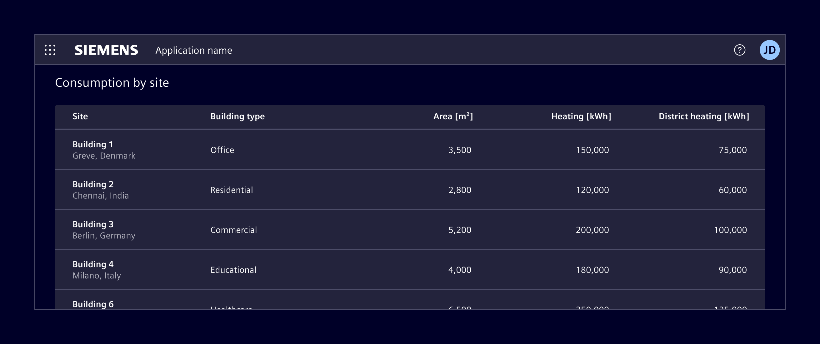
HTML tables are based on the native HTML table element and are intended for simple, mostly static data.
Usage
HTML table is the lowest-complexity option. Because it is based on the native HTML table element, it comes with some inherent limitations.
- The header is not sticky when vertical scrolling is used.
- Column widths cannot be resized by users.
- Pagination is not supported.
- There is no built-in support for DOM or data virtualization, unlike ngx-datatable.
- Performance degrades with larger datasets, depending on DOM complexity and hardware.
When to use
- Use it when the dataset is small.
- When the content is mostly read-only.
- When advanced interactions are not required.
Code
Element styles native HTML tables with CSS classes. Apply the .table class to a <table> element.
Usage
Use semantic table markup with a caption, table headers, and table body. Add scope="col" to column headers and scope="row" to row headers so assistive technologies can associate headers with their cells.
<table class="table">
  <caption>Device status</caption>
  <thead>
    <tr>
      <th scope="col">Device</th>
      <th scope="col">Status</th>
    </tr>
  </thead>
  <tbody>
    <tr>
      <th scope="row">Cooling unit</th>
      <td>Operational</td>
    </tr>
  </tbody>
</table>
Variants
Add .table-sm to use condensed rows. Add .table-striped to distinguish alternating body rows, and .table-hover to provide hover feedback for body rows.
Apply .table-active to a row or cell to highlight it. Use .table-success, .table-info, .table-warning, or .table-danger on a row or cell to communicate its status.
<table class="table table-sm table-striped table-hover">
  <!-- Table content -->
</table>

<tr class="table-active">
  <!-- Table cells -->
</tr>

<tr class="table-warning">
  <!-- Table cells -->
</tr>
Captions
Captions are displayed below the table by default. Add .caption-top to the <table> element to display the caption above it.
<table class="table caption-top">
  <caption>Device status</caption>
  <!-- Table content -->
</table>
Responsive tables
Wrap a wide table in .table-responsive to allow horizontal scrolling. Use a breakpoint variant such as .table-responsive-md to enable scrolling only below that breakpoint.
<div class="table-responsive">
  <table class="table">
    <!-- Table content -->
  </table>
</div>
Except where otherwise noted, content on this site is licensed under MIT License.