Wizard
A wizard is a step-by-step process that allows users to input information in a predefined order and in which subsequent steps may depend on information entered in previous ones.
Usage
Wizards can be used to simplify complex processes performed infrequently or by novice users. By showing less information at a time, they allow users to focus better on the content relevant to each step and decrease the chance of errors.
The Wizard component comes in a horizontal and vertical representation. Vertical wizards stack steps on top of each other, while horizontal ones place them side by side.
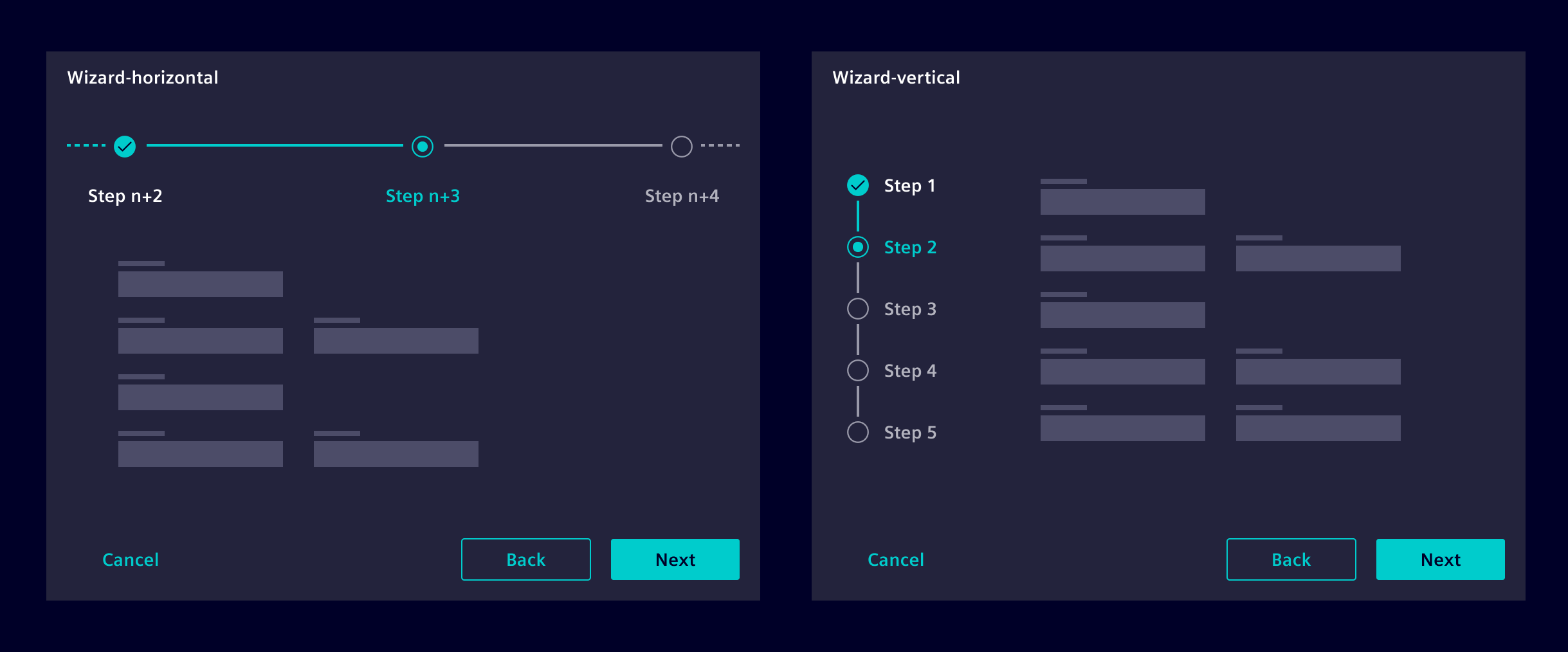
Use a horizontal wizard if:
- A small number of steps are used.
- When the wizard should remain accessible on mobile devices.
- When individual steps have longer title.
Use a vertical wizard if:
- A large number of steps are used.
- Enough vertical space is available for a side-by-side representation.
When to use
- When the task requires multiple steps.
- When complex data input is needed.
- When users need guidance to complete the process.
- When steps vary based on previous decisions.
- When users lack domain knowledge.
- When the user must complete steps in a specific sequence.
Best practices
- Minimize steps and keep the purpose clear.
- Show where the user is in the process.
- Don't disable or hide the
Backbutton. - Use a horizontal layout for fewer steps or mobile accessibility
- Provide a summary of choices.
Design
Elements
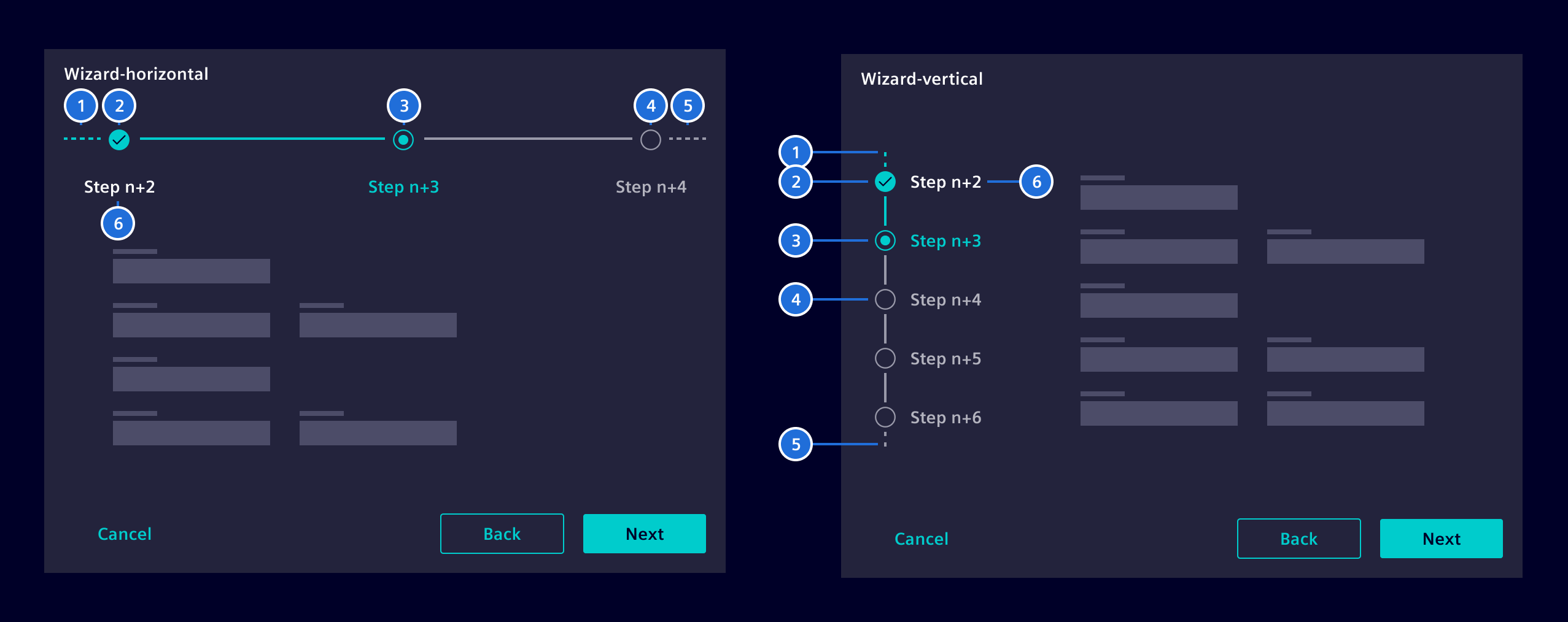
\1. Indication "more steps", 2. Step completed, 3. Current step, 4. Future step, 5. Indication "more steps", 6. Label
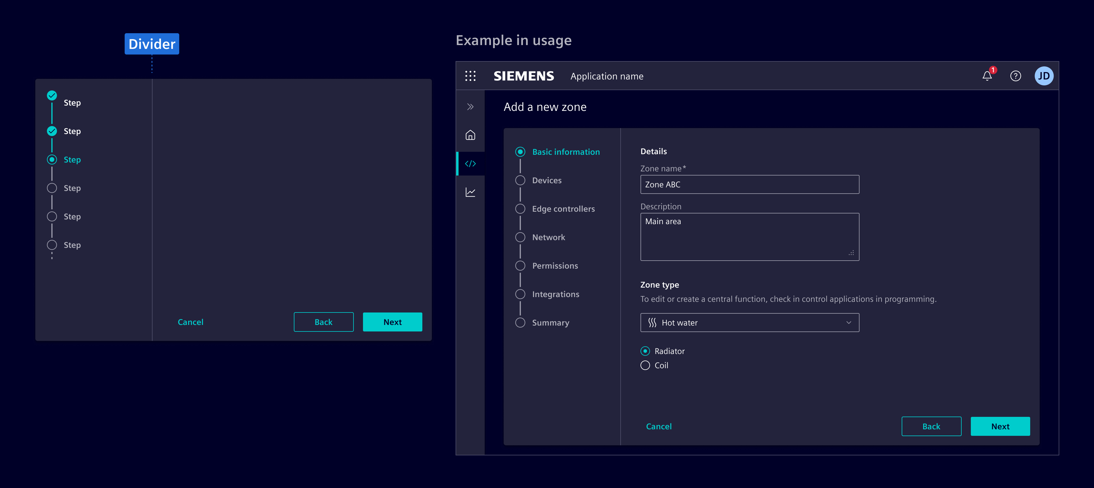
The vertical variant can also include an optional divider to visually separate steps and content for better clarity. Select the layout that aligns with the process's complexity, content length, and spatial requirements.
Wizard button placement
For both the horizontal and the vertical wizard, we recommend to place the buttons below the wizard content.

- Cancel button (optional), 2. Back button, 3. Next button
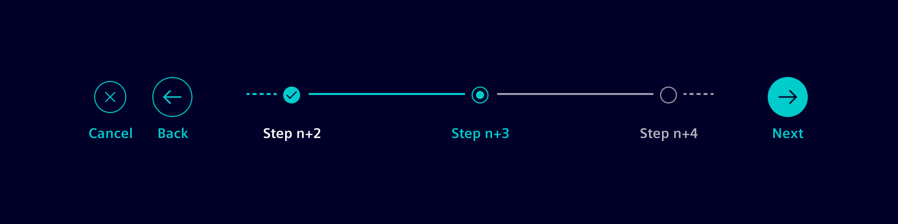
Alternative button placement for horizontal wizard
To ensure a stable position for the controls when the wizard content consumes a significant amount of vertical space, buttons can be positioned alongside the horizontal wizard.
Responsive behavior
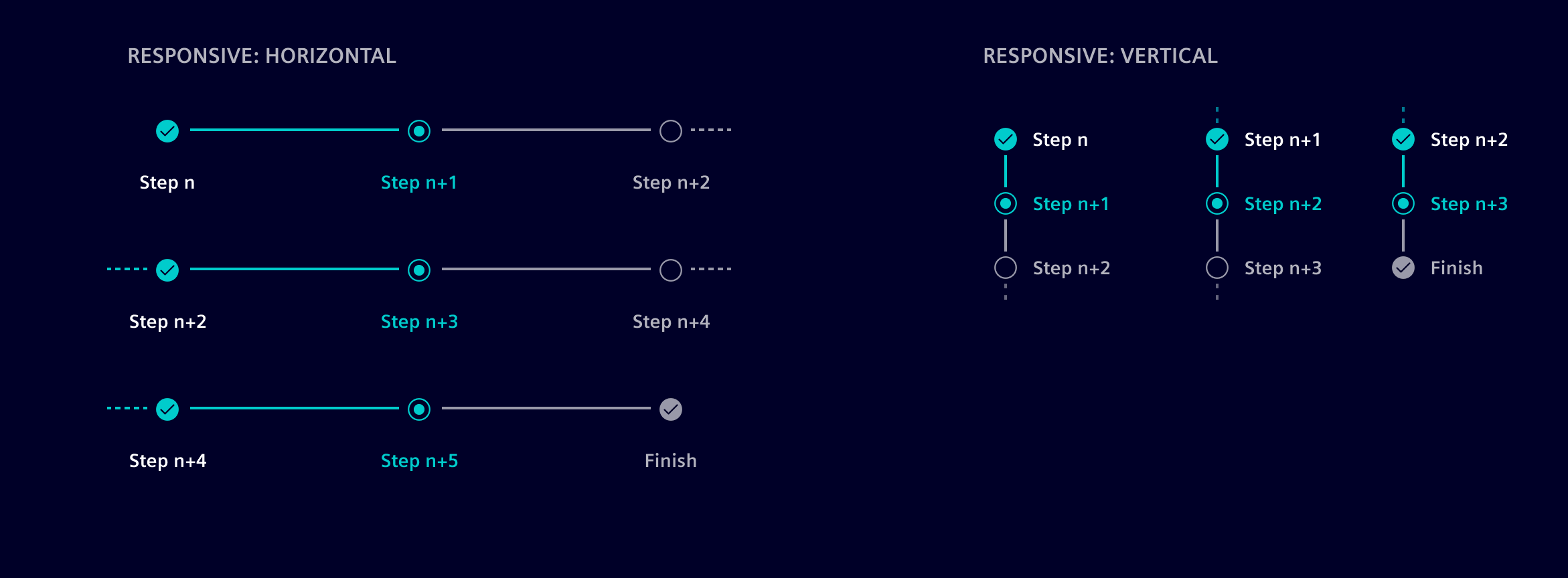
Steps may collapse or hide when space is limited and reappear as more space becomes available. For a vertical wizard, if the screen space becomes too constrained, consider switching to a horizontal layout after a defined breakpoint to preserve clarity.
Alternative step representation
Step numbers are useful when users are less familiar with a process and need clear guidance on where they are in a sequence. They establish a clear visual hierarchy, making it evident which step comes before or after the current one, and provide a clear linear progression.
Note: Consistency is crucial. If you use the step number representation in one part of your application or website, try to use it for all other cases as well to maintain a cohesive user experience.
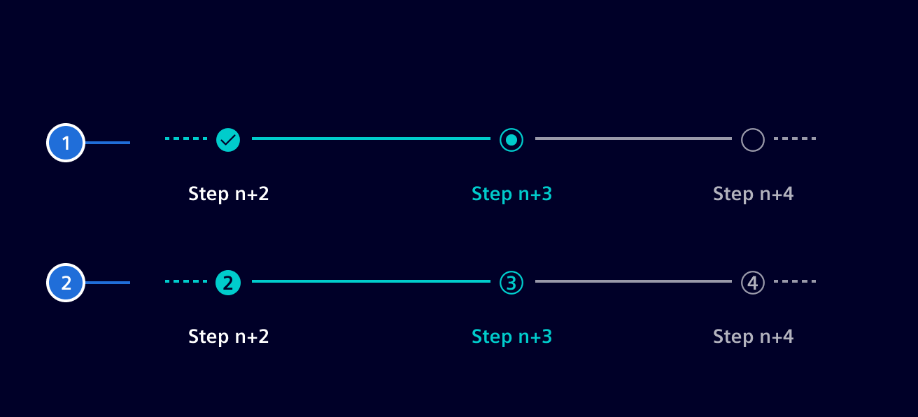
- Standard representation 2. Step number representation
Code
Shows multiple steps and allows users to click through using back, next, and save buttons.
Add a WizardStep to the template for each subtemplate. Define an optional title property and an optional isValid property. Buttons will only be enabled if isValid is true.
The button texts can be configured by optionally setting the nextText, backText, and saveText properties.
Outputs are available for the save, next, and back events.
Usage
si-wizard can be imported using the module
import { SiWizardModule } from '@siemens/element-ng/wizard';

@NgModule({
  imports: [SiWizardModule, ...]
})
or as a standalone component:
import { SiWizardComponent, SiWizardStepComponent } from '@siemens/element-ng/wizard';

@Component({
  imports: [
    SiWizardComponent,
    SiWizardStepComponent,
    ...
  ]
})
Wizard - Standard
Wizard - Vertical
The vertical wizard layout has an option to show a divider between the steps and the content. It can be enabled by setting the attribute showVerticalDivider to true. This option can be used in cases where the vertical wizard appears visually disconnected or "floating" within the interface, typically in full-screen layouts.
Wizard - Responsive
This example has the same settings as the basic example above. It just contains more steps to show the responsiveness the wizard provides. It shrinks and grows with it's given width.
You may resize your screen to see the effect.
Wizard - Failed
For setting the icon status to failed, add the failed attribute and set it to true.
If the attribute is not set, the default value will be false and the step will behave like the basic example above.
Wizard - Input Validation
This example demonstrates the use of isNextNavigable attribute to uncouple enabling/disabling of the next button and navigation to next step. This is useful for triggering form validation by next button click.
Show Completion Page
Add the enableCompletionPage attribute and set it to true to show a completion page after the wizard is finished.
If the attribute is not set, the wizard will use the default value false.
By default, the display duration of the completion page is 3000 ms. To change them, the completionPageVisibleTime attribute must be added and a time in ms must be specified.
The completionAction callback will perform a specified function, after the wizard was worked through.
Cancel Button
Add the hasCancel attribute and set it to true. With the output cancel you can define what happen if the user presses the cancel button.
Number representation
The number representation for wizard steps can be enabled by setting the showStepNumbers input to true.
SiWizardComponent API Documentation
si-wizard Input Properties
| Name | Type | Default | Description |
|---|---|---|---|
| backText ¶ | TranslatableString | $localize`:@@SI_WIZARD.BACK:Back` | Description of back button. |
| cancelText ¶ | TranslatableString | $localize`:@@SI_WIZARD.CANCEL:Cancel` | Description of cancel button. |
| completionPageVisibleTime ¶ | number | 3000 | Define how many milliseconds the completion page is visible. |
| completionText ¶ | TranslatableString | $localize`:@@SI_WIZARD.COMPLETED:Wizard completed!` | Text shown if you complete the wizard. |
| enableCompletionPage ¶ | boolean | false | Display a predefined page by the end of the wizard. |
| hasCancel ¶ | boolean | false | Show the cancel button |
| hideNavigation ¶ | boolean | false | Hide the navigation buttons previous/next. |
| hideSave ¶ | boolean | false | Hide the save button. |
| inlineNavigation ¶ | boolean | false | Set false to show navigation buttons in footer instead of inline. |
| nextText ¶ | TranslatableString | $localize`:@@SI_WIZARD.NEXT:Next` | Description of next button. |
| saveText ¶ | TranslatableString | $localize`:@@SI_WIZARD.SAVE:Save` | Description of save button. |
| showStepNumbers ¶ | boolean | false | Use number representation for steps. |
| showVerticalDivider ¶ | boolean | false | Set to true to display a divider between the steps and the content in the vertical |
| stepActiveIcon ¶ | string | 'elementRadioChecked' | Class name of icon shown for the active step. |
| stepCompletedIcon ¶ | string | 'elementCheckedFilled' | Class name of icon shown when a step was completed. |
| stepFailedIcon ¶ | string | 'elementWarningFilled' | Class name of icon shown when a step had an error. |
| stepIcon ¶ | string | 'elementNotChecked' | Class name of icon shown for current and upcoming steps. |
| verticalLayout ¶ | boolean | false | Set the orientation of the wizard to vertical. |
| verticalMaxSize ¶ | string | Set the wizard step container max size in vertical layout. | |
| verticalMinSize ¶ | string | Set the wizard step container min size in vertical layout. |
Output Properties
| Name | Type | Description |
|---|---|---|
| completionAction ¶ | void | Callback function triggered after the wizard has been completed. |
| wizardCancel ¶ | void | Callback function triggered if the wizard has been canceled. |
Attributes and Methods
| Name | Type | Default | Description |
|---|---|---|---|
| back(...) ¶ | (delta: number = 1) => void | Go to the previous wizard step. Parameters
| |
| (readonly) currentStep ¶ | (SiWizardStepComponent | undefined) | Get current visible wizard step. | |
| (readonly) index ¶ | number | Get the current step wizard step index. | |
| next(...) ¶ | (delta: number = 1) => void | Go to the next wizard step. Parameters
| |
| save() ¶ | () => void | Triggers the save action to complete the wizard. | |
| (readonly) stepCount ¶ | number | Get number of wizard steps. |
SiWizardStepComponent API Documentation
si-wizard-step Input Properties
| Name | Type | Default | Description |
|---|---|---|---|
| failed ¶ | boolean | false | Whether the step is shown as failed in the wizard navigation. |
| heading ¶ | TranslatableString | '' | Heading displayed for the wizard step. |
| isNextNavigable ¶ | boolean | true | Whether the wizard navigates to the next step after emitting next . |
| isValid ¶ | boolean | true | Whether the step is valid and allows navigation to subsequent steps. |
Output Properties
| Name | Type | Description |
|---|---|---|
| back ¶ | void | Emits when the user navigates back from this step. |
| next ¶ | void | Emits when the user navigates forward from this step. |
| save ¶ | void | Emits when the user completes the wizard from this step. |
Attributes and Methods
| Name | Type | Default | Description |
|---|---|---|---|
| (readonly) isActive ¶ | WritableSignal<boolean> | false | Whether this step is currently active or not. |
Types Documentation
| Represents a translatable string. This can either be a translation key, e.g. ACTIONS.EDIT that will be automatically translated when displayed on the UI or a pre-translated string, e.g. Edit . Equivalent to a normal string in usage and functionality. |
|---|
Except where otherwise noted, content on this site is licensed under MIT License.