Vertical navigation
Vertical navigation is a hierarchical global navigation that displays navigation options from top to bottom on the side of a screen.
Usage
The vertical navigation is positioned below the application header and aligned to the left in the content area (for LTR languages).
There are two variants: one with icons and labels, and another with text labels only. Both variants can be collapsed to free up additional screen space.
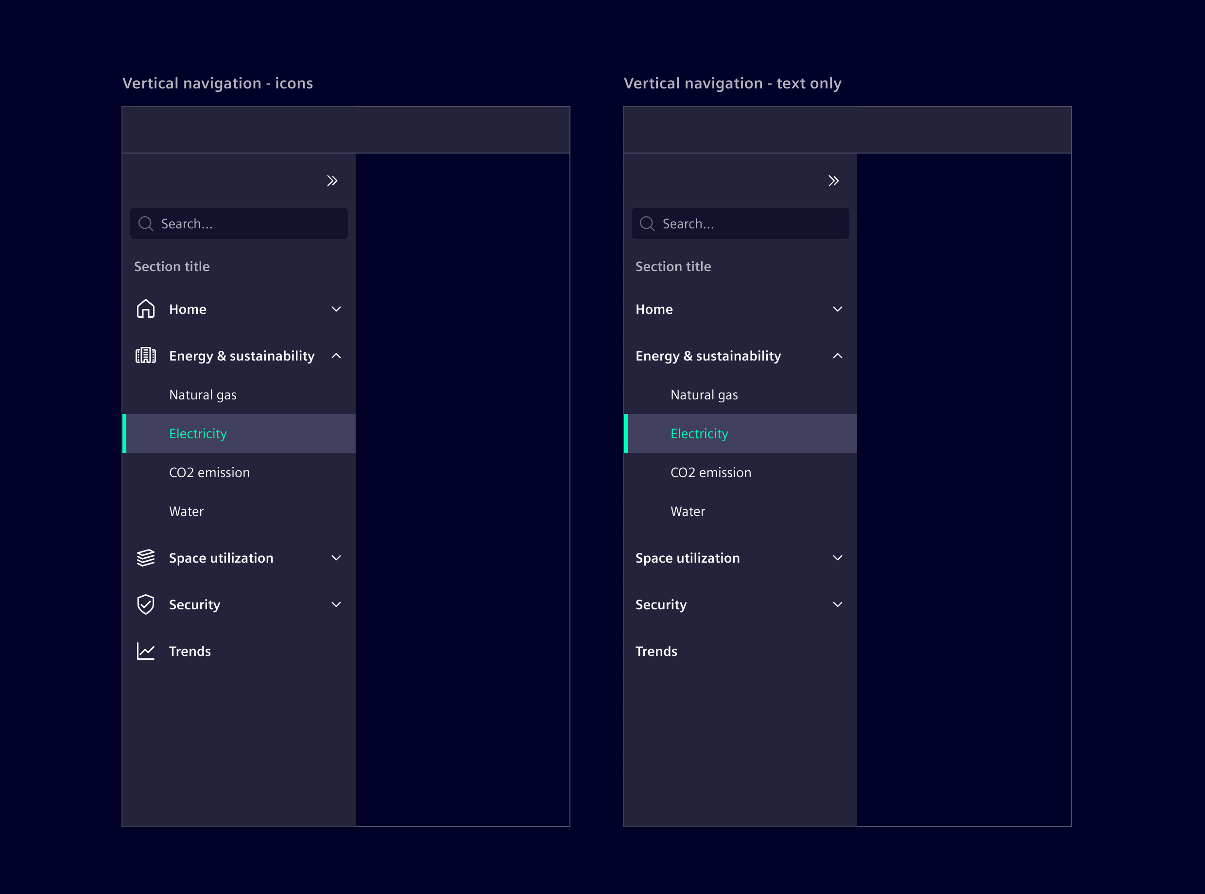
When to use
- When the application requires a persistent side menu for organizing navigation elements in a clear, accessible manner.
Best practices
- Only use icons if they clearly convey the intended meaning.
- Limit navigation to two tiers. For deeper content organization, consider using tabs, accordions or another navigation pattern.
Design
Elements
The vertical navigation can be configured with optional links, sub menus, and search, with only Expand/Collapse control being required.
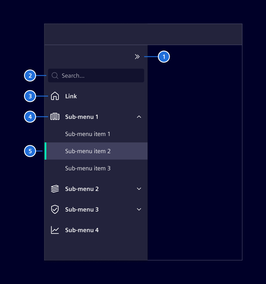
Labels
Labels have to be short and concise with a maximum of two words. The label will be truncated at the end with 3 ..., if there is no sufficient space.
Expand / Collapse
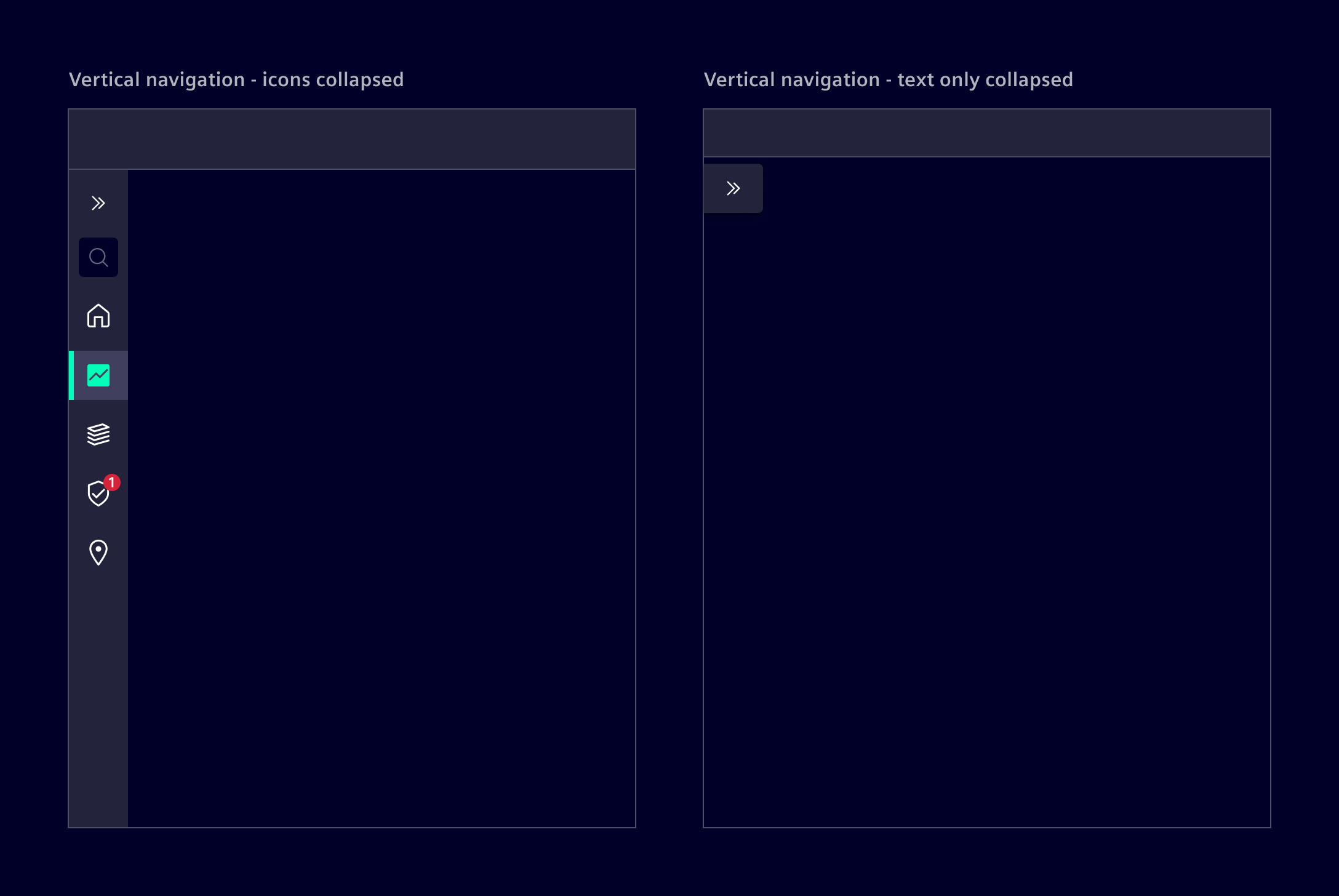
The vertical navigation with icons supports the possibility to be expanded or collapsed to provide additional screen real estate.
- Divider expanded, 2. Divider collapsed, 3. Section title expanded, 4. Section title collapsed
Item organization
Vertical navigation items can be organized into sections to enhance clarity and navigation flow. There are two methods:
- Dividers: Use it to separate items without labels. Is best for intuitive relationships where categories are unnecessary.
- Section titles: Apply section titles to label and categorize groups. Use for distinct categories requiring clear hierarchy.
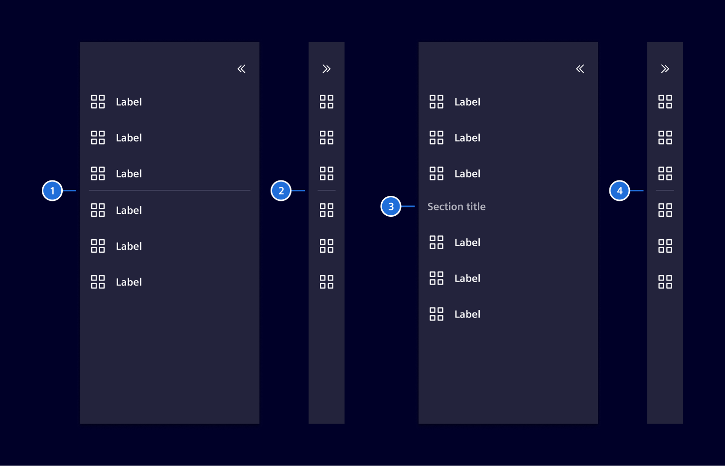
Use either method individually or combine them, but avoid overuse, as it can make the navigation feel cluttered.
- Divider expanded, 2. Divider collapsed, 3. Section title expanded, 4. Section title collapsed
Badges (optional)
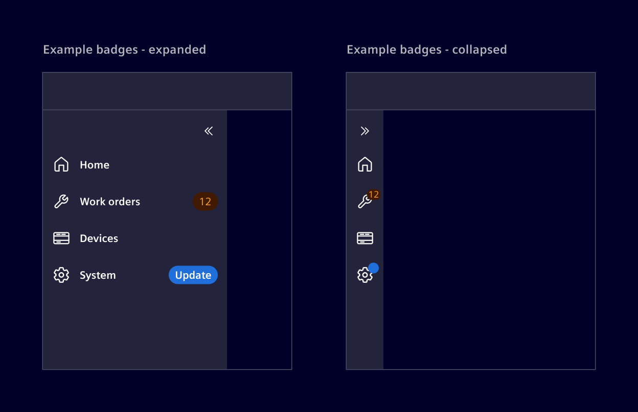
Items can include badges to provide users with quick, at-a-glance information. For submenus, badges are used only on child items. The parent item does not display a badge, except in the collapsed state.
When collapsed, numeric badges are shown in a compact form. If the badge contains text, it is displayed as a simple dot to indicate that something requires attention. Badges can be fully hidden in the collapsed state if needed.
Responsive behavior
The vertical navigation expands over the full height of the screen. It comes with a fixed width of 240px (expanded) or 48px when collapsed. If the height is not enough to show all the navigation menus, then a scrollbar will be available.
Code
Usage
import { SiNavbarVerticalComponent } from '@siemens/element-ng/navbar-vertical';

@Component({
  imports: [
    SiNavbarVerticalComponent, ...
  ]
})
Vertical navigation - icons & labels
To get a vertical navigation with icons, make sure to set icons for the top level items. No further configuration is necessary as [textOnly]="false" is the default value.
Vertical navigation - text labels only
To get a vertical navigation without icons, i.e. labels only set [textOnly]="true".
SiNavbarVerticalComponent API Documentation
si-navbar-vertical Layout state shared with components alongside a vertical navbar.
Input Properties
| Name | Type | Default | Description |
|---|---|---|---|
| collapsed ¶ | boolean | false | Whether the navbar-vertical is collapsed. |
| items ¶ | (MenuItem | NavbarVerticalItem)[] | [] | List of vertical navigation items |
| navbarCollapseButtonText ¶ | TranslatableString | $localize`:@@SI_NAVBAR_VERTICAL.COLLAPSE:Collapse` | Text for the navbar collapse button. Required for a11y |
| navbarExpandButtonText ¶ | TranslatableString | $localize`:@@SI_NAVBAR_VERTICAL.EXPAND:Expand` | Text for the navbar expand button. Required for a11y |
| searchable ¶ | boolean | false | Toggles search bar |
| searchDebounceTime ¶ | number | 400 | Debounce time for the search input |
| searchPlaceholder ¶ | TranslatableString | $localize`:@@SI_NAVBAR_VERTICAL.SEARCH_PLACEHOLDER:Search…` | Placeholder text for search |
| skipLinkMainContentLabel ¶ | TranslatableString | $localize`:@@SI_NAVBAR_VERTICAL.SKIP_LINK.MAIN_LABEL:Main content` | Label for the skip link to main content |
| skipLinkNavigationLabel ¶ | TranslatableString | $localize`:@@SI_NAVBAR_VERTICAL.SKIP_LINK.NAVIGATION_LABEL:Navigation` | Label for the skip link to the vertical navbar |
| stateId ¶ | string | An optional stateId to uniquely identify a component instance. Required for persistence of ui state. | |
| textOnly ¶ | boolean | false | Set to true if there are no icons |
| visible ¶ | boolean | true | Set to false to hide the vertical navbar |
Output Properties
| Name | Type | Description |
|---|---|---|
| collapsedChange ¶ | boolean | Whether the navbar-vertical is collapsed. |
| itemsChange ¶ | (MenuItem | NavbarVerticalItem)[] | List of vertical navigation items |
| searchEvent ¶ | string | Output for search bar input |
Attributes and Methods
| Name | Type | Default | Description |
|---|---|---|---|
| collapse() ¶ | () => void | Collapses the vertical navbar. | |
| expand() ¶ | () => void | Expands the vertical navbar. |
Types Documentation
| Union type for all possible all items in the navbar. |
|---|
| Represents a translatable string. This can either be a translation key, e.g. ACTIONS.EDIT that will be automatically translated when displayed on the UI or a pre-translated string, e.g. Edit . Equivalent to a normal string in usage and functionality. |
|---|
| Use this type to create a group that can hold multiple items. | ||||||||||
|---|---|---|---|---|---|---|---|---|---|---|
|
| Use this type to create a routerLink item. | |||||||||||
|---|---|---|---|---|---|---|---|---|---|---|---|
|
| Use this type to create an href link that will cause a real navigation. | ||||||||||
|---|---|---|---|---|---|---|---|---|---|---|
|
| AVOID USING THIS TYPE! Actions inside the navbar are an indication for a code smell. Use NavbarVerticalItemRouterLink instead whenever possible. | ||||||||||
|---|---|---|---|---|---|---|---|---|---|---|
|
| | |||
|---|---|---|---|
|
| | ||
|---|---|---|
|
| Common properties shared among navbar item types. | |||||||
|---|---|---|---|---|---|---|---|
|
| Union type for all items that can be wrapped in a group. |
|---|
Except where otherwise noted, content on this site is licensed under MIT License.