Tour
Tour provides a guided walkthrough of an application's key features and functions, helping users understand and navigate the interface effectively.
Usage
Use the tour to guide users through a series of steps or features within an application, offering contextual information and instructions to enhance the user experience.
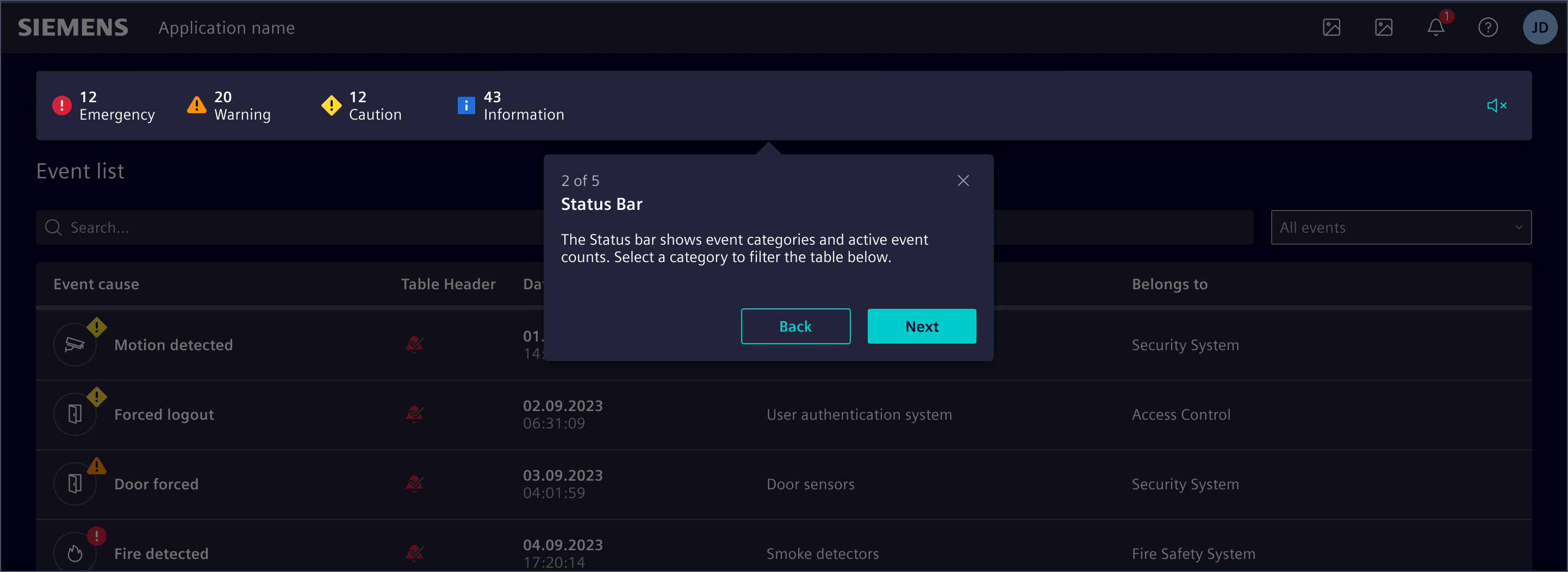
When to use
- To introduce new users to the application and its primary features.
- To guide users through a new workflow.
- To highlight significant updates or changes in the interface.
- To provide in-app training or onboarding for users.
Best practices
- Keep tours between 3 and 15 steps.
- Each step should have a clear and concise description.
- Focus on how the feature or function can benefit the user.
- Organize the tour steps in a logical sequence that mirrors the user’s workflow.
- Avoid overwhelming users with too much information at once.
Design
Elements
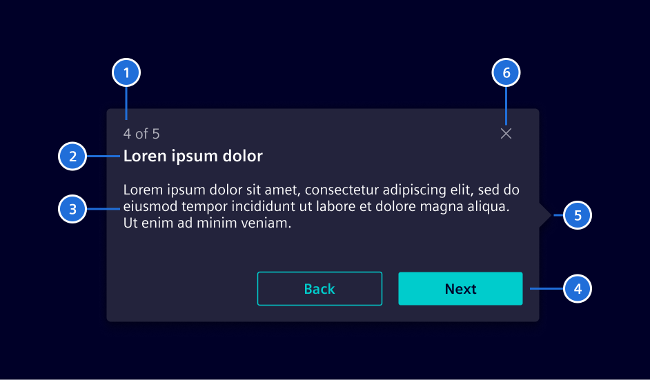
- Step number, 2. Title, 3. Description, 4. Actions, 5. Arrow (optional), 6. Close button
Tours can be automatically launched for new users during their first login to guide them through the UI. Automatic tours are best for first-time use only.
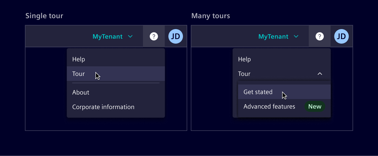
Users can access guided tours anytime from the Help menu in the application header.
If more than one tour is offered, they can be organized within the Help menu into categories such as "Getting started", "Advanced features" or "New features" for easy navigation.
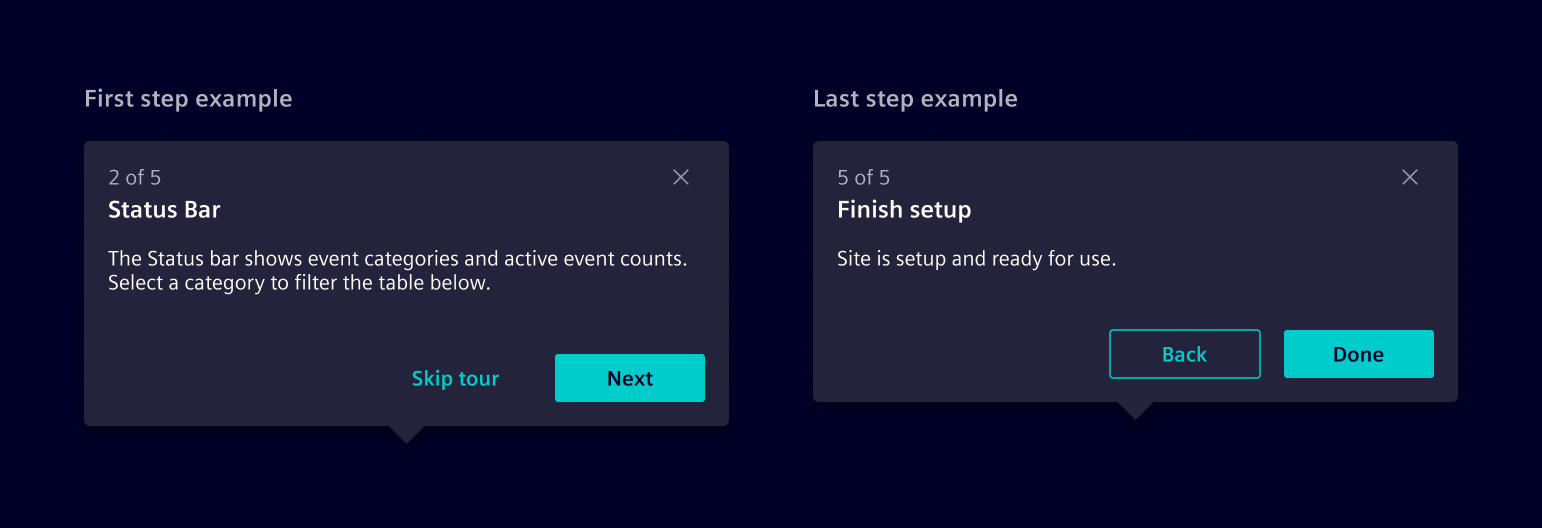
Tour beginning and end
The first step gives a brief overview of what to expect from the tour, with the option to skip it. The last step concludes the tour, summarizing key points and optionally offering additional resources.
Placement
The tour popover is automatically positioned above, below, to the left, or to the right of an element based on its screen position. The arrow can be placed along any edge to ensure optimal positioning.
Code
Usage
import { SiTourService } from '@siemens/element-ng/tour';

@NgModule({
  imports: [SiTourService, ...]
})
SiTourService API Documentation
Attributes and Methods
| Name | Type | Default | Description |
|---|---|---|---|
| addSteps(...) ¶ | (steps: TourStep[]) => void | Add steps to the tour Parameters
| |
| clearSteps() ¶ | () => void | Clear all steps | |
| complete() ¶ | () => void | Finish the tour | |
| (readonly) onTourCancel ¶ | Subject<void> | ... | Event triggered after the tour is cancelled, either through skip button or closing the tour dialog. |
| (readonly) onTourComplete ¶ | Subject<void> | ... | Event triggered after the tour is completed. |
| setOptions(...) ¶ | (options: TourOptions) => void | Sets options for the whole tour. Parameters
| |
| start() ¶ | () => void | Start the tour |
Types Documentation
| Options for each tour step. | |||||||||||||
|---|---|---|---|---|---|---|---|---|---|---|---|---|---|
|
| Options for tour | ||
|---|---|---|
|
| Common options for tour step and as default for tour step | |||||
|---|---|---|---|---|---|
|
| Represents a translatable string. This can either be a translation key, e.g. ACTIONS.EDIT that will be automatically translated when displayed on the UI or a pre-translated string, e.g. Edit . Equivalent to a normal string in usage and functionality. |
|---|
Except where otherwise noted, content on this site is licensed under MIT License.