Tabs
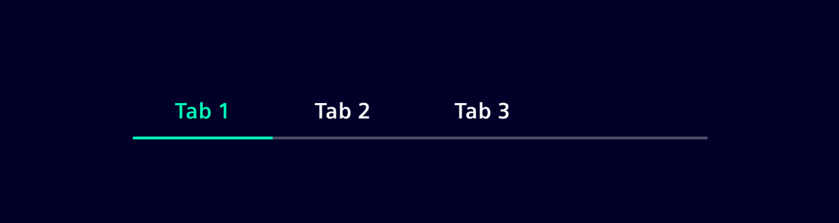
Tabs are used to separate information into logical sections in the context of a single page and to quickly navigate between them.
With Element v48, the tabs have been completely re-implemented including breaking changes in the API. The old tabs have been renamed to *-legacy and are available via legacy entrypoint @siemens/element-ng/tabs-legacy. For more details, see the BREAKING CHANGES notes for Element v48.0.0 in the changelog.
Usage
When to use
- Use tabs to group content that belongs to the same category.
- Use tabs when there is a large amount of content that can be separated.
- Use tabs to make the content accessible without navigating across pages or compromising on space.
- Different tab-panes should be logically related but mutually exclusive. A content element should only be in one tab at a time.
Best practices
- Don't mix different content types within the same tab structure.
- Avoid nested tabs (2 levels of tabs stacked on top of each other) since they add visual complexity, and are harder to navigate.
Design
Elements
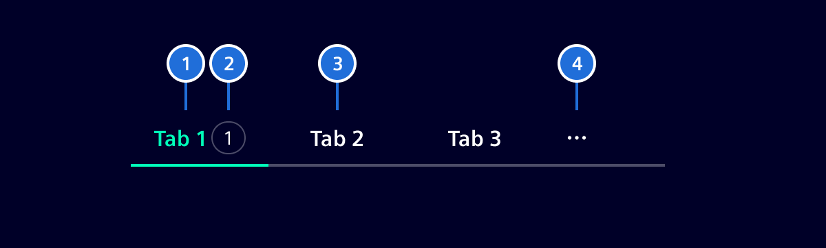
- Active tab, 2. Badge (optional), 3. Default tab, 4. Overflow menu
Tab label
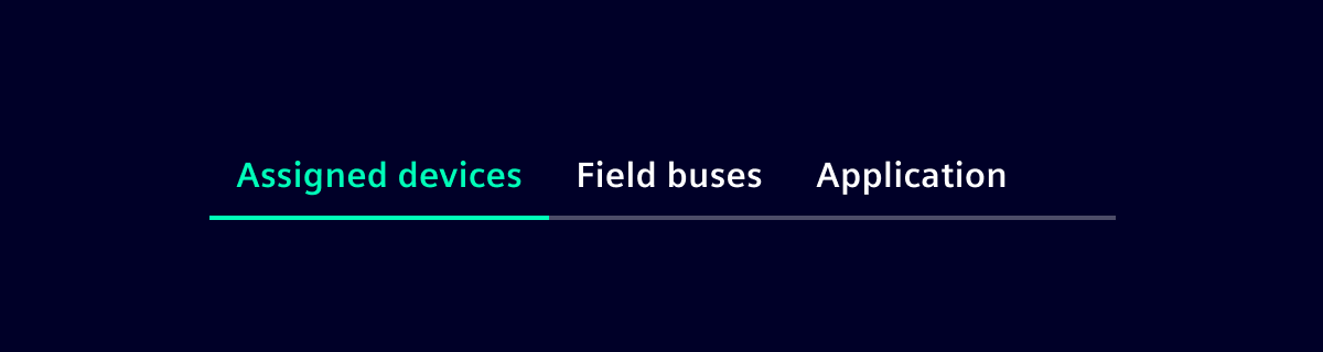
- The label describes the content contained within it.
- Labels are concise and use no more than two words.
- Tab labels should be written in title case and all words should be proper nouns.
- The label will not be truncated and uses the space it needs.
- The minimum width of a tab is
124px.
Number of tabs
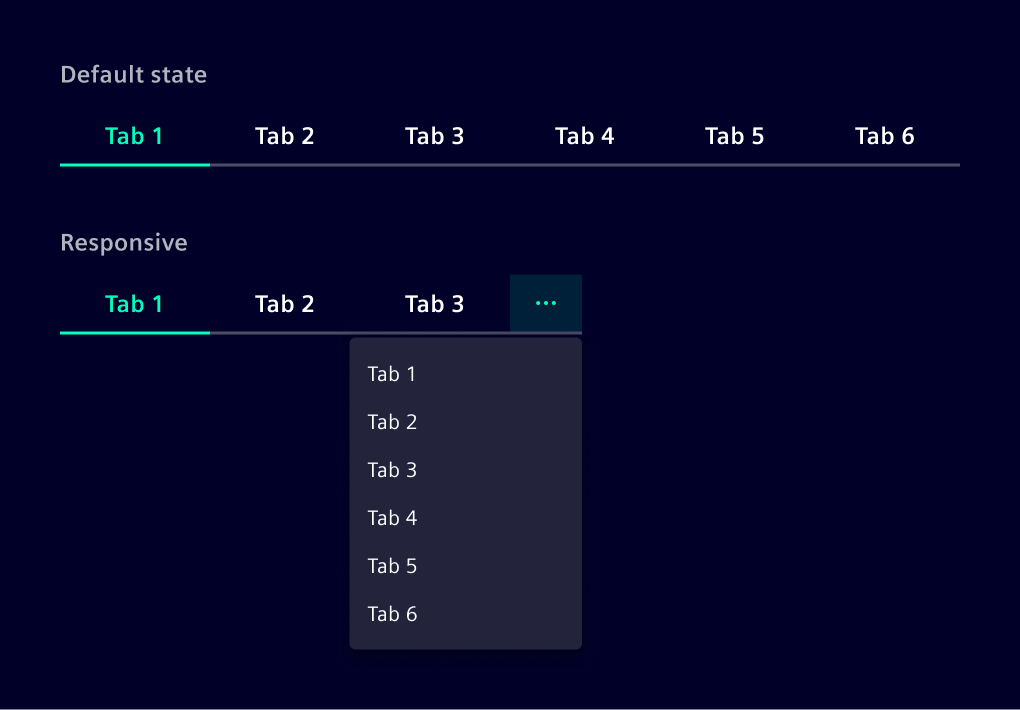
In most scenarios, you should use no more than six tabs. This ensures an uncluttered UI and reduces cognitive load for users. If more than six tabs are needed, consider other navigation patterns.
Order
The order of all tabs should be consistent across all pages. Tabs with related content should be grouped adjacent to each other. The most important tab should be the first.
Badge
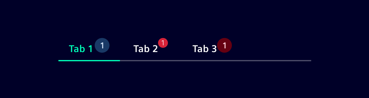
A small badge (dot) can be displayed in tabs to indicate when new information is available. The badge can also contain a number to display the amount of notifications.
Icon tabs
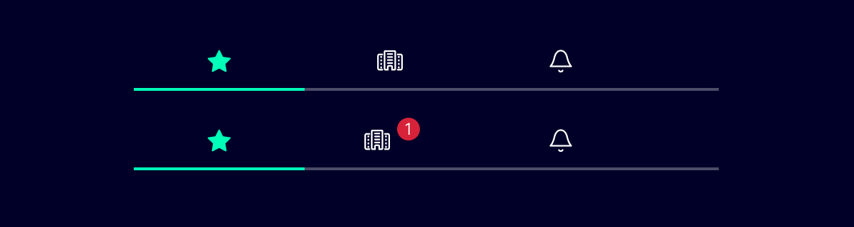
If there is not enough space to display meaningful labels, a tab version with icons can be used.
Note: This version only works with meaningful icons!
Closable tabs
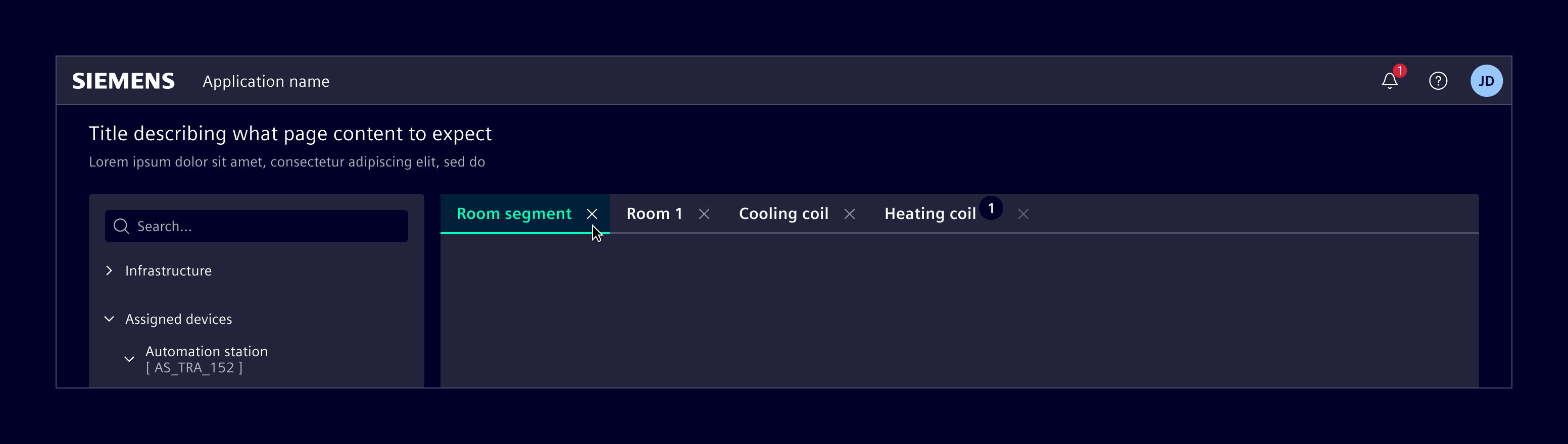
This variation allows users to open multiple tabs for multitasking or comparing information side by side, and subsequently close them as needed. They can be used in combination with badges.
Note: Closable tabs cannot be used in combination with icons.
Responsive behavior
When there isn’t enough space to display all the tabs, the ones that no longer fit collapse into a menu. This menu contains all the tabs in the same order, ensuring consistent navigation while optimizing space.
Code
Usage
import { SiTabComponent, SiTabsetComponent } from '@siemens/element-ng/tabs';

@Component({
  imports: [
    SiTabComponent,
    SiTabsetComponent,
    ...
  ]
})
Tabs
Tabs - Routing
Tabs - Icons
External Tab Content
Use SiTabPortalComponent to render tab content in a different part of the DOM outside of the si-tabset. This is useful for split layouts such as list-details. In these layouts, the tabs are in a header area and the content is in a separate body area.
Pass the SiTabsetComponent reference to the tabset input on SiTabPortalComponent.
<si-tabset #tabset>
  <si-tab heading="Overview" [active]="true"> Overview </si-tab>
  <si-tab heading="History"> History </si-tab>
</si-tabset>

<!-- Rendered elsewhere in the DOM -->
<si-tab-portal [tabset]="tabset" />
Toolbars
Tabs can be combined with toolbar actions (e.g. icon buttons) positioned inline in the tab bar. This pattern requires:
- A wrapper container with the classes
.nav-tabs .d-flex .align-items-center— this ensures the tabs and toolbar buttons are rendered on the same row, vertically aligned. - The
si-tabsetmust have.flex-fill .overflow-hidden—.flex-fillallows the tabset to take all available space (pushing toolbar buttons to the end), and.overflow-hiddenensures the responsive overflow menu works correctly within the flex layout. SiTabPortalComponentto render tab content separately from the tab header — this ensures toolbar buttons come before the tab content in the DOM/tab order for accessible keyboard navigation.
<!-- Wrapper container -->
<div class="nav-tabs d-flex align-items-center">
  <si-tabset #tabset class="flex-fill overflow-hidden">
    <si-tab heading="Write" [active]="true"> ... </si-tab>
    <si-tab heading="Preview"> ... </si-tab>
  </si-tabset>
  <!-- Toolbar actions placed after the tabset -->
  <si-menu-bar>
    <si-menu-item icon="element-link" aria-label="Link" siTooltip="Link" />
    <si-menu-item icon="element-settings" aria-label="Settings" siTooltip="Settings" />
  </si-menu-bar>
</div>
<!-- Tab content rendered separately for correct tab order -->
<si-tab-portal [tabset]="tabset" />
SiTabsetComponent API Documentation
si-tabset A component to group multiple tabs together. Can either be used with SiTabLinkComponent or SiTabComponent components.
Input Properties
| Name | Type | Default | Description |
|---|---|---|---|
| contentOverflowAuto ¶ | boolean | false | When set, the overflowing content inside the tab will automatically scroll |
SiTabComponent API Documentation
si-tab Creates a normal tab that can contain any content.
Example:
<si-tabset>
  <si-tab heading="Tab 1">
    <p>Content of Tab 1</p>
  </si-tab>
</si-tabset>
Input Properties
| Name | Type | Default | Description |
|---|---|---|---|
| active ¶ | boolean | false | Whether the tab is active or not. If set to true , the tab will be selected and its content will be displayed. |
| badgeColor ¶ | string | Background color of the badge. If no color is provided a red dot badge will be rendered. | |
| badgeContent ¶ | (boolean | TranslatableString) | Additional badge content. A value of - true will render a red dot - any string without a badgeColor will render a red dot with text - any string with a badgeColor will render a normal badge | |
| canActivate ¶ | () => boolean | Guard to check if the tab can be activated. If not provided, the tab can always be activated. | |
| canDeactivate ¶ | () => boolean | Guard to check if the tab can be deactivated. If not provided, the tab can always be deactivated. | |
| closable ¶ | boolean | false | Close the current tab. |
| disabled ¶ | boolean | false | Disables the tab. |
heading ¶ | TranslatableString | Title of the tab item. | |
| icon ¶ | string | Icon of the tab item. If provided, heading text will be ignored and only icon will be displayed. |
Output Properties
| Name | Type | Description |
|---|---|---|
| activeChange ¶ | boolean | Whether the tab is active or not. If set to true , the tab will be selected and its content will be displayed. |
| closeTriggered ¶ | void | Event emitter to notify when a tab is closed. |
Attributes and Methods
| Name | Type | Default | Description |
|---|---|---|---|
| selectTab(...) ¶ | (retainFocus: boolean) => void | Parameters
|
SiTabLinkComponent API Documentation
a[si-tab][routerLink] Creates a tab that uses the Angular router.
Example:
<si-tabset>
  <a si-tab routerLink="/home" heading="Home"></a>

  <router-outlet />
</si-tabset>
Input Properties
| Name | Type | Default | Description |
|---|---|---|---|
| badgeColor ¶ | string | Background color of the badge. If no color is provided a red dot badge will be rendered. | |
| badgeContent ¶ | (boolean | TranslatableString) | Additional badge content. A value of - true will render a red dot - any string without a badgeColor will render a red dot with text - any string with a badgeColor will render a normal badge | |
| closable ¶ | boolean | false | Close the current tab. |
| disabled ¶ | boolean | false | Disables the tab. |
| heading¶ | TranslatableString | Title of the tab item. | |
| icon ¶ | string | Icon of the tab item. If provided, heading text will be ignored and only icon will be displayed. |
Output Properties
| Name | Type | Description |
|---|---|---|
| closeTriggered ¶ | void | Event emitter to notify when a tab is closed. |
Attributes and Methods
| Name | Type | Default | Description |
|---|---|---|---|
| (readonly) active ¶ | Signal<(boolean | undefined)> | false | |
| ngOnDestroy() ¶ | () => void | A callback method that performs custom clean-up, invoked immediately before a directive, pipe, or service instance is destroyed. | |
| selectTab(...) ¶ | (retainFocus: boolean) => void | Parameters
|
Types Documentation
| Represents a translatable string. This can either be a translation key, e.g. ACTIONS.EDIT that will be automatically translated when displayed on the UI or a pre-translated string, e.g. Edit . Equivalent to a normal string in usage and functionality. |
|---|
| | ||||
|---|---|---|---|---|
|
| A component that renders the active tab's content at a remote location in the DOM using an Angular CDK DomPortal .This component automatically renders the content of the currently active si-tab , including the role="tabpanel" container with proper ARIA attributes linked to the active tab.Example: | ||
|---|---|---|
| ||
|
Code (legacy)
Element implements tabset and tab components that provide the correct styling and responsive behavior. It supports the usage combined with the Angular router (preferred way) or alternatively as plain components.
Note: This is the legacy tabs implementation. For new projects, use the improved tabs component.
Tabs with Angular Router
When using the tabs with the Angular router, each tab is just an anchor with a routerLink. Make sure to nest the <router-outlet /> inside the si-tabset-legacy component as the tabset applies some accessibility attributes. No need to apply routerLinkActive, this is done automatically.
<si-tabset-legacy>
  <a si-tab-legacy heading="Tab 1" routerLink="./tab-1"></a>
  <a si-tab-legacy heading="Tab 2" routerLink="./tab-2"></a>

  <router-outlet />
</si-tabset-legacy>
import { Component } from '@angular/core';
import { RouterLink } from '@angular/router';
import { SiTabsetLegacyComponent, SiTabLegacyComponent } from '@siemens/element-ng/tabs-legacy';

@Component({
  templateUrl: './my-component.html',
  imports: [SiTabsetLegacyComponent, SiTabLegacyComponent, RouterLink]
})
export class MyComponent {}
A corresponding route definition looks like this:
import { Route } from '@angular/router';

export const routes: Routes = [
  { path: '', redirectTo: 'tab-1', pathMatch: 'full' }, // Select the first tab by default
  { path: 'tab-1', component: Tab1Component },
  { path: 'tab-2', component: Tab2Component }
];
Tabs with plain components
In general, using the tabs with the Angular router is preferred as the state is stored in the URL. So deep-linking and bookmarking is supported. In some cases, this might not be needed, e.g. when using the tabs to group simple information on a page.
In this case, you can use the si-tabset component with si-tab components as children.
<si-tabset-legacy>
  <si-tab-legacy heading="Tab 1">Tab 1 content</si-tab-legacy>
  <si-tab-legacy heading="Tab 2" [active]="true">Tab 2 content</si-tab-legacy>
</si-tabset-legacy>
import { Component } from '@angular/core';
import { RouterLink } from '@angular/router';
import { SiTabsetLegacyComponent, SiTabLegacyComponent } from '@siemens/element-ng/tabs-legacy';

@Component({
  templateUrl: './my-component.html',
  imports: [SiTabsetLegacyComponent, SiTabLegacyComponent]
})
export class MyComponent {}
By default, no tab is active until the user clicks one. You can set the active property to true on one of the tabs to make it active by default. Ensure that only one tab has the active property set to true. Otherwise, the behavior is undefined.
Closable tabs
Both tab variants can be used as a closable tab. A tab that can be closed must be explicitly marked as closable by setting the closable property to true.
<si-tabset-legacy>
  @if(showTab1) {
  <a
    si-tab-legacy
    heading="Tab 1"
    routerLink="./tab-1"
    closable
    (closeTriggered)="removeTab1()"
  ></a>
  }
</si-tabset-legacy>
import { Component } from '@angular/core';
import { RouterLink } from '@angular/router';
import { SiTabsetLegacyComponent, SiTabLegacyComponent } from '@siemens/element-ng/tabs-legacy';

@Component({
  templateUrl: './my-component.html',
  imports: [SiTabsetLegacyComponent, SiTabLegacyComponent, RouterLink]
})
export class MyComponent {
  showTab1 = true;

  removeTab1() {
    this.showTab1 = false;
  }
}
The tabset does not automatically remove a closed tab. When closeTriggered is emitted, you need to handle the removal of the tab in your component logic.
Tab access control and guarding
By default, tabs should be hidden when the feature is irrelevant to the user’s role. However if there’s a clear reason for the user to see the tab (for example: to request access, or contact an admin), the tab may remain visible. In this case, navigation should still work but lead to a screen with an info page component with something like: "You don’t have access to this feature." "Contact your administrator to request access."
To achieve this use canActivate or canDeactivate provided by angular router guards or as custom callback input function in case of tabs with plain components to determine whether given tab can be activated or deactivated.
SiTabsetLegacyComponent API Documentation
si-tabset-legacy Deprecated: Use the new components from @siemens/element-ng/tabs instead. See https://element.siemens.io/components/layout-navigation/tabs/#code for usage instructions.
Input Properties
| Name | Type | Default | Description |
|---|---|---|---|
| selectDefaultTab ¶ | boolean | true | If selectDefaultTab is passed as 'false', this implies no default tab selection i.e. on initial load of tabset component no tab gets selected. |
| selectedTabIndex ¶ | number | 0 | Returns the currently selected tab index. Sets a selected tab index. This will activate the tab of the provided index, activates the tab and fires a notification about the change. If index is passed as -1 i.e. selectedTabIndex = -1 , this implies to clear all tab selection. |
| tabButtonMaxWidth ¶ | number | Define an optional max-width in px for the tab buttons. The minimum value is 100 . |
Output Properties
| Name | Type | Description |
|---|---|---|
| (readonly) deselect ¶ | EventEmitter<SiTabDeselectionEvent> | Event emitter to notify when a tab became inactive. |
| (readonly) selectedTabIndexChange ¶ | EventEmitter<number> | Event emitter to notify about selected tab index changes. You can either use bi-directional binding with [(selectedTabIndex)] or separate both with [selectedTabIndex]=... and (selectedTabIndexChange)=... |
SiTabLegacyComponent API Documentation
si-tab-legacy Deprecated: Use the new components from @siemens/element-ng/tabs instead. See https://element.siemens.io/components/layout-navigation/tabs/#code for usage instructions.
Input Properties
| Name | Type | Default | Description |
|---|---|---|---|
| badgeColor ¶ | string | Background color of the badge. If no color is provided a red dot badge will be rendered. | |
| badgeContent ¶ | (boolean | TranslatableString) | Additional badge content. A value of - true will render a red dot - any string without a badgeColor will render a red dot with text - any string with a badgeColor will render a normal badge | |
| closable ¶ | boolean | false | Close the current tab. |
| disabled ¶ | boolean | false | Disables the tab. |
| heading ¶ | TranslatableString | Title of the tab item. | |
| icon ¶ | string | Icon of the tab item. | |
| iconAltText ¶ | TranslatableString | Alternative name or translation key for icon. Used for A11y. |
Output Properties
| Name | Type | Description |
|---|---|---|
| (readonly) closeTriggered ¶ | EventEmitter<SiTabLegacyComponent> | Event emitter to notify when a tab is closed. |
Except where otherwise noted, content on this site is licensed under MIT License.