Split
The split component enables the division of the content area in two or more distinct sections, with a draggable handlebar between them. Parts can be resized, collapsed and expanded accordingly.
Usage
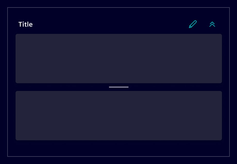
The split component allows the creation of dynamic layouts, divided in adjacent panes. Each pane can contain a variety of components, such as tables, lists, images, or maps. Panes are separated by the handlebar that support a dragging action for resizing.
When to use
- Use it when the content needs to be divided in different sections, allowing users some freedom in regards of viewport arrangement (e.g. give more space to a map or a table).
- Use it when part of the content needs to be hidden or being partially reduced in size so users can focus on their current task.
- Use it when all sections are relevant in combination to each other.
Best practices
- Be mindful about its use. Content can quickly become overly partitioned, increasing the interaction cost. Don't split the content in more than three sections.
- Define minimum and maximum pane sizes. Make sure to use sizes that keep the handlebar visible. If a pane gets too small, it can become too difficult to interact with.
- Allow users to hide a pane when it makes sense. E.g: If a design includes an edit function, consider letting users hide other panes to reduce distractions.
Design
Elements
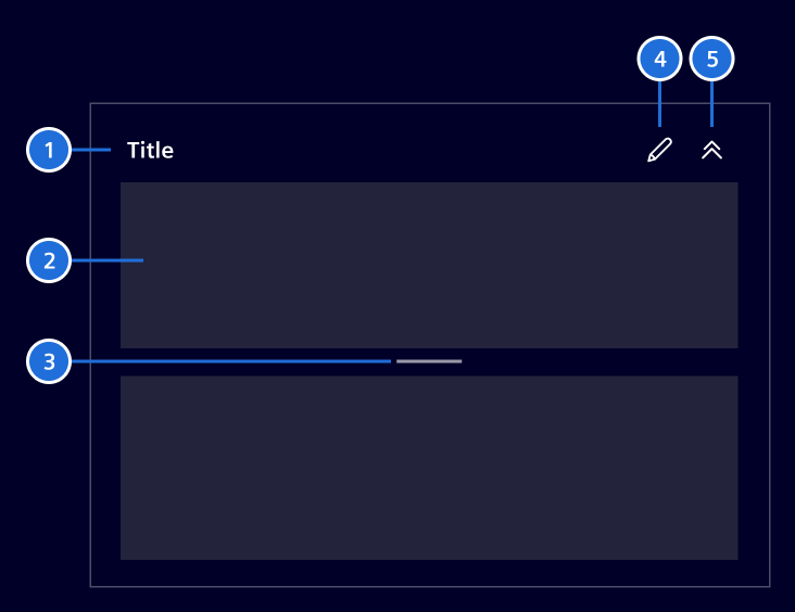
- Title (optional), 2. Pane, 3. Handlebar, 4. Additional actions (optional), 5. Expanse/collapse button (optional)
Panes are structural placeholders that divide content into sections. According to the layout guidelines, content should be grouped into cards with 4px rounded corners.
Given that panes are used to organize content, the same principle applies. To maintain consistency, use the card component inside panes. If that's not feasible, apply the element-radius-2 class for 4px rounded corners to align with design standards.
Layout orientation
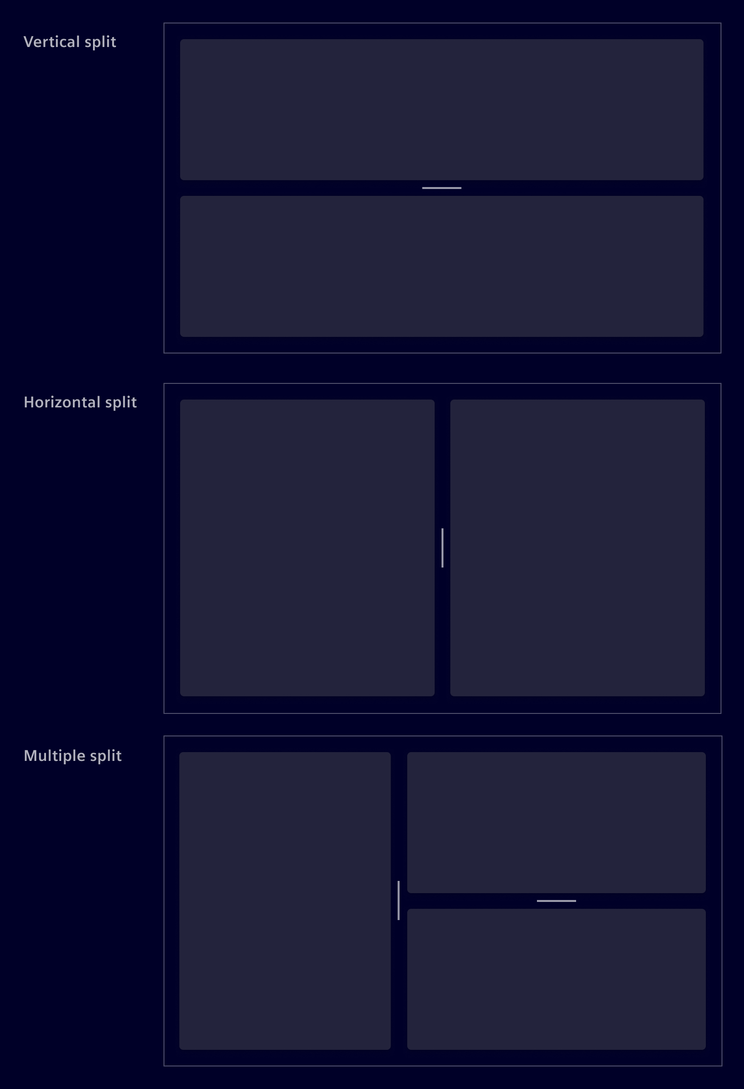
The component can be use to divide the screen horizontally, vertically or both. The orientation should be chosen based on the content type and the to be expected screen size.
Resizable containers
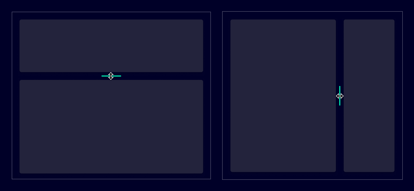
Users can change a pane's width or height by sliding the handlebar in either direction.
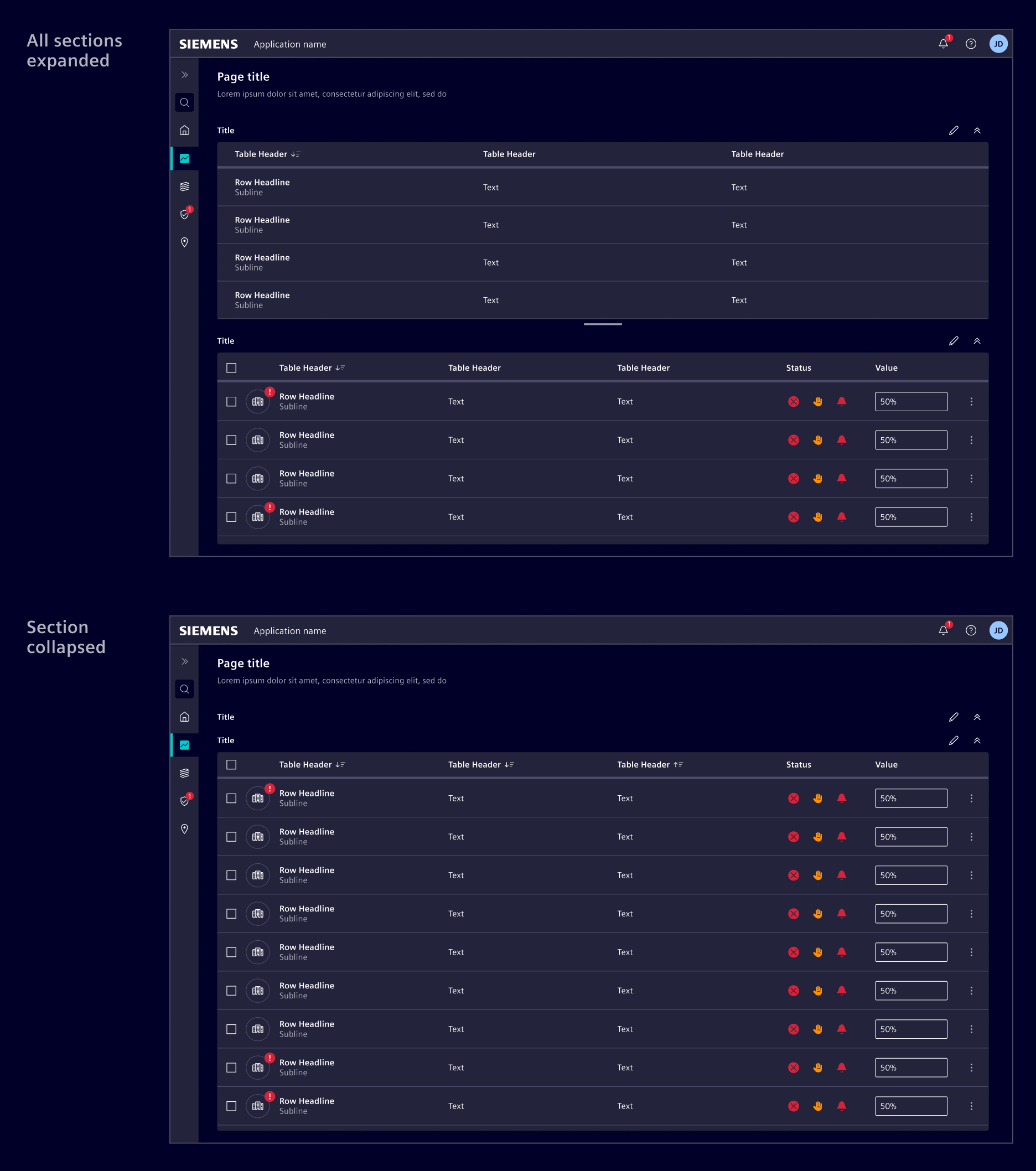
Expand and collapse
Optionally, panes can be expanded or collapsed to show or hide information, if the application allows said actions.
Responsive layout
Ensure that the chosen layout works well on all device types. For small screen sizes, consider changing the layout to an interactive one where users can switch between panes. See the list-details pattern's responsive behavior as an example.
Code
Usage
si-split can be imported using the module
import { RouterModule } from '@angular/router';

import { SiSplitModule } from '@siemens/element-ng/split';

@NgModule({
  imports: [SiSplitModule, RouterModule, ...]
})
or as a standalone component:
import { SiSplitComponent, SiSplitPartComponent } from '@siemens/element-ng/split';

@Component({
  imports: [
    SiSplitComponent,
    SiSplitPartComponent,
    ...
  ]
})
Sizing
Each si-split-part requires a numeric size and a unit. Use unit="fr" for a part that should scale with the available space. Use unit="px" for a part that should keep a fixed size while the split container changes size.
Horizontal collapsed heading direction
In a horizontal split, the title of a collapsed part is displayed vertically. To change its direction so it faces the start, add the align-heading-start class to the <si-split-part>. This class only affects the title while the part is collapsed in a horizontal split.
<si-split-part heading="..." collapsible="to-start" class="align-heading-start">...</si-split-part>
Horizontal split with fractional sizing
Horizontal split with mixed fixed and fractional sizing
Vertical split
Nested splits
Custom collapse icons
Hide the collapse button
Hide the header
SiSplitComponent API Documentation
si-split Input Properties
| Name | Type | Default | Description |
|---|---|---|---|
| gutterSize ¶ | number | 16 | Size of the gutter (divider) between split parts in pixels. |
| orientation ¶ | SplitOrientation | 'horizontal' | Defines the split layout direction. |
| stateId ¶ | string | An optional stateId to uniquely identify a component instance. Required for persistence of ui state. |
Output Properties
| Name | Type | Description |
|---|---|---|
| sizesChange ¶ | number[] | Emits the sizes of all parts as percentages when the user resizes a gutter. |
SiSplitPartComponent API Documentation
si-split-part Input Properties
| Name | Type | Default | Description |
|---|---|---|---|
| actions ¶ | Action[] | [] | Action buttons displayed in the split part header. |
| collapseIconClass ¶ | string | Sets the icon class that is used in the buttons of split parts to collapse and uncollapse the parts. | |
| collapseLabel ¶ | TranslatableString | $localize`:@@SI_SPLIT.COLLAPSE_LABEL:Collapse` | Aria label for collapse button. Needed for a11y |
| collapseOthers ¶ | boolean | false | This toggles the behavior when collapsing this split part. If enabled, all split parts between this one and the end of the split in the respective direction will be collapsed if this part is collapsed. If disabled, only this split part will be collapsed. |
| collapseToMinSize ¶ | boolean | false | Collapse only to the given min size. |
| collapsible ¶ | CollapseTo | undefined | Defines whether and in which direction the split part can collapse. When unset, the collapse button is hidden. |
| expanded ¶ | boolean | true | Sets the initial expanded or collapsed state of the split part. |
| headerTemplate ¶ | TemplateRef<{ $implicit: SiSplitPartComponent }> | Custom template for the split part header. The template receives the component instance as implicit context. | |
| heading ¶ | TranslatableString | Sets the title of the split part header. | |
| minSize ¶ | number | 0 | Minimum size in px. |
| removeContentOnCollapse ¶ | boolean | false | When a split part is collapsed, the content gets hidden but it will still remain within the DOM. If you want to remove and destroy the component in collapsed mode and recreate it on un-collapse, set this property to true. |
| showHeader ¶ | boolean | true | Defines if the header of the split part is visible. Default is true. |
size ¶ | number | Expanded size. | |
| stateId ¶ | string | An optional stateId to uniquely identify a component instance. Required for persistence of ui state. | |
| unit¶ | SplitUnit | Unit for the configured size . |
Output Properties
| Name | Type | Description |
|---|---|---|
| collapseChanged ¶ | boolean | Emits when the part is collapsed or expanded. |
| stateChange ¶ | PartState | Emits the part's expanded state and size after it is toggled. |
Attributes and Methods
| Name | Type | Default | Description |
|---|---|---|---|
| (readonly) collapsed ¶ | boolean | Get collapsed state. Returns True if the split part is collapsed, false is expanded. | |
| toggleCollapse() ¶ | () => void | Toggles the collapsed or expanded state. |
Types Documentation
| |
|---|
| | ||||
|---|---|---|---|---|
|
| Represents a translatable string. This can either be a translation key, e.g. ACTIONS.EDIT that will be automatically translated when displayed on the UI or a pre-translated string, e.g. Edit . Equivalent to a normal string in usage and functionality. |
|---|
| |
|---|
| |
|---|
| | |||
|---|---|---|---|
|
Except where otherwise noted, content on this site is licensed under MIT License.