Side panel
The side panel is a layout container that pushes-in from the right side of an application (for left-to-right/LTR orientation).
Usage
The side panel is used to display additional content or functionality that is related to the main content of a page.
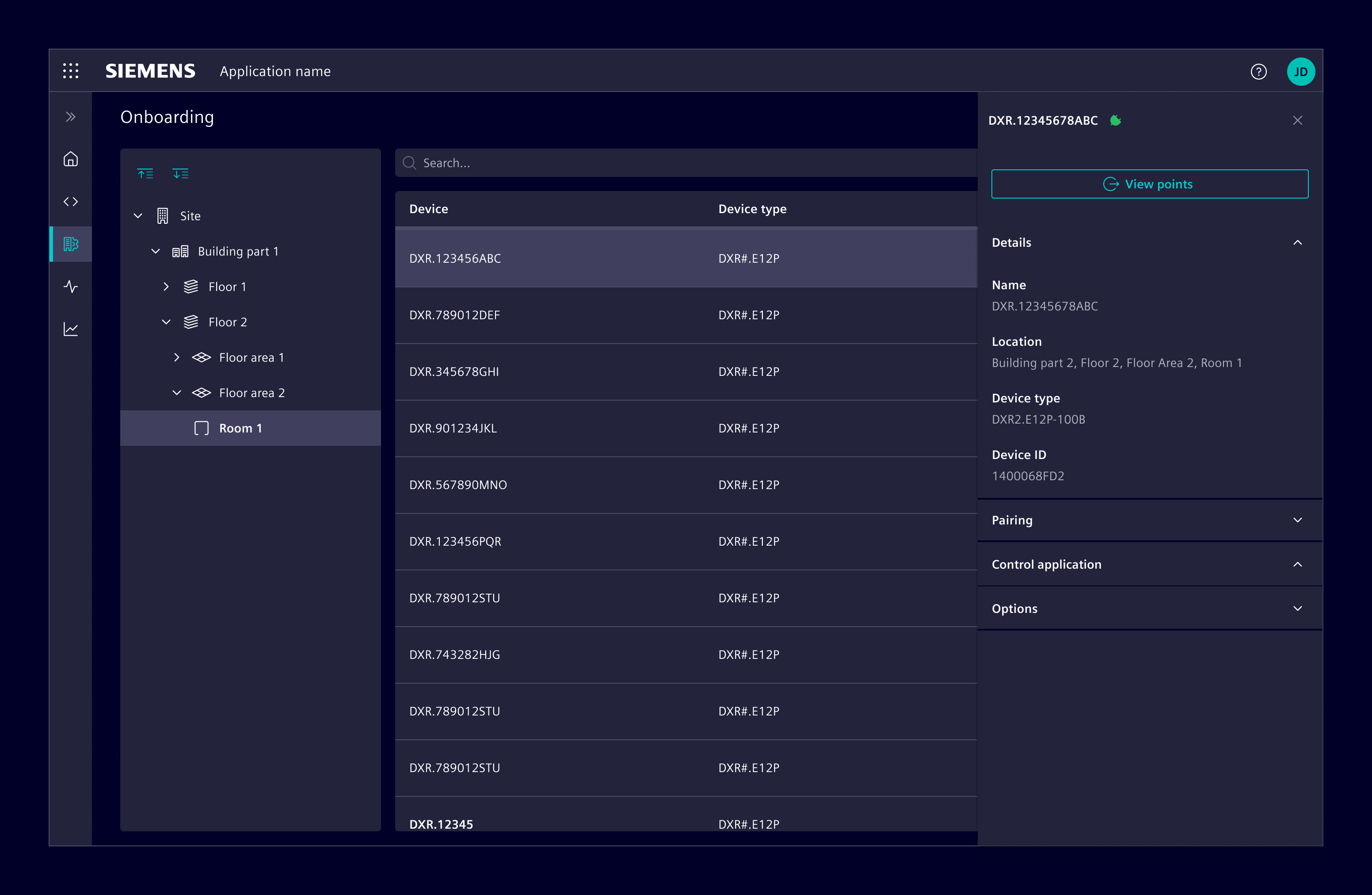
The panel takes the full application height and a fixed width. There are three pre-defined widths available: regular (390px), wide (500px), and extended (responsive).
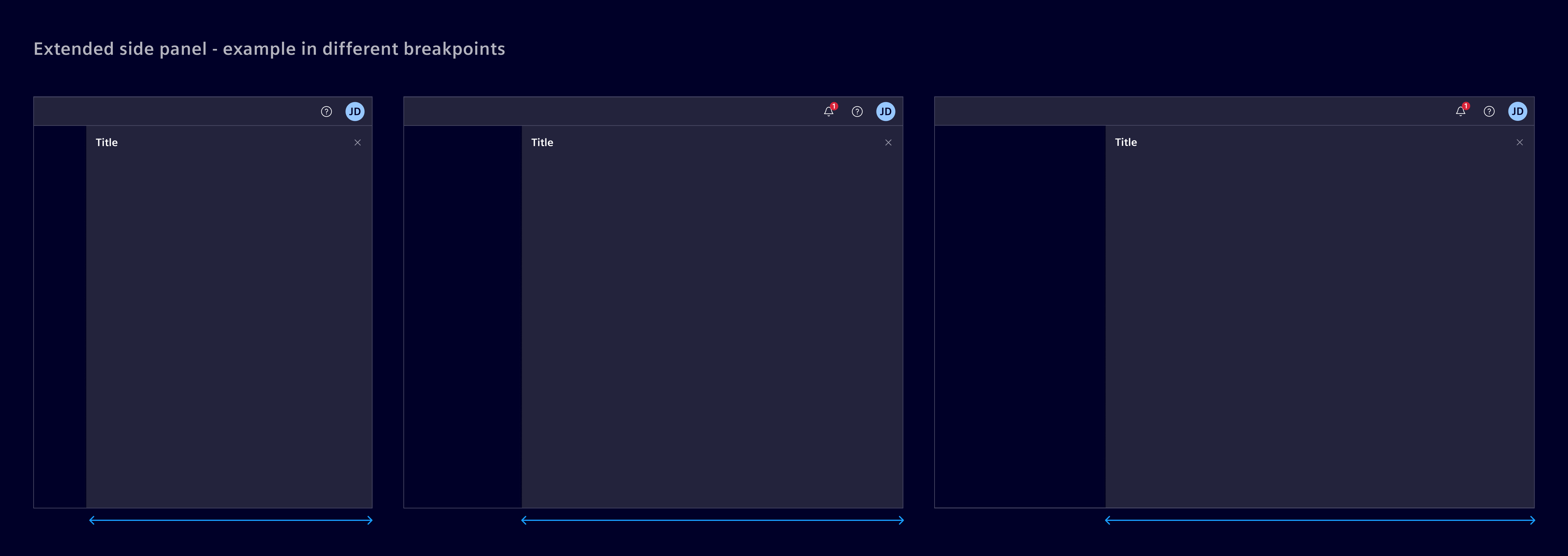
The extended variant adapts its width based on application breakpoints, providing more horizontal space on larger viewports while maintaining the same behavior and interaction model as other side panels.
When to use
- Use it to show detail information of a selected item/object from the main working area (e.g. of a list).
- Use it for navigation items such as links or menus.
- Use it for filter options to enable users to refine their search results.
- Use it for settings and preferences to allow users to customize their experience.
- Use it for help and support information.
- Use it for notifications to alert users about important updates, events or more.
Best practices
- Don't use it for permanent information. The content should be changing based on the context.
- The content should be scrollable if it exceeds the height of the application window.
Design
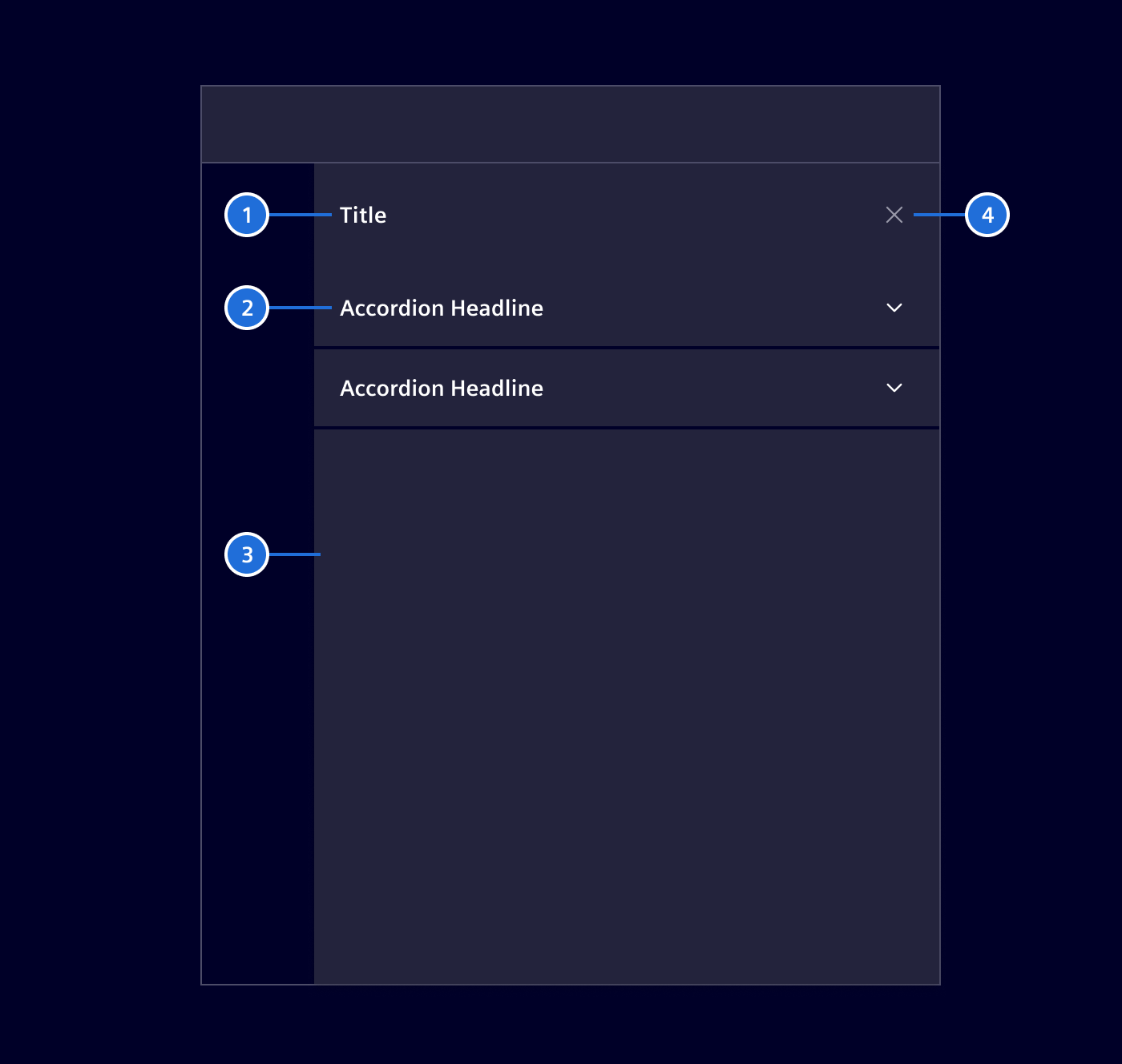
- Title: A descriptive title for the panel based on its content.
- Section header (optional): Use it for breaking the panel into multiple distinct sections.
- Content body: A container that allows to implement any kind of different content.
- Exit icon: Button used to hide or collapse the side panel.
Content
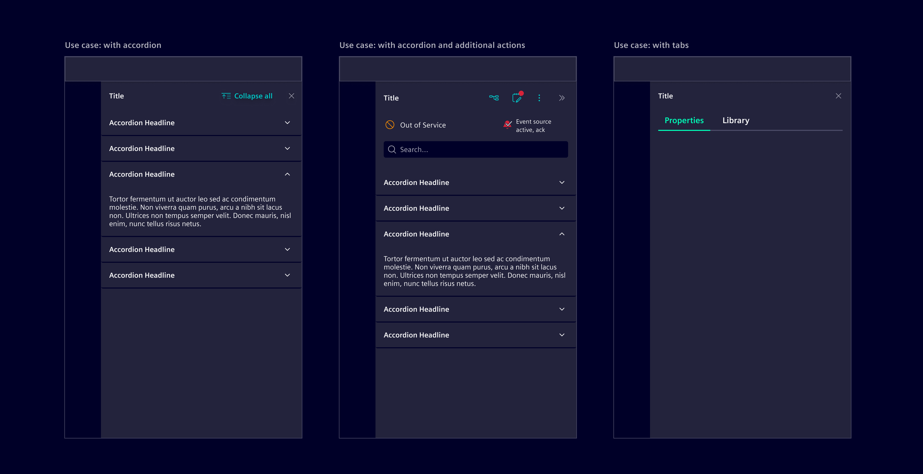
The side panel can contain any content based on the use case. It is common to use it with accordions and tabs to section information without overwhelming users.
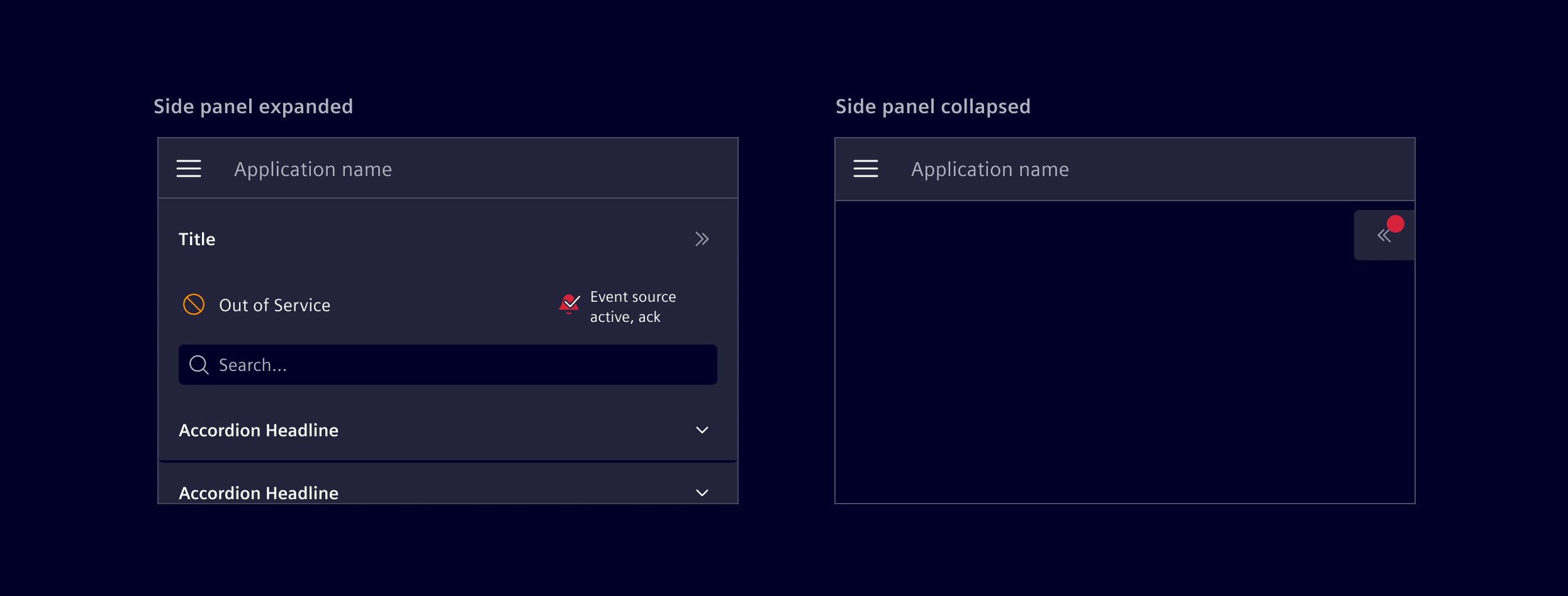
A special variation of the side panel allows for icons to represent the status of the selection, remaining visible even in the collapsed state. This is commonly used to represent data point states including event states, but is not restricted to these cases.
Modes
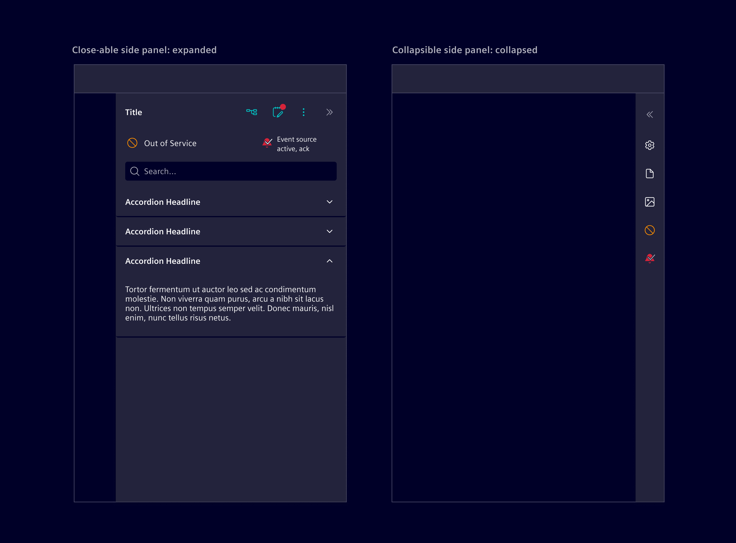
The side panel can be either closeable (the panel is completely hidden) or collapsible (still visible with summary information) according to the application/project use-case.
- Use a closeable side panel if the content has no direct relation to the items within the main content area. Closeable side panels are typically opened by selecting an entry within the horizontal navigation.
- Use a collapsible side panel if the content changes based on the selection made within the main content area.
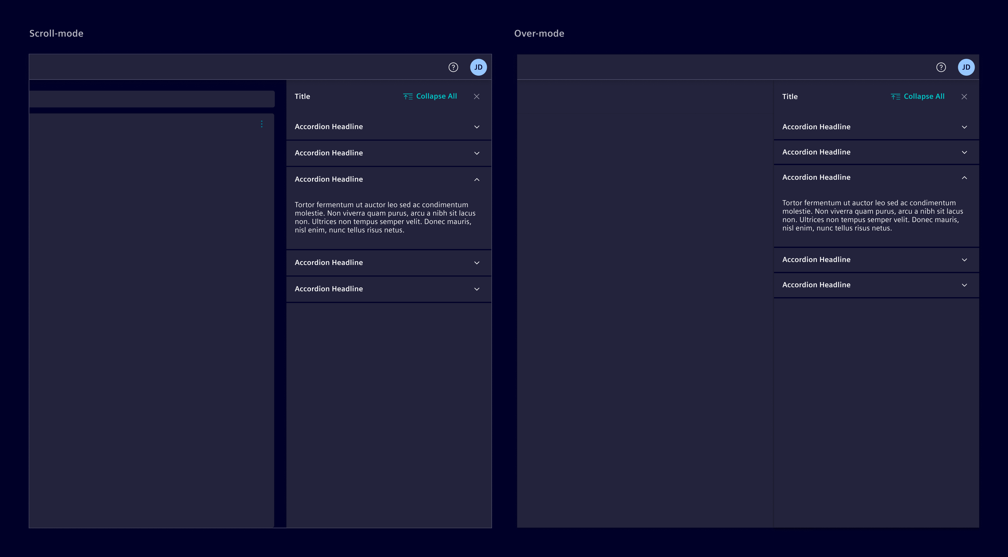
A side panel can be configured to use either over-mode or scroll-mode. In over-mode, the panel overlaps the main content area, while in scroll-mode, the panel pushes the main content area away.
Extended side panel
The extended side panel can be used as a responsive container when additional space is required beyond standard panel widths.
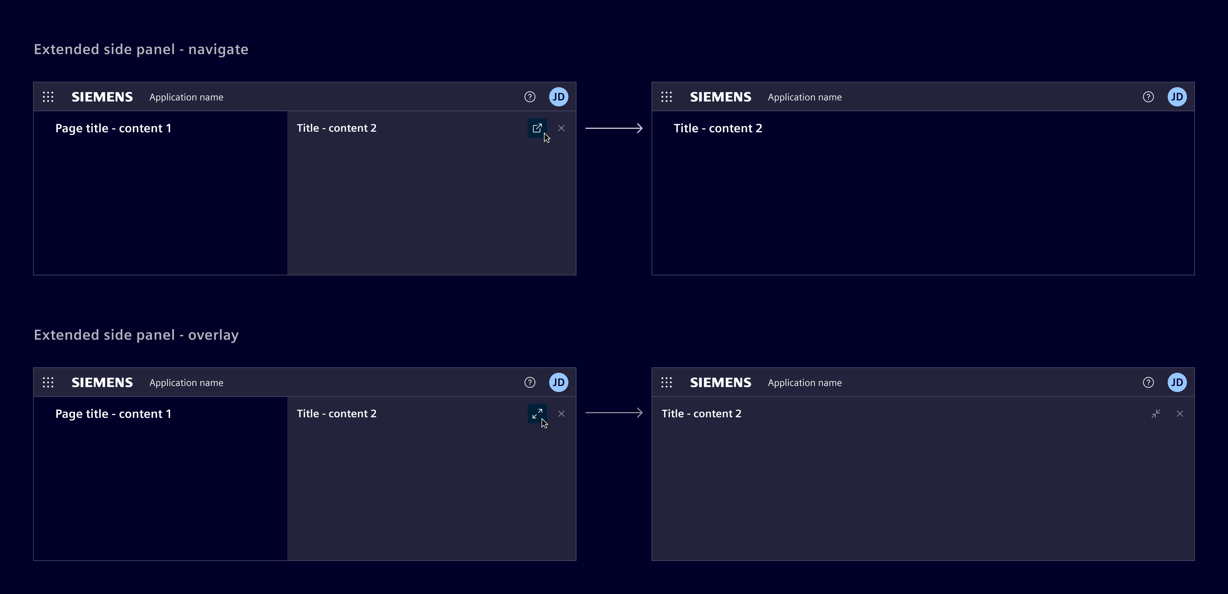
The extended side panel can remain alongside the main content, overlay it, or be used to navigate to a dedicated page.
Collapsible floating button
This is a variation of the collapsed state, specifically designed for smaller screens.
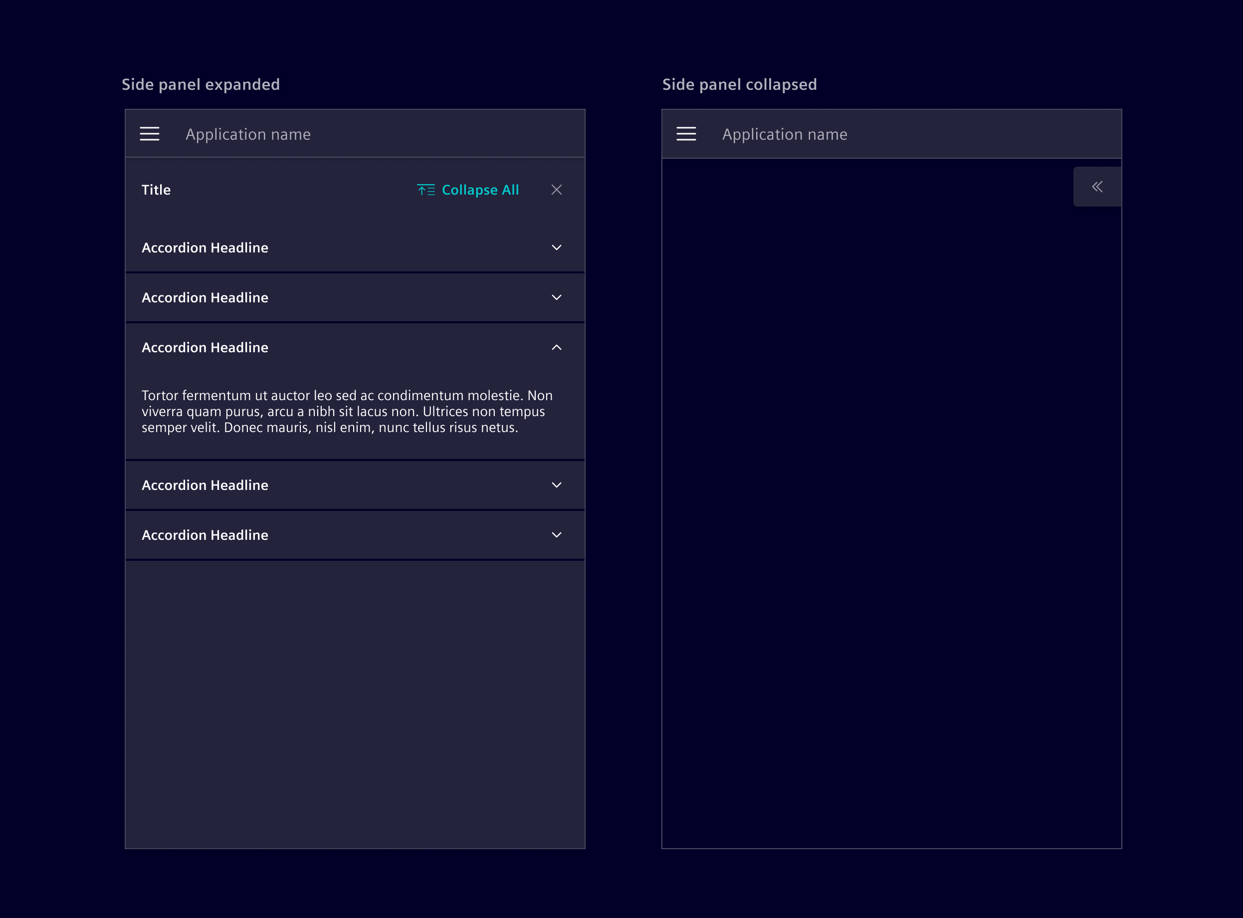
The floating button is restricted to the following configurations:
- The side panel by itself
- The side panel + application header
It should never be used in combination with the responsive behavior of the vertical navigation.
If data point states are available (out of service, event active, etc), a notification tag can be enabled to signal to the user that something requires attention.
Code
Use it together with <si-accordion> and <si-collapsible-panel> as shown in the example. If the accordion behavior of having only one open panel is not desired, simply use <si-collapsible-panel> without wrapping them in an <si-accordion>.
Usage
Within a module
import { SiSidePanelModule } from '@siemens/element-ng/side-panel';
import { SiAccordionModule } from '@siemens/element-ng/accordion';

@NgModule({
  imports: [SiAccordionModule, SiSidePanelModule, ...]
})
or as a standalone component
import { SiSidePanelComponent, SiSidePanelContentComponent } from '@siemens/element-ng/side-panel';
import { SiAccordionComponent, SiCollapsiblePanelComponent } from '@siemens/element-ng/accordion';

@Component({
  imports: [
    SiSidePanelComponent,
    SiSidePanelContentComponent
    SiAccordionComponent,
    SiCollapsiblePanelComponent,
  ]
})
All content that should be shown in the side panel needs to be wrapped in a <si-side-panel-content>.
The standard way to provide content for the side panel is by placing the <si-side-panel-content> element directly inside the <si-side-panel>:
Side panel with inner navigation
Use the siSidePanelBackButton directive to navigate from a detail view back to the previous view within the side panel:
Flexible content injection via cdkPortal and SiSidePanelService
A more flexible way is to use the cdkPortal directive from the Angular CDK Portal combined with the SiSidePanelService which allows to control the content of the side panel from anywhere within the application:
Collapsible side panel with various options
The side panel supports a mode where it collapses into a vertical bar instead of getting completely hidden. This mode can be enabled by setting [collapsible]="true" as demonstrated in the example below. There are also many other options that can be enabled on the <si-side-panel-content> like showing a search box, content actions, or status indicators.
SiSidePanelComponent API Documentation
si-side-panel Input Properties
| Name | Type | Default | Description |
|---|---|---|---|
| breakpoints ¶ | Breakpoints | Specifies custom breakpoints to automatically switch mode. The smMinimum specifies the breakpoint for the mobile view.The lgMinimum specifies the breakpoint to allow scroll mode(below automatically uses over mode). The xlMinimum specifies the breakpoint to allow scroll modewith wide size (below automatically uses over mode). | |
| collapsed ¶ | boolean | Default state of navigation | |
| collapsible ¶ | boolean | false | |
| disableBackdrop ¶ | boolean | false | Whether to disable backdrop when side panel is open in over mode. When false (default), the backdrop prevents interaction with background content while preserving visual context. |
| enableMobile ¶ | boolean | false | Enable mobile drawer for small screen sizes. Should not be used in conjunction with the vertical navbar. |
| mode ¶ | SidePanelMode | 'over' | Mode of side panel (ignored below a certain width) |
| size ¶ | SidePanelSize | 'regular' | Size of side-panel |
| toggleItemLabel ¶ | TranslatableString | $localize`:@@SI_SIDE_PANEL.TOGGLE:Toggle` | Toggle icon aria-label, required for a11y |
Output Properties
| Name | Type | Description |
|---|---|---|
| closed ¶ | void | Emits when the panel is closed |
| collapsedChange ¶ | boolean | Default state of navigation |
| contentResize ¶ | ElementDimensions | Emits whenever the content is resized due to opening and closing or parent resize. |
Attributes and Methods
| Name | Type | Default | Description |
|---|---|---|---|
| toggleSidePanel() ¶ | () => void | Toggle whether the side panel is expanded or not. |
SiSidePanelContentComponent API Documentation
si-side-panel-content Input Properties
| Name | Type | Default | Description |
|---|---|---|---|
| closeButtonLabel ¶ | TranslatableString | $localize`:@@SI_SIDE_PANEL.CLOSE:Close` | Aria label for close button. Needed for a11y |
| displayMode ¶ | SidePanelDisplayMode | Display mode for side panel - enables navigate or overlay functionality | |
| enterFullscreenLabel ¶ | TranslatableString | $localize`:@@SI_SIDE_PANEL.ENTER_FULLSCREEN:Full screen` | Enter fullscreen aria-label, required for a11y |
| exitFullscreenLabel ¶ | TranslatableString | $localize`:@@SI_SIDE_PANEL.EXIT_FULLSCREEN:Exit full screen` | Exit fullscreen aria-label, required for a11y |
| heading ¶ | TranslatableString | '' | Header of side panel |
| navigateConfig ¶ | SidePanelNavigateConfig | Configuration for navigate mode | |
| primaryActions ¶ | (MenuItem | ContentActionBarMainItem)[] | [] | Input list of primary action items |
| searchable ¶ | boolean | false | Toggles search bar |
| searchPlaceholder ¶ | TranslatableString | $localize`:@@SI_SIDE_PANEL.SEARCH_PLACEHOLDER:Search…` | Placeholder text for search |
| secondaryActions ¶ | (MenuItem | MenuItem)[] | [] | Input list of secondary action items. |
| showMobileDrawerBadge ¶ | boolean | false | Show a badge on the mobile drawer indicating a new alert or notification |
| toggleItemLabel ¶ | TranslatableString | $localize`:@@SI_SIDE_PANEL.TOGGLE:Toggle` | Toggle icon aria-label, required for a11y |
collapsible ¶ | boolean | undefined | Deprecated: This input is no longer used. The collapsible state is managed by the SiSidePanelService. This input will be removed in a future major version. |
| statusActions¶ | StatusItem[] | [] | Status icons/actions Deprecated: Use the SiSidePanelActionsComponent instead: <si-side-panel-content> <si-side-panel-actions> <button type="button" si-side-panel-action icon="element-alarm-background-filled" iconColor="status-danger" stackedIcon="element-alarm-tick" stackedIconColor="text-primary" (click)="action()" > Action </button> </si-side-panel-actions> </si-side-panel-content> |
Output Properties
| Name | Type | Description |
|---|---|---|
| searchEvent ¶ | string | Output for search bar input |
Attributes and Methods
| Name | Type | Default | Description |
|---|---|---|---|
| toggleFullscreen() ¶ | () => void | Toggle fullscreen overlay mode |
SiSidePanelService API Documentation
Attributes and Methods
| Name | Type | Default | Description |
|---|---|---|---|
| close() ¶ | () => void | Close side panel. | |
| hideTemporaryContent() ¶ | () => boolean | Hide side panel temporary content, reverting to state before showing temporary content. | |
| isFullscreen() ¶ | () => boolean | Indicate if side panel is in fullscreen overlay mode. | |
| (readonly) isFullscreen$ ¶ | Observable<boolean> | ... | Emits when fullscreen overlay mode is toggled. |
| isOpen() ¶ | () => boolean | Indicate is side panel open. | |
| (readonly) isOpen$ ¶ | Observable<boolean> | this.openSubject.asObservable() | Emits on side panel is open or close. |
| isTemporaryOpen() ¶ | () => boolean | Indicate that the side panel is open with temporary content. | |
| open() ¶ | () => void | Open side panel. | |
| releaseBodyScrollLock() ¶ | () => void | Release body scroll lock. Restores scroll when no more locks exist. | |
| requestBodyScrollLock() ¶ | () => void | Request body scroll lock. Uses reference counting to handle multiple panels. | |
| setFullscreen(...) ¶ | (fullscreen: boolean) => void | Set fullscreen overlay mode. Parameters
| |
| setSidePanelContent(...) ¶ | (portal: (Portal<any> | undefined)) => void | Set or update displayed content. Parameters | |
| showTemporaryContent(...) ¶ | (portal: (Portal<any> | undefined)) => Observable<void> | Show side panel temporary content, opening the side panel when necessary. Parameters | |
| toggle() ¶ | () => void | Toggle side panel open/close. | |
| toggleFullscreen() ¶ | () => void | Toggle fullscreen overlay mode. |
Types Documentation
| | ||||||
|---|---|---|---|---|---|---|
|
| Side panel mode options. - scroll: pushes content when side panel opens/closes, - over: Opens as an overlay on existing content. Just like modal. |
|---|
| Side panel size options. - regular: 390px, - wide: 500px, - extended: responsive width that adapts to screen size. Full width on small/medium screens, scales from 480px to 912px (max) on larger screens for optimal content display |
|---|
| Represents a translatable string. This can either be a translation key, e.g. ACTIONS.EDIT that will be automatically translated when displayed on the UI or a pre-translated string, e.g. Edit . Equivalent to a normal string in usage and functionality. |
|---|
| | |||
|---|---|---|---|
|
| Side panel display mode options. - navigate: allows navigation to dedicated page - overlay: allows full-screen overlay toggle |
|---|
| Configuration for side panel navigation. |
|---|
| |
|---|
| |
|---|
| An extension of MenuItem to support combined icons. Deprecated: Use the SiSidePanelActionsComponent instead: | ||||||||||||||||||||||||||
|---|---|---|---|---|---|---|---|---|---|---|---|---|---|---|---|---|---|---|---|---|---|---|---|---|---|---|
|
| Interface representing a router link item in the side panel. | |||||
|---|---|---|---|---|---|
|
| Interface representing a link item in the side panel. | |||||
|---|---|---|---|---|---|
|
| | ||||||||||
|---|---|---|---|---|---|---|---|---|---|---|
|
| | |||||||||||
|---|---|---|---|---|---|---|---|---|---|---|---|
|
| | |||||||||||
|---|---|---|---|---|---|---|---|---|---|---|---|
|
| Represents a menu item that navigates using the Angular Router. Requires a configured Angular Router. | |||||||||||
|---|---|---|---|---|---|---|---|---|---|---|---|
|
| | ||||||||||
|---|---|---|---|---|---|---|---|---|---|---|
|
| | |||
|---|---|---|---|
|
| | |||||||||||
|---|---|---|---|---|---|---|---|---|---|---|---|
|
| | |||
|---|---|---|---|
|
| | ||
|---|---|---|
|
| | ||||||||
|---|---|---|---|---|---|---|---|---|
|
| Implement and provide this to an SiMenuFactoryComponent to receive trigger events. | |||||||
|---|---|---|---|---|---|---|---|
| |||||||
|
| Used in events emitted from SiLinkActionService | |||
|---|---|---|---|
|
| | ||||||||||
|---|---|---|---|---|---|---|---|---|---|---|
|
| Creates an actions container for the side-panel. This action will remain visible if the side-panel is collapsed. Example: | ||
|---|---|---|
|
| | |||||||||||||||||||||||||||
|---|---|---|---|---|---|---|---|---|---|---|---|---|---|---|---|---|---|---|---|---|---|---|---|---|---|---|---|
| |||||||||||||||||||||||||||
| |||||||||||||||||||||||||||
|
| | |||||||
|---|---|---|---|---|---|---|---|
| |||||||
| |||||||
|
Except where otherwise noted, content on this site is licensed under MIT License.