Modals
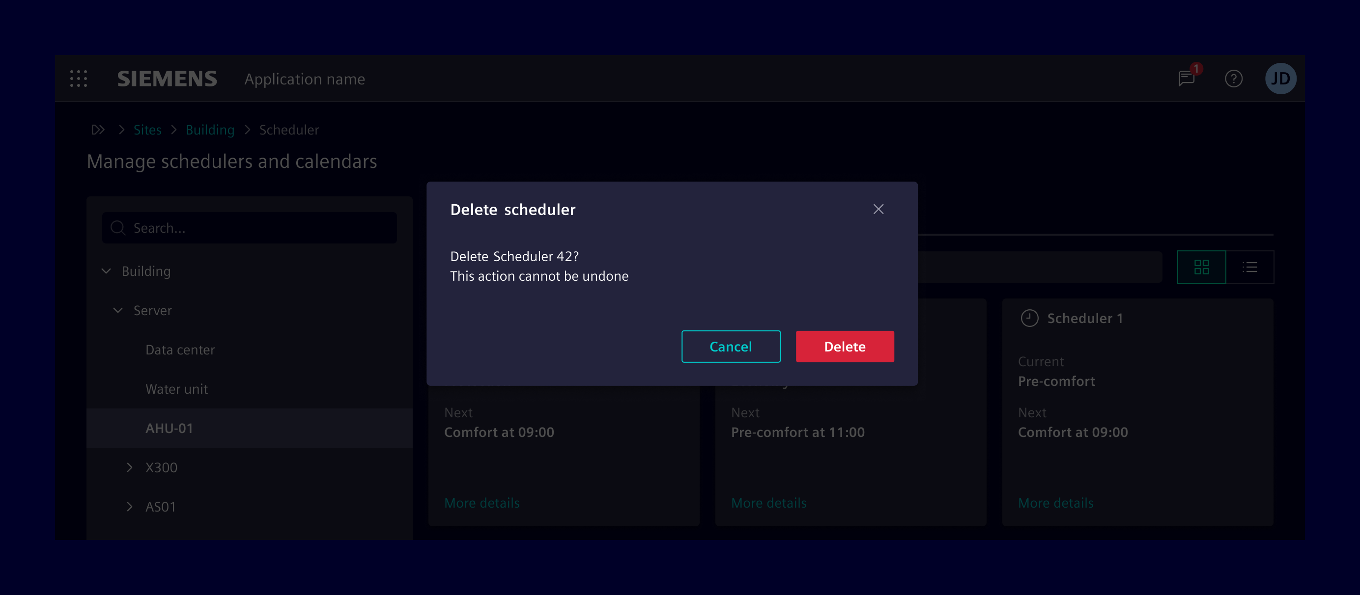
Modals are flexible dialog prompts which offer minimal required functionality and smart defaults. They block the parent window and force users to interact with the modal itself before allowing to continue the workflow.
Usage
When to use
- Use modals for guided interactions or showing additional details.
- Use it to interrupt a flow and to catch the user’s full attention.
- Use it to prompt a user to enter information crucial to continuing a process.
Best practices
- Use button texts which represent their intended action (e.g. use
Deleteinstead ofYeson a delete confirmation dialog). - Be mindful when to show the modal to avoid interrupting the user flow.
- Modals must always be used in combination with backdrop to provide visual focus on the active modal content.
- Don't use it for complex decision making that requires additional sources of information unavailable in the current context.
- Don't use it for nonessential information that is unrelated to the current user flow.
Design
Elements
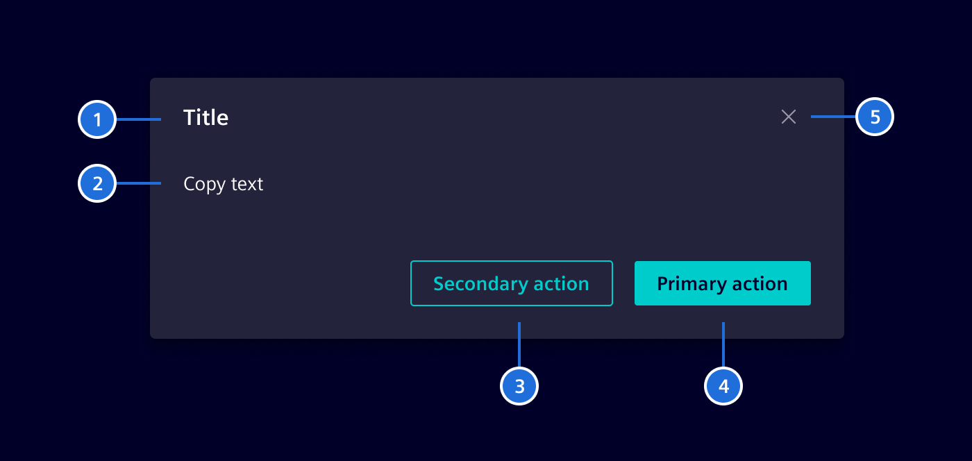
- Title, 2. Content, 3. Secondary action (optional), 4. Primary action, 5. Cancel
Common modal types
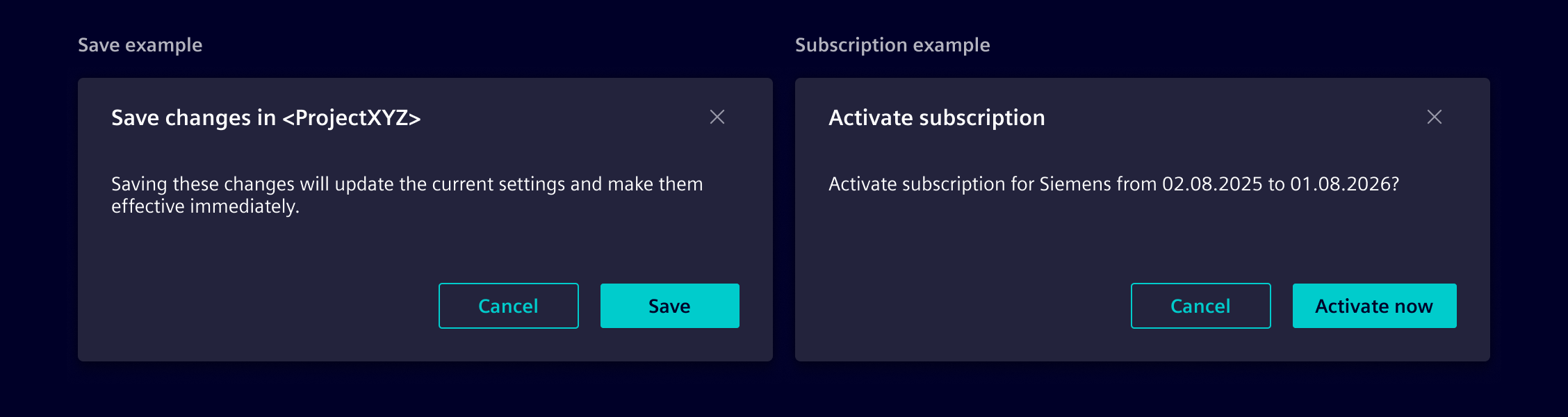
Modals serve various purposes depending on the scenario. Common examples include:
-
Transactional modals
Used to collect or confirm user inputs, such as completing a form or setting preferences. -
Confirmation modals
Ensure users explicitly approve an action, like saving or submitting data.
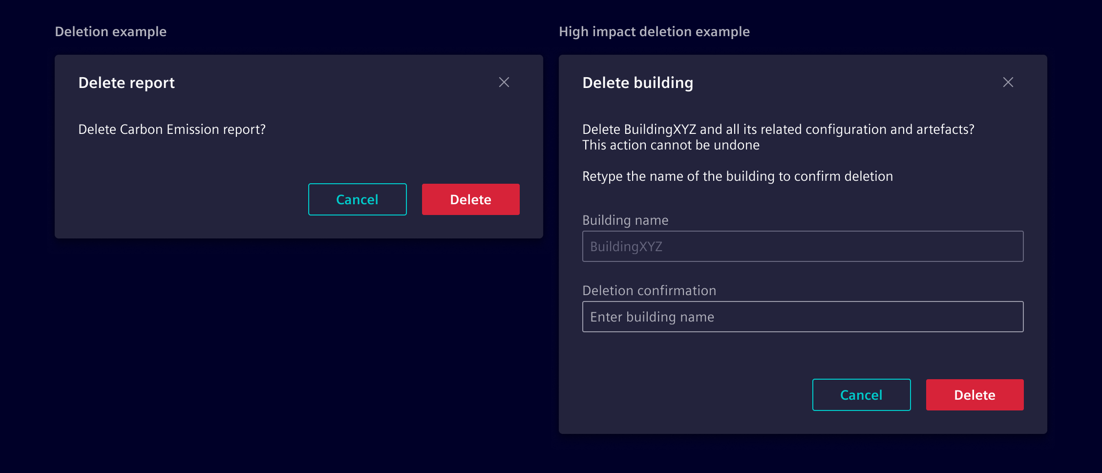
- Deletion modals
They are used when the action cannot be undone or the data is hard to recreate. For high-impact deletions (e.g., deleting a site with months of work), explicit confirmation is required, with safeguards like typing the object’s name or enforcing a 4-eyes principle. Low-impact deletions, where data is easy to recreate, don’t require a modal.
Code
Modals support various content structures, sizes, and behaviors to organize information effectively. Choose the appropriate pattern based on your workflow needs.
Below are examples of what’s supported. Consumers can display modals programmatically using the SiModalService or use predefined modal dialogs.
Generic modals
To display a modal dialog in any component, follow these steps:
- Import and inject the
SiModalServicein your component. - Use the
showmethod ofSiModalServiceto display the modal. This method takes either aTemplateRefor a component you want to display in the modal. - Pass configuration options like
classto customize sizing, scrolling, or positioning.
import { Component, inject, TemplateRef, viewChild } from '@angular/core';
import { ModalRef, SiModalService } from '@siemens/element-ng/modal';

@Component({
  template: `
    <button type="button" class="btn btn-secondary" (click)="openModal()">Open modal</button>

    <ng-template #sampleModal let-modalRef="modalRef">
      <div class="modal-header">
        <h4 class="modal-title" id="sample-modal-title">Modal title</h4>
        <button
          type="button"
          class="btn btn-circle btn-tertiary-ghost element-cancel"
          aria-label="Close modal"
          (click)="modalRef.hide('cancel')"
        ></button>
      </div>
      <div class="modal-body">
        <p>This is the modal body.</p>
      </div>
      <div class="modal-footer">
        <button type="button" class="btn btn-secondary" (click)="modalRef.hide('close')">
          Close
        </button>
        <button type="button" class="btn btn-primary" (click)="modalRef.hide('save')">
          Save
        </button>
      </div>
    </ng-template>
  `
})
export class SampleComponent {
  private modalService = inject(SiModalService);
  private modal = viewChild.required<TemplateRef<unknown>>('sampleModal');
  private modalRef?: ModalRef<unknown>;

  openModal(): void {
    this.modalRef = this.modalService.show(this.modal(), {
      class: 'modal-dialog-centered',
      ariaLabelledBy: 'sample-modal-title'
    });
  }
}
Modal content
When displaying modals with SiModalService, the outer dialog container, backdrop, and surface are automatically managed by the service. Consumers only need to structure the template or component content placed inside the dialog:
- Header (optional): Apply
.modal-headerfor the title bar containing.modal-title, an optional status icon, and a dismiss button - Body (required): Apply
.modal-bodyfor the main content area with standardized padding and spacing - Footer (optional): Apply
.modal-footerfor action buttons, right-aligned with standardized spacing
<ng-template #sampleModal let-modalRef="modalRef">
  <div class="modal-header">
    <h4 class="modal-title" id="sample-modal-title">Modal title</h4>
    <button
      type="button"
      class="btn btn-circle btn-tertiary-ghost element-cancel"
      aria-label="Close modal"
      (click)="modalRef.hide('cancel')"
    ></button>
  </div>
  <div class="modal-body">
    <p>Modal body content goes here.</p>
  </div>
  <div class="modal-footer">
    <button type="button" class="btn btn-secondary" (click)="modalRef.hide('close')">
      Close
    </button>
    <button type="button" class="btn btn-primary" (click)="modalRef.hide('save')">
      Save changes
    </button>
  </div>
</ng-template>
Available content classes:
| Class | Element | Purpose | Usage |
|---|---|---|---|
.modal-header | <div> | Header container | Top bar placing title, optional status icon, and dismiss button on opposite ends |
.modal-title | <h1> - <h6>, <span> | Primary heading | Heading for the modal dialog with standardized typography and line height |
.modal-body | <div> | Content area | Main container for dialog content, forms, and scrollable data |
.modal-footer | <div> | Action bar | Container for action buttons with right alignment and standardized spacing |
Best practices:
- Always associate
.modal-titlewith the dialog by settingariaLabelledByin modal options - Include a dismiss button in
.modal-headerwith an accessiblearia-label - If an icon is placed in
.modal-header, add the.iconclass to ensure standard sizing and margin before.modal-title - Place primary actions on the right and cancel or dismiss actions to the left in
.modal-footer
Modal sizes
Modals support several width options to accommodate different content requirements. By default, a modal dialog has a maximum width of 500px on viewports above the small (sm) breakpoint.
To change the width, pass a size modifier class in the class property of ModalOptions when calling SiModalService.show():
Available size classes:
| Class | Max width (sm and up) | Purpose | Usage |
|---|---|---|---|
.modal-sm | 300px | Small dialogs | Simple alerts, short prompts, or compact confirmation dialogs |
| (default) | 500px | Standard dialogs | General transactional tasks, settings, and standard confirmations |
.modal-lg | 800px | Large dialogs | Multi-step forms, complex inputs, or data tables with multiple cols |
.modal-xl | 1140px | Extra large dialogs | Data-heavy views, wizards, or advanced configuration panels |
.modal-fullscreen | 100vw / 100% | Fullscreen dialogs | Full-viewport coverage for immersive workflows or mobile layouts |
Responsive full-screen variants:
Responsive full-screen classes make the dialog full-screen only below a specific breakpoint, returning to standard dialog sizing on larger viewports:
| Class | Full-screen breakpoint |
|---|---|
.modal-fullscreen-sm-down | Full-screen below 576px (sm) |
.modal-fullscreen-md-down | Full-screen below 768px (md) |
.modal-fullscreen-lg-down | Full-screen below 992px (lg) |
.modal-fullscreen-xl-down | Full-screen below 1200px (xl) |
.modal-fullscreen-xxl-down | Full-screen below 1400px (xxl) |
this.modalService.show(template, {
  class: 'modal-lg'
});
Centered modals
By default, modals are aligned near the top of the viewport. Pass .modal-dialog-centered in the class property of ModalOptions to vertically center the modal in the viewport:
this.modalService.show(template, {
  class: 'modal-dialog-centered'
});
Scrollable modals
When modal content exceeds the viewport height, the default behavior scrolls the entire modal container. To keep the header and footer fixed in place while making only the body content scrollable, pass .modal-dialog-scrollable in the class property of ModalOptions.
This sets overflow-y: auto on .modal-body and limits the dialog height to the viewport, ensuring that dialog titles and action buttons remain visible at all times:
this.modalService.show(template, {
  class: 'modal-dialog-scrollable'
});
Combining modifier classes
Modifier classes can be combined as needed. For example, combine .modal-lg, .modal-dialog-centered, and .modal-dialog-scrollable for a large, vertically centered dialog with internal body scrolling:
this.modalService.show(template, {
  class: 'modal-lg modal-dialog-centered modal-dialog-scrollable'
});
Predefined modal dialogs
This section describes the general usage of the element modals.
Action dialog
Element provides the service SiActionDialogService. The service provides a method to display the modal dialogs for each dialog type. They offer mandatory and optional parameters to configure the dialogs and return an Observable with the user's result.
Alert dialog
Use the alert dialog to request the attention of the user to a certain event, which is so severe, that the normal use of the application is interrupted and the user needs to confirm to this alert. The result is just confirm, which indicates that the users took notice of the dialog.
Confirmation dialog
Use the confirmation dialog to request a yes-no or agree-disagree confirm-decline answer from the user. Default button labels are yes and no. Closing the dialog with the close button returns a decline.
Delete confirmation dialog
Use the delete confirmation dialog to request user confirmation before deleting any object.
Edit-discard dialog (unsaved data)
Use the edit-discard dialog when leaving or canceling a data form that was modified. User results are Save, Discard, or Cancel.
Save: User still wants to save the changes. Save them and navigate away.Discard: Discard the changes and navigate away.Cancel: User is unsure and cancel leaving the form. Close the dialog and let the user further edit the form.
Column selection dialog
Use the SiColumnSelectionDialogService if you need a dialog to configure the column setup of a table.
SiModalService API Documentation
Attributes and Methods
| Name | Type | Default | Description |
|---|---|---|---|
| show(...) ¶ | <T, CT: any> (content: (TemplateRef<any> | (args: any[]) => {}), config: ModalOptions<T>, closeValue: CT) => ModalRef<T, CT> | Shows a modal with the given content and configuration. Returns A reference to the modal. Parameters
|
SiActionDialogService API Documentation
The service provides convenient methods to show common modal dialogs. All return an observable, which emit the dialog results. After emitting, the observables complete. Therefore, clients do not need to unsubscribe.
Attributes and Methods
| Name | Type | Default | Description |
|---|---|---|---|
| showActionDialog(...) ¶ | <(T: ActionDialog)> (dialog: T, diOptions: ModalDependencyInjectionOptions) => Observable<ActionDialogReturnType<T>> | Shows an action dialog Returns Observable for the result of the dialog. Need to subscribe() to show the dialogParameters
|
SiColumnSelectionDialogService API Documentation
Attributes and Methods
| Name | Type | Default | Description |
|---|---|---|---|
| showColumnSelectionDialog(...) ¶ | (dialogConfig: SiColumnSelectionDialogConfig, diOptions: ModalDependencyInjectionOptions) => Observable<ColumnSelectionDialogResult> | Opens a column selection dialog. Despite other dialogs, this dialog informs the consumer not ONLY with clicking submit or cancel , but also with changing the place or visibility of a dialog row thanks to the instant type of emitted event.Parameters
|
Types Documentation
| Reference to a modal dialog | ||||||||||||
|---|---|---|---|---|---|---|---|---|---|---|---|---|
| ||||||||||||
| ||||||||||||
| ||||||||||||
|
| | ||||||||||||
|---|---|---|---|---|---|---|---|---|---|---|---|---|
|
| | ||||
|---|---|---|---|---|
|
| Returns the return value type for the given action dialog type |
|---|
| All possible action dialogs. |
|---|
| An action dialog showing an alert | ||||||||
|---|---|---|---|---|---|---|---|---|
|
| |
|---|
| An action dialog for a confirmation. | |||||||||
|---|---|---|---|---|---|---|---|---|---|
|
| |
|---|
| An action dialog for an edit/discard prompt. | |||||||||||||
|---|---|---|---|---|---|---|---|---|---|---|---|---|---|
|
| |
|---|
| An action dialog for a delete confirmation. | |||||||||
|---|---|---|---|---|---|---|---|---|---|
|
| |
|---|
| Represents a translatable string. This can either be a translation key, e.g. ACTIONS.EDIT that will be automatically translated when displayed on the UI or a pre-translated string, e.g. Edit . Equivalent to a normal string in usage and functionality. |
|---|
| | ||||
|---|---|---|---|---|
|
| | |||||||
|---|---|---|---|---|---|---|---|
|
| Emit type of dialog actions. ok : Emitted when user submits. cancel : Emitted when user clicks cancel. instant : Emitted when visibility or place of a row changes.instant type is used to reflect the ui changes real time even before closing the dialog. |
|---|
Except where otherwise noted, content on this site is licensed under MIT License.