List-Details
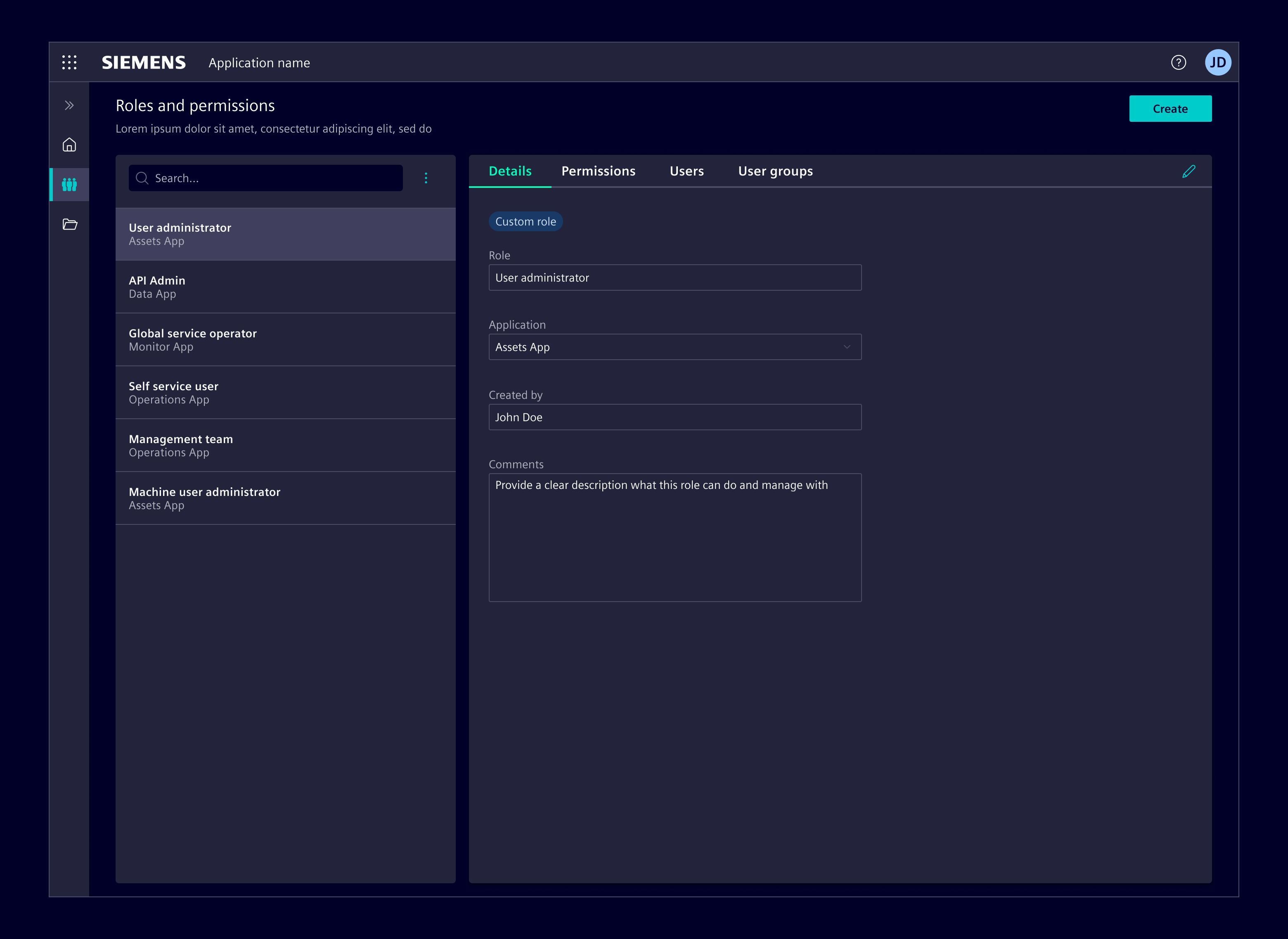
List-Details (formerly Main-detail container) is a layout pattern that shows a list of items and the corresponding details of the selected item. It allows users to stay focused on the main content (list) while accessing and editing related details without losing context.
Usage
Use this layout when viewing details from an item in a large list or group on the same page is required.
The content in the list pane such as list, data table or simple navigation is used to control the information shown in the details pane.
Selecting an item from the list pane opens the details pane. The user can select another item from the list pane to switch content of the details pane.
List-details layouts are optimized for wider screens, while also incorporating a responsive behavior to adapt to various screen sizes.
When to use
- For navigating through hierarchical data structures, making it easier for users to explore and understand content.
- When there's a need to navigate through large amounts of data or items but only focus on one item at a time.
- In scenarios where users might need to switch quickly between items without losing context.
Design
Elements
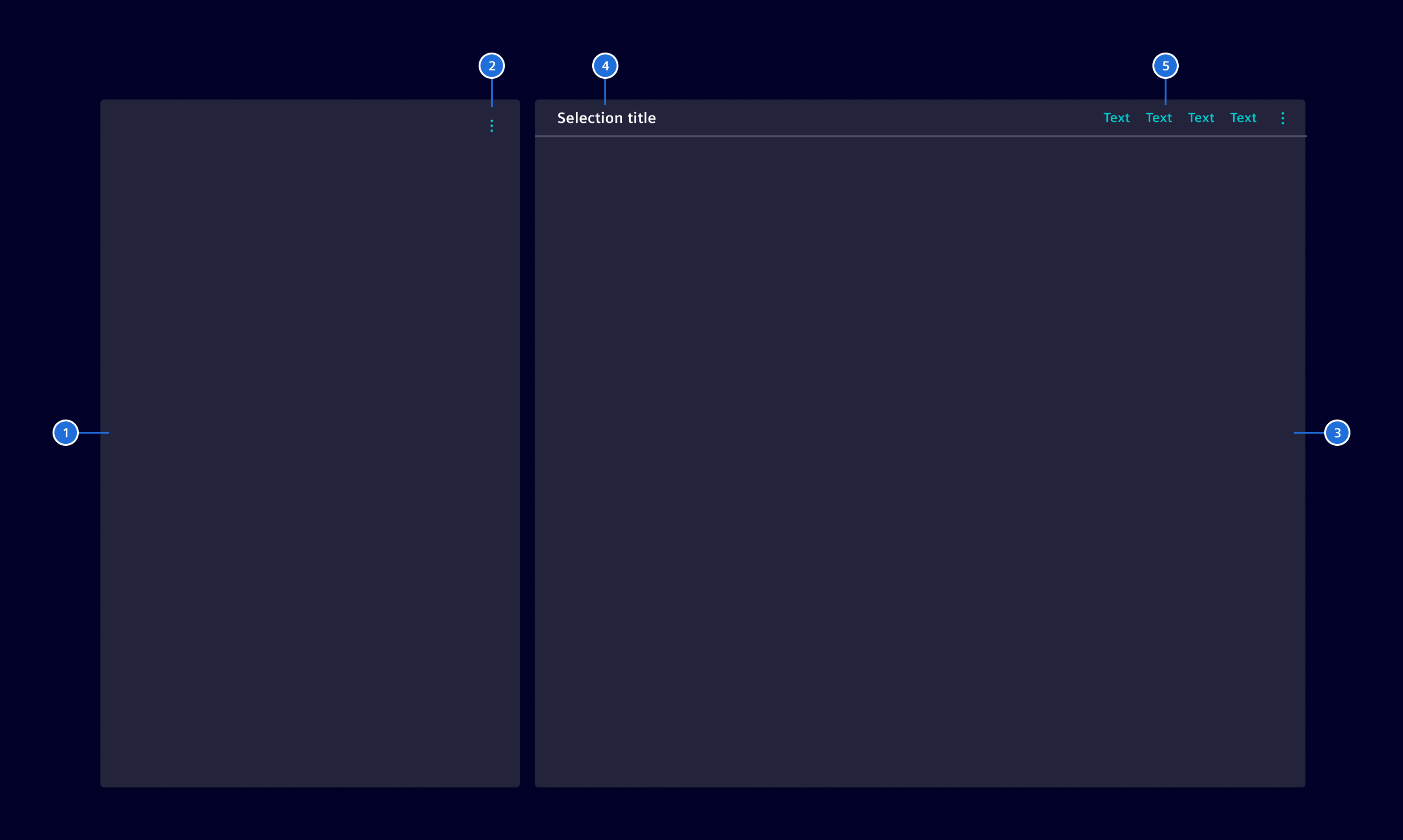
- List pane: Displays content types such as lists, tables or trees.
- List actions (optional): These are the functions that a user can perform within the list pane.
- Details pane: Displays information from the selected node, such as tables, forms or KPIs.
- Details title (optional): It provides context about the information displayed, e.g. name of the selected item
- Details actions (optional): Functions that can be performed within the details pane.
Resizing the panes
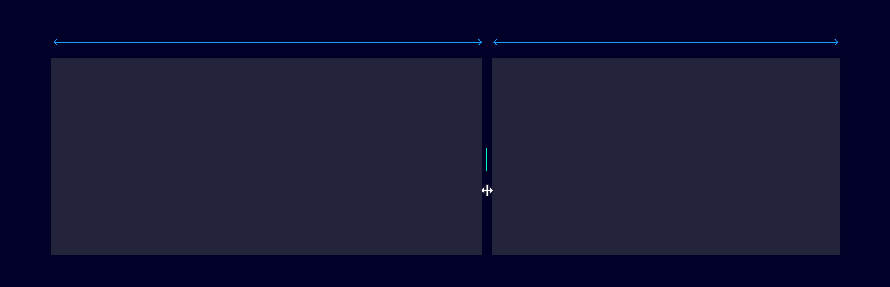
The two sections can be dynamically resizable: when users hover over the dividing area, the cursor turns into a double-sided arrow, allowing for size adjustments.
Edit mode
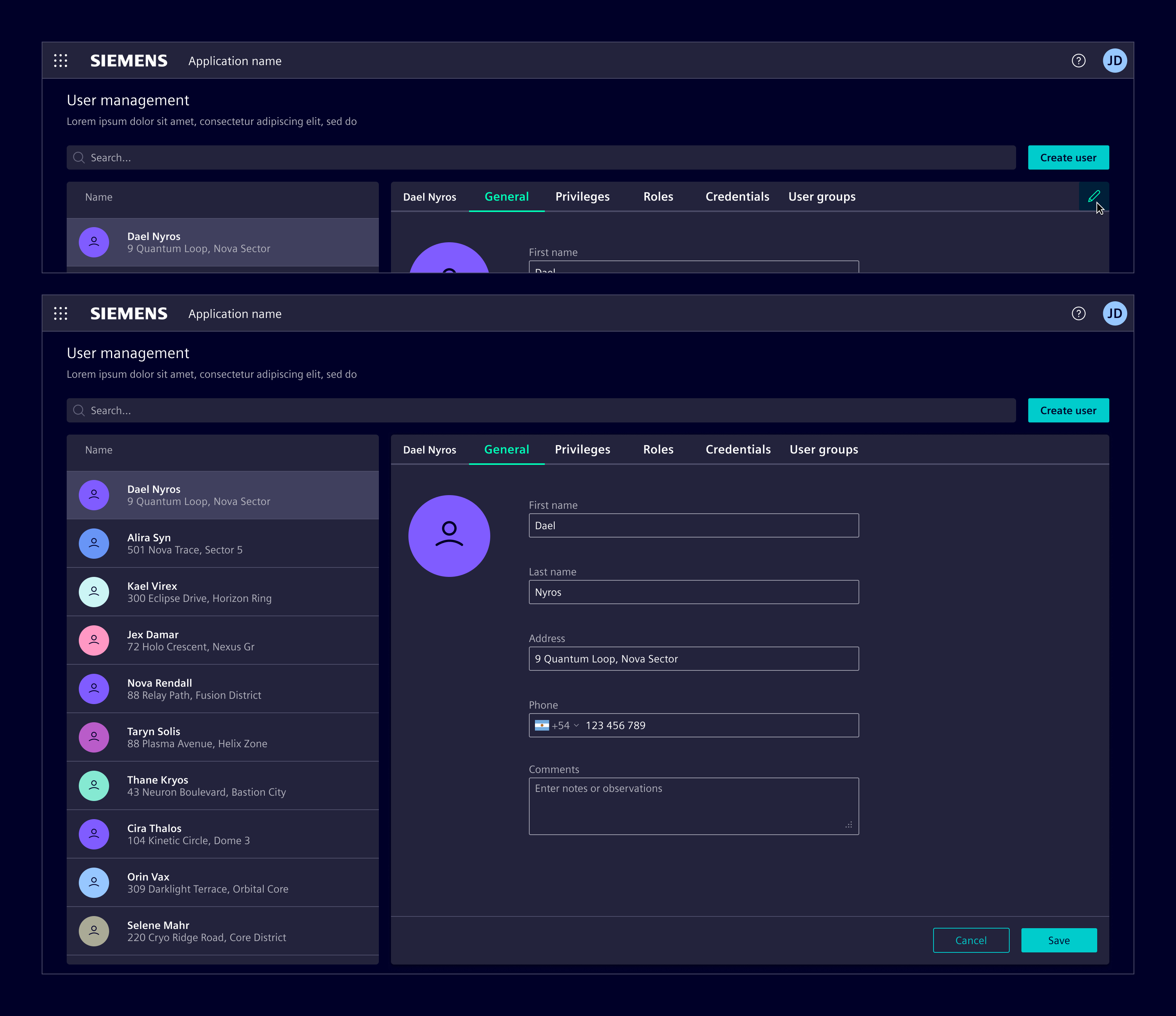
An 'Edit mode' can be optionally enabled in the details pane, allowing content modifications. When active, 'Save' and 'Cancel' actions are displayed in a footer.
The main content area is scrollable independently of the footer. This way, the footer remains visible and accessible even when the content overflows.
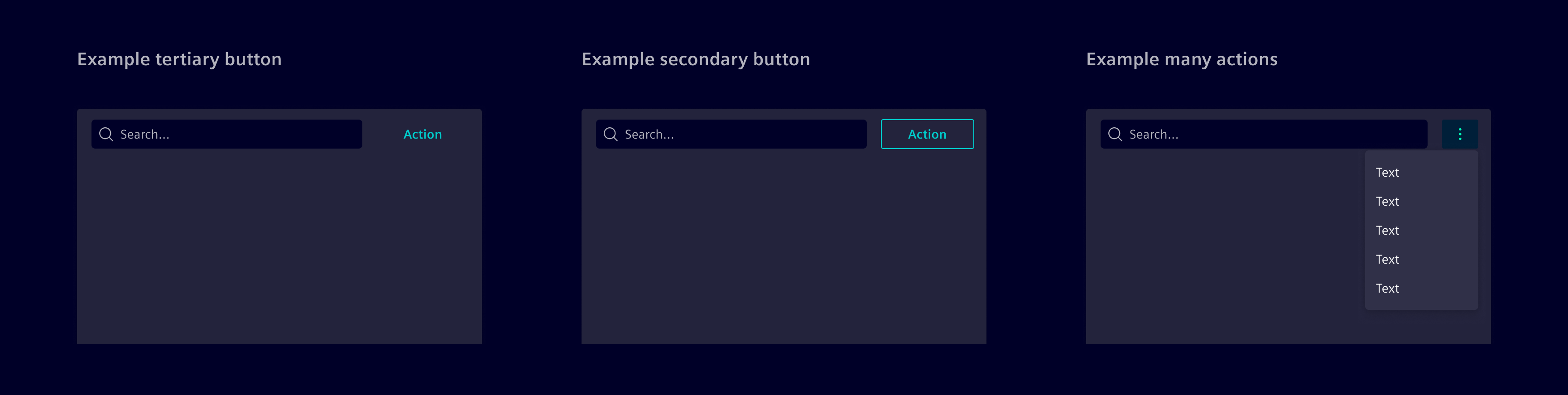
Search and actions in list
These actions are designed to manipulate data in the list pane.
They are context-specific, meaning they directly affect the item in the list pane. For example, a bulk action to "Update user permissions" to modify settings for multiple users at once, or "Adjust settings for multiple zones" enables uniform changes across different areas in a single step.
Any button type can be used as an action. However, if more than one action is needed, they should be collapsed over a menu, or reconsidered as global actions.
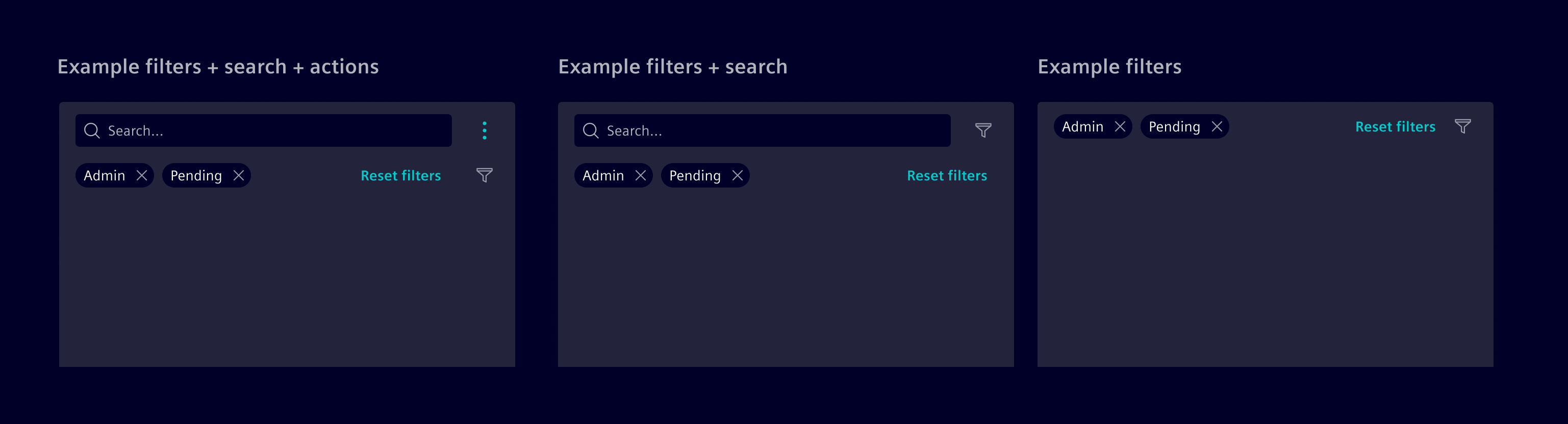
Filtering in the list
If filters are needed in the list, a filter button can be placed above the content. Applied filters can be represented with a filter bar.
If the action next to the search bar is used for another purpose, the filter button can be placed next to the applied filters.
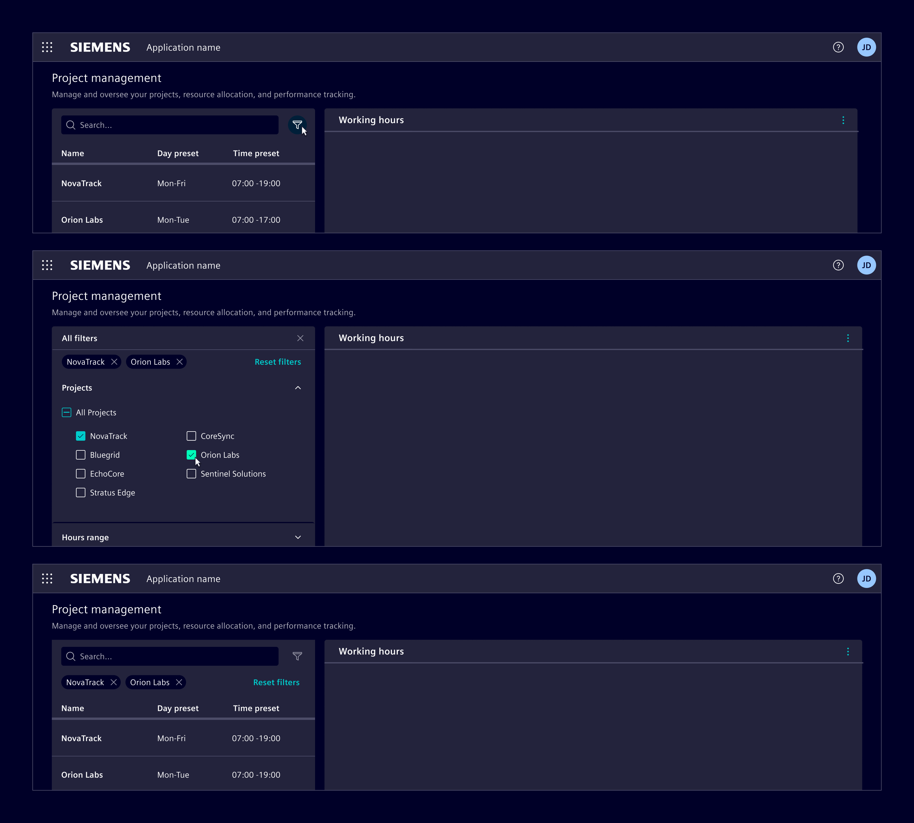
Filters in the list pane can overlay the content to show filtering options. When activated, a panel appears, allowing users to select criteria, and then retracts to update the displayed content based on the selected filters.
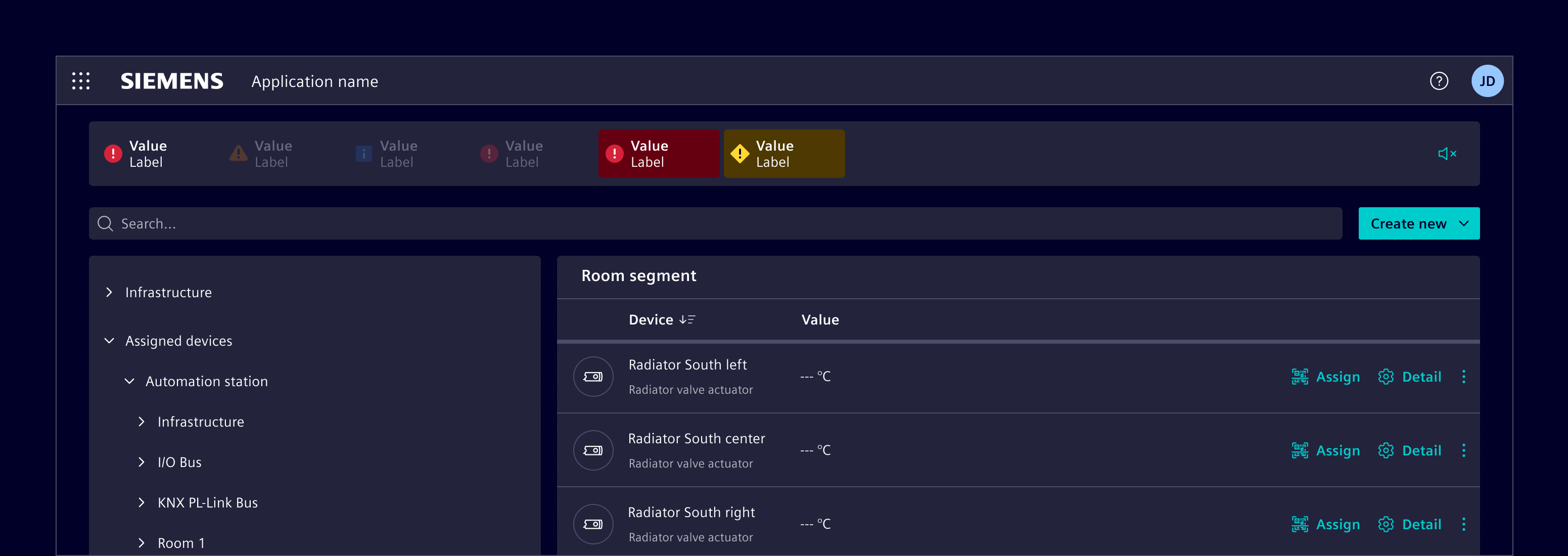
Global search and actions
Unlike the actions that are exclusive to the 'List' or 'Details', global actions transcend specific areas and provide functionality that is consistently relevant regardless of the user's current focus. E.g.: A 'Create' button that initiates the process to create a new entry to the list pane.
Bulk actions
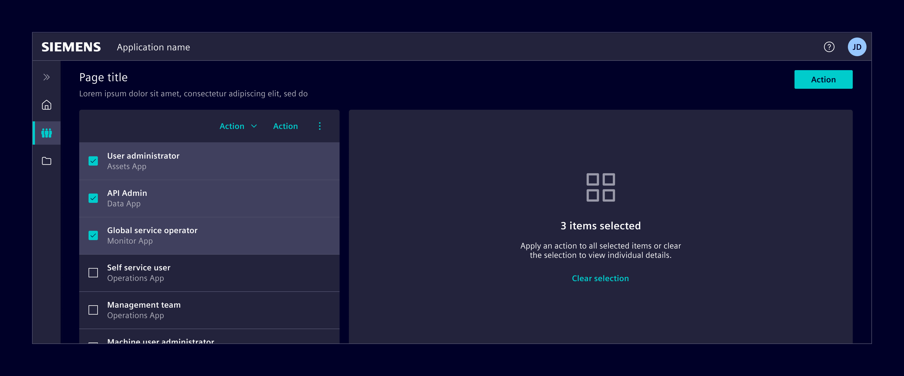
When multiple items can be selected, the details pane will display an empty state guiding users to either perform an action or clear the selection.
Initial interaction
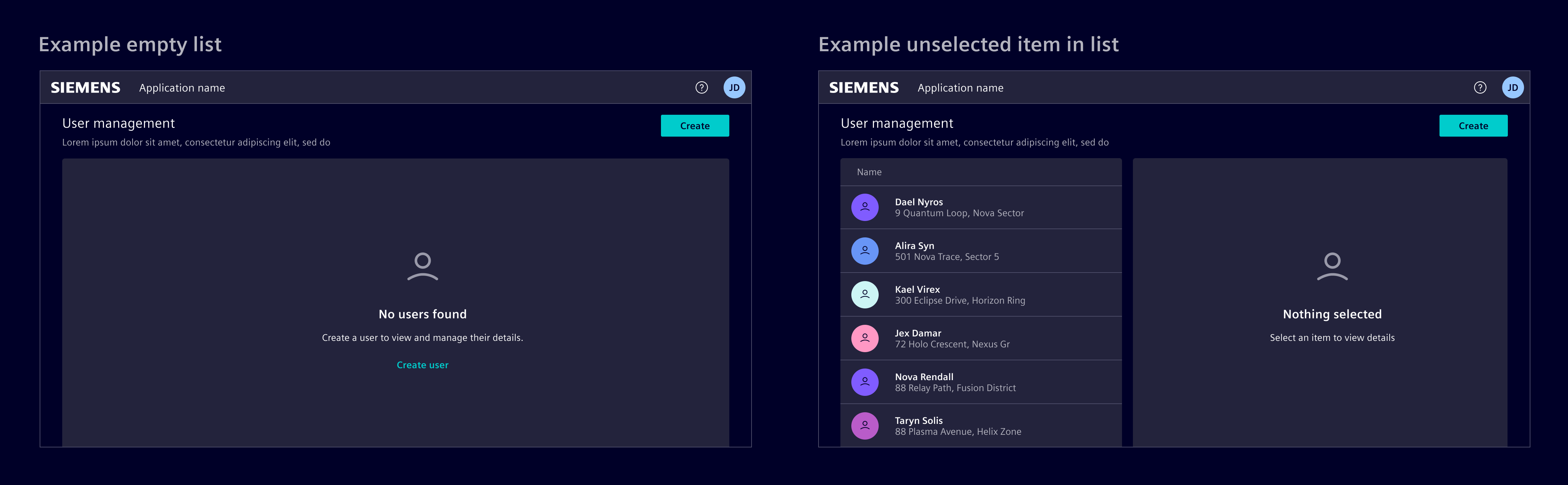
Consider the initial interaction: It can either feature a preselected item, displaying its details, or be user-initiated, where the details pane relists empty until an item is selected or created.
There can also be situations where the list pane itself is not populated until the user creates or adds an item.
In instances, where no data is immediately available, use an empty state to guide the user.
Responsive behavior
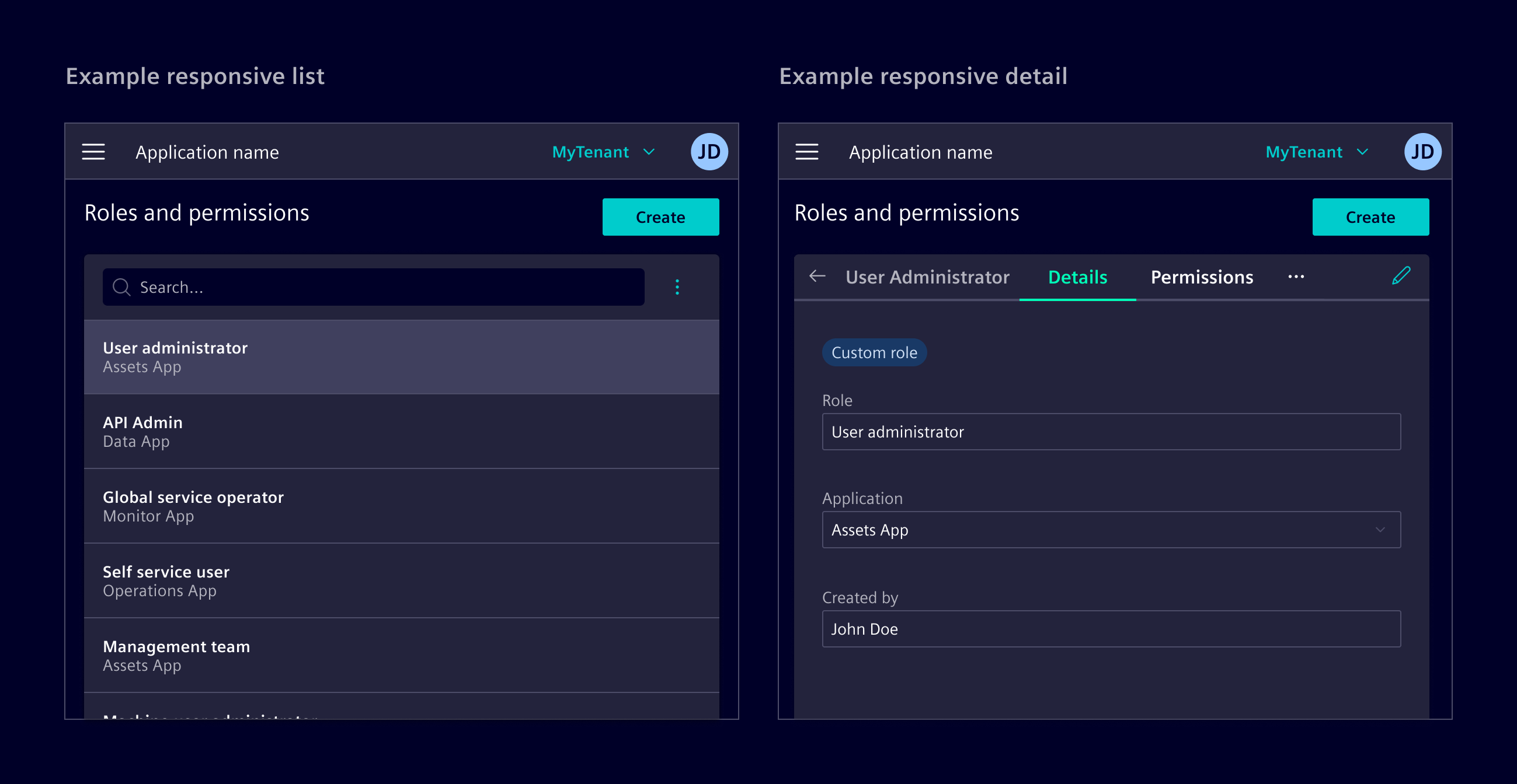
In responsive mode, the List-details splits into two screens: first displaying the main content, then the details of a selected node with a 'Back' button.
Code
Usage
import { SiListDetailsComponent } from '@siemens/element-ng/list-details';

@Component({
  imports: [SiListDetailsComponent, ...]
})
The <si-list-details> represents the layout used to organize the different elements. Inside it different child template components are used to assign the content to the correct position in the list-details layout and enable the correct responsive styling, the <si-list-pane> and <si-details-pane>.
Inside the <si-list-pane> the following child components can be used:
<si-list-pane-header>: Header of the list pane, typically containing search and actions.<si-list-pane-body>: Body of the list pane, typically containing the list or table.
Inside the <si-details-pane> the following child components can be used:
<si-details-pane-header>: Header of the details pane, typically containing the title and actions.<si-details-pane-body>: Body of the details pane, typically containing the details content.<si-details-pane-footer>: Footer of the details pane, typically containing save and cancel actions.
It is highly advised to use at least the <si-details-pane-header> to show the back button in a responsive (mobile) view.
When resizing is enabled, the underlying list split part uses the listWidthUnit input, while the details split part always uses unit="fr". The list pane uses unit="px" by default. Accordingly, listWidth defaults to 300 and represents pixels with the default configuration.
Use listWidthUnit="fr" to retain a relative split, where listWidth is the list pane's fractional weight. When resizing is disabled, listWidth continues to control the static layout as a percentage. For both resizable listWidthUnit="fr" and static layouts, values outside the inclusive range 0-100 use the standard 32/68 list/details split.
If the content may exceed the available space, the overflow-auto class should be applied to the body components or a child inside them.
In the standard layout, the card class should be applied to both the <si-list-pane> and <si-details-pane>, though it can also be moved to suite the design needs.
Default pixel sizing
SiListDetailsComponent API Documentation
si-list-detailsInput Properties
| Name | Type | Default | Description |
|---|---|---|---|
| detailsActive ¶ | boolean | false | Whether the details are currently active or not, mostly relevant in the responsive scenario when the viewport only shows either the list or the detail. |
| disableResizing ¶ | boolean | false | Whether the list and detail parts should be resizable by a splitter or not. This is only supported in the 'large' scenario (when hasLargeSize is true ). Default value is false . |
| expandBreakpoint ¶ | number | BOOTSTRAP_BREAKPOINTS.mdMinimum | A numeric value defining the minimum width in px, which the component needs to be displayed in its large layout. Whenever smaller than this threshold, the small layout will be used. Default is value is BOOTSTRAP_BREAKPOINTS.mdMinimum. |
| listWidth ¶ | number | 300 | The list pane size, updated when the split is resized or restored. With resizing enabled, the value uses listWidthUnit : pixels for px , or a percentage-based fractional weight for fr . With resizing disabled, the value is always interpreted as a percentage. Percentage values must be in the inclusive range 0-100; values outside this range fall back to a 32/68 list/details split. |
| listWidthUnit ¶ | SplitUnit | 'px' | Unit used for the list split part when resizing is enabled. |
| minDetailsSize ¶ | number | 300 | Sets the minimal width of the detail component in pixel. |
| minListSize ¶ | number | 300 | Sets the minimal width of the list component in pixel. |
| stateId ¶ | string | An optional stateId to uniquely identify a component instance. Required for persistence of ui state. |
Output Properties
| Name | Type | Description |
|---|---|---|
| detailsActiveChange ¶ | boolean | Whether the details are currently active or not, mostly relevant in the responsive scenario when the viewport only shows either the list or the detail. |
| listWidthChange ¶ | number | The list pane size, updated when the split is resized or restored. With resizing enabled, the value uses listWidthUnit : pixels for px , or a percentage-based fractional weight for fr . With resizing disabled, the value is always interpreted as a percentage. Percentage values must be in the inclusive range 0-100; values outside this range fall back to a 32/68 list/details split. |
Attributes and Methods
| Name | Type | Default | Description |
|---|---|---|---|
| (readonly) hasLargeSize ¶ | Signal<boolean> | ... |
SiListPaneComponent API Documentation
si-list-paneNo API to document for this.
SiListPaneHeaderComponent API Documentation
si-list-pane-headerNo API to document for this.
SiListPaneBodyComponent API Documentation
si-list-pane-bodyNo API to document for this.
SiDetailsPaneComponent API Documentation
si-details-paneNo API to document for this.
SiDetailsPaneHeaderComponent API Documentation
si-details-pane-headerInput Properties
| Name | Type | Default | Description |
|---|---|---|---|
| backButtonText ¶ | TranslatableString | $localize`:@@SI_LIST_DETAILS.BACK:Back` | Details back button text. Required for a11y. |
| backButtonUrl ¶ | string | '../' | The URL to navigate to when the back buttons is clicked. This is only used when the si-details-pane is used with a router-outlet. |
| hideBackButton ¶ | boolean | false | You can hide the back button in the mobile view by setting true. Required in add, edit workflows on mobile sizes. During add or edit, the back button should be hidden. Default value is false . |
| title ¶ | TranslatableString | Optional title to be displayed. |
SiDetailsPaneBodyComponent API Documentation
si-details-pane-bodyNo API to document for this.
SiDetailsPaneFooterComponent API Documentation
si-details-pane-footerNo API to document for this.
Types Documentation
|
|
| Represents a translatable string. This can either be a translation key, e.g. ACTIONS.EDIT that will be automatically translated when displayed on the UI or a pre-translated string, e.g. Edit . Equivalent to a normal string in usage and functionality. |
|---|
|
| ||||||||||||||||||||||||||||||||
| ||||||||||||||||||||||||||||||||
| ||||||||||||||||||||||||||||||||
|
| A service wrapping ResizeObserver . This is a service for those reasons: - only one ResizeObserver should be used for performance reason. - For Angular change detection to work, explicit ngZone calls are necessary - Observable stream | |||||||||||||||||||||||||||||||||||||||||||||||||||||||||||
|---|---|---|---|---|---|---|---|---|---|---|---|---|---|---|---|---|---|---|---|---|---|---|---|---|---|---|---|---|---|---|---|---|---|---|---|---|---|---|---|---|---|---|---|---|---|---|---|---|---|---|---|---|---|---|---|---|---|---|---|
| |||||||||||||||||||||||||||||||||||||||||||||||||||||||||||
| |||||||||||||||||||||||||||||||||||||||||||||||||||||||||||
|
Code (legacy)
Usage
import { SiMainDetailContainerComponent } from '@siemens/element-ng/main-detail-container';

@Component({
  imports: [SiMainDetailContainerComponent, ...]
})
The <si-main-detail-container> represents the layout container used to organize the different elements. The slot attribute on the child elements is used to assign them to the correct position in the list-details layout.
The slot attribute accepts one of the following values:
mainSearch: Search field for the main listmainActions: Content actions for the main listmainData: List/table to show the main datadetails: Details panedetailActions: Content actions for the details pane
When resizableParts is enabled, the main split part uses the mainContainerWidthUnit input (unit="px" by default), while the detail part always uses unit="fr". The mainContainerWidth value is interpreted using mainContainerWidthUnit; for example, 300 means 300px with the default configuration. Use mainContainerWidthUnit="fr" to retain a relative split, where mainContainerWidth is the main part's fractional weight.
When the component is not resizable, mainContainerWidth continues to be interpreted as a percentage for the static layout.
SiMainDetailContainerComponent API Documentation
si-main-detail-containerInput Properties
| Name | Type | Default | Description |
|---|---|---|---|
| containerClass ¶ | string | 'px-6 pt-6 px-md-9' | CSS class(es) applied to the outermost container. Per default, Bootstrap classes to handle responsive paddings are applied: px-6 pt-6 px-md-9 . |
| detailContainerClass ¶ | string | 'pb-6' | CSS class(es) applied to the detail container. In combination with containerClass , this allows for settings individual padding and margin values on the individual containers. |
| detailsActive ¶ | boolean | false | Whether the details are currently active or not, mostly relevant in the responsive scenario when the viewport only shows either the main or the detail. |
| detailsBackButtonText ¶ | TranslatableString | $localize`:@@SI_MAIN_DETAIL_CONTAINER.BACK:Back` | Details back button text. Required for a11y. |
| detailsHeading ¶ | TranslatableString | '' | The heading of the detail area. |
| heading ¶ | TranslatableString | '' | The heading of the main-detail layout component, usually a page heading. |
| hideBackButton ¶ | boolean | false | You can hide the back button in the mobile view by setting true. Required in add, edit workflows on mobile sizes. During add or edit, the back button should be hidden. Default value is false . |
| largeLayoutBreakpoint ¶ | number | BOOTSTRAP_BREAKPOINTS.mdMinimum | A numeric value defining the minimum width in px, which the container needs to be displayed in its large layout. Whenever smaller than this threshold, the small layout will be used. Default is value is BOOTSTRAP_BREAKPOINTS.mdMinimum. |
| mainContainerClass ¶ | string | 'pb-6' | CSS class(es) applied to the main container. In combination with containerClass , this allows for settings individual padding and margin values on the individual containers. |
| mainContainerWidth ¶ | (number | "default") | 'default' | The size of the main container. When resizableParts is enabled, the value is interpreted using mainContainerWidthUnit and updates as the splitter is moved. With mainContainerWidthUnit="fr" , numeric values must be from 0 to 100 (inclusive). The main and detail fractional weights are the value and 100 - value ; out-of-range values fall back to 32 and 68 . In the static layout, numeric values represent a percentage from 0 to 100 (inclusive); out-of-range values leave both containers without max-size constraints. Pixel widths are not limited to the 0 to 100 range.With 'default' , resizable pixel layouts use minMainSize , resizable fractional layouts use main and detail weights of 32 and 68 , and static layouts use 50% . |
| mainContainerWidthUnit ¶ | SplitUnit | 'px' | Unit used for the main split part when resizableParts is enabled. |
| minDetailSize ¶ | number | 300 | Sets the minimal width of the detail container in pixel. |
| minMainSize ¶ | number | 300 | Sets the minimal width of the main container in pixel. |
| resizableParts ¶ | boolean | false | Whether the main and detail parts should be resizable by a splitter or not. This is only supported in the 'large' scenario (when hasLargeSize is true ). Default value is false . |
| stateId ¶ | string | An optional stateId to uniquely identify a component instance. Required for persistence of ui state. | |
| truncateHeading ¶ | boolean | false | Whether the heading should be truncated (single line) or not. Default value is false . |
Output Properties
| Name | Type | Description |
|---|---|---|
| detailsActiveChange ¶ | boolean | Whether the details are currently active or not, mostly relevant in the responsive scenario when the viewport only shows either the main or the detail. |
| hasLargeSizeChange ¶ | boolean | Emits whether the components size is large enough to display main and details views next to each other or not. |
| mainContainerWidthChange ¶ | (number | "default") | The size of the main container. When resizableParts is enabled, the value is interpreted using mainContainerWidthUnit and updates as the splitter is moved. With mainContainerWidthUnit="fr" , numeric values must be from 0 to 100 (inclusive). The main and detail fractional weights are the value and 100 - value ; out-of-range values fall back to 32 and 68 . In the static layout, numeric values represent a percentage from 0 to 100 (inclusive); out-of-range values leave both containers without max-size constraints. Pixel widths are not limited to the 0 to 100 range.With 'default' , resizable pixel layouts use minMainSize , resizable fractional layouts use main and detail weights of 32 and 68 , and static layouts use 50% . |
Attributes and Methods
| Name | Type | Default | Description |
|---|---|---|---|
| hasLargeSize ¶ | boolean | Whether the main-detail layout component has a large size or not, true if the container´s width matches or exceeds the largeLayoutBreakpoint . |
Except where otherwise noted, content on this site is licensed under MIT License.