Skip to content

Launchpad

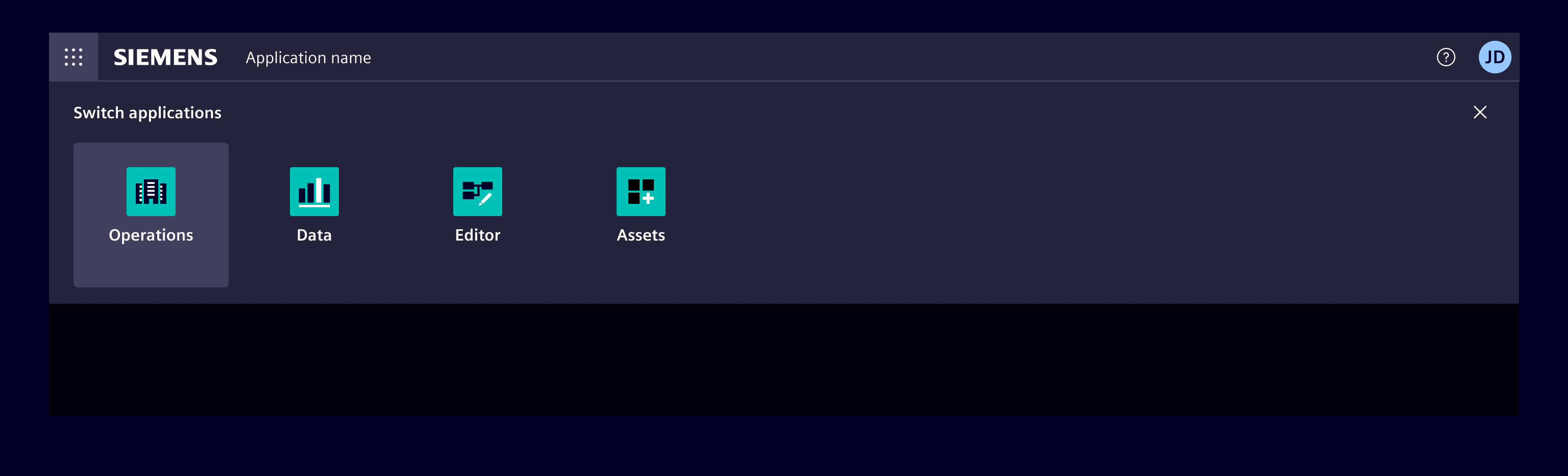
The launchpad provides a way for the user to easily navigate between applications.

Usage

Launchpad

When to use

  • Use a launchpad to give the user the possibility to launch apps or switch between apps easily within one application.

Best practices

  • If there are a lot of apps, it's recommended for this component to include recently used apps, frequently used apps.
  • If the list is a manageable size, include all apps or products available on the system.
  • Allow users to manage the applications.
  • Only use the launchpad for more than two apps.

Design

Elements

Launchpad

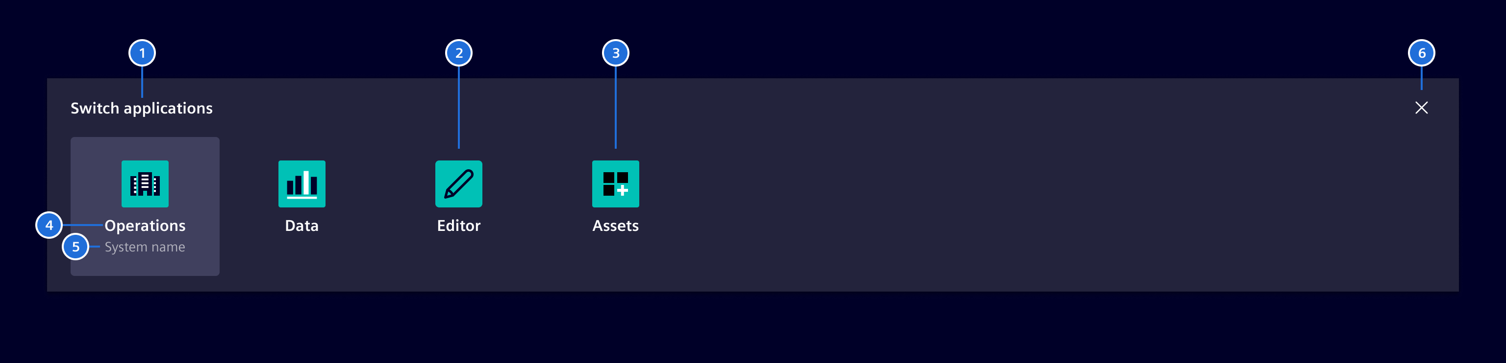
  1. Title, 2. App with icon, 3. App with logo, 4. App name, 5. System name (optional), 6. Close

The app is represented by the app logo or alternatively by an icon.

States

Launchpad

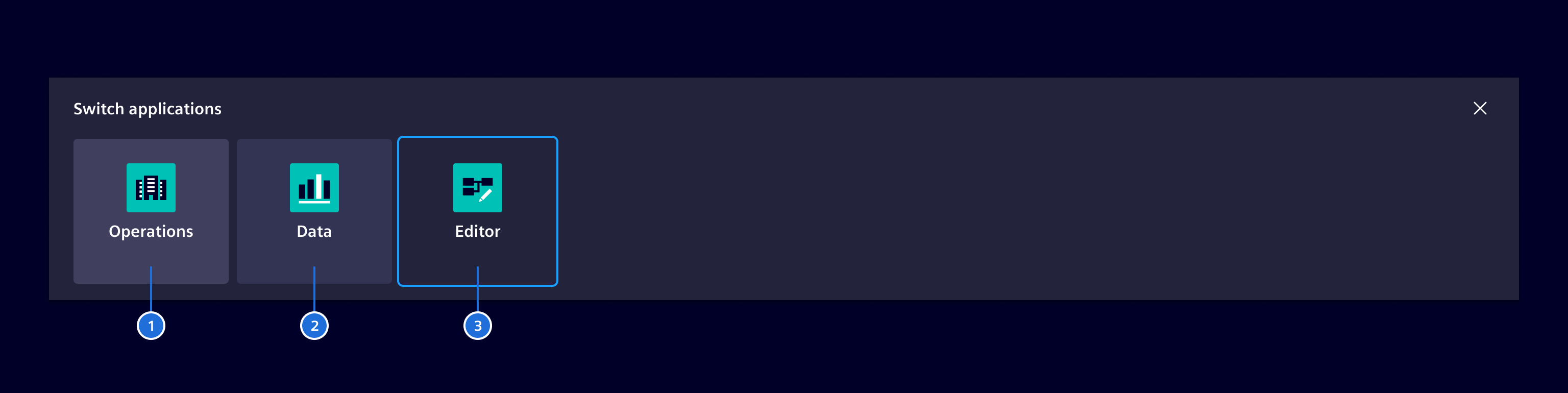
  1. Current app, 2. Hover state, 3. Focused

Categories (optional)

Launchpad categories

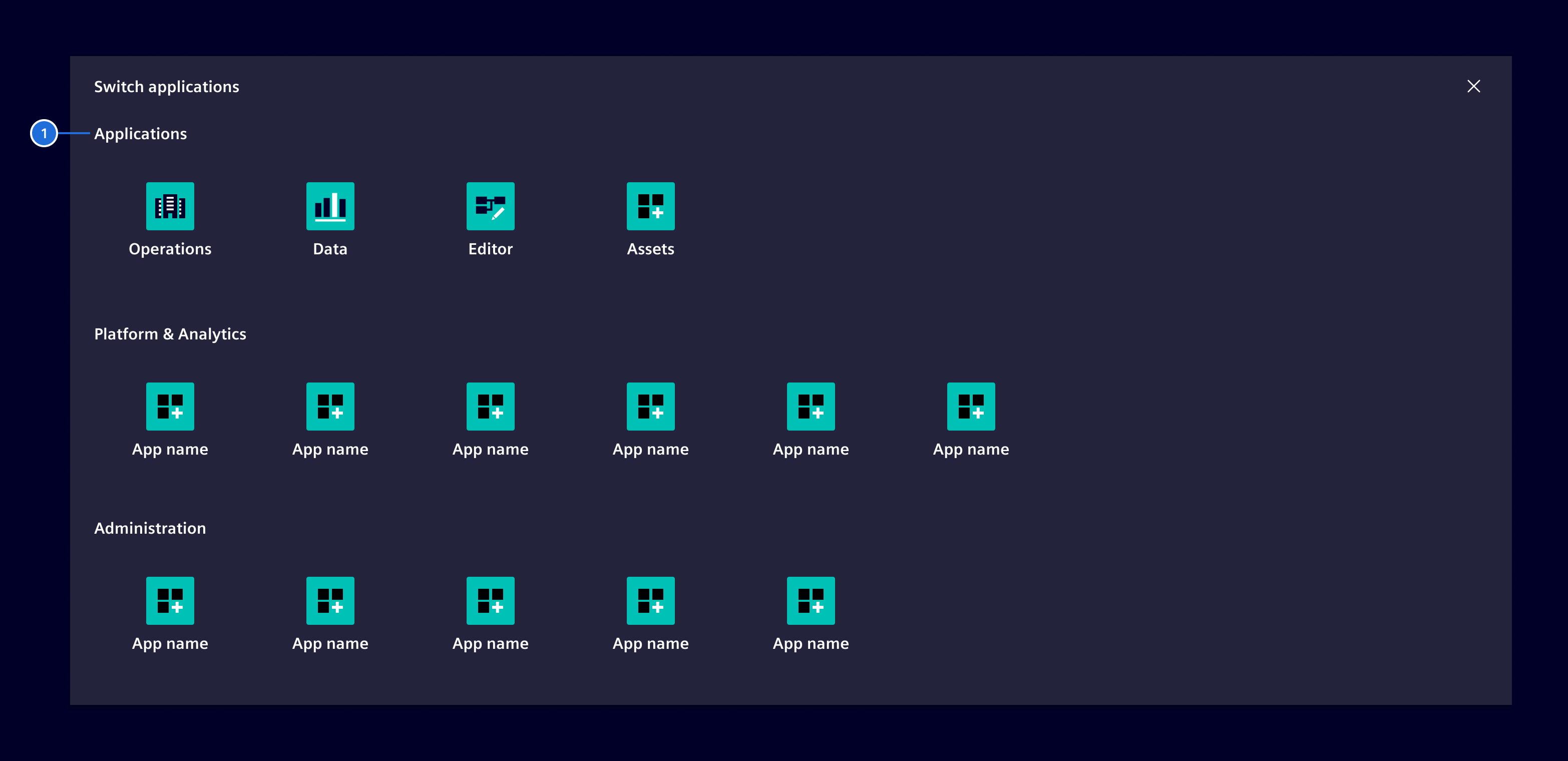
  1. Category title

If there is a large number of applications it is possible to organize and group them for a better overview. Apps should be grouped in a logical and meaningful way.

Favorites (optional)

Launchpad favorites

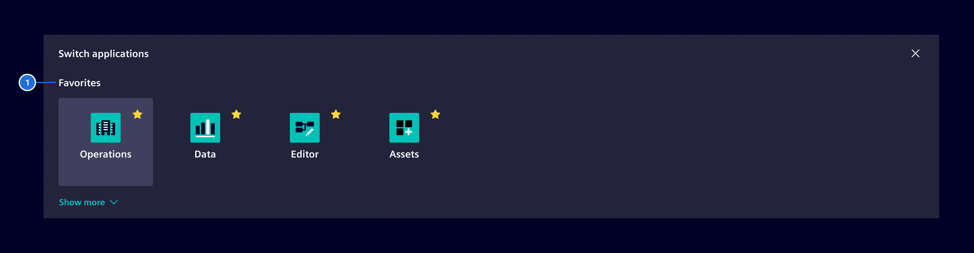
For a better overview, the concept of favorites allows the user to only show the most important apps at a glance and to hide less frequent used ones.
Launchpad favorites expanded

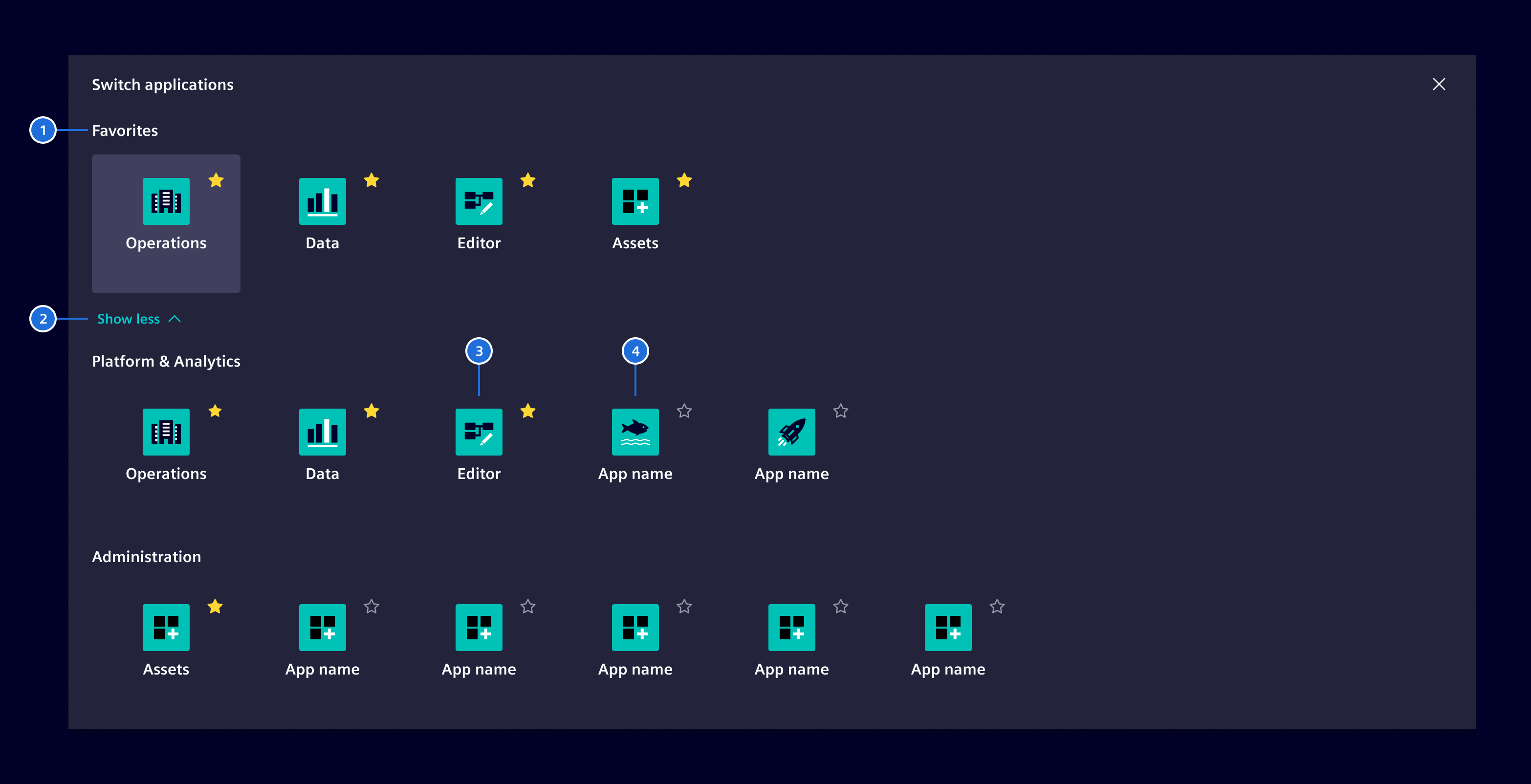
  1. Title, 2. Expand/Collapse-toggle, 3. Favorite app, 4. Standard app

In the expanded view, the user can click on the star-icon to mark the app as a favorite one. The app will then be part of the favorite apps category. To unstar an app the user simply clicks on the star-icon again.

Both concepts of Categories and Favorites can be mixed if necessary.

Open app in separate tab (optional)

Launchpad external app

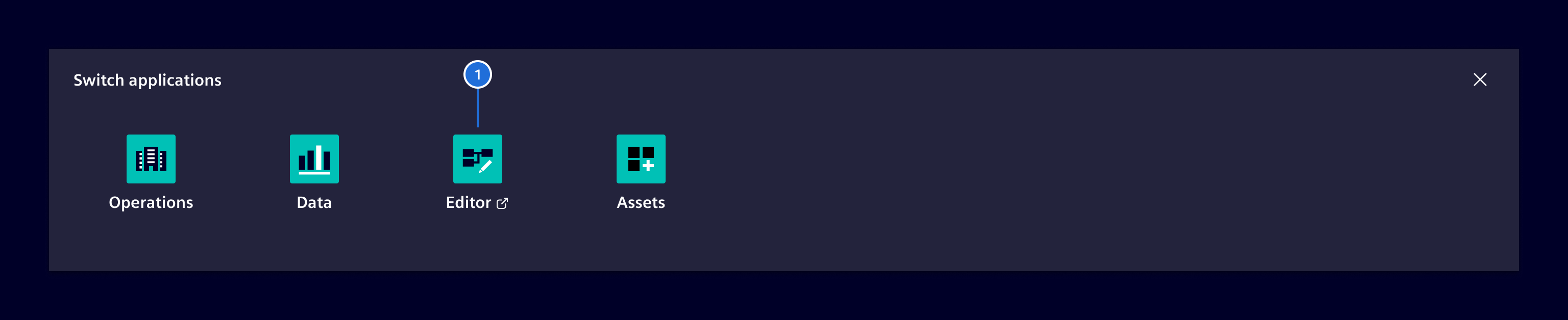
  1. Open app in separate tab

Apps opening in a separate tab must be marked by an additional element-export icon. The original tab remains open to allow a fast and easy return to the current app.

Responsive behavior

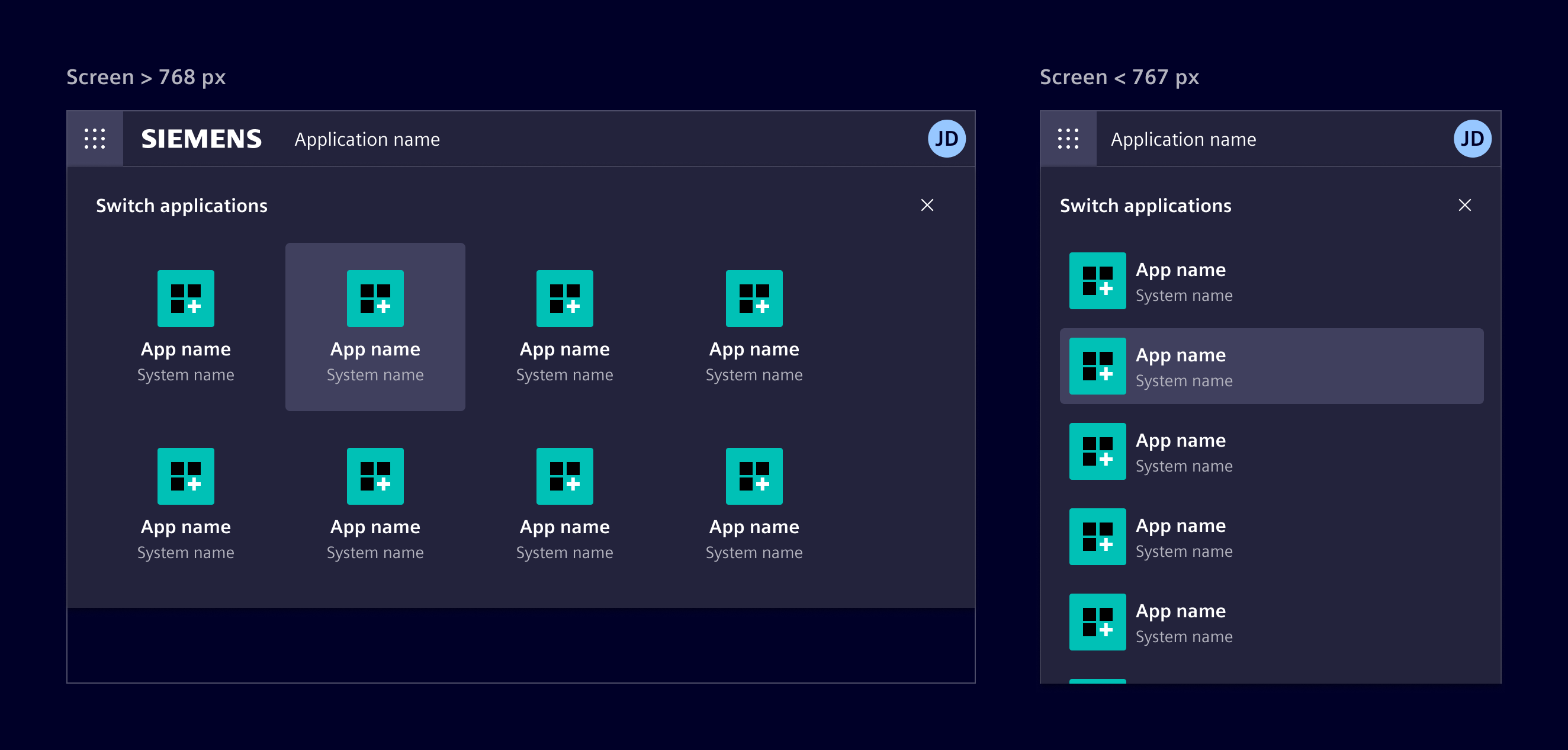
By decreasing the viewport size the apps within the launchpad will be stacked. For screen sizes <768px (sm and xs), the layout switches to a vertical list.
Launchpad responsive

Code

The launchpad (si-launchpad-factory) ist part of the application header.

Wrap it inside a ng-template and provide the template to the si-application-header component.

<si-application-header [launchpad]="launchpad"> ... </si-application-header>

<ng-template #launchpad>
  <si-launchpad-factory [apps]="myAppsOrCategories" />
</ng-template>

Example

SiLaunchpadFactoryComponent API Documentation

selector
si-launchpad-factory

Input Properties

Name Type Default Description
apps
Required
(App[] | AppCategory[]) All app items shown in the launchpad.
closeText
TranslatableString $localize`:@@SI_LAUNCHPAD.CLOSE:Close launchpad` Text to close the launchpad. Needed for a11y.
enableFavorites
boolean false Allow the user to select favorite apps which will then be displayed at the top.
favoriteAppsText
TranslatableString $localize`:@@SI_LAUNCHPAD.FAVORITE_APPS:Favorites` Title of the favorite apps section.
showMoreAppsText
TranslatableString $localize`:@@SI_LAUNCHPAD.SHOW_MORE:Show more` Title of the show more apps button.
subtitleText
TranslatableString Subtitle of the launchpad. When not provided, no subtitle is displayed.
titleText
TranslatableString $localize`:@@SI_LAUNCHPAD.TITLE:Switch app` Title of the launchpad.
showLessAppsText
Deprecated
unknown Deprecated: This input no longer has an effect. showMoreAppsText is shown in all cases.

Output Properties

Name Type Description
favoriteChange
FavoriteChangeEvent

Types Documentation

Represents a categories in the launchpad.
Properties
The apps to show under this category.
apps: App[]
The name of the app category.
name?: TranslatableString
Represents a translatable string. This can either be a translation key, e.g. ACTIONS.EDIT that will be automatically translated when displayed on the UI or a pre-translated string, e.g. Edit . Equivalent to a normal string in usage and functionality.
Properties
app: App
favorite: boolean
Properties
Whether the app should be marked as external.
external?: boolean
Whether the app is marked as favorite.
favorite?: boolean
CSS class to apply, which should render the icon. Typically, "element-*".
iconClass?: string
Icon of the app.
iconUrl?: string
Name of the app
name: TranslatableString
Name of the related system.
systemName?: TranslatableString
Properties
Whether the dropdown should be opened inline.
inlineDropdown: Signal<boolean>
The position of the dropdown if opened in an overlay.
overlayPosition?: ConnectedPosition[]
Methods
Called whenever a dropdown is close *
Parameters
trigger: SiHeaderDropdownTriggerDirective
Called whenever a dropdown is opened *
Parameters
trigger: SiHeaderDropdownTriggerDirective
Called whenever an item is triggered that is not opening another dropdown.
onDropdownItemTriggered: () => void
Root component for the application header.
Constructor
() => {}
Properties
breakpointObserver: BreakpointObserver = ...
closeMobileMenus: Subject<void> = ...
closeMobileSub: Subscription = ...
Defines the minimum breakpoint which must be matched to expand the header / switch to desktop mode.
expandBreakpoint: InputSignal<("never" | "sm" | "md" | "lg" | "xl" | "xxl")> = 'sm'
focusTrap: Signal<CdkTrapFocus> = ...
hasNavigation: WritableSignal<boolean> = ...
icons: Record<("elementThumbnails" | "elementMenu"), string> = ...
id: string = ...
injector: Injector = ...
inlineDropdown: Signal<boolean> implements inlineDropdown = ...
Template reference for the launchpad content rendered inside the header.
launchpad: InputSignal<(TemplateRef<void> | undefined)> = ...
Accessible label for the launchpad toggle button.
launchpadLabel: InputSignal<TranslatableString> = $localize`:@@SI_APPLICATION_HEADER.LAUNCHPAD:Launchpad`
launchpadOpen: WritableSignal<boolean> = ...
mobileNavigationExpanded: WritableSignal<boolean> = ...
navigationToggle: Signal<(ElementRef<HTMLDivElement> | undefined)> = ...
openDropdown?: SiHeaderDropdownTriggerDirective
openDropdownCount: WritableSignal<number> = ...
toggleNavigation: TranslatableString = ...
idCounter: number = 0
Methods
backdropClicked: () => void
closeLaunchpad: () => void
closeMobileNavigation: () => void
Parameters
trigger?: SiHeaderDropdownTriggerDirective
Parameters
trigger?: SiHeaderDropdownTriggerDirective
navigationEscapePressed: () => void
A callback method that performs custom clean-up, invoked immediately before a directive, pipe, or service instance is destroyed.
ngOnDestroy: () => void from OnDestroy.ngOnDestroy
onDropdownItemTriggered: () => void from onDropdownItemTriggered
openLaunchpad: () => void
openMobileNavigation: () => void
toggleLaunchpad: () => void
toggleMobileNavigationExpanded: () => void
Directive for trapping focus within a region.
Constructor
() => {}
Properties
_captureFocus: any
_elementRef: any
_focusTrapFactory: any
Previously focused element to restore focus to upon destroy when using autoCapture.
_previouslyFocusedElement: any
Whether the directive should automatically move focus into the trapped region upon initialization and return focus to the previous activeElement upon destruction.
autoCapture: boolean
Underlying FocusTrap instance.
focusTrap: FocusTrap
ngAcceptInputType_autoCapture: unknown
ngAcceptInputType_enabled: unknown
Accessors
Whether the focus trap is active.
get enabled: boolean
set enabled: (value: boolean)
Methods
A callback method that is invoked immediately after Angular has completed initialization of all of the directive's content. It is invoked only once when the directive is instantiated.
ngAfterContentInit: () => void from AfterContentInit.ngAfterContentInit
A callback method that performs change-detection, invoked after the default change-detector has checked the directive's input bindings in the parent template. See KeyValueDiffers and IterableDiffers for implementing custom change checking for collections.
ngDoCheck: () => void from DoCheck.ngDoCheck
(changes: { autoCapture: SimpleChange<boolean>, enabled: SimpleChange<boolean>, focusTrap: SimpleChange<FocusTrap>, ngAfterContentInit: SimpleChange<() => void>, ngDoCheck: SimpleChange<() => void>, ngOnChanges: SimpleChange<(changes: { focusTrap?: SimpleChange<FocusTrap> | undefined; enabled?: SimpleChange<boolean> | undefined; autoCapture?: SimpleChange<boolean> | undefined; ngOnDestroy?: SimpleChange<...> | undefined; ngAfterContentInit?: SimpleChange<...> | undefined; ngDoCheck?: SimpleChange<...> | undefined; ngOnChanges?: SimpleChange<...> ...) => void>, ngOnDestroy: SimpleChange<() => void> }) => void from OnChanges.ngOnChanges
A callback method that is invoked immediately after the default change detector has checked data-bound properties if at least one has changed, and before the view and content children are checked.
Parameters
The changed properties.
changes: { autoCapture: SimpleChange<boolean>, enabled: SimpleChange<boolean>, focusTrap: SimpleChange<FocusTrap>, ngAfterContentInit: SimpleChange<() => void>, ngDoCheck: SimpleChange<() => void>, ngOnChanges: SimpleChange<(changes: { focusTrap?: SimpleChange<FocusTrap> | undefined; enabled?: SimpleChange<boolean> | undefined; autoCapture?: SimpleChange<boolean> | undefined; ngOnDestroy?: SimpleChange<...> | undefined; ngAfterContentInit?: SimpleChange<...> | undefined; ngDoCheck?: SimpleChange<...> | undefined; ngOnChanges?: SimpleChange<...> ...) => void>, ngOnDestroy: SimpleChange<() => void> }
A callback method that performs custom clean-up, invoked immediately before a directive, pipe, or service instance is destroyed.
ngOnDestroy: () => void from OnDestroy.ngOnDestroy
Trigger to open dropdowns in a navbar. A dropdown will always be attached to the view, even if not visible.

If a dropdown is opened in desktop mode, it will be reattached to an overlay while being opened.
Constructor
() => {}
Properties
_isOpen: boolean = false
ariaControls: string = ...
destroying: boolean = false
Template rendered inside the dropdown.
dropdown: InputSignal<TemplateRef<unknown>> = ...
dropdownClose: Subject<void> = ...
Context data passed to the dropdown template.
dropdownData: InputSignal<unknown> = ...
elementRef: ElementRef<HTMLElement> = ...
headerAnchorComponentRef?: ComponentRef<SiHeaderAnchorComponent>
id: string = ...
injector: DestroyableInjector = ...
Whether the dropdown is opened inline (mobile) instead of in an overlay (desktop). Inline dropdowns are simple disclosure groups, while overlay dropdowns are dialogs.
inline: Signal<boolean> = ...
level: number = ...
navbar: (HeaderWithDropdowns | null) = ...
Emits whenever a dropdown is opened or closed.
openChange: OutputEmitterRef<boolean> = ...
Child triggers will set themselves here if they are open.
openSubmenu?: SiHeaderDropdownTriggerDirective
overlay: Overlay = ...
overlayRef?: OverlayRef
parent: (SiHeaderDropdownTriggerDirective | null) = ...
portal?: TemplatePortal<unknown>
viewContainerRef: ViewContainerRef = ...
viewRef?: EmbeddedViewRef<unknown>
idCounter: number = 0
Accessors
Whether the dropdown is currently open.
get isOpen: boolean
get isOverlay: boolean
Methods
attachDropdownInline: () => void
attachDropdownOverlay: () => void
click: () => void
(options: { all: boolean }) => void
Closes the dropdown.
Parameters
options?: { all: boolean }
A callback method that is invoked immediately after the default change detector has checked data-bound properties if at least one has changed, and before the view and content children are checked.
ngOnChanges: () => void from OnChanges.ngOnChanges
A callback method that performs custom clean-up, invoked immediately before a directive, pipe, or service instance is destroyed.
ngOnDestroy: () => void from OnDestroy.ngOnDestroy
A callback method that is invoked immediately after the default change detector has checked the directive's data-bound properties for the first time, and before any of the view or content children have been checked. It is invoked only once when the directive is instantiated.
ngOnInit: () => void from OnInit.ngOnInit
Opens the dropdown.
open: () => void

Except where otherwise noted, content on this site is licensed under MIT License.