Cards
A card is a content container to display important and useful information, e.g. trend charts, key data etc.
Usage
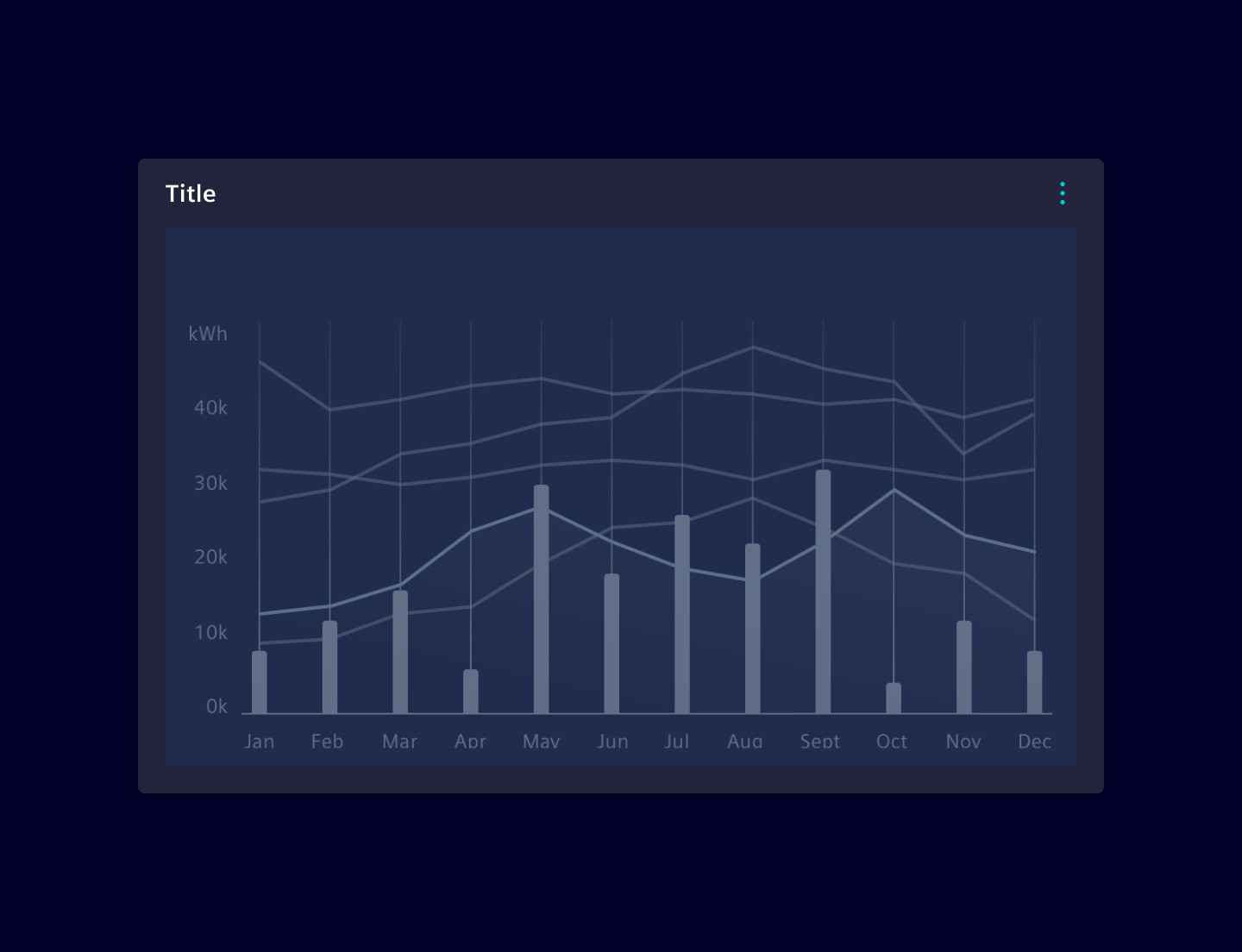
When to use
- To cluster information.
Best practices
- Only include the most relevant information.
- Set an appropriate size (height and width) of the card to give the content the space needed to convey the information.
Design
Elements
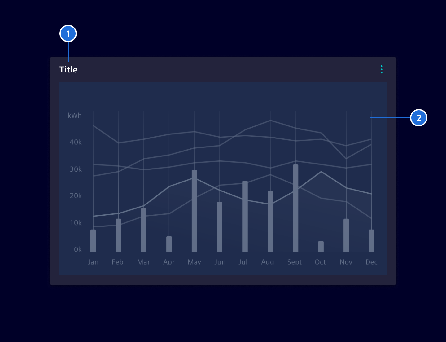
1. Header (optional): Card header contains a title and an optional content action bar. 2. Content area: The main area of the card. It can contain any type of content, such as text, graphs, tables.
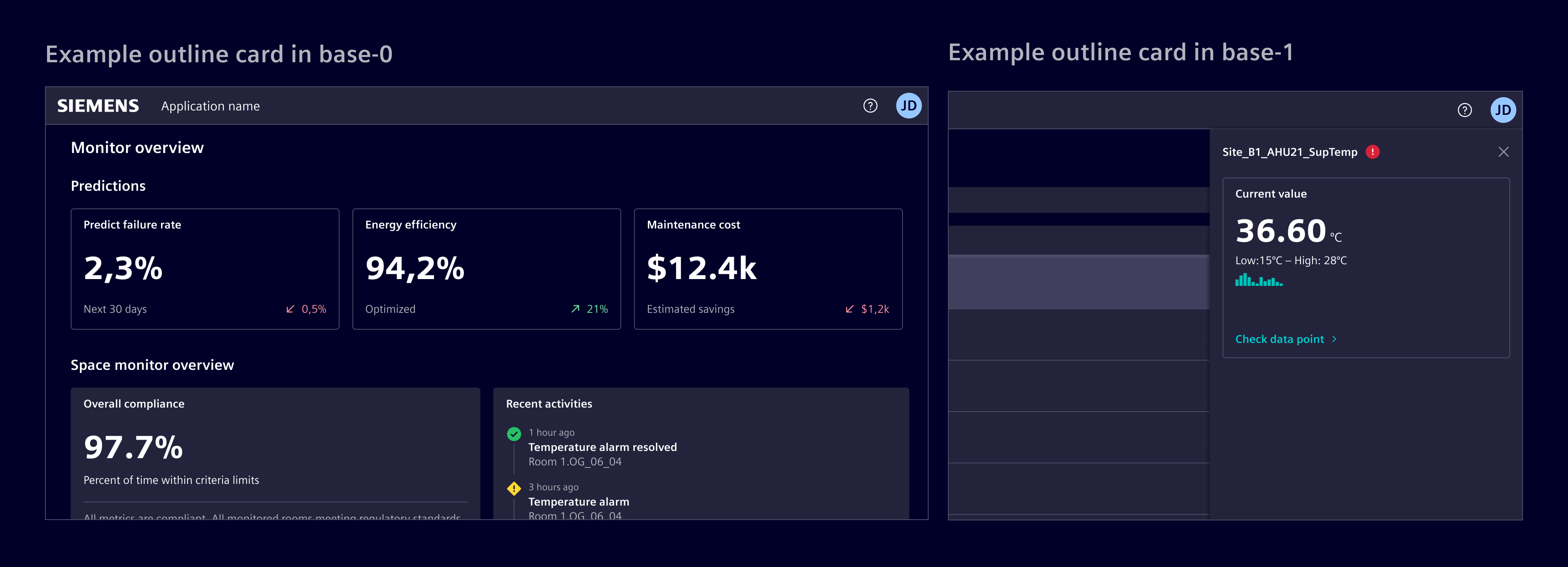
Cards can also be displayed as outline, without a background. Use this variant when the content should visually blend with the page background while still being grouped as a card.
Images
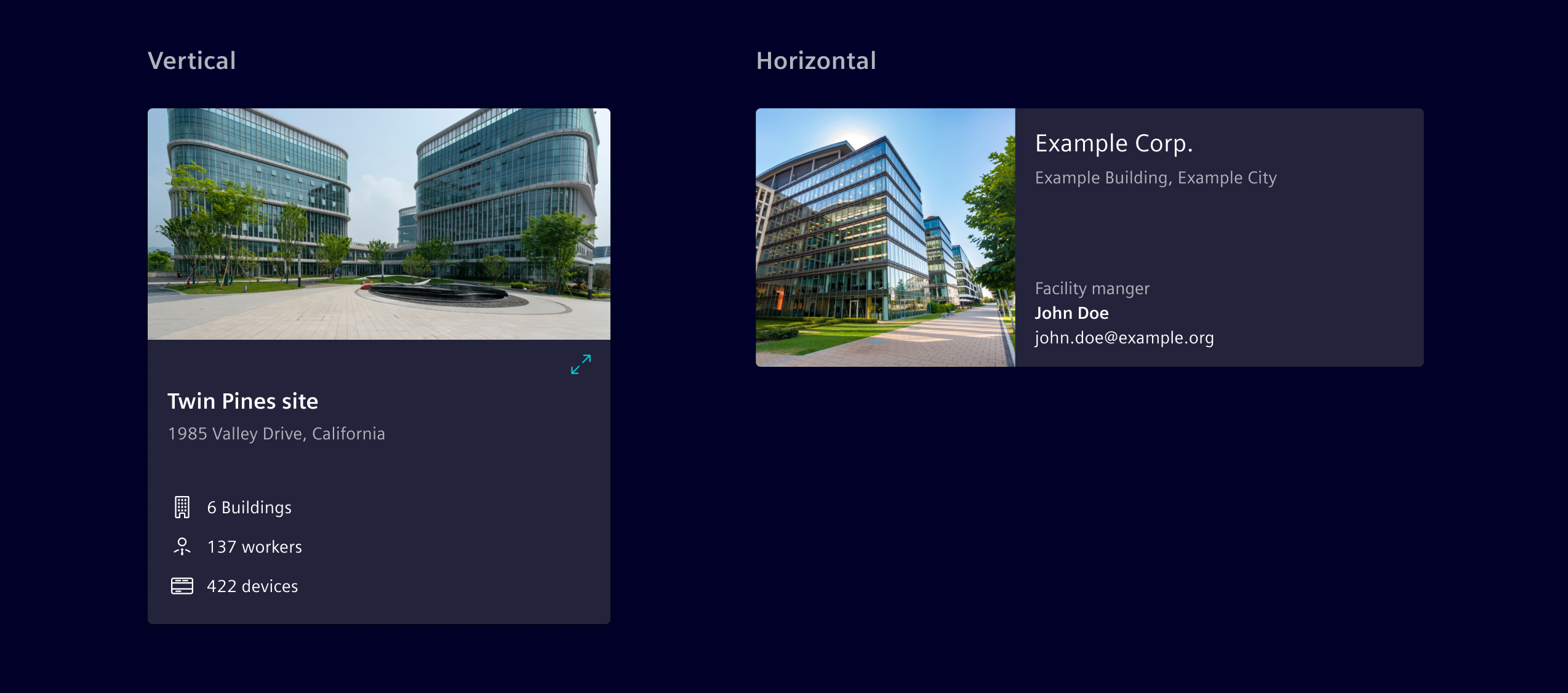
Cards can include an image and be placed either vertically or horizontally.
Accent line
An accent line can be used to highlight general, non-critical information. This approach should be reserved for cases where it improves clarity or reinforces the card's purpose.
To prevent overuse and maintain its impact, the accent line should be applied selectively rather than to every card. Use distinct colors, such as $element-ui-0, to emphasize information without implying urgency.
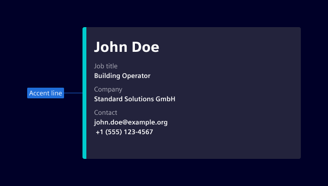
For status indication, refer to the value widget.
Action cards
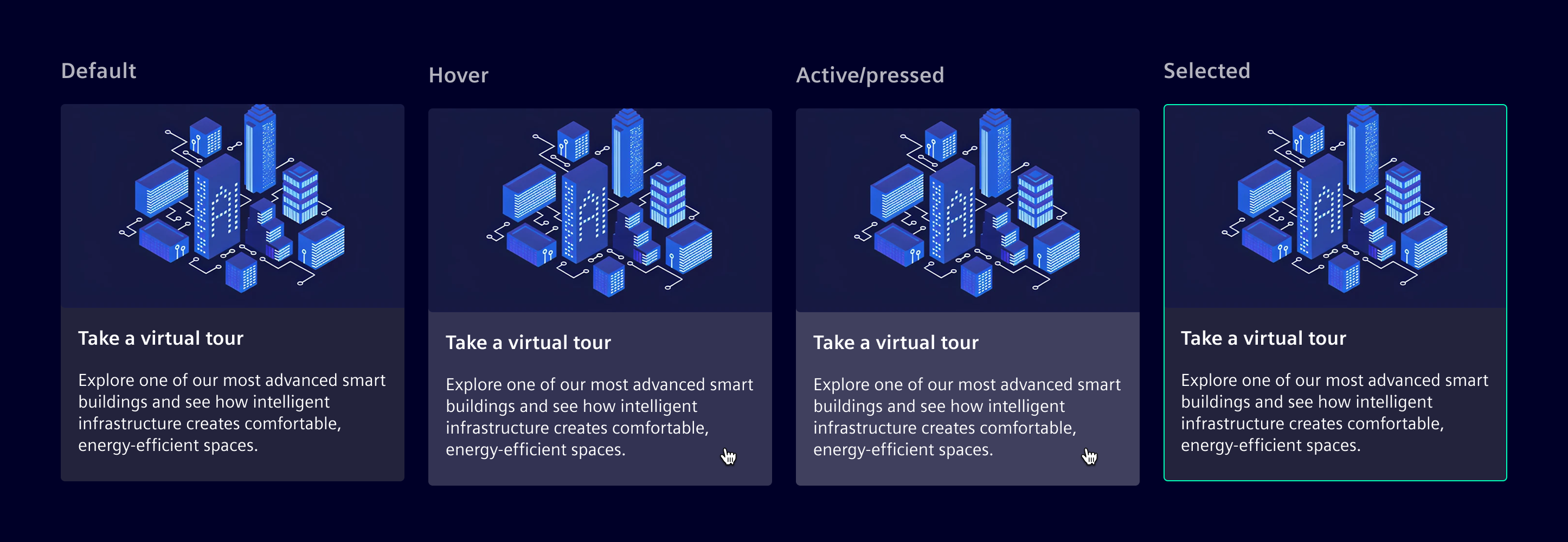
Action cards are interactive elements where the entire container is selectable and triggers a single action. They support hover, pressed, focus, and disabled states. They can also retain a selection state, behaving like a toggle.
Action cards do not include other interactive elements to prevent conflicting interactions.
Card sizes
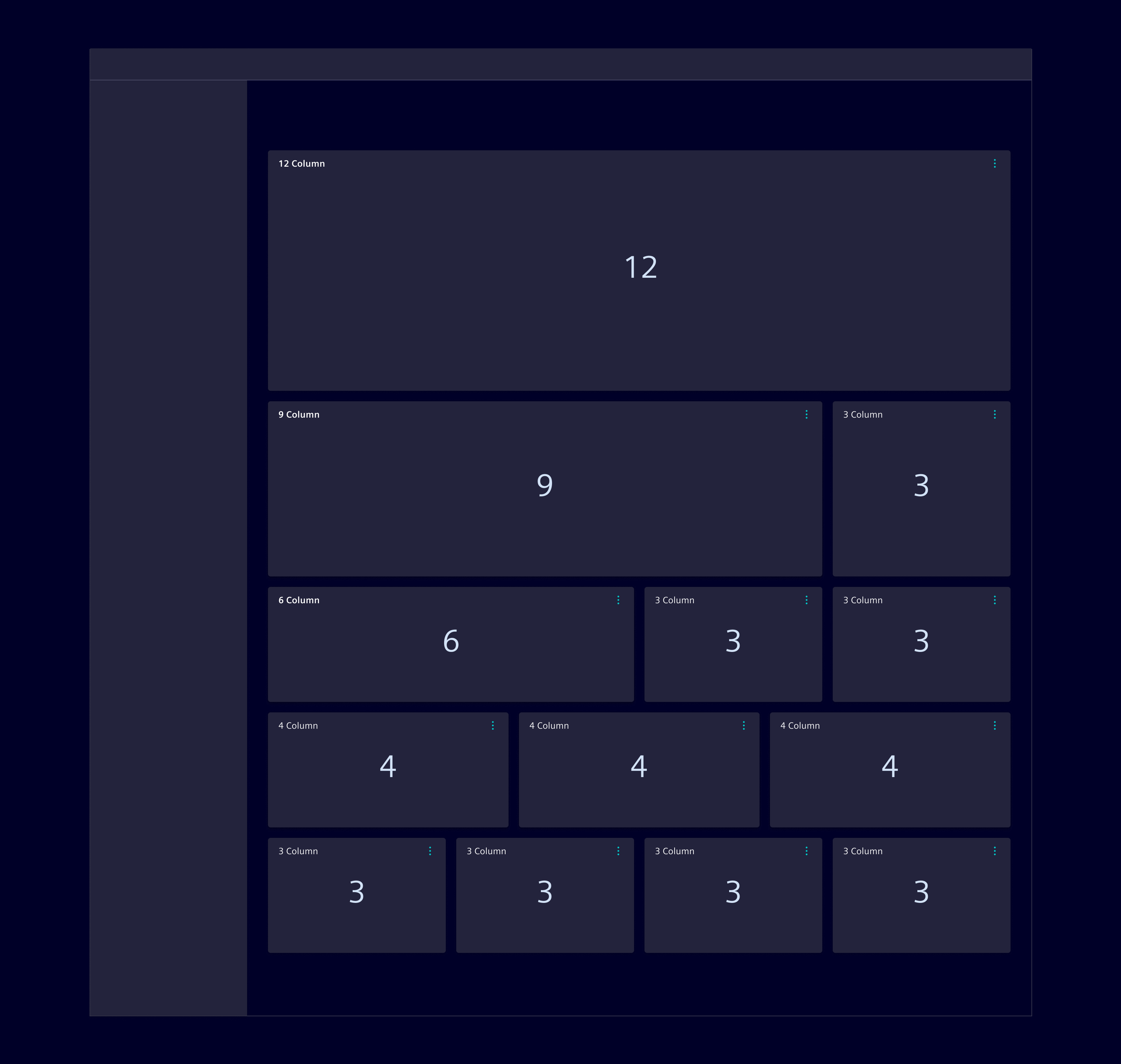
To ensure an aligned visual grid and proper aesthetic of dashboards, card sizes follow the underlying 12 column grid of the work area. The card can span over 3, 4, 6, 9 or 12 columns.
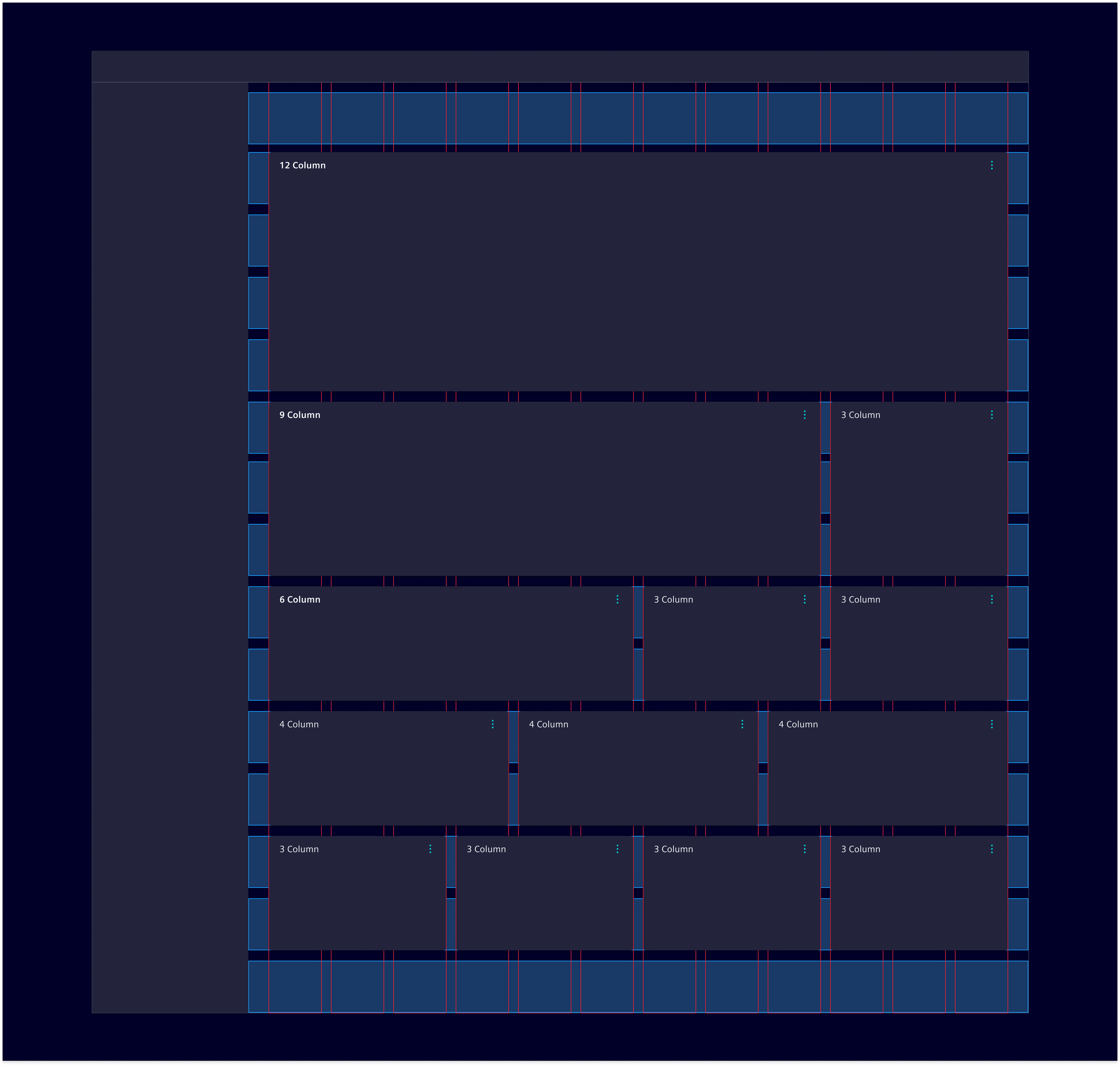
The card's width is defined by a horizontal grid system. The necessary height is primarily driven by the content. For visual aesthetic and reordering reasons, the number of height-sizes should be kept low and consistent.
Full-screen view
Cards can be enlarged via the content action menu to get more detailed information. The card then uses the whole working area. This makes sure that primary navigation, statusbar, notifications or other important information for the users are still accessible. Dashboard wide settings like e.g. time-range filter shall not be visible. If Expand is the only content action, then the expand icon is directly accessible, otherwise it will be part of the content actions list.
Responsive behavior
With the column grid system in place, cards will first vary their width within certain breakpoints. As the screen size gets smaller and smaller cards will be stacked more and more.
Code
Cards support various content structures to organize information effectively. Choose the appropriate pattern based on your content needs.
Below are examples of what’s supported. Consumer can either choose to use a pure CSS approach or the SiCardComponent.
For the maximize/restore functionality to work correctly the cards container/working area needs to have position: relative;.
SiCardComponent
import { SiCardComponent } from '@siemens/element-ng/card';

@Component({
  imports: [SiCardComponent, ...]
})
The si-card component makes use of the card classes. The header is configurable by input properties (see API). A header icon and the card body are provided using content projection, with the selectors headerIcon and body.
When using header icon, make sure to include spacing between the icon and the heading. In addition, the heading and text within the body should be left aligned.
Try to avoid content overflows in cards. In case of overflows, make sure the scrollbar is placed on the edge of the card and padding is set internally.
SiCardComponent API Documentation
si-card Input Properties
| Name | Type | Default | Description |
|---|---|---|---|
| actionBarTitle ¶ | TranslatableString | '' | Optional setting of html title attribute for the content action bar. Helpful for a11y when only one action is configured in expand mode. |
| actionBarViewType ¶ | ViewType | 'collapsible' | The view type of the content action bar of the card. Default is collapsible for dashboards. However, in some cases you might need to change to expanded or mobile . |
| actionParam ¶ | any | A param that will be passed to the action in the primary/secondary actions. This allows to re-use the same primary/secondary action arrays across rows in a table. | |
| heading ¶ | TranslatableString | Card header text. | |
| imgAlt ¶ | TranslatableString | Alt text for a provided image. | |
| imgDir ¶ | ("horizontal" | "vertical" | undefined) | 'vertical' | Defines if an image is placed on top or start (left) of the card. |
| imgObjectFit ¶ | ("fill" | "none" | "contain" | "cover" | "scale-down" | undefined) | 'scale-down' | Sets the image object-fit CSS property. |
| imgObjectPosition ¶ | string | Sets the image object-position CSS property. | |
| imgSrc ¶ | string | Image source for the card. | |
| primaryActions ¶ | (MenuItem | ContentActionBarMainItem)[] | [] | Input list of primary action items. Supports up to 4 actions and omits additional ones. |
| secondaryActions ¶ | (MenuItem | MenuItem)[] | [] | Input list of secondary action items. |
| subHeading ¶ | TranslatableString | Card secondary header text. |
Attributes and Methods
| Name | Type | Default | Description |
|---|---|---|---|
| (readonly) displayContentActionBar ¶ | Signal<boolean> | ... | Returns true when primary or secondary actions are set. |
Action cards
Action cards function as interactive buttons that can perform actions when clicked. Use si-action-card when you need cards that trigger specific actions.
The component includes a selectable input that enables selection state on the card.
SiActionCardComponent API Documentation
button[si-action-card] An action card component that extends the base card component with option to either select the whole card or trigger an action.
Usage: as selectable card: <button si-action-card selectable type="button" [(selected)]="isSelected">...</button>
or as an action card: <button si-action-card type="button" (click)="doSomeAction()">...</button>
Input Properties
| Name | Type | Default | Description |
|---|---|---|---|
| heading ¶ | TranslatableString | Card header text. | |
| imgAlt ¶ | TranslatableString | Alt text for a provided image. | |
| imgDir ¶ | ("horizontal" | "vertical" | undefined) | 'vertical' | Defines if an image is placed on top or start (left) of the card. |
| imgObjectFit ¶ | ("fill" | "none" | "contain" | "cover" | "scale-down" | undefined) | 'scale-down' | Sets the image object-fit CSS property. |
| imgObjectPosition ¶ | string | Sets the image object-position CSS property. | |
| imgSrc ¶ | string | Image source for the card. | |
| selectable ¶ | boolean | false | Makes whole card selectable. |
| selected ¶ | boolean | false | Indicates if the card is selected. Ignored when selectable is not set to true . |
| subHeading ¶ | TranslatableString | Card secondary header text. |
Output Properties
| Name | Type | Description |
|---|---|---|
| selectedChange ¶ | boolean | Indicates if the card is selected. Ignored when selectable is not set to true . |
Outline cards
Outline cards are a variation of cards with a border and no background color. Every card can be turned into an outline card by adding the .card-outline class to the card container.
<si-card class="card-outline"> ... </si-card>
Native HTML markup
The pure CSS approach structures a card into three distinct sections for optimal content organization:
- Header (optional): Apply
.card-headerto<h*>elements or<div>for titles and top-level information - Body (required): Apply
.card-bodyfor the main content area with proper padding and spacing - Footer (optional): Apply
.card-footerfor additional information that sticks to the bottom
<div class="card">
  <div class="card-header">Card header</div>
  <div class="card-body">
    <h5 class="card-title">Special title treatment</h5>
    <p class="card-text">With supporting text below as a natural lead-in to additional content.</p>
  </div>
  <div class="card-footer">Card footer</div>
</div>
Style content elements like titles and text within cards using the semantic classes. Always place these elements inside a .card-body container for proper padding and alignment.
Available content classes:
| Class | Element | Purpose | Usage |
|---|---|---|---|
.card-title | <h1> - <h6> | Primary heading | Main title or heading for the card content |
.card-subtitle | <h1> - <h6> | Secondary heading | Supporting text below the main title, typically smaller and muted |
.card-text | <p> | Body text | Main content paragraphs and descriptive text |
Best practices:
- Use
.card-titlefor the most important heading in each card - Apply
.card-subtitlefor supporting information that enhances the title - Wrap body content in
.card-textfor consistent typography
<div class="card">
  <div class="card-body">
    <h5 class="card-title">Card title</h5>
    <h6 class="card-subtitle mb-2 text-secondary">Card subtitle</h6>
    <p class="card-text">
      Some quick example text to build on the card title and make up the bulk of the card’s content.
    </p>
  </div>
</div>
To properly integrate an image with a card, apply the .card-img-top or .card-img-bottom class to your <img> element. This automatically rounds the image's top or bottom corners to match the card's border radius.
<div class="card">
  <img src="..." class="card-img-top" alt="..." />
  <div class="card-body">
    <h5 class="card-title">Card title</h5>
    <p class="card-text">
      Some quick example text to build on the card title and make up the bulk of the card’s content.
    </p>
  </div>
</div>
Create organized lists within cards using the list.
<div class="card">
  <ul class="list list-divider">
    <li class="list-item">An item</li>
    <li class="list-item">A second item</li>
    <li class="list-item">A third item</li>
  </ul>
</div>
Combine lists with card headers.
<div class="card">
  <div class="card-header">Header text</div>
  <ul class="list list-divider">
    <li class="list-item">An item</li>
    <li class="list-item">A second item</li>
    <li class="list-item">A third item</li>
  </ul>
</div>
Add footers to provide additional context or actions for list content.
<div class="card">
  <ul class="list list-divider">
    <li class="list-item">An item</li>
    <li class="list-item">A second item</li>
    <li class="list-item">A third item</li>
  </ul>
  <div class="card-footer">Card footer</div>
</div>
Cards assume no specific width to start, so they’ll be 100% wide unless otherwise stated. You can change this as needed with custom CSS, grid classes or utilities.
Card layouts
Element provides different container patterns to organize and manage multiple cards effectively:
- Card groups - Connected cards with equal dimensions
- Grid cards - Flexible grid-based card arrangements
Card groups create cohesive card layouts where cards are connected and maintain equal dimensions. Ideal for showcasing related content side-by-side. All cards automatically match the height of the tallest card.
<div class="card-group">
  <div class="card">
    <div class="card-body">
      <p class="card-text">
        This is a wider card with supporting text below as a natural lead-in to additional content.
        This content is a little bit longer.
      </p>
    </div>
  </div>
  <div class="card">
    <div class="card-body">
      <p class="card-text">
        This card has supporting text below as a natural lead-in to additional content.
      </p>
    </div>
  </div>
</div>
When card groups include footers, they automatically align at the bottom regardless of content height differences.
<div class="card-group">
  <div class="card">
    <div class="card-body">
      <p class="card-text">
        This is a wider card with supporting text below as a natural lead-in to additional content.
        This content is a little bit longer.
      </p>
    </div>
    <div class="card-footer">
      <small class="text-disabled">Last updated 3 mins ago</small>
    </div>
  </div>
  <div class="card">
    <div class="card-body">
      <p class="card-text">
        This card has supporting text below as a natural lead-in to additional content.
      </p>
    </div>
    <div class="card-footer">
      <small class="text-disabled">Last updated 3 mins ago</small>
    </div>
  </div>
</div>
Use the grid system to create responsive card layouts. Wrap cards in columns and rows to control their positioning and spacing.
For example, here’s .row-cols-1 laying out the cards on one column, and .row-cols-md-2 splitting four cards to equal width across multiple rows, from the medium breakpoint up.
<div class="row row-cols-1 row-cols-md-2 g-4">
  <div class="col">
    <div class="card">
      <div class="card-body">
        <p class="card-text">
          This is a longer card with supporting text below as a natural lead-in to additional
          content. This content is a little bit longer.
        </p>
      </div>
    </div>
  </div>
  <div class="col">
    <div class="card">
      <div class="card-body">
        <p class="card-text">
          This is a longer card with supporting text below as a natural lead-in to additional
          content. This content is a little bit longer.
        </p>
      </div>
    </div>
  </div>
  <div class="col">
    <div class="card">
      <div class="card-body">
        <p class="card-text">
          This is a longer card with supporting text below as a natural lead-in to additional
          content.
        </p>
      </div>
    </div>
  </div>
  <div class="col">
    <div class="card">
      <div class="card-body">
        <p class="card-text">
          This is a longer card with supporting text below as a natural lead-in to additional
          content. This content is a little bit longer.
        </p>
      </div>
    </div>
  </div>
</div>
Types Documentation
| Represents a translatable string. This can either be a translation key, e.g. ACTIONS.EDIT that will be automatically translated when displayed on the UI or a pre-translated string, e.g. Edit . Equivalent to a normal string in usage and functionality. |
|---|
| |
|---|
| |
|---|
| |
|---|
| | ||||||||||
|---|---|---|---|---|---|---|---|---|---|---|
|
| | |||||||||||
|---|---|---|---|---|---|---|---|---|---|---|---|
|
| | |||||||||||
|---|---|---|---|---|---|---|---|---|---|---|---|
|
| Represents a menu item that navigates using the Angular Router. Requires a configured Angular Router. | |||||||||||
|---|---|---|---|---|---|---|---|---|---|---|---|
|
| | ||||||||||
|---|---|---|---|---|---|---|---|---|---|---|
|
| | |||
|---|---|---|---|
|
| | |||||||||||
|---|---|---|---|---|---|---|---|---|---|---|---|
|
| | |||
|---|---|---|---|
|
| | ||
|---|---|---|
|
| | ||||||||
|---|---|---|---|---|---|---|---|---|
|
| Implement and provide this to an SiMenuFactoryComponent to receive trigger events. | |||||||
|---|---|---|---|---|---|---|---|
| |||||||
|
| Used in events emitted from SiLinkActionService | |||
|---|---|---|---|
|
| | ||||||||||
|---|---|---|---|---|---|---|---|---|---|---|
|
| | |||||||||||||||||||||||||||
|---|---|---|---|---|---|---|---|---|---|---|---|---|---|---|---|---|---|---|---|---|---|---|---|---|---|---|---|
| |||||||||||||||||||||||||||
| |||||||||||||||||||||||||||
|
| | |||||||
|---|---|---|---|---|---|---|---|
| |||||||
| |||||||
|
Except where otherwise noted, content on this site is licensed under MIT License.