Breadcrumb
Breadcrumbs help users to see their current location in relation to the rest of the website or application.
Usage
Breadcrumbs display the user's location within a hierarchical structure, showing the path from the highest-level entity (root) to the current page or content, one step at a time.
They typically begin with the root page and progress to the active page, helping users understand where they are and navigate back to higher levels.

When to use
- Use breadcrumbs when the user is most likely to have landed on the page from an external source.
- Use for applications that have a large amount of content organized in a hierarchy of more than two levels.
Best practices
- Avoid using breadcrumbs on single-level sites or applications without a meaningful hierarchy.
- All breadcrumb items should be clickable.
- Breadcrumbs are secondary navigation, they should never replace the primary navigation.
- Use consistent naming that matches page titles or navigation labels.
Design
Elements
A breadcrumb consists of the following elements:

- Root element: Highest entity level, displayed with an icon or a text.
- Entity name: An entity represents a section or page within the product or page. Entity names use a button link that uses the section or page title to link to that section or page.
- Separator: Provides a visual distinction between individual entities using the same font as the rest of the breadcrumb (not icons).
- Current page or content: Indicates the current position. It's not a link.
Root element
The root element can either be the default icon element-breadcrumb-root or a meaningful text, like Startpage.
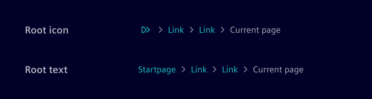
Responsive behavior
The default rule is to show as much of the path as possible in the available real estate. Entities will be truncated if the available space is not sufficient to show the entire breadcrumb.
Truncation

Super long entity names are truncated.

Truncated entity labels show their full text in a tooltip on hover or keyboard focus. Clicking the label navigates directly to the entity.
Long breadcrumb

When a path contains more levels of entities that can be displayed, the breadcrumb auto-collapses and uses ellipses to indicate more information. It's best practice to show at least the first and last entity when collapsing. Users open a menu containing the hidden breadcrumb items by clicking on the ellipses. Selecting an item navigates to that entity and closes the menu. The menu also closes on an outside click or by pressing Escape, returning focus to the ellipses button.
Code
The first entry will be used as the root element and won't show the title but will be represented as an icon.
The items parameter takes an array of BreadcrumbItem entries. They contain a title and link property. The link property can be an array or a string and will be used as a routerLink.
Usage
import { SiBreadcrumbRouterComponent } from '@siemens/element-ng/breadcrumb-router';

@Component({
  imports: [SiBreadcrumbRouterComponent,...]
})
Breadcrumb Router
The si-breadcrumb-router component displays a breadcrumb according to the Angular router hierarchy of the current route. The breadcrumb titles and links are configurable by enriching the Angular route configuration with addition data. The component uses the default implementation SiBreadcrumbDefaultResolverService of the SiBreadcrumbResolverService interface, which reads the router configuration and provides the BreadcrumbItem objects. Using the injector token SI_BREADCRUMB_RESOLVER_SERVICE you can provide your own SiBreadcrumbResolverService implementation.
import { SI_BREADCRUMB_RESOLVER_SERVICE, SiBreadcrumbRouterComponent } from '@siemens/element-ng/breadcrumb-router';

...

@Component({
  imports: [
    ...
    SiBreadcrumbRouterComponent,
  ],
  providers: [
    {
      provide: SI_BREADCRUMB_RESOLVER_SERVICE,
      useClass: YourBreadcrumbResolverService,
    }
  ]
  ...
})
When using the default resolver service you need to enrich the Angular route configuration with breadcrumb information. The default resolver iterates through the route hierarchy to construct the breadcrumb items. The breadcrumb item title is taken from the path element or from a title property of the data configuration object. For a custom configuration that deviate from the route hierarchy, use a siBreadcrumb object in the data object that provides the complete breadcrumb item information for that route. Configure title and an optional link. The following example shows the variations:
titleconfiguration indataobjecttitlewith route parameter configuration indataobjecttitleandlinkconfiguration in nestedsiBreadcrumbobject
The title can also be a translation key and gets translated. Unfortunately, translation does currently not work in combination with route parameter.
import { Route } from '@angular/router';

export const routes: Route[] = [
  {
    path: 'test',
    data: {
      title: 'Test' // Title is displayed in the breadcrumb
    },
    children: [
      {
        path: ':id',
        data: {
          title: 'Test - {id}' // id will be resolved with the current parameter value
        }
      }
    ]
  },
  {
    path: 'test/sub-test',
    data: {
      /*
       * In this scenario the automatic calculation of the route is broken because
       * test/sub-test is handled as one UrlSegment. Therefore, only one breadcrumb
       * link would be rendered. Providing the links manually solves this problem.
       * It is not possible to define wildcards in the link names here.
       */
      siBreadcrumb: [
        { title: 'Test', link: '/test' },
        { title: 'Sub-Test', link: '/test/sub-test' }
      ]
    }
  },
  {
    path: 'protocol/:idprotocol/run/:idrun',
    component: RunComponent,
    data: {
      siBreadcrumb: [
        { title: 'Protocol ({idprotocol})', link: 'protocol/:idprotocol' },
        { title: 'Run ({idrun})' } // current route is used if no path is provided
      ]
    }
  }
];
The siBreadcrumb object is an array of BreadcrumbRouterLink objects.
| Defines the title and link of a breadcrumb item in a route configuration and compatible to BreadcrumbItem . | |||
|---|---|---|---|
|
See Angular docs to learn how to resolve route data with the Angular router resolvers.
Custom Breadcrumb Resolver
There are scenarios where the default resolver is not sufficient. In those cases you can write a custom resolver like this:
import { Injectable } from '@angular/core';
import { ActivatedRouteSnapshot } from '@angular/router';
import { BreadcrumbItem } from '@siemens/element-ng/breadcrumb';
import { SiBreadcrumbDefaultResolverService } from '@siemens/element-ng/breadcrumb-router';
import { Observable } from 'rxjs';

@Injectable()
export class CustomBreadcrumbResolverService extends SiBreadcrumbDefaultResolverService {
  resolve(route: ActivatedRouteSnapshot): BreadcrumbItem[] | Observable<BreadcrumbItem[]> {
    return super
      .resolve(route)
      .map((link: BreadcrumbItem) => ({ ...link, title: rewriteName(link.name) }));
  }
}
The resolver uses the following type:
| Service interface to resolve the breadcrumb items on the base of a route. | ||||||
|---|---|---|---|---|---|---|
|
Afterwards you need to provide the custom resolver, instead of the default resolver, in your app.module.ts:
import { SI_BREADCRUMB_RESOLVER_SERVICE, SiBreadcrumbRouterComponent } from '@siemens/element-ng/breadcrumb-router';

...

@Component({
  imports: [
    ...
    SiBreadcrumbRouterComponent,
  ],
  providers: [
    {
      provide: SI_BREADCRUMB_RESOLVER_SERVICE,
      useClass: CustomBreadcrumbResolverService,
    }
  ]
  ...
})

export class AppComponent {
}
SiBreadcrumbComponent API Documentation
si-breadcrumb Input Properties
| Name | Type | Default | Description |
|---|---|---|---|
| ariaLabel ¶ | TranslatableString | $localize`:@@SI_BREADCRUMB:Breadcrumb navigation` | Aria label for the main breadcrumb navigation. Needed for a11y. |
items ¶ | BreadcrumbItem[] | Array of breadcrumb items. | |
| showRootAsText ¶ | boolean | false | Shows the "root" route as the provided title string instead of an icon. |
SiBreadcrumbRouterComponent API Documentation
si-breadcrumb-router Input Properties
| Name | Type | Default | Description |
|---|---|---|---|
| ariaLabel ¶ | TranslatableString | $localize`:@@SI_BREADCRUMB_ROUTER_LABEL:breadcrumb` | Aria label for the main breadcrumb navigation. Needed for a11y. |
Types Documentation
| Represents a translatable string. This can either be a translation key, e.g. ACTIONS.EDIT that will be automatically translated when displayed on the UI or a pre-translated string, e.g. Edit . Equivalent to a normal string in usage and functionality. |
|---|
| Item that should be displayed in a breadcrumb. As input, we expect an optional title and link, which can be an URL or array of URL segments. | ||||||||||
|---|---|---|---|---|---|---|---|---|---|---|
|
| | ||||||||||
|---|---|---|---|---|---|---|---|---|---|---|
|
| Property A function that will be invoked when clicking on the menu item. When passed as a string, use together with SiLinkActionService to receive events. This is meant for repetitive things in lists/tables/etc. |
|---|
| Property A boolean that lets the link know whether it is disabled or not. |
|---|
| href? Property Defines a href URI that the menu item will be linked to. Will be used to set the href attribute of the a element. Will only be used if link and function is not set. |
|---|
| Property A boolean that lets the link know whether it is active or not. It is useful when action() is executed instead of link route. |
|---|
| link? Property Defines the link of the menu item within the application using the angular router link concept. Accepts an array of any as per [routerLink API definition] https://angular.dev/api/router/RouterLink . |
|---|
| Property The navigation extras provide additional routing options when using the router link. |
|---|
| Property The target attribute specifies where to open the linked document. If no target is specified, the link will open in the current tab. |
|---|
| Property The optional tooltip of the link. Can be either the text to be displayed or the translation key. |
|---|
Except where otherwise noted, content on this site is licensed under MIT License.