Application header
The Application header organizes an application's structure and content, making it easy to find information and achieve tasks. It communicates relationships, context, and actions a user can take within an application.
Usage
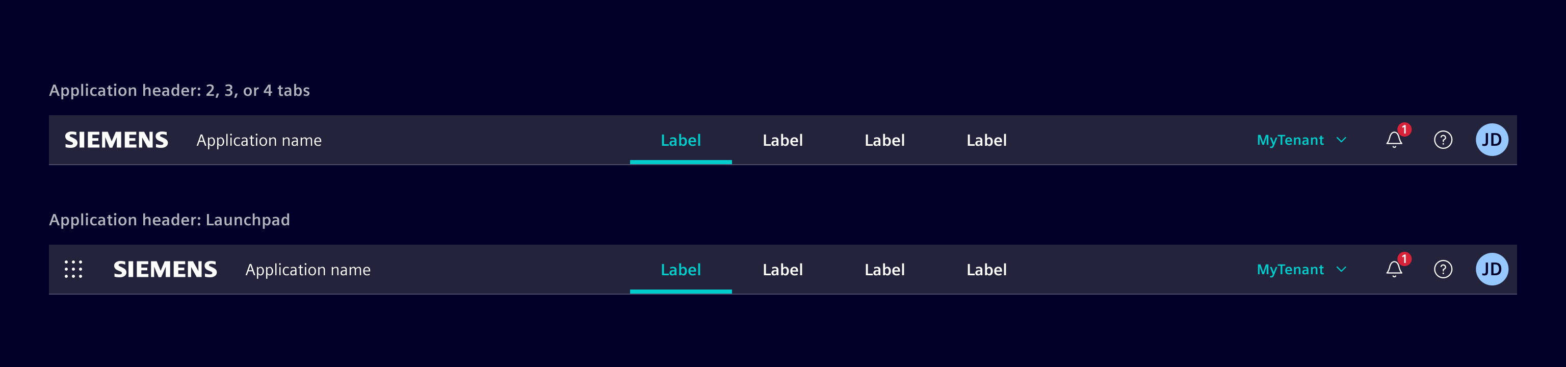
There are variations of the application header: Standard version and with launchpad support.
When to use
- To provide a consistent, application-wide shell that anchors branding, identity, and global context across all pages.
- To expose the application's primary navigation, with up to four top-level navigation items.
- To give users quick access to global actions and information such as settings, notifications, help, and the user profile.
- To let users switch between different application contexts via the launchpad.
Design
Elements
The application header consists of the following elements:
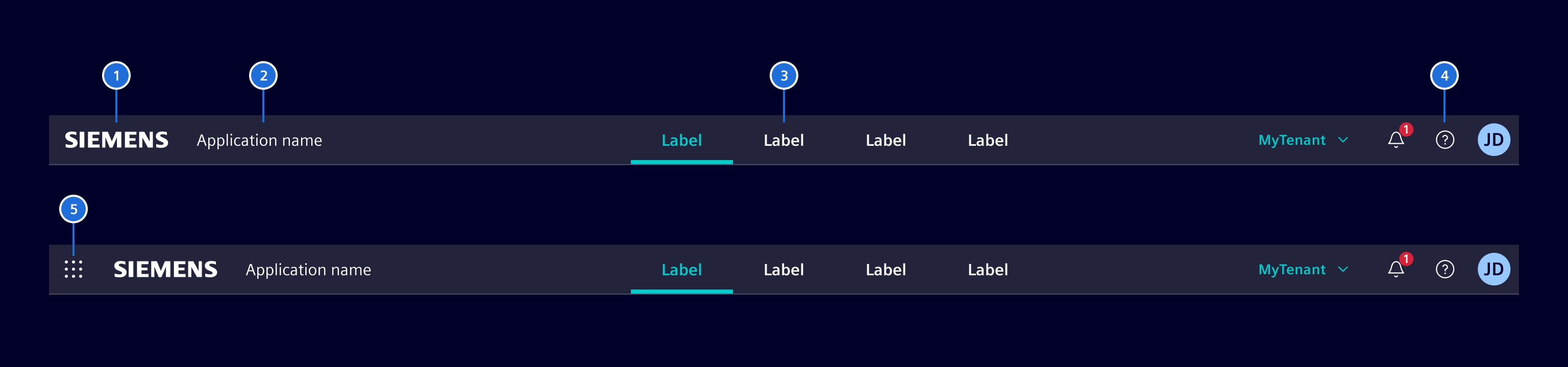
(1) Brand-logo, (2) Application name, (3) Primary navigation items (up to four), (4) Tool bar, (5) Launchpad selector
Launchpad
The application header supports a launchpad that can be opened via (5) launchpad selector. It allows a user to switch between different application contexts. See the launchpad documentation for more information.
Toolbar
The toolbar contains all the additional navigation and indication elements, which gives the user access to general information like: settings, user profile, about pages, help etc.
Help menu
The help menu is mandatory for all applications, because it has legal relevant aspects. The help menu is located left of the user avatar and uses element-help as icon.
The user menu is based on the menu container.
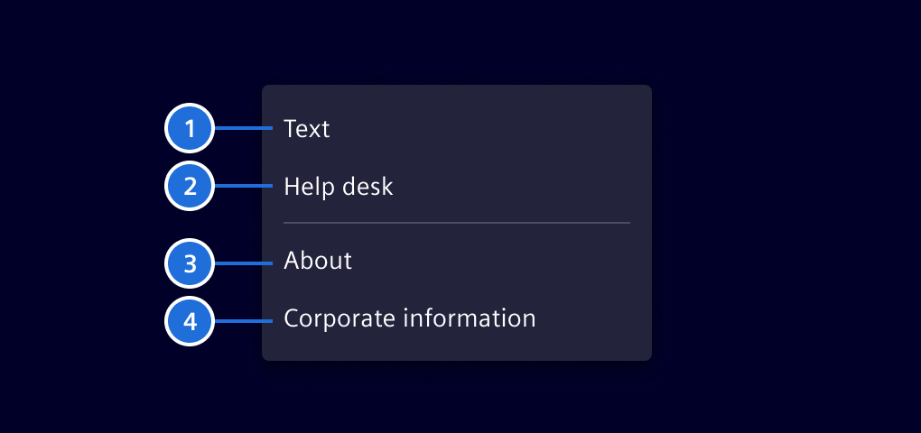
- Help (optional)
- Additional information for providing help to the user (optional)
- Link to the About page (mandatory)
- Link to the Corporate Information page (mandatory)
Note:
- The help menu should provide a fast overview about related content.
- Other legal links should be part of the about page.
User menu (optional)
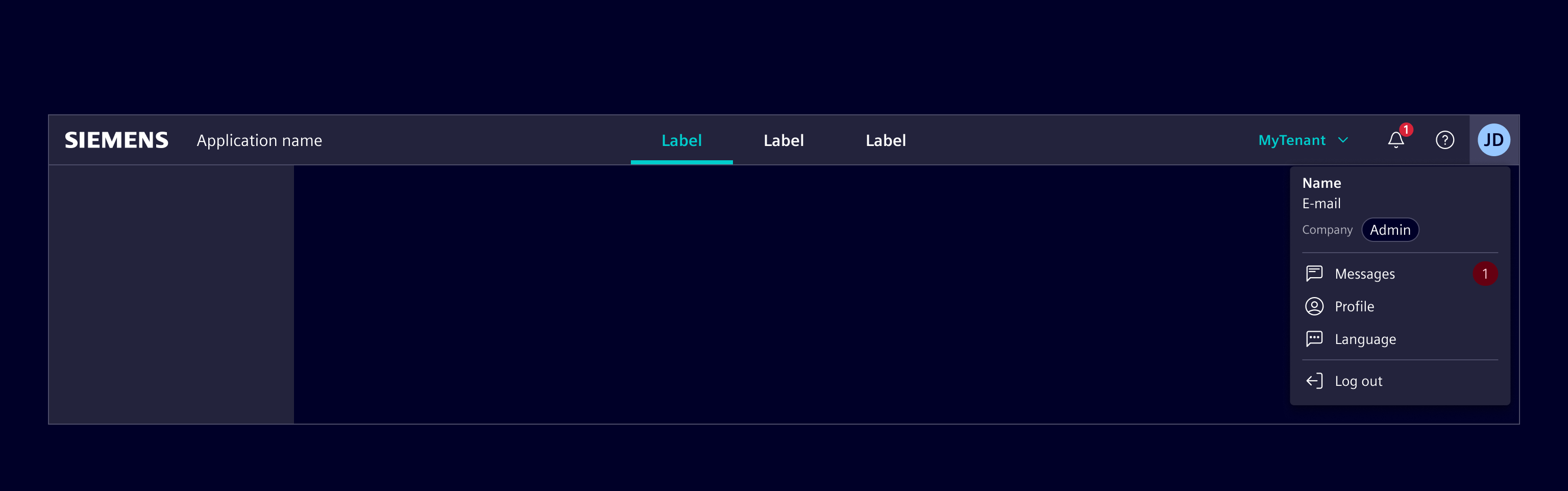
The user menu is mandatory for all applications, which are providing content to a signed in user. This menu is not needed for pages without user management.
The user menu is based on the menu container.
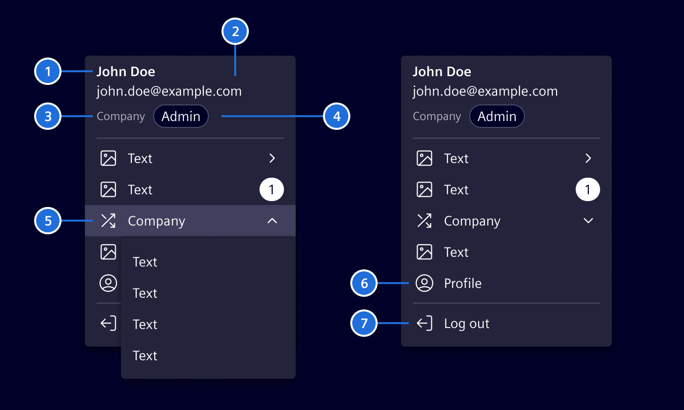
- User name (readable)
- Technical username (typically the email address)
- Company (deprecated)
- Role
- Company Switcher (deprecated)
- Profile / user-specific settings
- Sign out
Responsive behavior
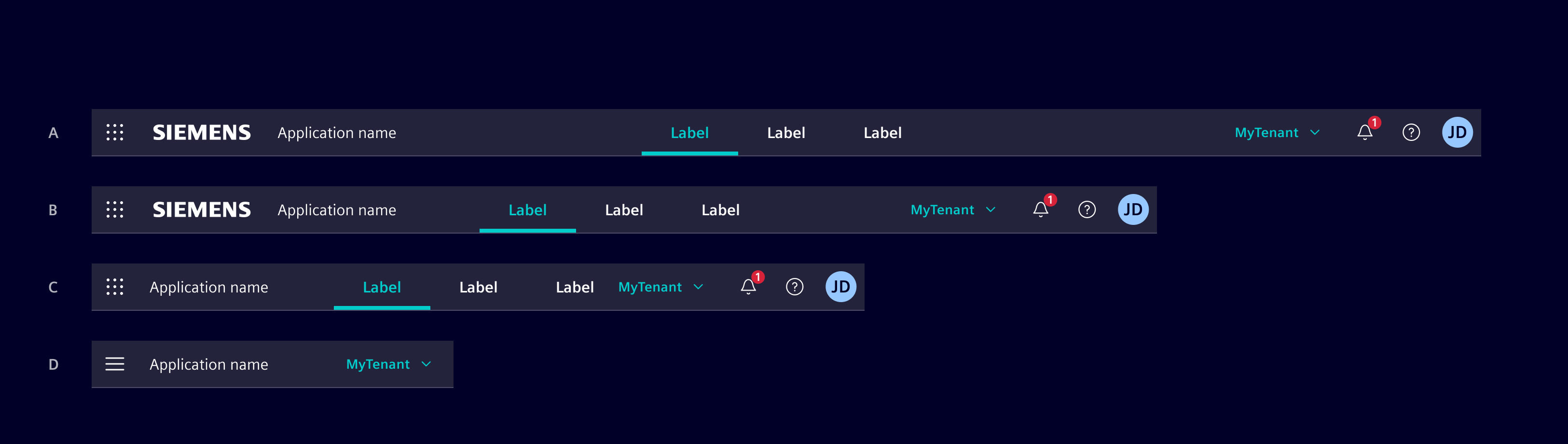
(A) The application header spans over the whole screen width.
On smaller screens it behaves according to the following rule set:
- (B) Decrease of whitespace between Brand-area, Primary navigation items and tool-bar to a defined minimum, no abbreviations of labels.
- (C) Brand logo will be skipped, further decrease whitespace to a minimum.
- (D) Switch to mobile view, here the active tab name will be displayed or if not present, then the application name.
Code
Element provides a template driven approach to create an application header. This enables applications to customize the header according to their needs.
The header has three main sections which can be placed inside the si-application-header.
<si-application-header>
  <si-header-brand></si-header-brand>
  <si-header-navigation></si-header-navigation>
  <si-header-actions></si-header-actions>
</si-application-header>
Launchpad
The application header also supports a launchpad. See the launchpad documentation for more information.
Header brand
The brand section contains brand related content, most likely the logo and the application name.
<si-application-header>
  <si-header-brand>
    <a siHeaderLogo routerLink="/" class="d-none d-md-flex"></a>
    <h1 class="application-name">My application</h1>
  </si-header-brand>
  ...
</si-application-header>
Instead of the Siemens logo, you can also use a custom logo like the Siemens healthineers logo.
<si-application-header>
  <si-header-brand>
    <a routerLink="/" class="navbar-brand px-6 focus-inside">
      <img src="./assets/images/siemens-healthineers-logo.svg" alt="Siemens healthineers" />
    </a>
    ...
  </si-header-brand>
  ...
</si-application-header>
Header navigation
The navigation section contains the primary navigation items.
<si-application-header>
  ...
  <si-header-navigation>
    <a si-header-navigation-item routerLink="/m1" routerLinkActive="active">Module 1</a>
    <a si-header-navigation-item routerLink="/m2" routerLinkActive="active">Module 2</a>
  </si-header-navigation>
  ...
</si-application-header>
Header navigation items can have header-dropdowns containing subitems.
<si-application-header>
  ...
  <si-header-navigation>
    <button
      si-header-navigation-item
      [siHeaderDropdownTriggerFor]="dropdown"
      routerLinkActive="active"
    >
      Module 1
      <ng-template #dropdown>
        <si-header-dropdown>
          <a si-header-dropdown-item routerLink="/m1/1" routerLinkActive="active">Module 1.1</a>
          <a si-header-dropdown-item routerLink="/m1/2" routerLinkActive="active">Module 1.2</a>
        </si-header-dropdown>
      </ng-template>
    </button>
  </si-header-navigation>
  ...
</si-application-header>
It is important that the dropdown is placed inside the si-header-navigation-item. This is required by the routerLinkActive directive as it only detects content or view children.
Header actions
The actions section contains additional actions like the user menu and the help menu. Actions are typically buttons that open a header-dropdown.
<si-application-header>
  ...
  <si-header-actions>
    <button si-header-action-item icon="element-help" [siHeaderDropdownTriggerFor]="help">
      Help
    </button>
  </si-header-actions>
</si-application-header>

<ng-template #help>
  <si-header-dropdown>
    <a si-header-dropdown-item routerLink="/about">About</a>
    <a si-header-dropdown-item routerLink="/corporate-information">Corporate Information</a>
  </si-header-dropdown>
</ng-template>
Header action menus should be placed outside the si-application-header to keep the actual header definition clean.
Account menu
The application header provides a special action item for the user account menu showing the initials or the profile picture. The code below demonstrates how to use custom content next to standard dropdown items. Adopt this in your application to create an account menu similar to the one in the deprecated si-primary-navbar.
<si-application-header>
  ...
  <si-header-actions>
    <button
      si-header-account-item
      type="button"
      name="Lars Vegas"
      [siHeaderDropdownTriggerFor]="account"
    >
    </button>
  </si-header-actions>

  <ng-template #account>
    <si-header-dropdown>
      <si-account-details
        name="Lars Vegas"
        email="lars.vegas@siemens.com"
        company="Siemens AG"
        userRole="Admin"
      />
      <div class="dropdown-divider"></div>
      <button
        si-header-dropdown-item
        icon="element-language"
        type="button"
        [siHeaderDropdownTriggerFor]="..."
      >
        Language
      </button>
      ...
    </si-header-dropdown>
  </ng-template>
</si-application-header>
Selection menu (Tenant switch)
The application header provides another special item for selecting a global state, like a tenant. Only use this once per application.
<si-application-header>
  ...
  <si-header-actions>
    <button si-header-selection-item type="button" [siHeaderDropdownTriggerFor]="...">
      {{currentTenant}}
    </button>
  </si-header-actions>
</si-application-header>
The application is responsible for managing the state and the selection dialog. For simple use cases, an application can use the si-header-dropdown component to show available options.
If a more complex selection dialog is required, an application can use the (click) event to show a custom dialog. The open state of the si-selection-item can be controlled by the [open] input. Use this input only, if you are not using the siHeaderDropdownTriggerFor directive.
Custom content
si-header-brand, si-header-navigation, si-header-actions and si-header-dropdown can contain custom content. Use this to add extra content like user details or a tenant switch.
When adding custom content, ensure that the necessary styling is applied. Add the header-item class to get the basic styling for header items. If the item is interactive (like a button), add the focus-inside class to prevent the overflow of the focus ring. If the item has a dropdown attached, include the dropdown caret.
A very basic custom item could look like this:
<button class="header-item focus-inside" [siHeaderDropdownTriggerFor]="dropdown">
  Custom content
  <span class="element-down-2 dropdown-caret"></span>
</button>
Layout and responsive behavior
The header is designed to be responsive and to adapt to different screen sizes. It supports two modes: expanded and collapsed (mobile). The header switches the mode automatically based on screen size. By default, it will switch to collapsed on the sm breakpoint (576px). Use the expandBreakpoint input to change the breakpoint.
In the expanded mode, the header will split the available space evenly between the brand, navigation, and actions sections. If not enough space is available, the header will resize the different parts. It will not automatically switch to the collapsed, so developers must ensure that the content fits the available space.
In the collapsed mode the header will only show the brand and action section. The navigation section is collapsed into a hamburger menu.
To customize the visible actions in the collapsed mode, use the si-header-collapsible-actions component. It will collapse its actions into a menu.
<si-application-header>
  ...
  <si-header-actions>
    ...
    <si-header-collapsible-actions>
      <button si-header-action-item icon="element-help">Help</button>
    </si-header-collapsible-actions>
    ...
  </si-header-actions>
</si-application-header>
There should only be one si-header-collapsible-actions component per header.
To customize other content within the header like the logo, use utility classes. If an item should only be visible for screens larger or equal md, apply d-none to hide it and d-md-flex to show it on md and larger.
<si-application-header>
  <si-header-brand>
    <a siHeaderLogo routerLink="/" class="d-none d-md-flex"></a>
    ...
  </si-header-brand>
  ...
</si-application-header>
You can use those classes as well to change the order of items in the collapsed mode. Do this by duplicating the item and hiding it either in expanded or collapsed.
In the following example, the FAQ button should be shown before the Help button in expanded mode. But in the collapsed mode, it should be shown inside the collapsible actions. Therefor, the FAQ button is duplicated and each version has the required bootstrap utilities applied.
<si-application-header>
  ...
  <si-header-actions>
    <!-- FAQ button to be shown in expanded mode. -->
    <!-- "d-none" is hiding it generally, "d-sm-flex" is overriding this to show the button on screens larger or equal "sm" -->
    <button si-header-action-item icon="element-faq" class="d-none d-sm-flex">FAQ</button>
    <button si-header-action-item icon="element-help">Help</button>
    <si-header-collapsible-actions>
      <!-- FAQ button to be shown in collapsed mode. -->
      <!-- "d-sm-none" is hiding it on screens larger or equal "sm" -->
      <button si-header-action-item icon="element-faq" class="d-sm-none">FAQ</button>
      <button si-header-action-item icon="element-notification">Notifications</button>
    </si-header-collapsible-actions>
    ...
  </si-header-actions>
</si-application-header>
You can also use any other d-<breakpoint>-<mode> class. For changing the order, use same breakpoint as for switching the header mode (default: sm). To show elements always use d-<breakpoint>-flex.
Header dropdowns
As shown in previous examples, the header dropdown is an optional component to add a dropdown menu to header items. While being visually similar to the si-menu, header dropdowns are quite different. Unlike the si-menu, header dropdowns feature a tab-based keyboard interaction which provides a better user experience for keyboard users in headers / navbars. The header dropdown seamlessly integrates into the header by managing focus automatically and adopting to the header's current responsive mode.
A header menu is opened by a siHeaderDropdownTriggerFor directive which should be applied to an interactive element. The dropdown content should be placed inside a si-header-dropdown element within a ng-template. It is possible to nest dropdown items and to add custom content like dividers.
<button class="btn btn-primary" [siHeaderDropdownTriggerFor]="dropdown2">Toggle dropdown</button>

<ng-template #dropdown1>
  <si-header-dropdown>
    <button si-header-dropdown-item>Item 1</button>
    <button si-header-dropdown-item [siHeaderDropdownTriggerFor]="dropdown2">Item 2</button>
    <span class="dropdown-divider"></span>
    <button si-header-dropdown-item>Item 3</button>
  </si-header-dropdown>
</ng-template>

<ng-template #dropdown2>
  <button si-header-dropdown-item>Item 2.1</button>
  <button si-header-dropdown-item>Item 2.2</button>
</ng-template>
Header dropdowns should only be used in headers. In other areas, use the SiMenu instead.
Example
SiApplicationHeaderComponent API Documentation
si-application-header Root component for the application header.
Input Properties
| Name | Type | Default | Description |
|---|---|---|---|
| expandBreakpoint ¶ | ("never" | "sm" | "md" | "lg" | "xl" | "xxl") | 'sm' | Defines the minimum breakpoint which must be matched to expand the header / switch to desktop mode. |
| launchpad ¶ | TemplateRef<void> | Template reference for the launchpad content rendered inside the header. | |
| launchpadLabel ¶ | TranslatableString | $localize`:@@SI_APPLICATION_HEADER.LAUNCHPAD:Launchpad` | Accessible label for the launchpad toggle button. |
SiHeaderBrandDirective API Documentation
si-header-brand No API to document for this.
SiHeaderNavigationComponent API Documentation
si-header-navigation No API to document for this.
SiHeaderNavigationItemComponent API Documentation
button[si-header-navigation-item], a[si-header-navigation-item] Adds a navigation item to the header. Should be located inside .header-navigation .
No API to document for this.
SiHeaderActionsDirective API Documentation
si-header-actions No API to document for this.
SiHeaderActionItemComponent API Documentation
button[si-header-action-item], a[si-header-action-item] Adds an action item to the header. Should be located inside .header-actions .
Input Properties
| Name | Type | Default | Description |
|---|---|---|---|
| badge ¶ | (number | boolean | null) | Adds a badge to the header item. If type - =number, the number will be shown and automatically trimmed if \>99 - =true, an empty red dot will be shown | |
icon ¶ | string | The icon to be shown. |
Attributes and Methods
| Name | Type | Default | Description |
|---|---|---|---|
| ngOnChanges(...) ¶ | (changes: { badge: SimpleChange<(number | boolean | null | undefined)>, dropdownTrigger: SimpleChange<(SiHeaderDropdownTriggerDirective | null)>, icon: SimpleChange<string>, ngOnChanges: SimpleChange<(changes: { readonly icon?: SimpleChange<string> \| undefined; readonly badge?: SimpleChange<number \| boolean \| null \| undefined> \| undefined; ngOnChanges?: SimpleChange<...> \| undefined; readonly dropdownTrigger?: SimpleChange<...> \| undefined; ngOnInit?: SimpleChange<...> \| undefined; }) => void>, ngOnInit: SimpleChange<() => void> }) => void | A callback method that is invoked immediately after the default change detector has checked data-bound properties if at least one has changed, and before the view and content children are checked. Parameters
| |
| ngOnInit() ¶ | () => void | A callback method that is invoked immediately after the default change detector has checked the directive's data-bound properties for the first time, and before any of the view or content children have been checked. It is invoked only once when the directive is instantiated. |
SiHeaderAccountItemComponent API Documentation
button[si-header-account-item] Adds an account item to the header. Should be located inside .header-actions .
Input Properties
| Name | Type | Default | Description |
|---|---|---|---|
| accountItemLabel ¶ | TranslatableString | $localize`:@@SI_APPLICATION_HEADER.ACCOUNT:Account of {{name}}` | Accessible label for the account item. |
| badge ¶ | (number | boolean | null) | Adds a badge to the header item. If type - =number, the number will be shown and automatically trimmed if \>99 - =true, an empty red dot will be shown | |
| imageUrl ¶ | string | URL to an image which should be shown instead of the initials. | |
| initials ¶ | string | Initials of the account. If not provided, they will be calculated. | |
| name¶ | string | Name of the account. |
Attributes and Methods
| Name | Type | Default | Description |
|---|---|---|---|
| ngOnChanges(...) ¶ | (changes: { accountItemLabel: t(() => $localize`:@@SI_APPLICATION_HEADER.ACCOUNT:Account of {{name}}`), badge: SimpleChange<(number | boolean | null | undefined)>, dropdownTrigger: SimpleChange<(SiHeaderDropdownTriggerDirective | null)>, imageUrl: SimpleChange<(string | undefined)>, initials: SimpleChange<(string | undefined)>, name: SimpleChange<string>, ngOnChanges: SimpleChange<(changes: { readonly name?: SimpleChange<string> \| undefined; readonly initials?: SimpleChange<string \| undefined> \| undefined; readonly imageUrl?: SimpleChange<string \| undefined> \| undefined; ... 4 more ...; ngOnInit?: SimpleChange<...> \| undefined; }) => void>, ngOnInit: SimpleChange<() => void> }) => void | A callback method that is invoked immediately after the default change detector has checked data-bound properties if at least one has changed, and before the view and content children are checked. Parameters
| |
| ngOnInit() ¶ | () => void | A callback method that is invoked immediately after the default change detector has checked the directive's data-bound properties for the first time, and before any of the view or content children have been checked. It is invoked only once when the directive is instantiated. |
SiHeaderCollapsibleActionsComponent API Documentation
si-header-collapsible-actions Container for actions that should be collapsed in mobile mode.
Input Properties
| Name | Type | Default | Description |
|---|---|---|---|
| mobileToggleLabel ¶ | TranslatableString | $localize`:@@SI_APPLICATION_HEADER.TOGGLE_ACTIONS:Show actions` | Accessible label of the toggle button if actions are collapsed. |
SiHeaderDropdownTriggerDirective API Documentation
[siHeaderDropdownTriggerFor] siHeaderDropdownTrigger Trigger to open dropdowns in a navbar. A dropdown will always be attached to the view, even if not visible.
If a dropdown is opened in desktop mode, it will be reattached to an overlay while being opened.
Input Properties
| Name | Type | Default | Description |
|---|---|---|---|
| dropdownData ¶ | unknown | Context data passed to the dropdown template. | |
| siHeaderDropdownTriggerFor¶ | TemplateRef<unknown> | Template rendered inside the dropdown. |
Output Properties
| Name | Type | Description |
|---|---|---|
| openChange ¶ | boolean | Emits whenever a dropdown is opened or closed. |
Attributes and Methods
| Name | Type | Default | Description |
|---|---|---|---|
| close(...) ¶ | (options: { all: boolean }) => void | Closes the dropdown. Parameters
| |
| (readonly) isOpen ¶ | boolean | Whether the dropdown is currently open. | |
| open() ¶ | () => void | Opens the dropdown. |
SiHeaderDropdownComponent API Documentation
si-header-dropdown Wrapper component for SiHeaderDropdownItemComponent . Must only be opened using an SiHeaderDropdownTriggerDirective .
No API to document for this.
SiHeaderDropdownItemComponent API Documentation
si-header-dropdown-item, a[si-header-dropdown-item], button[si-header-dropdown-item] Creates a dropdown-item. Must be used within an SiHeaderDropdownComponent .
Input Properties
| Name | Type | Default | Description |
|---|---|---|---|
| badge ¶ | (string | number) | Badge that is rendered after the label. | |
| badgeColor ¶ | string | Color of the badge (not iconBadge). | |
| checked ¶ | ("" | "check" | "radio") | Whether the icon is checked with a radio or check mark. | |
| icon ¶ | string | Optional icon that will be rendered before the label. | |
| iconBadge ¶ | (string | number) | Badge (always red) that is attached to the icon. |
Types Documentation
| Represents a translatable string. This can either be a translation key, e.g. ACTIONS.EDIT that will be automatically translated when displayed on the UI or a pre-translated string, e.g. Edit . Equivalent to a normal string in usage and functionality. |
|---|
| | ||||||||||||
|---|---|---|---|---|---|---|---|---|---|---|---|---|
| ||||||||||||
|
| Can be used to pass context-specific options to a header-dropdown that should / or cannot be provided by a consuming application. | ||
|---|---|---|
|
| Directive for trapping focus within a region. | |||||||||
|---|---|---|---|---|---|---|---|---|---|
| |||||||||
| |||||||||
| |||||||||
|
Except where otherwise noted, content on this site is licensed under MIT License.