Accordion
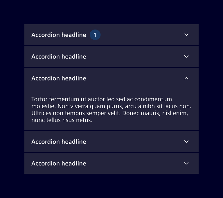
The accordion component allows users to expand and collapse content sections in a vertically stacked layout. Each section is represented by a header that users can select to reveal or hide the corresponding content.
Usage
Accordions are often used to display large amounts of related information in a condensed, organized manner. By collapsing and expanding sections, users can focus on the selected content.
The title in the header gives a preview of the content, allowing to find the looked after information quickly and efficiently. For sections containing lists or data, a badge can offer a quick summary, such as the total number of items.
When to use
- When users need to focus on key information without viewing all content at once.
- To group related information clearly and in a way that's easy to navigate, improving content understanding.
- When space is limited, allowing users to hide irrelevant content, especially in side panel or on mobile screens.
- Use it for content that is not immediately necessary but still useful for users to access when they need it.
Best practices
- Don't use it when users need most or all of the content on the page to accomplish their task.
- Keep the number of sections manageable to avoid clutter.
- Consider expanding important sections by default.
- Avoid using them for primary navigation or essential information.
Design
Elements
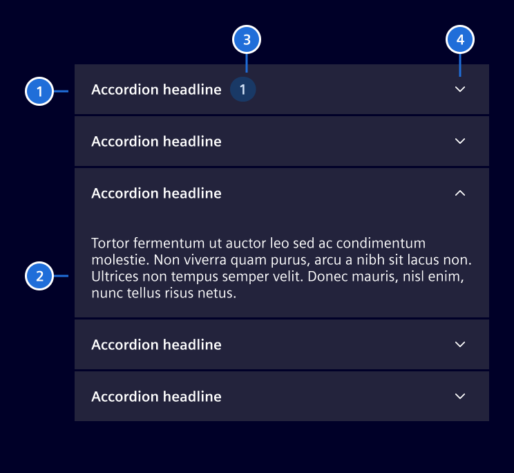
\1.Header, 2. Content, 3. Badge (optional), 4. Expand/collapse indicator
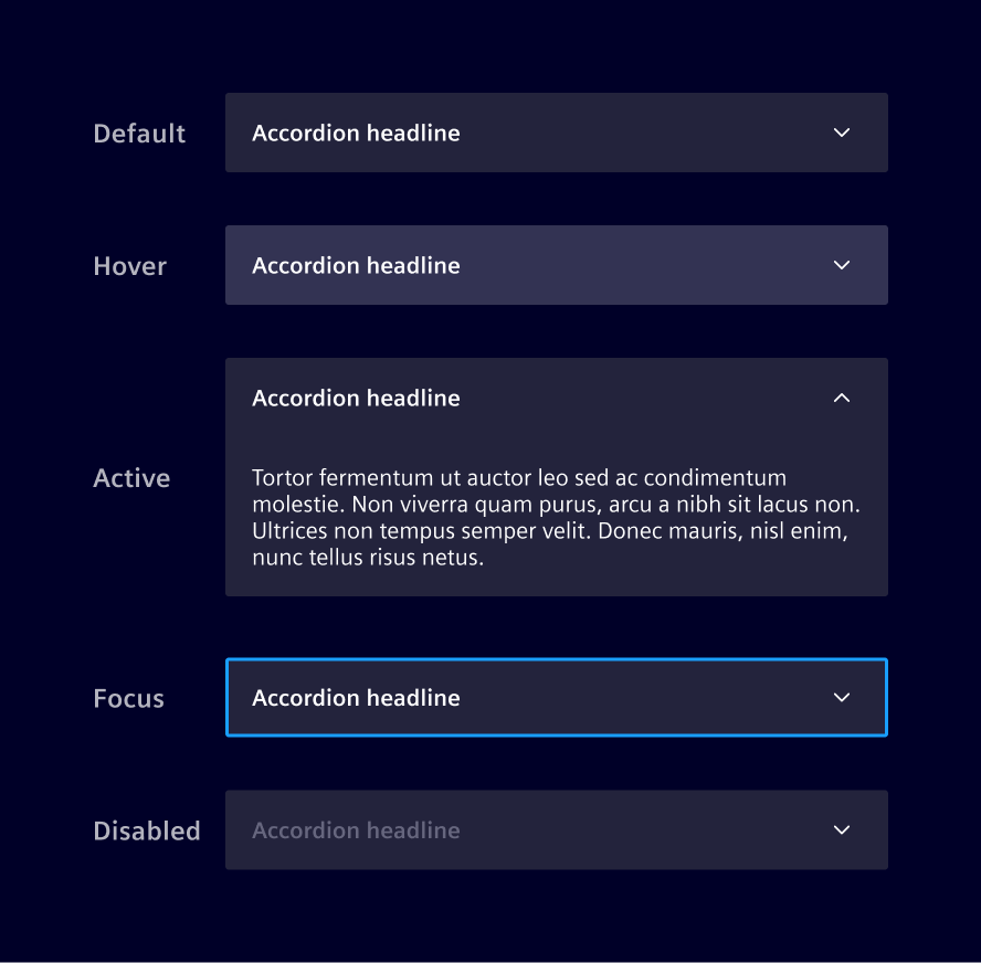
States
Placement
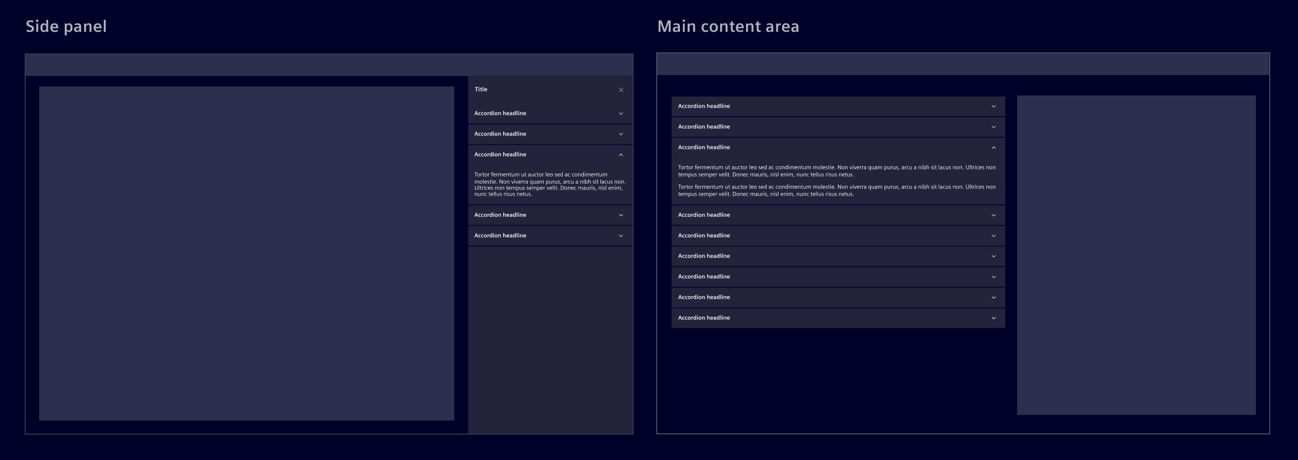
Accordions can be used in either the side panel or within the main content area.
Collapsible panels variants
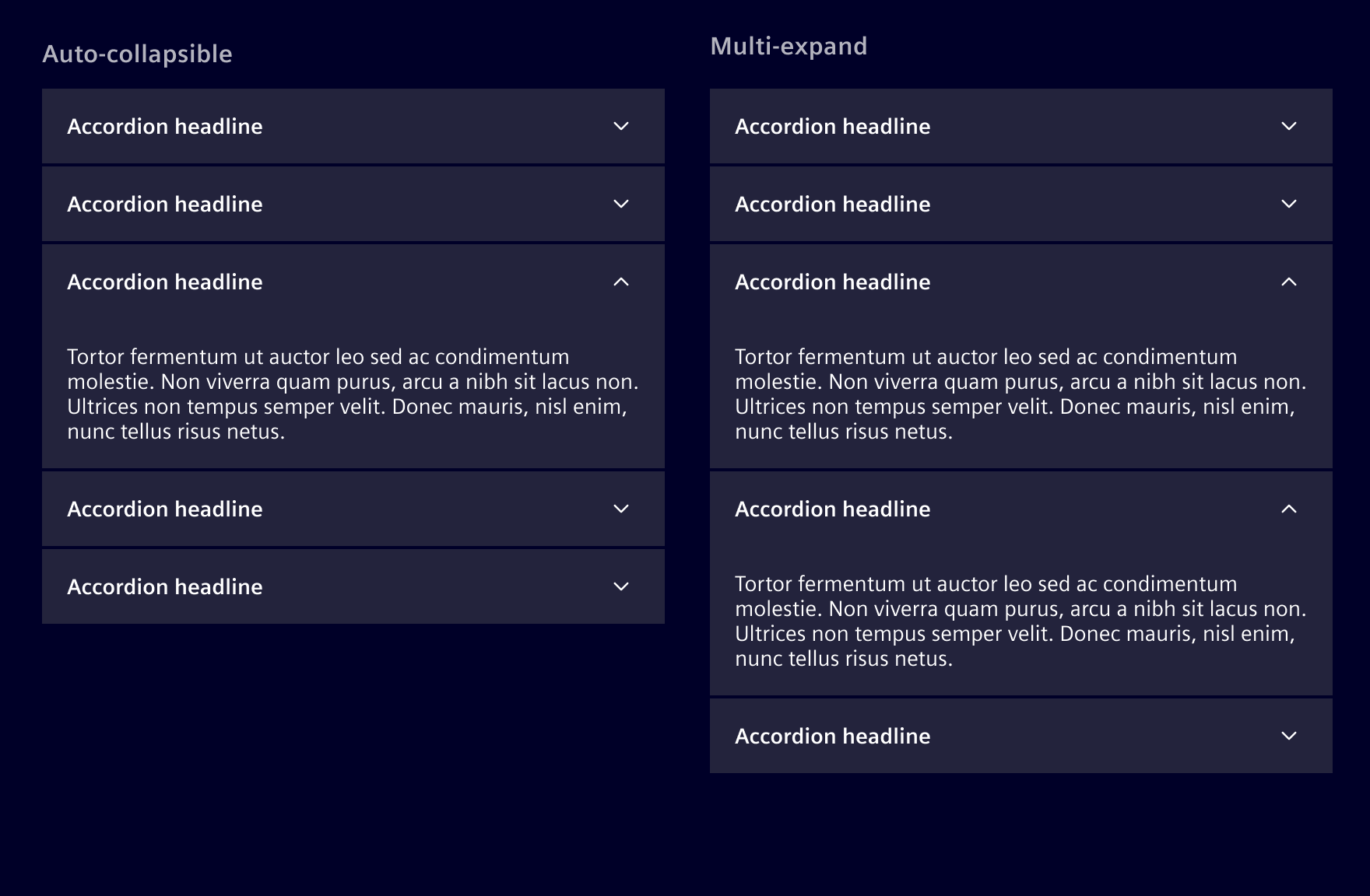
According to the use case, the accordion sections can be auto-collapsible or multi-expand.
- Auto-collapsible accordions allow only one section to be open at a time.
- Multi-expand accordions allow multiple sections to remain open simultaneously.
As a general rule, it's best to allow users to open multiple sections simultaneously, enabling them to view and compare different sections at once. Use the auto-collapsible accordion if the information in each section is independent and users are unlikely to need simultaneous access.
Scrolling behavior
When the content length exceeds the viewport, the entire accordion should scroll vertically. Avoid scrolling within individual sections.
Code
Usage
si-accordion can be imported using the module
import { SiAccordionModule } from '@siemens/element-ng/accordion';

@NgModule({
  imports: [SiAccordionModule, ...]
})
or as a standalone component
import { SiAccordionComponent, SiCollapsiblePanelComponent } from '@siemens/element-ng/accordion';

@Component({
  imports: [
    SiAccordionComponent,
    SiCollapsiblePanelComponent,
    ...
  ]
})
The basic element is <si-collapsible-panel> which consists of a heading and collapsible content. Use as many as required. The panels can be used with or without the accordion effect provided by <si-accordion>, see the two examples:
Collapsible Panels
In this example, collapsible panels are used without an accordion allowing multiple panels staying open at the same time.
In the next example, we combine the panels with icons and additional header CSS classes.
Custom heading
The collapsible panel supports customizing the heading via content projection by applying the si-panel-heading directive to an HTML element as shown in the example below:
<si-collapsible-panel contentCssClasses="p-6">
  <span si-panel-heading>Heading via <mark>content projection</mark></span>
  The panel content
</si-collapsible-panel>
SiCollapsiblePanelComponent API Documentation
si-collapsible-panel Input Properties
| Name | Type | Default | Description |
|---|---|---|---|
| badge ¶ | (string | number) | Defines the content of the optional badge. Should be a number or something like "100+". if undefined or empty string, no badge is displayed | |
| badgeColor ¶ | string | Defines the background color of the badge. Default is specific to Element flavour. | |
| contentBgClasses ¶ | string | '' | Additional CSS classes for the collapsible content region. |
| contentCssClasses ¶ | string | '' | Additional CSS classes for the wrapping content element. |
| disabled ¶ | boolean | false | Whether the si-collapsible-panel is disabled. |
| headerCssClasses ¶ | string | '' | Additional CSS classes for the top element. |
| heading ¶ | TranslatableString | Heading for the collapsible panel. | |
| icon ¶ | string | The icon to be displayed besides the heading. | |
| opened ¶ | boolean | false | Expand/collapse the panel. |
colorVariant ¶ | BackgroundColorVariant | Color variant for component background. Deprecated: This input has no effect on the component styling. |
Output Properties
| Name | Type | Description |
|---|---|---|
| openedChange ¶ | boolean | Expand/collapse the panel. |
| panelToggle ¶ | boolean | An event emitted when the user triggered expand/collapse and emit with the new open state. The event is emitted before the animation happens. |
Attributes and Methods
| Name | Type | Default | Description |
|---|---|---|---|
| openClose(...) ¶ | (open: boolean, enableAnimation: boolean = true) => void | Expand/collapse panel. Parameters |
Full Accordion
The collapsible panels are wrapped with <si-accordion> to make sure only one panel is open at a time:
SiAccordionComponent API Documentation
si-accordion Input Properties
| Name | Type | Default | Description |
|---|---|---|---|
| expandFirstPanel ¶ | boolean | true | Whether the first panel is expanded initially. |
| fullHeight ¶ | boolean | false | Whether panels expand to fill the accordion height. |
| hcollapsed ¶ | boolean | false | Whether the accordion is horizontally collapsed. |
Types Documentation
| Represents a translatable string. This can either be a translation key, e.g. ACTIONS.EDIT that will be automatically translated when displayed on the UI or a pre-translated string, e.g. Edit . Equivalent to a normal string in usage and functionality. |
|---|
| Use this type with filter components colorVariant to render component variants based on background of container |
|---|
Except where otherwise noted, content on this site is licensed under MIT License.