Threshold
The threshold component compares an input signal to specific threshold values and produces an output based on whether the input signal is above or below the threshold.
The threshold editor enables the user to create and edit thresholds and their conditions.
Usage
A threshold editor component is typically used in situations where a user needs to set a specific threshold value or range for a particular parameter or setting. This can be useful in a variety of contexts, such as setting comfort-levels, air quality-levels and more.
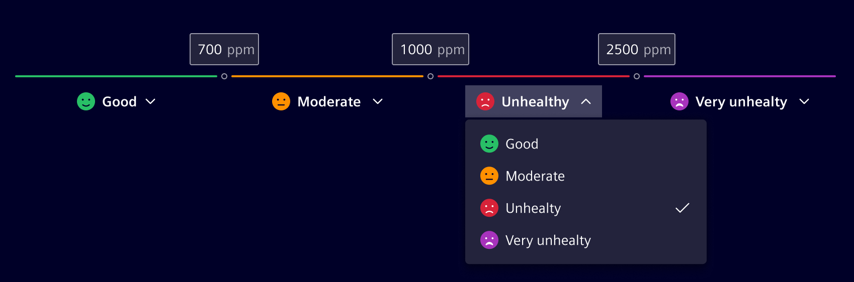
The component is highly flexible and can be customized to specific project needs in terms of:
- Number of thresholds (1..n)
- Unit of threshold values
- Condition levels
- Adding and deleting thresholds
- Layout: Vertical, horizontal
Design
Elements
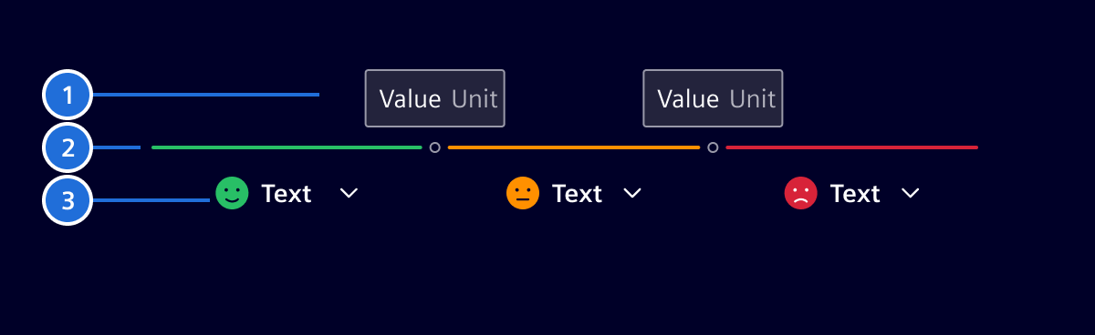
- Threshold value: Allows users to input a numeric value. The unit (optional) is configurable to a specific to need and has to be the same for all threshold values. See the number input component to for its interaction states.
- Connector: Visually links the different steps together. It can assume different colors according to the selected condition.
- Condition: Allows users to select a condition. It can have an icon or a composite icon. See the select component for further details.
Number of thresholds
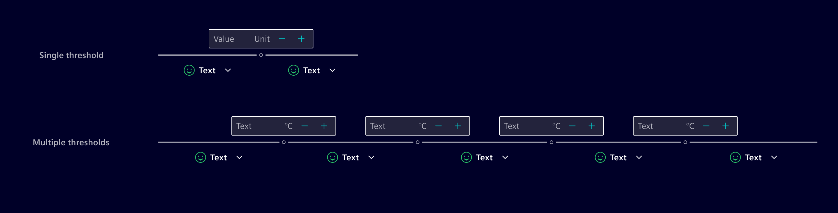
The number of thresholds is defined by the use-case but limited by the available space based on viewport and orientation. There should be at least a single threshold and ideally not more than 6.
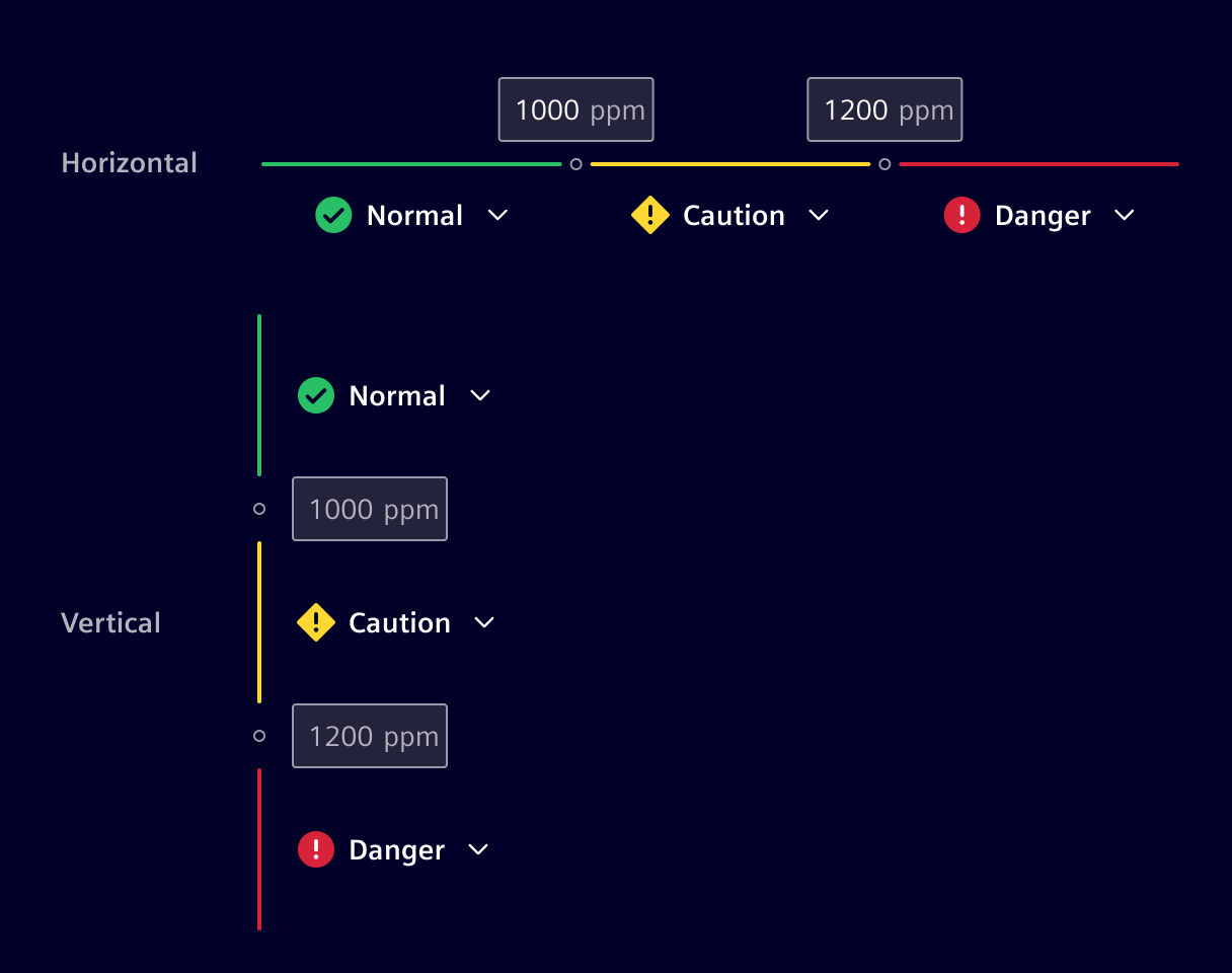
Layout
The project can choose between a horizontal or vertical layout. The vertical orientation adapts better to small screen sizes and higher number of thresholds.
Modes
Depending on the use-case, the threshold component can be used in two different modes:
- Static: Predefined number of thresholds, where the user can only adapt the threshold values and the conditions.
- Configurable: In addition to the static mode, the user can also add and remove thresholds.
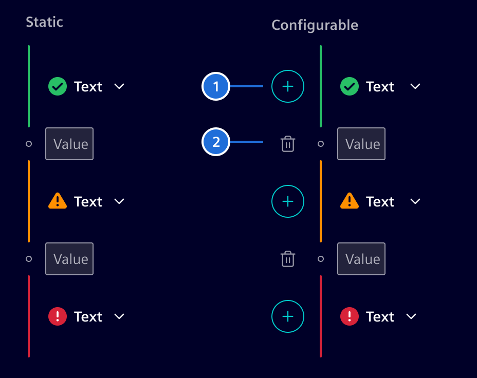
- Add, 2. Delete
Validation
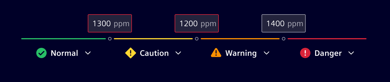
Threshold values have to be in an ascending and logical order. If the threshold values are not entered in a ascending order by the user, then he will get a feedback.
Code
Usage
import { SiThresholdComponent } from '@siemens/element-ng/threshold';

@Component({
  imports: [SiThresholdComponent, ...]
})
SiThresholdComponent API Documentation
si-threshold Input Properties
| Name | Type | Default | Description |
|---|---|---|---|
| addAriaLabel ¶ | TranslatableString | $localize`:@@SI_THRESHOLD.ADD:Add step` | The aria-label for add button |
| canAddRemoveSteps ¶ | boolean | true | When disabled, steps cannot be added/removed |
| deleteAriaLabel ¶ | TranslatableString | $localize`:@@SI_THRESHOLD.DELETE:Remove step` | The aria-label for delete button |
| horizontalLayout ¶ | boolean | false | Use horizontal layout? |
| inputAriaLabel ¶ | TranslatableString | $localize`:@@SI_THRESHOLD.INPUT_LABEL:Threshold value` | The aria-label for input field |
| maxSteps ¶ | number | 0 | Max. number of steps, 0 for no hard limit |
| maxValue ¶ | number | 100 | The max. value for the threshold value |
| minValue ¶ | number | 0 | The min. value for the threshold value |
| options ¶ | SelectOption<unknown>[] | [] | Options to be shown in select dropdown |
| readonly ¶ | boolean | false | The obvious |
| readonlyConditions ¶ | boolean | false | Indicate that the threshold options are readonly and cannot be changed. This will also disable adding / removing steps. |
| scrollStrategy ¶ | ScrollStrategy | defaultConnectedOverlayScrollStrategy() | CDK scroll strategy used for threshold option select overlays. |
| showDecIncButtons ¶ | boolean | true | Show dec/inc buttons? |
| statusAriaLabel ¶ | TranslatableString | $localize`:@@SI_THRESHOLD.STATUS:Status` | The aria-label for status selection |
| stepSize ¶ | number | 1 | The step size for the threshold value |
| thresholdSteps ¶ | ThresholdStep[] | [] | The thresholds |
| unit ¶ | string | '' | The unit to show |
| useAliasForStepValues ¶ | boolean | false | When enabled, numeric step inputs are replaced with readonly text fields displaying the aliasLabel of each step. Add/remove step buttons are also hidden. |
| validation ¶ | boolean | true | Do validation? |
Output Properties
| Name | Type | Description |
|---|---|---|
| thresholdStepsChange ¶ | ThresholdStep[] | The thresholds |
| validChange ¶ | boolean | Fired when validation status changes |
Attributes and Methods
| Name | Type | Default | Description |
|---|---|---|---|
| (readonly) valid ¶ | boolean | Whether the current input value is valid or not. |
Types Documentation
| Represents a translatable string. This can either be a translation key, e.g. ACTIONS.EDIT that will be automatically translated when displayed on the UI or a pre-translated string, e.g. Edit . Equivalent to a normal string in usage and functionality. |
|---|
| A select option | ||||||||||
|---|---|---|---|---|---|---|---|---|---|---|
|
| One step in a list of thresholds | |||||
|---|---|---|---|---|---|
|
Except where otherwise noted, content on this site is licensed under MIT License.