Text area
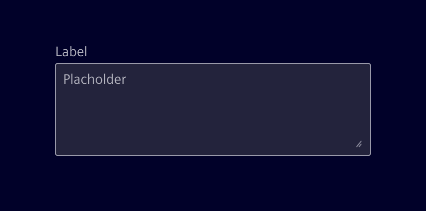
Text areas allow users to enter multiple lines of text within a field.
Usage
Use a text area when the expected user input spans multiple lines. For single-line input, use a single-line field instead.
Best practices
- Keep labels short and clear
- Use placeholders to reinforce the information needed in the input. They should not contain critical information, instead use labels for that.
- Assist while the user is entering the data (warning, validation, etc.)
Design
Elements
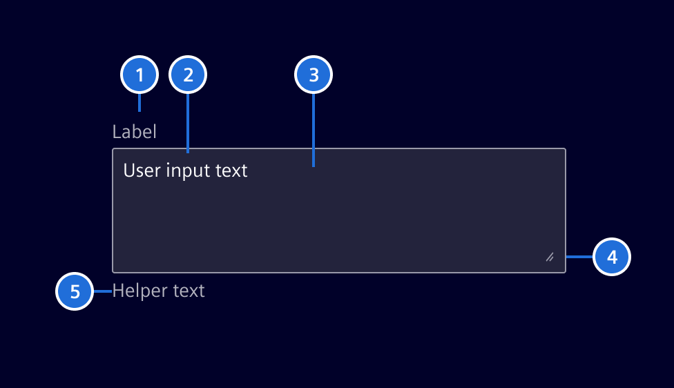
1. Label (optional), 2. Content/Placeholder text, 3. Container, 4. Icon (optional), 5. Helper text (optional), 6. Resizer (optional)
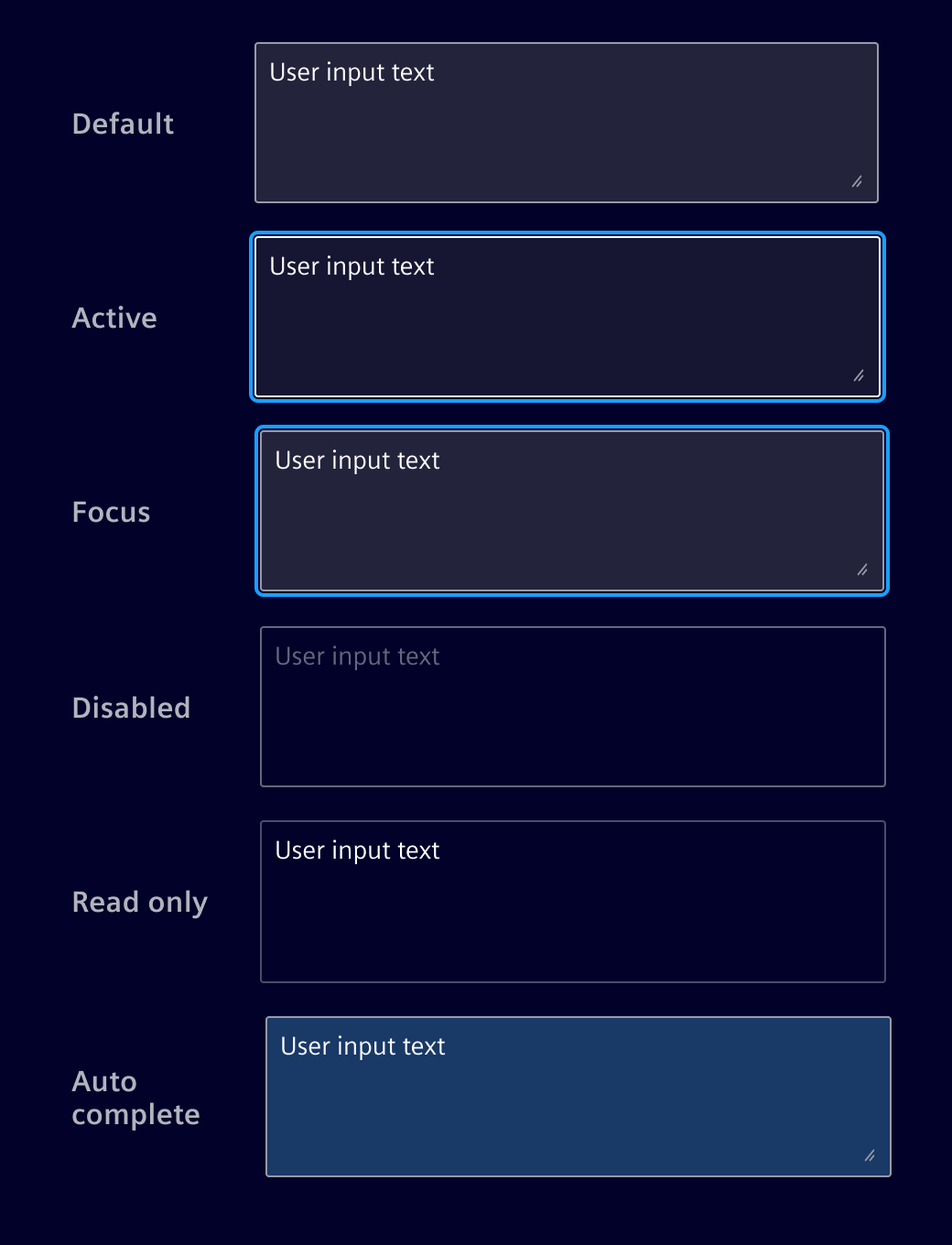
Interaction states
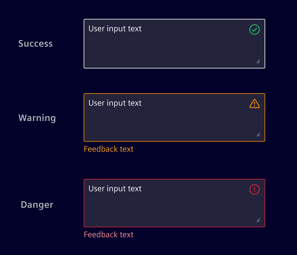
Validation states
Real time validation helps to streamline the process and keep input data clean while the user is filling out the field.
Content overflow
The input height can be fixed, with overflow managed by a scrollbar, or it can grow dynamically as the user types. Users may also manually resize the field if resizing is enabled.
Except where otherwise noted, content on this site is licensed under MIT License.