Select
Select inputs are fields that allow users to choose options from a menu.
Usage
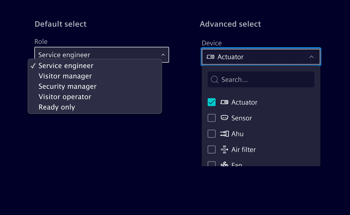
Element offers two distinct select input types: the Default Select and the Advanced Select.
The default select is based on the native HTML select element. Use it for straightforward scenarios where users need to select a single option from a dropdown list.
The advanced select is designed to accommodate more complex requirements, offering support for single-selection, multi-selection, icons, and a search function. This variant should be employed only when one or more of the mentioned capabilities are necessary.
When to use
- When users need to make a choice among a list of options.
- When there are more than 5 options to choose from.
- When options can be logically grouped (e.g., countries, cities, etc.).
- Use it in forms and for attribute selection.
Best practices
- Don't use it if there are less than three options available for selection.
- Analyze what actions will save more time for the user (e.g. selecting an item versus typing that item).
- If possible, mark the default option as the recommended one (avoid extra clicking).
Design
Default select
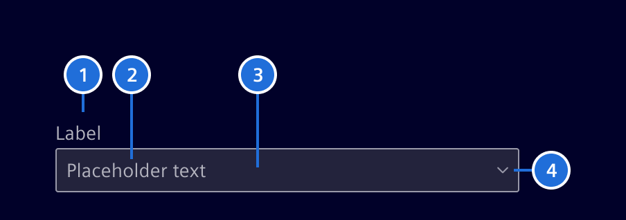
1.Label (optional), 2. Content/placeholder text, 3. Container, 4. Arrow
Advanced select
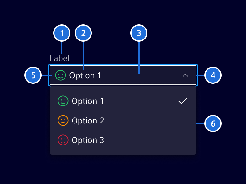
Label (optional) 2. Content/placeholder text, 3. Container, 4. Arrow, 5. Icon (optional), 6. Menu
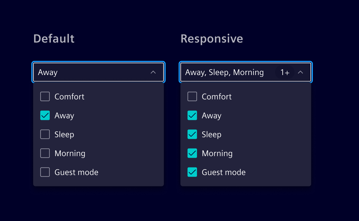
Advanced select supports both single and multiple selections. When dealing with many options, a filterable menu with a search bar can be used to streamline selection.
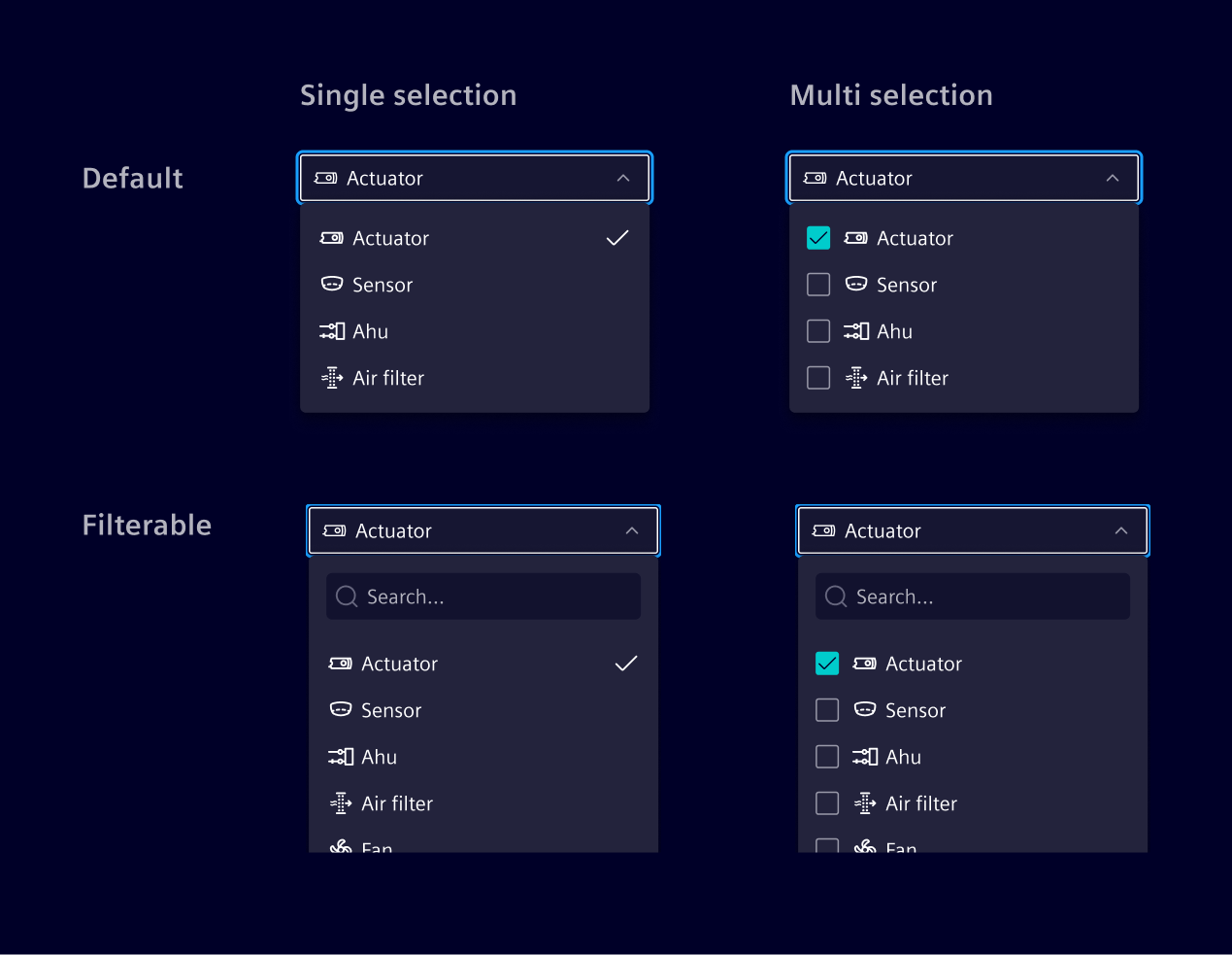
Selected options are displayed within the input field. If they exceed the available space, they will be grouped into a single pill (e.g. using 3+).
States
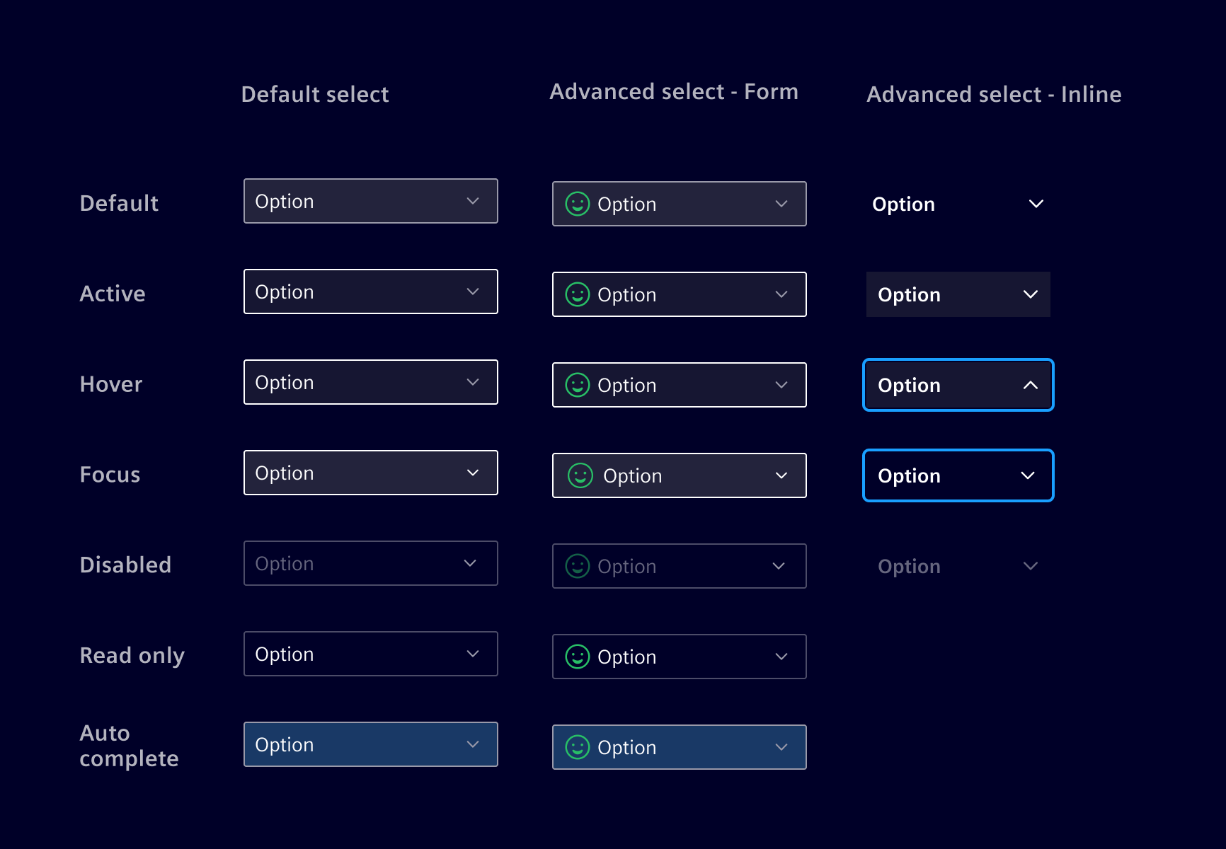
Advanced select provides two configurations: Inline for direct integration with content, and form-style for structured data entry.
Label (optional)
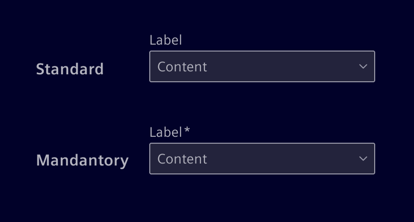
Effective form labeling helps users understand what information to enter.
- Keep labels short and clear (should not be wider than the input field).
- A mandatory field is marked with an *-asterisk.
Validation
The select input field has the same validation states as a input component.
Code
References
- Bootstrap: Select
Example
si-select component
Element also offers a custom select component called si-select. The si-select component provide the following abilities:
- specify the icon for each specified option.
- disable options
- single / multi-select behavior
- custom option input
- option groups
- customizable rendering of options
- option filtering
- customizable footer with actions
The component should only be used if you require one of the listed abilities. Otherwise the native select input with Bootstrap markup is preferred.
Usage
si-select can be imported using the module
import { SiSelectModule } from '@siemens/element-ng/select';

@NgModule({
  imports: [SiSelectModule, ...]
})
or as a standalone component:
import {
  SiSelectComponent,
  SiSelectSimpleOptionsDirective, // At least one option directive is required. Unused option types can be omitted.
  SiSelectSingleValueDirective, // At least one value directive is required. Unused value types can be omitted.
  SiSelectMultiValueDirective
} from '@siemens/element-ng/select';

@Component({
  imports: [
    SiSelectComponent,
    SiSelectSimpleOptionsDirective,
    SiSelectSingleValueDirective,
    SiSelectMultiValueDirective,
  ]
})
Options
Options are provided as an array of SelectItem<T> objects:
<si-select
  [options]="[
    {
      type: 'option',
      value: { id: id, myProperty: myValue },
      label: 'Label',
      disabled: false,
      icon: 'element-face-happy',
      iconColor: 'status-success'
    }
  ]"
/>
Customize option rendering using a template. This template is used for options in the dropdown and, when no input template is provided, for the selected value in the closed input as well:
<si-select
  [options]="[
    { type: 'option', value: 'good', label: 'Good' },
    { type: 'option', value: 'fair', label: 'Fair' },
    { type: 'option', value: 'bad', label: 'Bad' }
  ]"
>
  <ng-template let-option siSelectOptionTemplate>{{ option.label | uppercase }}</ng-template>
</si-select>
To use different templates for the dropdown options and the selected value in the closed input, provide an additional siSelectValueTemplate template. Both templates receive the SelectOption<T> as their implicit value:
<si-select [options]="options">
  <ng-template let-option siSelectOptionTemplate>
    <div class="d-flex flex-column">
      <span>{{ option.label }}</span>
      <small class="text-secondary">Additional information</small>
    </div>
  </ng-template>
  <ng-template let-option siSelectValueTemplate>{{ option.label }}</ng-template>
</si-select>
Wrap options in groups:
<si-select
  [options]="[
    {
      type: 'group',
      label: 'Group',
      options: [{ type: 'option', label: 'Option', value: 'value' }]
    }
  ]"
>
  <!-- Optional group template -->
  <ng-template let-group siSelectGroupTemplate>{{ group.label | uppercase }}</ng-template>
</si-select>
Lazy options
Instead of providing eagerly loaded options, applications can provide an [optionSource]. The option source allows lazy loading of options. It can be used with or without filtering.
To use the [optionSource] applications must implement the SelectOptionSource interface:
// This provides options which value are of type MyValue.
// For async methods the si-select will show a loading spinner until the observable emits the first time.
// Always return options in a consistent order.
export class MyOptionSource implements SelectOptionSource<MyValue> {
  getOptionsForValues(values: MyValue[]): Observable<SelectOptionNext<MyValue>[]> {
    // si-select will call this function when it needs to get options for the provided values.
    // This function is typically called when the value is set via a formControl or ngModel.
    // Lookup the values on your server and return the corresponding options.
  }

  getAllOptions?(): Observable<SelectItem<MyValue>[]> {
    // This function is optional, if filtering is enabled.
    // The options returned by this function are shown in the dropdown when no search value is provided.
    // You can return all available options or just a subset of the most common options.
    // If this function is not implemented only the selected options are shown.
  }

  getOptionsForSearch?(search: MyValue): Observable<SelectItem<MyValue>[]> {
    // This function is required if filtering is enabled.
    // It is never called with an empty search value.
    // Return all options that matches the search value.
  }

  compareOptions?(a: SelectOptionNext<MyValue>, b: SelectOptionNext<MyValue>): number {
    // This function is optional.
    // If provided it is used to compare options for sorting.
    // This ensures a correct order if options are loaded from the cache.
  }

  optionsEqual?(optionA: MyValue, optionB: MyValue): boolean {
    // By default si-select checks values on equality by reference.
    // If you use objects as values override this method so that equal values are recognized as such.
    // For primitiv values like strings this method should be omitted.
  }
}
Then use this source in your component:
import {
  SiSelectComponent,
  SiSelectSingleValueDirective,
  SiSelectLazyOptionsDirective
} from '@siemens/element-ng/select';

@Component({
  selector: 'app-sample',
  template: '<si-select [optionSource]="myOptionSource" [formControl]="control" />',
  imports: [SiSelectComponent, SiSelectSingleValueDirective, SiSelectLazyOptionsDirective]
})
export class SampleComponent {
  myOptionSource = new MyOptionSource();
  control = new FormControl<MyValue | null>(null);
}
Selection
Single selection:
@Component({
  selector: 'app-sample',
  imports: [SiSelectComponent, SiSelectSimpleOptionsDirective, SiSelectSingleValueDirective],
  template: '<si-select [options]="optionsList" [(value)]="selected" />'
})
export class SampleComponent {
  optionsList: SelectItem<string>[] = [
    {
      type: 'option',
      value: 'good',
      label: 'Good'
    },
    {
      type: 'option',
      value: 'fair',
      label: 'Fair'
    }
  ];
  selected = 'good';
}
Multi selection:
@Component({
  selector: 'app-sample',
  imports: [SiSelectComponent, SiSelectSimpleOptionsDirective, SiSelectMultiValueDirective],
  template: '<si-select multi [options]="optionsList" [(value)]="multiValue" />'
})
export class SampleComponent {
  optionsList: SelectItem<string>[] = [
    { type: 'option', value: 'good', label: 'Good' },
    { type: 'option', value: 'fair', label: 'Fair' }
  ];
  multiValue = ['good', 'fair'];
}
Filtering options
Add the attribute hasFilter to enable an input element for option filtering in the overlay of the si-select component. If a custom template is used, a value provider is required.
<si-select hasFilter [options]="[...]" />
Footer actions
By using the siSelectActions directive, you can add custom actions to the footer of the si-select component.
To align the styling to the design system specification it is necessary that actions:
- apply the
siSelectActiondirective to each item - and footer buttons shall apply the following classes
btn btn-link.
<si-select [options]="[{ id: 'option1', title: 'Option 1' }, { id: 'option2', title: 'Option 2' }]">
  <ng-template siSelectActions>
    <button siSelectAction type="button" class="btn btn-link" aria-label="Action 1">
      Action 1
    </button>
    <button siSelectAction type="button" class="btn btn-link" aria-label="Action 2">
      Action 2
    </button>
  </ng-template>
</si-select>
In some scenarios it is necessary to close the dropdown on click for example to display a modal dialog. The siSelectActions directive offers an input selectActionAutoClose for this purpose.
The following demonstrates how to add a "Create" button within the dropdown actions that, when clicked, will close the dropdown:
<si-select [options]="[{ id: 'option1', title: 'Option 1' }, { id: 'option2', title: 'Option 2' }]">
  <ng-template siSelectActions>
    <button siSelectAction selectActionAutoClose type="button" class="btn btn-link" (click)="....">
      Create
    </button>
  </ng-template>
</si-select>
Custom select (experimental)
When the rigid si-select options API is not enough — for example to embed a tree, drive multi-stage selection with Apply / Cancel semantics, or render arbitrary UI inside the dropdown — applications can compose their own select from the following primitives:
SiCustomSelectDirective— host directive providing the combobox wiring:ControlValueAccessor(formControl,ngModel,[(value)]), disabled / readonly handling,SiFormItemControlintegration, ARIAcomboboxrole, keyboard activation (Enter, Space, ArrowDown / ArrowUp), CDK overlay lifecycle, and focus trapping inside the dropdown.SiSelectComboboxComponent— the visual trigger that renders the projected value and the dropdown caret. Pair it withSiSelectComboboxValueComponentto mark individual selected entries.SiSelectDropdownDirective— structural directive (*si-select-dropdown/<ng-template si-select-dropdown>) that registers the dropdown content template with the parent custom select. Requires acontentTypeinput whose value is forwarded to thearia-haspopupattribute of the combobox host (menu,listbox,tree,grid,dialog,true, orfalse).
The strategy is intentionally minimal: the host directive owns state, focus, keyboard handling and form integration, while applications retain full control over what is rendered in the trigger and in the dropdown. The same component can therefore be styled either as a form-control (inside an si-form-item, with validation) or as a button (btn btn-ghost) by applying the corresponding class on the host element.
A custom select component typically applies SiCustomSelectDirective as a host directive and exposes the inputs and outputs the application needs:
@Component({
  selector: 'app-tree-select',
  imports: [SiSelectComboboxComponent, SiSelectDropdownDirective, SiTreeViewComponent],
  template: `
    <si-select-combobox>
      @if (select.value(); as val) {
        {{ val }}
      } @else {
        <span class="text-secondary">Select a location...</span>
      }
    </si-select-combobox>

    <ng-template si-select-dropdown contentType="tree">
      <si-tree-view
        ariaLabel="Locations"
        [items]="items()"
        [enableSelection]="true"
        [singleSelectMode]="true"
        (treeItemClicked)="selectItem($event)"
      />
    </ng-template>
  `,
  hostDirectives: [
    {
      directive: SiCustomSelectDirective,
      inputs: ['disabled', 'readonly', 'value'],
      outputs: ['valueChange']
    }
  ]
})
export class TreeSelectComponent {
  protected readonly select = inject<SiCustomSelectDirective<string>>(SiCustomSelectDirective);

  readonly items = input<TreeItem[]>([]);

  selectItem(item: TreeItem): void {
    if (item.label) {
      this.select.updateValue(item.label as string);
      this.select.close();
    }
  }
}
Because si-tree-view (and similar components) mutate the model they render, inputs must be deep-cloned before they are passed in. A robust pattern is to keep a pendingItems signal that is repopulated from a fresh JSON.parse(JSON.stringify(...)) clone whenever the dropdown opens, so each opening starts from a clean slate without leaking state back to the caller.
The same primitives can drive a multi-select with Apply / Cancel. The host component buffers pending changes while the dropdown is open and only calls select.updateValue(...) once the user confirms — keeping the ControlValueAccessor value stable until the selection is applied.
SiSelectComponent API Documentation
si-select Common interface for form item controls. Controls that should be connected to SiFormItemComponent must implement this interface and must be provided using the SI_FORM_ITEM_CONTROL token.
Input Properties
| Name | Type | Default | Description |
|---|---|---|---|
| ariaLabel ¶ | (string | null) | null | Aria label of the select. |
| disabled ¶ | boolean | false | Whether the select input is disabled. |
| errormessageId ¶ | string | ${this.id()}-errormessage | This ID will be bound to the aria-describedby attribute of the select. |
| filterPlaceholder ¶ | TranslatableString | $localize`:@@SI_SELECT.SEARCH-PLACEHOLDER:Search…` | Placeholder for search input field. |
| hasFilter ¶ | boolean | false | Enables the filter input |
| id ¶ | string | __si-select-${SiCustomSelectDirective.idCounter++} | Unique identifier. |
| labelledby ¶ | string | undefined | Aria labelledby of the select. |
| noResultsFoundLabel ¶ | TranslatableString | $localize`:@@SI_SELECT.NO-RESULTS-FOUND:No results found` | Label if no item can be found. |
| placeholder ¶ | TranslatableString | Placeholder text to display when no options are selected. | |
| readonly ¶ | boolean | false | Readonly state. Similar to disabled but with higher contrast. |
| scrollStrategy ¶ | ScrollStrategy | defaultConnectedOverlayScrollStrategy() | Optional CDK scroll strategy used for the custom select overlay. |
Output Properties
| Name | Type | Description |
|---|---|---|
| openChange ¶ | boolean | Emits when the dropdown open state changes. |
Attributes and Methods
| Name | Type | Default | Description |
|---|---|---|---|
| close() ¶ | () => void | Closes the si-select . | |
| (readonly) errormessageId ¶ | InputSignal<string> | ... | ID bound to the select's aria-describedby attribute. |
| (readonly) id ¶ | InputSignal<string> | ... | Unique identifier. |
| (readonly) labelledbyInput ¶ | InputSignal<(string | undefined)> | ... | Aria labelledby of the select. |
| open() ¶ | () => void | Opens the si-select . | |
| (readonly) openChange ¶ | OutputEmitterRef<boolean> | ... | Emits when the dropdown open state changes. |
| (readonly) readonly ¶ | InputSignalWithTransform<boolean, unknown> | ... | Readonly state. |
| (readonly) scrollStrategy ¶ | InputSignal<ScrollStrategy> | ... | Scroll strategy used for the select overlay. |
Simple options (via SiSelectSimpleOptionsDirective)
si-select[options] This directive allows passing SelectItem to the SiSelectComponent .
Example:
<si-select [options]="[{ type: 'option', value: 'one', label: 'One' }, { type: 'option', value: 'two', label: 'Two' }]"></si-select>
<si-select [options]="[{ type: 'group', label: 'Group', options [{ type: 'option', value: 1, label: 'One' }, { type: 'option', value: 2, label: 'Two' }] }]"></si-select>
Input Properties
| Name | Type | Default | Description |
|---|---|---|---|
| optionEqualCheckFn ¶ | (a: T, b: T) => boolean | (a: T, b: T): boolean => a === b | By default, values are check on referential equality. Provide a function to customize the behavior. |
| options ¶ | (SelectItem<T>[] | null) | Options to be shown in select dropdown |
Attributes and Methods
| Name | Type | Default | Description |
|---|---|---|---|
| (readonly) allRows ¶ | Signal<SelectItem<T>[]> | [] | All group and option items in the dropdown. |
| onFilter(...) ¶ | (filterValue: string) => void | This function is called when a user enters a filter query. It is expected that an implementation will update the rows based on the query.Parameters
| |
| onValueChange(...) ¶ | (value: T[]) => void | Is always called when the value changes. The implementation must update selectedRows when called. Parameters
| |
| (readonly) rows ¶ | Signal<SelectItem<T>[]> | [] | Rows that should be shown. |
| (readonly) selectedRows ¶ | Signal<SelectOption<T>[]> | ... | List of all options that are currently selected. Must be updated when onValueChange is called. |
SiCustomSelectDirective API Documentation
[siCustomSelect] Host directive for building custom selects.
Add this as a hostDirective on your component and expose the inputs/outputs you need. The directive handles: - ControlValueAccessor: ControlValueAccessor integration ( formControl , ngModel , [(value)] ) - Disabled / readonly state management - Overlay lifecycle for the dropdown (open/close) - Focus management and focus trapping in the dropdown - Opening the dropdown on click, Enter, Space, ArrowDown, ArrowUp - SiFormItemControl integration
Use SiSelectDropdownDirective to mark the dropdown template in your component, and call open , close , updateValue from your component logic.
Example:
@Component({
  selector: 'app-my-select',
  hostDirectives: [{
    directive: SiCustomSelectDirective,
    inputs: ['disabled', 'readonly', 'value'],
    outputs: ['valueChange']
  }],
  template: `
    <si-select-combobox>
      {{ select.value() }}
    </si-select-combobox>
    <ng-template si-select-dropdown contentType="listbox">
      <button (click)="select.updateValue('new'); select.close()">Pick</button>
    </ng-template>
  `
})
export class MySelectComponent {
  readonly select = inject(SiCustomSelectDirective);
}
Input Properties
| Name | Type | Default | Description |
|---|---|---|---|
| disabled ¶ | boolean | false | Whether the select input is disabled. |
| errormessageId ¶ | string | ${this.id()}-errormessage | This ID will be bound to the aria-describedby attribute of the select. |
| id ¶ | string | __si-select-${SiCustomSelectDirective.idCounter++} | Unique identifier. |
| labelledby ¶ | string | undefined | Aria labelledby of the select. |
| readonly ¶ | boolean | false | Readonly state. Similar to disabled but with higher contrast. |
| siCustomSelectScrollStrategy ¶ | ScrollStrategy | defaultConnectedOverlayScrollStrategy() | Optional CDK scroll strategy used for the custom select overlay. |
| value ¶ | (T | null) | undefined | The current value, supports two-way binding via [(value)] . |
Output Properties
| Name | Type | Description |
|---|---|---|
| openChange ¶ | boolean | Emits when the dropdown open state changes. |
| valueChange ¶ | (T | null) | The current value, supports two-way binding via [(value)] . |
Attributes and Methods
| Name | Type | Default | Description |
|---|---|---|---|
| close() ¶ | () => void | Closes the dropdown overlay and restores focus. | |
| (readonly) disabled ¶ | Signal<boolean> | ... | Combined disabled state from input and form control. |
| (readonly) isOpen ¶ | WritableSignal<boolean> | false | Whether the dropdown is currently open. |
| open(...) ¶ | (event: Event) => void | Opens the dropdown overlay. Parameters
| |
| updateValue(...) ¶ | (value: (T | null | undefined)) => void | Updates the value programmatically. Call this from your dropdown template to set the new value. Parameters |
SiSelectComboboxComponent API Documentation
si-select-combobox Visual trigger element for custom selects built with SiCustomSelectDirective . Renders the projected content and a dropdown caret icon.
The ARIA role, focus handling, and state attributes live on the host component via SiCustomSelectDirective — this component is purely visual.
Example:
<si-select-combobox>
  {{ select.value() }}
</si-select-combobox>
No API to document for this.
SiSelectComboboxValueComponent API Documentation
si-select-combobox-value Represents a single selected value inside an SiSelectComboboxComponent .
Project one <si-select-combobox-value> per selected entry. Optional icon , iconColor , stackedIcon and stackedIconColor inputs mirror the icon API of SelectOption and render an icon (with optional stacked overlay) before the projected content.
Add the comma-separated CSS class to render a comma between adjacent values. Omit it when using chips, custom separators, or a single value.
Example:
<si-select-combobox>
  <si-select-combobox-value
    icon="element-face-happy"
    iconColor="status-success"
  >
    {{ select.value() }}
  </si-select-combobox-value>
</si-select-combobox>
Input Properties
| Name | Type | Default | Description |
|---|---|---|---|
| icon ¶ | string | An optional icon rendered before the projected content. | |
| iconColor ¶ | string | Optional CSS color class applied to icon . | |
| stackedIcon ¶ | string | Optional secondary icon stacked on top of icon . | |
| stackedIconColor ¶ | string | Optional CSS color class applied to stackedIcon . |
SiSelectDropdownDirective API Documentation
[si-select-dropdown] Structural directive marking the dropdown template for custom selects built with SiCustomSelectDirective .
When placed on an <ng-template> , it automatically registers the template with the parent SiCustomSelectDirective .
Example:
<ng-template si-select-dropdown contentType="listbox">
  <!-- custom dropdown content -->
</ng-template>
Input Properties
| Name | Type | Default | Description |
|---|---|---|---|
| closeOnTab ¶ | boolean | false | Whether pressing Tab closes the dropdown. Keep this disabled when the dropdown contains controls that users must reach with Tab. |
contentType ¶ | SiSelectDropdownContentType | Describes the kind of content rendered by the dropdown. The value is forwarded to the aria-haspopup attribute of the combobox host of the parent SiCustomSelectDirective . |
Types Documentation
| Variable |
|---|
| Represents a translatable string. This can either be a translation key, e.g. ACTIONS.EDIT that will be automatically translated when displayed on the UI or a pre-translated string, e.g. Edit . Equivalent to a normal string in usage and functionality. |
|---|
| Common interface for form item controls. Controls that should be connected to SiFormItemComponent must implement this interface and must be provided using the SI_FORM_ITEM_CONTROL token. | |||||
|---|---|---|---|---|---|
|
| | ||||
|---|---|---|---|---|
|
| Interface for form error mapper. It resolves a key to either a translatable string or function which is called with the validation error for its key and should return a translatable string. | |
|---|---|
| |
| Function The error mapper is used to resolve an angular validation error to a TranslatableString . It will be merged with already existing error mappers. | ||
|---|---|---|
|
| | ||||||
|---|---|---|---|---|---|---|
|
| Alias for SelectOption or SelectGroup |
|---|
| A select option | ||||||||||
|---|---|---|---|---|---|---|---|---|---|---|
|
| A select option group | |||||
|---|---|---|---|---|---|
|
| Possible values for the aria-haspopup attribute exposed by the combobox host of a custom select. |
|---|
| | ||||||||||||||||||||||||||
|---|---|---|---|---|---|---|---|---|---|---|---|---|---|---|---|---|---|---|---|---|---|---|---|---|---|---|
| ||||||||||||||||||||||||||
| ||||||||||||||||||||||||||
| ||||||||||||||||||||||||||
|
| Deprecated: This component should no longer be used. When providing a form wide error mapper, use the provideFormValidationErrorMapper . When using the column layout, use the form-col-layout classes.For a custom breakpoint use the SCSS mixin: | |||||||||||
|---|---|---|---|---|---|---|---|---|---|---|---|
| |||||||||||
| |||||||||||
| |||||||||||
|
| | ||||||||||||
|---|---|---|---|---|---|---|---|---|---|---|---|---|
| ||||||||||||
| ||||||||||||
|
Except where otherwise noted, content on this site is licensed under MIT License.