Skip to content

Number input

The number input allows users to enter and modify a numeric value with an optional unit.

Usage

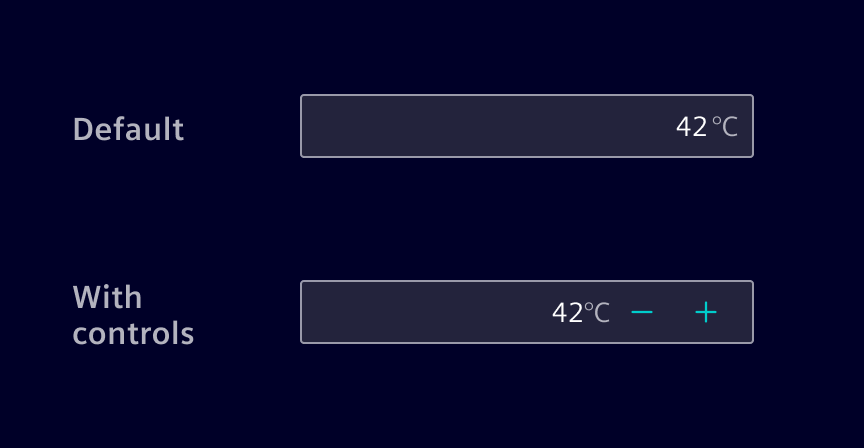
The component includes + / - controls to increment or decrement the value in predefined steps. It acts as a high-level alternative to the native number input control.
Number input

When to use

  • To enter a numeric value in a form or inline in a component.
  • When a user needs precise control over a numeric value.

Best practices

  • Define the width of the number input field according to the maximum value and the grid system.
  • Offer a smart default value whenever possible.
  • When precision is not important, use a slider instead.

Design

Elements

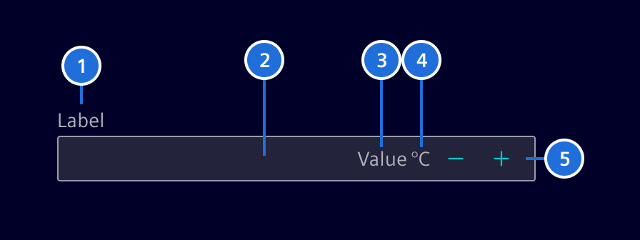
Number input - elements

1. Label (optional), 2. Container, 3. Content, 4. Unit (optional), 5. Controls (optional)

Label (optional)

Effective form labeling helps users understand what information to enter.
Number input - label

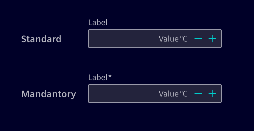
  • Provide a short and concise label that is shorter than the input field itself.
  • A mandatory field is marked with an *-asterisk.
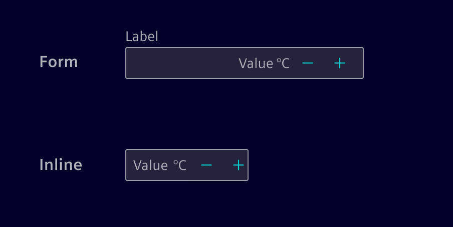
  • Labels can be placed above or left to the input.

Controls (optional)

The number input can contain controls to increment or decrement the value.

It is possible to set the step size. E.g. in a range of 0..10'000, a step size of 10 is more appropriate.
Number input - controls

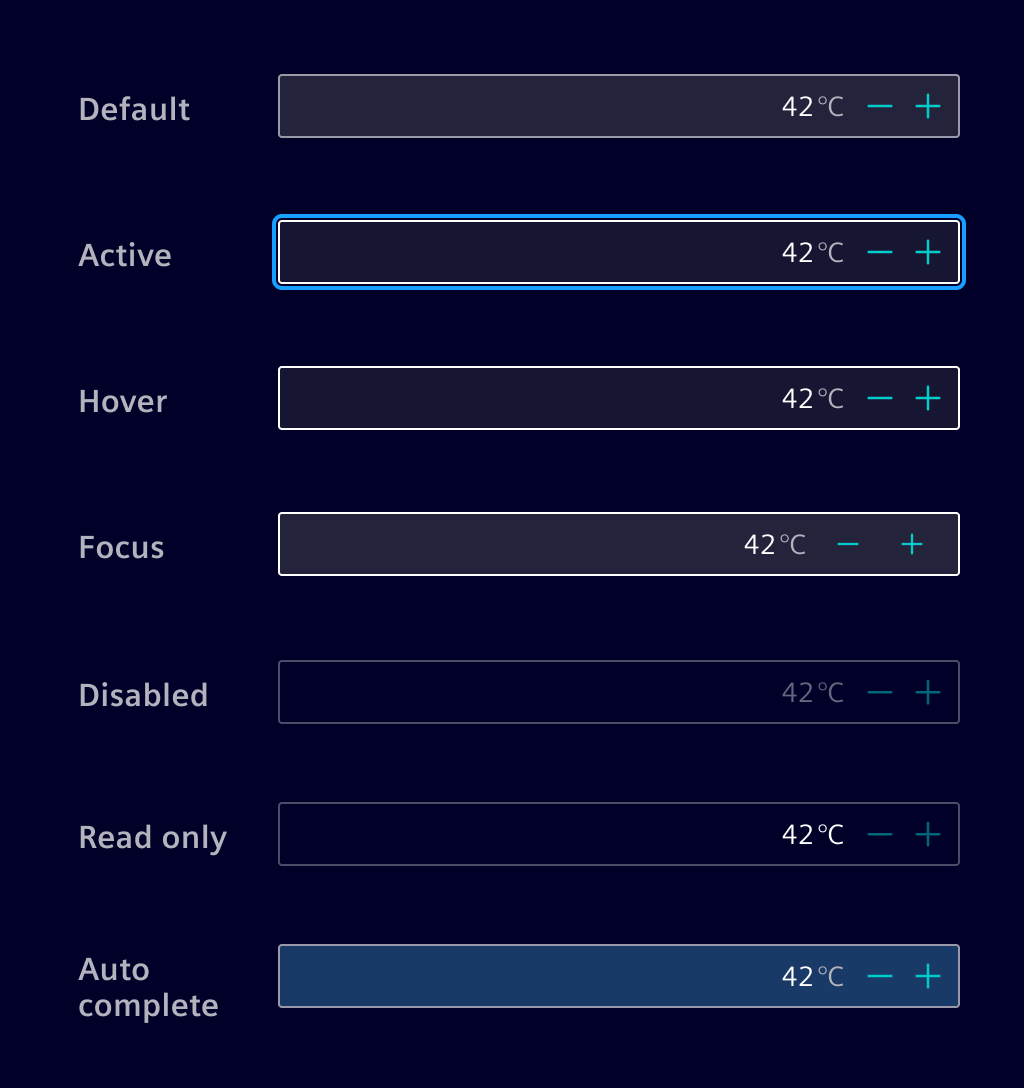
Interaction states

Number input - states

Validation

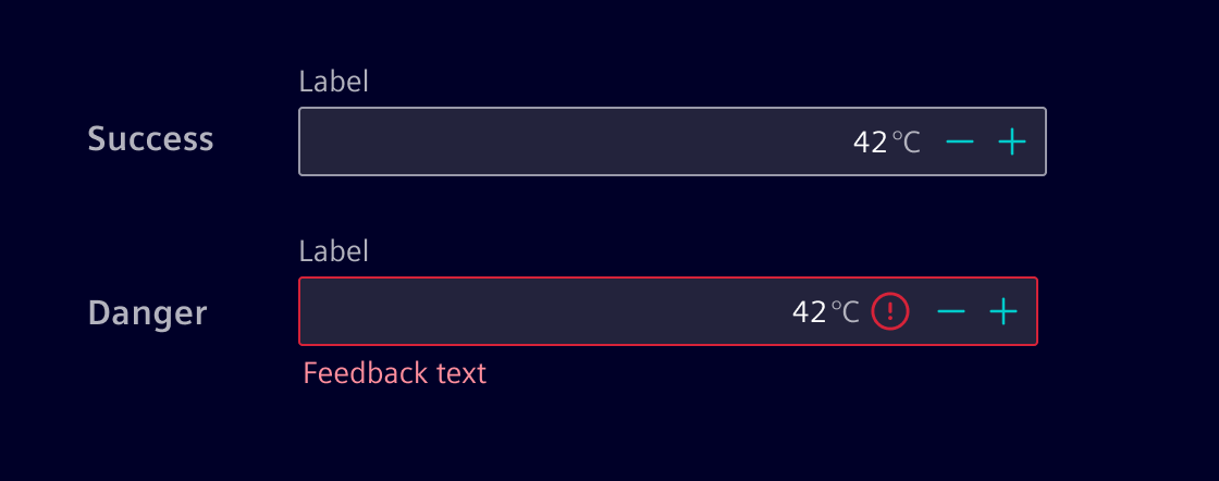
Real-time validation ensures that the data being entered is within a specific range or follows certain rules, preventing errors and ensuring the integrity of the data.
Number input - validation

Code

A drop-in replacement for the HTML <input type="number">. It has more accessible increment decrement buttons and can show a unit.

Usage

import { SiNumberInputComponent } from '@siemens/element-ng/number-input';

@Component({
  imports: [SiNumberInputComponent, ...]
})

SiNumberInputComponent API Documentation

selector
si-number-input

Common interface for form item controls. Controls that should be connected to SiFormItemComponent must implement this interface and must be provided using the SI_FORM_ITEM_CONTROL token.

Input Properties

Name Type Default Description
aria-label
TranslatableString undefined The aria-label passed to the input
disabled
boolean false Whether the input is disabled.
errormessageId
string ${this.id()}-errormessage This ID will be bound to the aria-describedby attribute of the number-input. Use this to reference the element containing the error message(s) for the number-input. It will be picked by the SiFormItemComponent if the number-input is used inside a form item.
inputId
string __si-number-input-${SiNumberInputComponent.idCounter++} ID that is set on the input, e.g. for <​label for="..."​>
max
number undefined The max. value for HTML input
min
number undefined The min. value for HTML input
placeholder
TranslatableString The placeholder for input field.
readonly
boolean false Whether the input can be focused but not edited.
showButtons
boolean true Show increment/decrement buttons?
step
(number | "any") 1 The step size for HTML input
unit
string Optional unit label
value
(number | null) The value

Output Properties

Name Type Description
valueChange
(number | undefined) Emits the current value when the user changes it.

Attributes and Methods

Name Type Default Description
(readonly) id
Signal<string> ... The actual id of the control that should be used in the for attribute of a label.
(readonly) inputElement
Signal<ElementRef<HTMLInputElement>> ...

Types Documentation

Represents a translatable string. This can either be a translation key, e.g. ACTIONS.EDIT that will be automatically translated when displayed on the UI or a pre-translated string, e.g. Edit . Equivalent to a normal string in usage and functionality.
Common interface for form item controls. Controls that should be connected to SiFormItemComponent must implement this interface and must be provided using the SI_FORM_ITEM_CONTROL token.
Properties
Generated ID that the SiFormItemComponent will assign to the element containing the error messages. Implementations of SiFormItemControl must generate this ID and assign it to the aria-describedby attribute of their focusable elements.
errormessageId: (string | Signal<string>)
The actual id of the control that should be used in the for attribute of a label.
id?: (string | Signal<(string | undefined)>)
If the control is meant to be used a checkbox. This affects the label positioning.
isFormCheck?: boolean
ID that should be assigned to the label element inside the SiFormItemComponent .

If the target control is not of type input, select or button, it cannot be referenced by a label. Instead, aria-labelledby must be used to create a reference to a label. In such a case, an implementation of SiFormItemControl must provide the id of the label in labelledby . SiFormItemComponent will apply the id to the label so that it can be used inside the control to reference it in the aria-labelledby attribute.

labelledby?: (string | Signal<(string | undefined)> | null)
Properties
key: string
message?: TranslatableString
params: any
Interface for form error mapper. It resolves a key to either a translatable string or function which is called with the validation error for its key and should return a translatable string.
Index signature: [ key: string ]: (string | (error: any) => string | undefined)
Properties
dateFormat?: (TranslatableString | (error: { format: string }) => TranslatableString)
email?: (TranslatableString | (error: { email: boolean }) => TranslatableString)
max?: (TranslatableString | (error: { actual: number, max: number }) => TranslatableString)
maxDate?: (TranslatableString | (error: { actual: Date, max: Date }) => TranslatableString)
maxLength?: (TranslatableString | (error: { actualLength: number, requiredLength: number }) => TranslatableString)
min?: (TranslatableString | (error: { actual: number, min: number }) => TranslatableString)
minDate?: (TranslatableString | (error: { actual: Date, min: Date }) => TranslatableString)
minLength?: (TranslatableString | (error: { actualLength: number, requiredLength: number }) => TranslatableString)
numberFormat?: (TranslatableString | (error: { numberFormat: boolean }) => TranslatableString)
pattern?: (TranslatableString | (error: { pattern: (string | RegExp) }) => TranslatableString)
required?: (TranslatableString | (error: { required: boolean }) => TranslatableString)
requiredTrue?: (TranslatableString | (error: { required: boolean }) => TranslatableString)
The error mapper is used to resolve an angular validation error to a TranslatableString . It will be merged with already existing error mappers.
Parameters
mapper: SiFormValidationErrorMapper

Properties
lgMinimum: number
mdMinimum: number
smMinimum: number
xlMinimum: number
xxlMinimum: number
Constructor
() => {}
Properties
container: (SiFormContainerComponent<{ [ key: string ]: AbstractControl<any, any, any> } }> | null) = ...
control: Signal<(AbstractControl<any, any, any> | null | undefined)> implements SiFormFieldsetControl.control = ...
controlElementRef: Signal<(ElementRef<HTMLElement> | undefined)> = ...
Disables the automatic error printing. Error printing will be enabled by default in v46.
disableErrorPrinting: InputSignalWithTransform<boolean, unknown> = false
errors: WritableSignal<SiFormError[]> implements SiFormFieldsetControl.errors = ...
fieldControl: Signal<(SiFormItemControl | undefined)> = ...
fieldControlNative: WritableSignal<(SiFormItemControl | undefined)> = ...
fieldControlQuery: Signal<(SiFormItemControl | undefined)> = ...
fieldset: (SiFormFieldsetComponent | null) = ...
Maps validation errors of the contained control to custom messages.
formErrorMapper: InputSignal<(SiFormValidationErrorMapper | undefined)> = ...
hasRequiredValidator: WritableSignal<boolean> = ...
The label to be displayed in the form item. It will be translated if a translation key is available.
label: InputSignal<TranslatableString> = ...
A custom width value to be applied to the label. A value of 0 is allowed as well to visually hide away the label area.

Numbers will be converted to pixels. Using numbers is discouraged and might be dropped.

Example:
labelWidth="100px"
labelWidth: InputSignal<(string | number | undefined)> = ...
labelWidthCssVar: Signal<(string | undefined)> = ...
ngControl: Signal<(NgControl | undefined)> = ...
previousErrors?: (ValidationErrors | null)
printErrors: Signal<boolean> = ...
radioGroupName: Signal<(string | undefined)> implements SiFormFieldsetControl.radioGroupName = ...
required: Signal<boolean> implements SiFormFieldsetControl.required = ...
Defines that this form item is required for the overall form to be valid.
requiredInput: InputSignalWithTransform<boolean, unknown> = false
requiredTestControl: FormControl<(string | null)> = ...
requiredValidator: Signal<(RequiredValidator | undefined)> = ...
touched: WritableSignal<boolean> implements SiFormFieldsetControl.touched = ...
validationErrorService: SiFormValidationErrorService = ...
validator?: (ValidatorFn | null)
Accessors
get formItemErrormessageId: (string | null)
get formItemId: (string | null)
get formItemLabelledBy: (string | null)
Methods
A callback method that is invoked immediately after the default change detector has completed checking all of the directive's content.
ngAfterContentChecked: () => void from AfterContentChecked.ngAfterContentChecked
A callback method that is invoked immediately after Angular has completed initialization of all of the directive's content. It is invoked only once when the directive is instantiated.
ngAfterContentInit: () => void from AfterContentInit.ngAfterContentInit
(changes: { control: SimpleChange<Signal<(AbstractControl<any, any, any> | null | undefined)>>, disableErrorPrinting: false, errors: SimpleChange<WritableSignal<SiFormError[]>>, formErrorMapper: SimpleChange<(SiFormValidationErrorMapper | undefined)>, label: SimpleChange<TranslatableString>, labelWidth: SimpleChange<(string | number | undefined)>, ngAfterContentChecked: SimpleChange<() => void>, ngAfterContentInit: SimpleChange<() => void>, ngControl: SimpleChange<Signal<(NgControl | undefined)>>, ngOnChanges: SimpleChange<(changes: { readonly label?: SimpleChange<TranslatableString> | undefined; readonly labelWidth?: SimpleChange<string | number | undefined> | undefined; ... 13 more ...; ngOnDestroy?: SimpleChange<...> | undefined; }) => void>, ngOnDestroy: SimpleChange<() => void>, ngOnInit: SimpleChange<() => void>, radioGroupName: SimpleChange<Signal<(string | undefined)>>, required: SimpleChange<Signal<boolean>>, requiredInput: false, touched: SimpleChange<WritableSignal<boolean>> }) => void from OnChanges.ngOnChanges
A callback method that is invoked immediately after the default change detector has checked data-bound properties if at least one has changed, and before the view and content children are checked.
Parameters
The changed properties.
changes: { control: SimpleChange<Signal<(AbstractControl<any, any, any> | null | undefined)>>, disableErrorPrinting: false, errors: SimpleChange<WritableSignal<SiFormError[]>>, formErrorMapper: SimpleChange<(SiFormValidationErrorMapper | undefined)>, label: SimpleChange<TranslatableString>, labelWidth: SimpleChange<(string | number | undefined)>, ngAfterContentChecked: SimpleChange<() => void>, ngAfterContentInit: SimpleChange<() => void>, ngControl: SimpleChange<Signal<(NgControl | undefined)>>, ngOnChanges: SimpleChange<(changes: { readonly label?: SimpleChange<TranslatableString> | undefined; readonly labelWidth?: SimpleChange<string | number | undefined> | undefined; ... 13 more ...; ngOnDestroy?: SimpleChange<...> | undefined; }) => void>, ngOnDestroy: SimpleChange<() => void>, ngOnInit: SimpleChange<() => void>, radioGroupName: SimpleChange<Signal<(string | undefined)>>, required: SimpleChange<Signal<boolean>>, requiredInput: false, touched: SimpleChange<WritableSignal<boolean>> }
A callback method that performs custom clean-up, invoked immediately before a directive, pipe, or service instance is destroyed.
ngOnDestroy: () => void from OnDestroy.ngOnDestroy
A callback method that is invoked immediately after the default change detector has checked the directive's data-bound properties for the first time, and before any of the view or content children have been checked. It is invoked only once when the directive is instantiated.
ngOnInit: () => void from OnInit.ngOnInit
updateRequiredState: () => void
updateValidationMessages: () => void
<(TControl: { [ K in keyof TControl ]: AbstractControl })>
Class
▶
Deprecated: This component should no longer be used.

When providing a form wide error mapper, use the provideFormValidationErrorMapper .
import { provideFormValidationErrorMapper } form '@siemens/element-ng/forms'

@Component({
  template: `<form>...</form>`
  providers: [provideFormValidationErrorMapper({
    'name.required': 'CUSTOM_REQUIRED_ERROR'
  })]
})
class MyFormComponent {}


When using the column layout, use the form-col-layout classes.

<!-- Responsive column layout -->
<form class="responsive-form-col-layout">...</form>
<!-- Always column layout -->
<form class="form-col-layout">...</form>


For a custom breakpoint use the SCSS mixin:

scss
@use '@siemens/element-theme/src/styles/bootstrap/mixins/form-layout';

// Custom responsive breakpoint
.custom-form-col-layout {
  // Above 400px the column layout is used
  @include form-layout.responsive-form-col-layout(400px);
}
Constructor
() => {}
Properties
The container hosts the form within a siResizeContainer to configure the breakpoint for different screen sizes. Optionally, change the container breakpoints with the contentContainerBreakpoints input.
contentContainerBreakpoints: InputSignal<(Breakpoints | undefined)> = ...
A map the maps from control names of the form to their translate keys. The initial map is empty and the user is responsible to add the required translate keys.
controlNameTranslateKeyMap: InputSignal<Map<string, string>> = new Map<​string, string​>()
In some scenarios, one may not want the form container to be responsible for the layout relevant si-container-[xs|...] classes, but let this be done by a different, nested component, e.g. by a group box. In these cases, the property should be set to true.
disableContainerBreakpoints: InputSignalWithTransform<boolean, unknown> = false
Disables the automatic error printing in all nested SiFormItemComponent . Error printing will be enabled by default in v46.
disableErrorPrinting: InputSignalWithTransform<boolean, unknown> = false
Every validation error has an errorCode. This map holds translate keys for error codes. The keys can be used to display a translated message for each validation error. The defaults old english readable key defaults for the Angular standard validators of the Validators class like min , max or required .

Use the input to set your own translate keys for the form validators you need.

errorCodeTranslateKeyMap: InputSignal<(SiFormValidationErrorMapper | Map<string, string> | undefined)> = ...
Set the form entity to the container to enable the overall form validation on in the form container edit panel.
form: InputSignal<(FormGroup<TControl> | undefined)> = ...
formErrorMapper: Signal<{ [ key: string ]: (string | (error: any) => string | undefined) } }> = ...
hasParentContainer: boolean = ...
A custom width value to be applied to all labels.

Example:
labelWidth="100px".
labelWidth: InputSignal<(string | undefined)> = ...
A form container in readonly mode is only displaying the form content without ability to change it. The edit panel with typically save and cancel buttons is hidden. Set to true to display the edit panel.
readonly: InputSignalWithTransform<boolean, unknown> = false
Accessors
Indicates whether the content editor message shall be styled as warning.
Returns true , if SiFormContainerComponent.userInteractedWithForm is true and the form is invalid.

get invalidFormContainerMessage: boolean
Indicates whether the user interacted with the form.
Returns true , if the user selected at least one form element and [blurred] https://developer.mozilla.org/en-US/docs/Web/API/Element/blur_event by losing focus again (e.g. by setting focus on another element), or by editing the content of a form element. Otherwise false .

get userInteractedWithForm: boolean
Indicates whether content editor message shall be styled as success.
Returns true , if SiFormContainerComponent.userInteractedWithForm is true and the form is valid.

get validFormContainerMessage: boolean
Methods
Parameters
controlName: string
Constructor
() => {}
Properties
errors: Signal<readonly SiFormError[]> = ...
formItems: WritableSignal<SiFormFieldsetControl[]> = ...
hasOnlyRadios: Signal<boolean> = ...
Switches all child inputs to inline mode
inline: InputSignalWithTransform<boolean, unknown> = false
isRequired: Signal<boolean> = ...
The label for the entire fieldset.
label: InputSignal<TranslatableString> = ...
labelId: string = ...
Overrides the parent label width.
labelWidth: InputSignal<(string | undefined)> = ...
Adds a required marker to the label
required: InputSignalWithTransform<boolean, unknown> = false
showErrors: Signal<boolean> = ...
labelIdCounter: number = 0
Methods
(item: SiFormFieldsetControl) => void
Parameters
item: SiFormFieldsetControl
(item: SiFormFieldsetControl) => void
Parameters
item: SiFormFieldsetControl

Except where otherwise noted, content on this site is licensed under MIT License.