Input
Input allows a user to provide text based input in different formats. They are usually found within a form but can also be part of a modal, search, or card.
Usage
When the expected text input is a single line as opposed to a paragraph.
It supports different types of input formats like text, number, password, email, tel, URL and more.
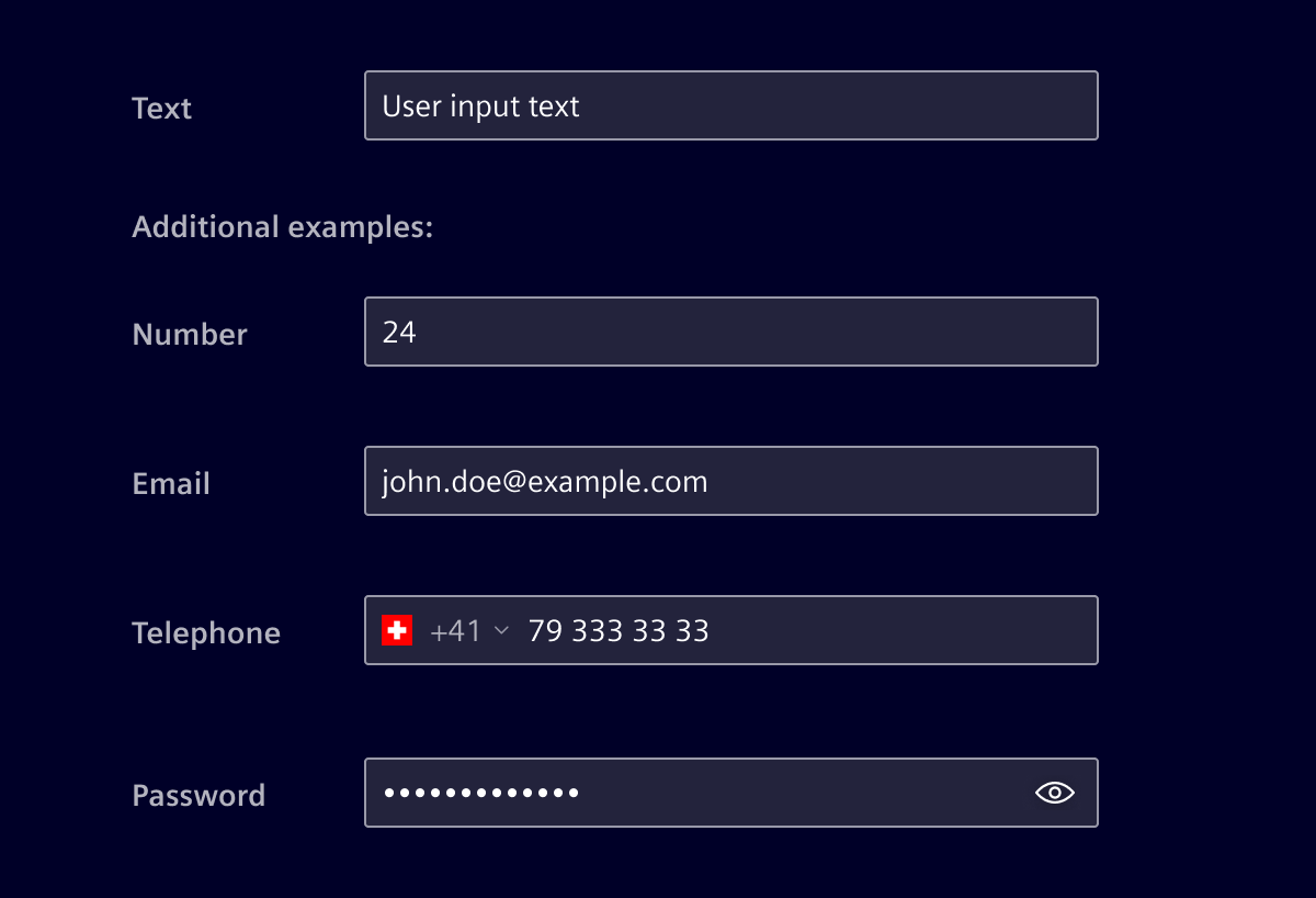
Element design system offers specific components for:
When to use
- When the expected user input is a single line of text or numerical values.
- When there is a need to enter text.
- Common text input types include user names, descriptions, URLs, emails, addresses, and plain text searches.
Best practices
- When the expected user input is more than one line use the textarea component instead.
- Distinguish between editable vs. read-only fields.
- Differentiate between required and optional fields.
- Maintain a proper field size, according to each specific case.
- Define the width of the input field according to the content and the grid system.
- Do not use single-line text fields for longer input texts.
Design
Elements
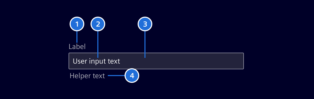
- Label (optional), 2. Content / Placeholder text, 3. Container, 4. Icons (optional), 5. Helper text (optional)
Label (optional)
Precise labeling helps users understand what information to enter.
- Keep labels short and clear (should not be wider than the input field).
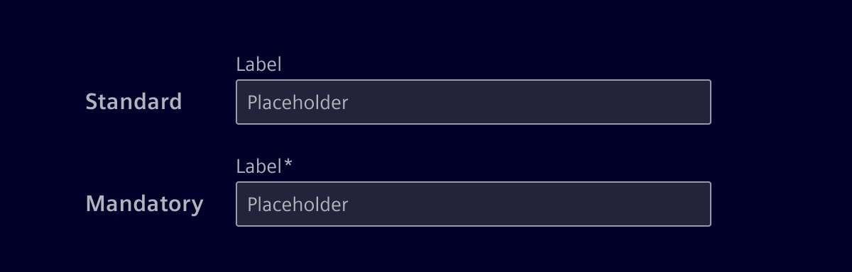
- A required field will be marked with an *-asterisk.
- Labels can be placed above or left to the input.
Content
Labels should always be present to describe the purpose of the field. If possible, use smart default values to help users avoid unnecessary typing. Use type-ahead to make suggestions, if the value cannot be determined.
Placeholders
Placeholder text can offer hints or examples of expected content. Since placeholders disappear when users start typing, they shouldn’t contain essential information.
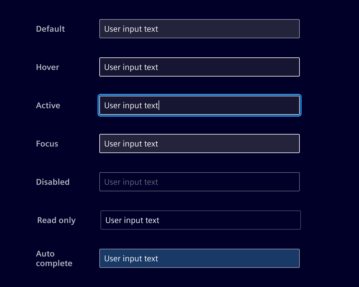
When an input field is disabled, the placeholder is hidden since the field cannot be edited or focused.
Container
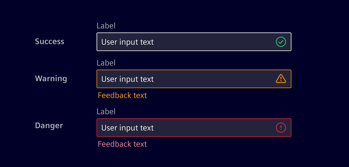
The container is used to indicate the different states an input field can have.
Validation
Real time validation helps to streamline the process and keep input data clean while the user is filling out forms.
Password
Defining a new or changing a password
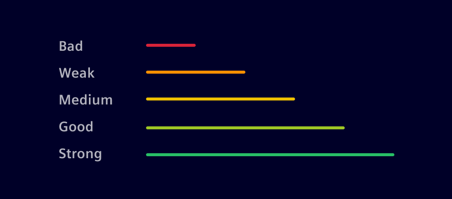
The password strength indication helps to ensure that a password meets the password policy, such as minimum length, the use of certain characters and more. It gives the user immediate feedback about the current password strength and instructions to strength the password.

1. Instructions, 2. Strength indicator, 3. Show/Hide - control (Optional)
Give the user clear instructions about how to meet the password requirements like:
- Minimum length
- Uppercase letter (
[A..Z]) - Lowercase letter (
[a..z]) - Use number (
[0..9]) - Special character (
[$,#,...])
The strength indicator validates and gives the user visual feedback about the password's strength.
Entering a password/login
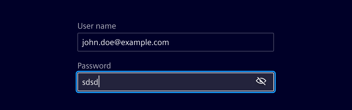
The password visibility toggle allows users to show or hide their passwords, enhancing both convenience and security.
Code
References
- Bootstrap: Form Control
Usage
Password input with visibility toggle
The si-password-toggle component provides an inputType property that has to be applied to the input's type:
<si-password-toggle #toggle>
  <input
    ...
    [type]="toggle.inputType"
  ></input>
</si-password-toggle>
Password strength policy
The si-password-strength component provides the user feedback about the strength of a new password.
Wrap the component around an input with type="password". Add the [siPasswordStrength] directive to the input field and specify the requirements which have to be fulfilled for an eligible password.
Utilize the output callback event (passwordStrengthChanged) to get the current password strength.
<si-password-strength>
  <input
    id="password"
    type="password"
    name="password"
    class="form-control"
    ngModel
    [siPasswordStrength]="{
      minLength: 8,
      uppercase: true,
      lowercase: true,
      digits: true,
      special: true
    }"
    (passwordStrengthChanged)="doSomething($event)"
  />
</si-password-strength>
SiPasswordToggleComponent API Documentation
si-password-toggle Input Properties
| Name | Type | Default | Description |
|---|---|---|---|
| hideLabel ¶ | TranslatableString | $localize`:@@SI_PASSWORD_TOGGLE.HIDE:hide password` | The aria-label (translatable) for the password hide icon. |
| showLabel ¶ | TranslatableString | $localize`:@@SI_PASSWORD_TOGGLE.SHOW:show password` | The aria-label (translatable) for the password show icon. |
| showVisibilityIcon ¶ | boolean | true | Whether to show the visibility toggle icon. |
Output Properties
| Name | Type | Description |
|---|---|---|
| typeChange ¶ | string | Emits the type attribute for the <input> ('password' | 'text') whenever the password visibility is getting toggled. |
Attributes and Methods
| Name | Type | Default | Description |
|---|---|---|---|
| (readonly) inputType ¶ | string | The type attribute for the <input> ('password' | 'text'). |
SiPasswordStrengthComponent API Documentation
si-password-strength Input Properties
| Name | Type | Default | Description |
|---|---|---|---|
| showVisibilityIcon ¶ | boolean | true | Whether to show the visibility toggle icon. |
SiPasswordStrengthDirective API Documentation
[siPasswordStrength] Input Properties
| Name | Type | Default | Description |
|---|---|---|---|
| siPasswordStrength ¶ | PasswordPolicy | { minLength: 8, uppercase: true, lowercase: true, digits: true, special: true } | Define Siemens password strength. |
Output Properties
| Name | Type | Description |
|---|---|---|
| passwordStrengthChanged ¶ | (number | void) | Output callback event called when the password changes. The number indicated the number of rules which still can be met. ( -2 --\> 2 rules are still unmet, 0 --\> all met) |
Types Documentation
| Represents a translatable string. This can either be a translation key, e.g. ACTIONS.EDIT that will be automatically translated when displayed on the UI or a pre-translated string, e.g. Edit . Equivalent to a normal string in usage and functionality. |
|---|
| | ||||||||
|---|---|---|---|---|---|---|---|---|
|
Except where otherwise noted, content on this site is licensed under MIT License.