Forms
Forms are components designed to create and structure input masks, consisting of multiple input controls. They are configurable to fit various use cases and layouts.
Usage
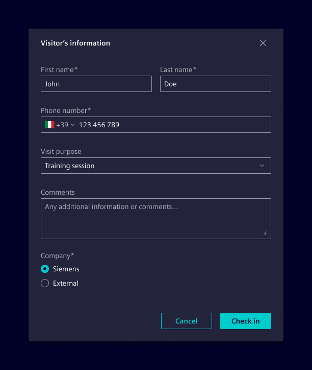
A form is a set of related input controls that allow users to provide information.
Best practices
- Keep it short. Remove fields that collect redundant, untimely, or unnecessary information.
- Ask for information in a logical sequence.
- Visually group related fields.
- Match fields to the type and size of the expected input.
- When possible, use smart defaults and typeahead behavior.
- Don’t rely on placeholders; include a short and meaningful label.
- Distinguish optional and required fields. Required fields can be indicated using an asterisk.
- Make action buttons task-specific
Design
Elements
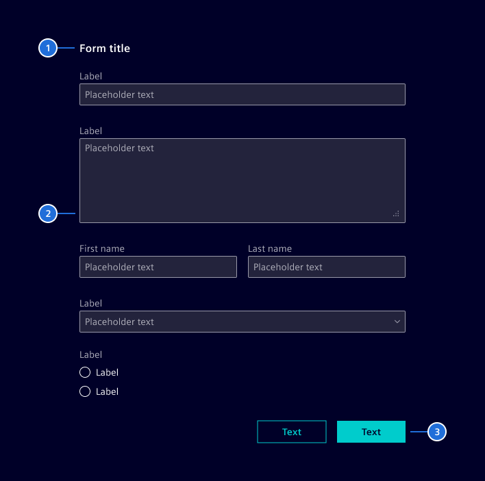
Forms can be comprised of some or all of the following elements:
- Title: A brief headline that indicates the form's purpose or the information it collects.
- Form body: Enable users to insert free or specific form text (e.g: text inputs, select, checkboxes, radio buttons, and more).
- Actions: Allow users to submit or quit a form.
States
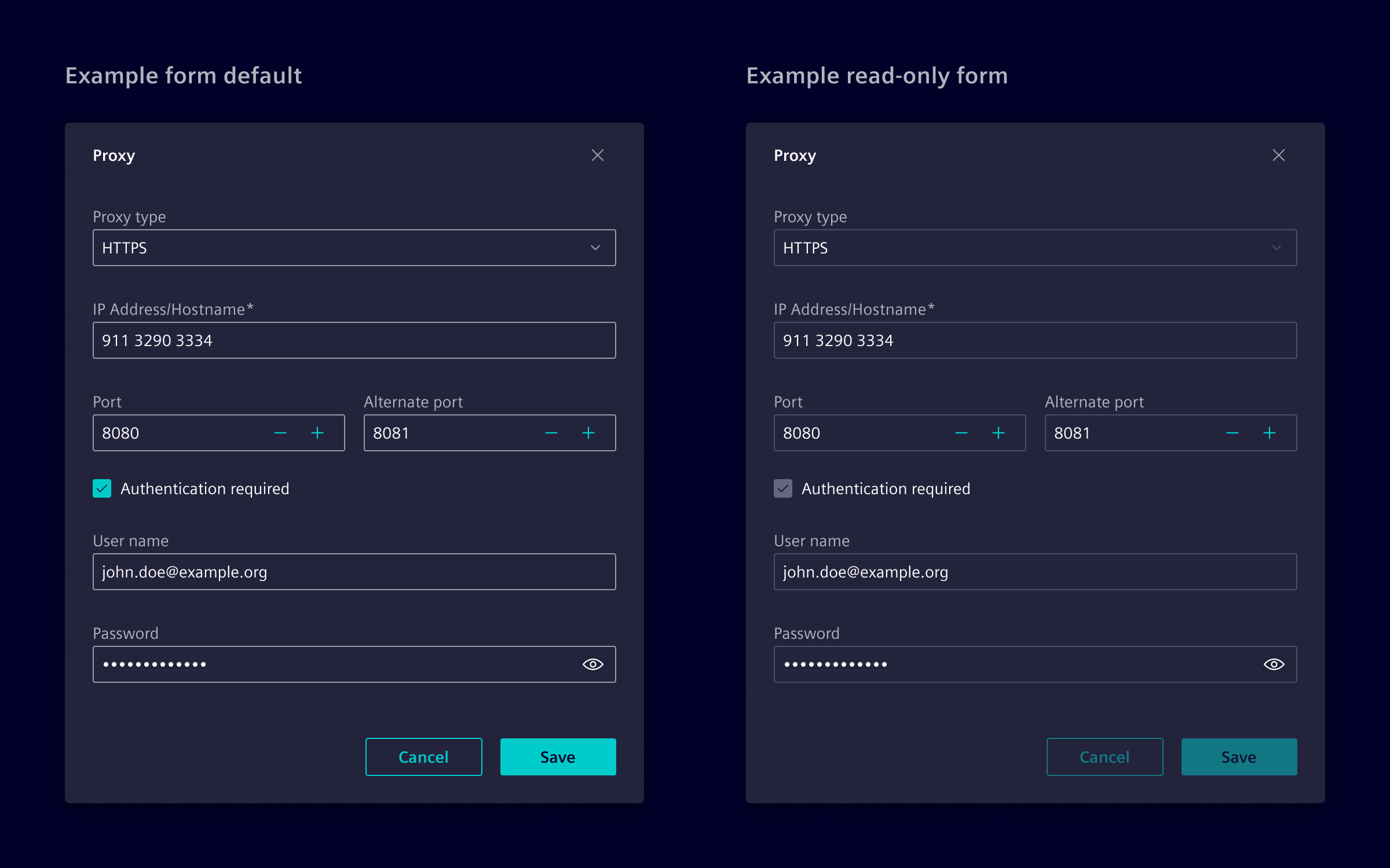
The status of the form directly corresponds to the status of each of its individual fields.
Labels
Labels can be placed on top of fields or to the left (in RTL languages). All labels in a single form should use the same placement style. Prefer top placement of labels, since it provides a consistent left edge alignment, improving scannability.
Validation
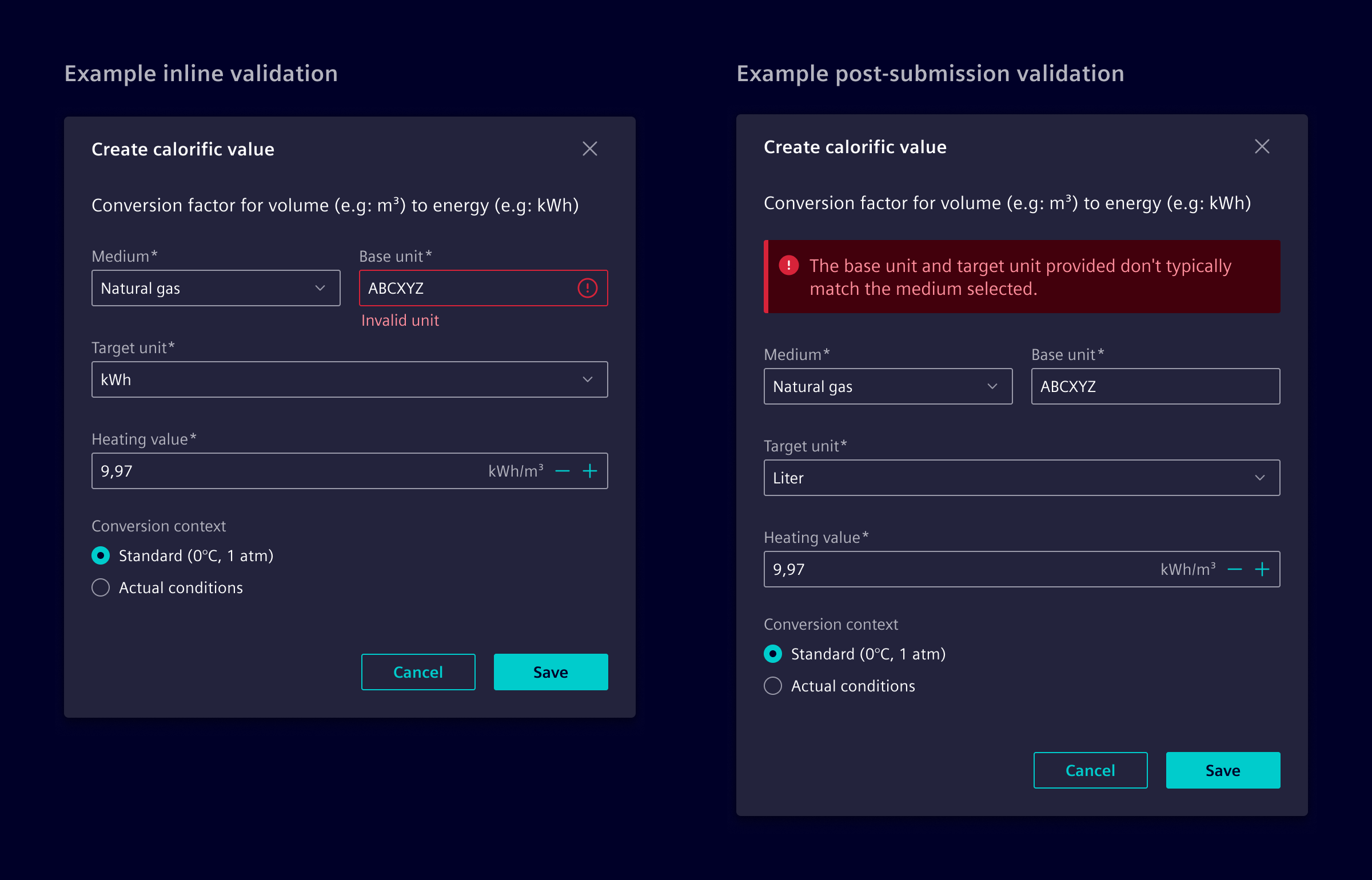
Always display error states within the form and prioritize the use of inline validation.
- Inline validation: This validates user data while they fill out the form, being triggered immediately after a field loses focus.
- Post-submission validation: This assesses the entire form's data only after the user has submitted it, providing feedback through inline notifications.
Code
User input is one of the essential pillars of many applications. Read Forms in Angular as basis for working with forms.
The following are important yet repetitive tasks for every form control (e.g. input, textarea, checkbox) of a form:
- For accessibility, linking a
<label>to its input usingid/forattributes or aria attributes. - the label must be correctly aligned for different types, e.g. text, checkbox, ...
- Display meaningful validation error messages on input to guide and support the user.
- Group related form fields to a fieldset. For example, multiple radio checkbox inputs belong to one input and have one label.
Element provides components to shift repetitive and common tasks from the application developers to the framework.
We support all Angular form implementations. Choose the Element component depending on the Angular form feature you use:
- Signal forms (
formField) --> usesi-form-field - Reactive forms (
formControl/formControlName) --> usesi-form-item - Template driven forms (
ngModel) -->si-form-item
Both si-form-field and si-form-item have a very similar interface and interact the same way with other Element components. In the following only si-form-field is shown, but si-form-item is always usuable the same way.
The si-form-field component is a wrapper around a form control element that renders the associated label.
<si-form-field label="My form field">
  <input [formField]="form.field" class="form-control" />
</si-form-field>
The si-form-field component adds and links a label to the control in compliance to WCAG v2.2, so that screen readers are able to guide users through the form.
Native controls like <input> and Element controls like si-select are only recognized by the si-form-field if they are an Angular form field, meaning that they have [formField] attached (for si-form-item: [formControl], [formControlName] or [ngModel]).
Form feedback
Element form controls should provide user feedback on user input. Angular Forms handle valid and invalid form states automatically. In addition, Element supports setting form control states and feedback messages explicitly in the template:
<si-form-field label="Warning item">
  <input class="form-control is-warning" />
  <span class="warning-feedback">Attention, this is a Warning!</span>
</si-form-field>
These states are available:
- valid -->
is-valid - warning -->
is-warning - error -->
is-error
For warning and error states, a respective icon is automatically added. Starting with Element v46, the feedback icon must not be added manually.
Error messages
si-form-field is capable of showing errors from Angular's validation mechanism automatically. Element has a built-in resolution of standard errors like required. On top of that, Element supports configuring the resolution mechanism. This enables applications to adjust existing messages and add new ones for custom validators.
Global error resolution
For a standalone app:
import { ApplicationConfig } from '@angular/core';
import { provideFormValidationErrorMapper } from '@siemens/element-ng/form';

export const appConfig: ApplicationConfig = {
  providers: [
    provideFormValidationErrorMapper({
      maxlength: 'MY.CUSTOM.ERROR.MESSAGE.KEY', // when using ngx-translate one has access to the validation result as parameters (requiredLength and actualLength in this case)
      minlength: ({ requiredLength }) =>
        `This field must be at least ${requriredLength} characters long`,
      myCustomError: ({ myCustomErrorResult }) => `My custom error message: ${myCustomErrorResult}`
    })
  ]
};
or for a module base app:
import {SiFormModule} from '@siemens/element-ng/form';

@NgModule({
  imports: [
    SiFormModule.withConfiguration({
      validationErrorMapper: {
        maxlength: 'MY.CUSTOM.ERROR.MESSAGE.KEY', // when using ngx-translate one has access to the validation result as parameters (requiredLength and actualLength in this case)
        minlength: ({ requiredLength }) => `This field must be at least ${requriredLength} characters long`,
        myCustomError: ({ myCustomErrorResult }) => `My custom error message: ${myCustomErrorResult}`,
      },
    })
  ],
})
Local error resolution
For the si-form-field use the message property the form schema:
this.form = form(this.formModel, schemaPath => {
  required(schemaPath.field, { message: 'MY.REQUIRED_ERROR' });
});
For the si-form-item use the formErrorMapper input:
<si-form-item label="Required input" [formErrorMapper]="{required: 'MY.REQUIRED_ERROR'}">
  ...
</si-form-item>
Required detection
si-form-field automatically detects whether a form control is required. It does this by checking if Angular's required validator is attached.
To have this check working, make sure that only the standard validators of Angular are used.
Form fieldset
Use a si-form-fieldset to group multiple related si-form-field. This is often required for radio inputs, but works for every other type as well.
<si-form-fieldset label="Radion options">
  <si-form-field label="Radio option A">
    <input type="radio" class="form-check-input" />
  </si-form-field>
  <si-form-field label="Radio option B">
    <input type="radio" class="form-check-input" />
  </si-form-field>
</si-form-fieldset>
Context help
To provide contextual help within form fields, use the SiHelpButtonComponent. Add the si-help-button directive to a button placed inside the form field. This allows you to display additional information or guidance related to the input field.
<si-form-field label="Input label">
  <button
    si-help-button
    type="button"
    siHelpTitle="Help for input"
    siHelpContent="The context help description"
  >
  </button>
  <input class="form-control" />
</si-form-field>
Custom controls
si-form-field provides an API for being linked to custom controls implemented by an application. Custom controls must implement the SiFormItemControl interface and provide themselves as SI_FORM_ITEM_CONTROL:
import { SI_FORM_ITEM_CONTROL, SiFormItemControl } from '@siemens/element-ng/form';
import { Component } from '@angular/core';

@Component({
  providers: [{ provide: SI_FORM_ITEM_CONTROL, useExisting: CustomControlComponent }]
})
export class CustomControlComponent implements SiFormItemControl {
  // Provide an automatically generated ID.
  // If your component is only a wrapper around either an input, textarea or select,
  // assign this ID to that element. Otherwise assign it to the host element.
  private static idCounter = 0;
  readonly id = `__app-custom-control-${CustomControlComponent.idCounter++}`;

  // Set this only if the custom-control is NOT an input, textarea or select.
  // It is required as the [for] attribute of an label only works for native inputs.
  readonly labelledby = `${this.id}-label`;

  // Set to true if, the control should be rendered like a checkbox. This only affects the positioning of the label.
  // If false, this should be omitted.
  readonly isFormCheck = false;
}
For HTML Elements that are marked as form-control (--> input like appearance), icons are automatically included. If the form-control contains custom icons at the end, like the dropdown arrow for select, wrap them in a form-control-actions element.
The form-control-actions element handles layout (height, vertical centering, spacing) and renders the validation feedback icon on its leading edge. It can be used in two ways.
When form-control-actions is a sibling of a form-control, wrap both elements in the same positioned container, for example one with position-relative.
Do not add form-control-actions to a component that already renders it internally. This applies to si-calendar-button, si-password-toggle, si-date-range, si-number-input, si-select, and si-select-combobox. si-calendar-button and si-password-toggle also provide the positioned container required by the sibling pattern.
- Inside a custom composite
form-control: The wrapper owns the trailing space, so no--si-action-icon-offsetis needed. The custom control is responsible for its internal layout.
<div class="form-control">
  <input />
  <div class="form-control-actions">
    <i class="my-action-icon element-arrow-down icon"></i>
  </div>
</div>
- As a sibling of the input: The
form-control-actionselement is pinned to the top-right edge of the input. Set--si-action-icon-offseton the input to reserve space for the actions so the input's content does not overlap them. Wrap both elements in a positioned container.
<div class="position-relative">
  <input class="form-control" style="--si-action-icon-offset: 1.5rem" />
  <div class="form-control-actions">
    <button type="button" class="my-action-button"></button>
  </div>
</div>
Column layout
Forms can switch to a column layout where labels are displayed next to the input. Apply the respective classes directly on the form to enable the column layout.
responsive-form-col-layout switches to the column mode only above 48ch, form-col-layout switches screensize independent to the column layout.
<form class="responsive-form-col-layout"> ... </form>
To customize the breakpoint, use the responsive-form-col-layout mixin within your component that holds the form:
@use '@siemens/element-theme/src/styles/bootstrap/mixins/form-layout';

:host {
  // Above 400px the column layout is used
  @include form-layout.responsive-form-col-layout(400px);
}
Example
Si-Form-Container (deprecated)
The si-form-container is an optional wrapper around a form. It provides additional responsive behavior for switching labels dependent on the available size from block (label is on top the input) to inline (label is on the same line).
Angular Formly
Formly is a library for generating dynamic forms based on JSON input instead of pre-constructed HTML templates. Consider using formly for forms whose fields are not known at compile time and instead are created dynamically based on data. Element provides a built-in theming for formly which is part of the si-formly component. See also Dynamic Forms.
Native HTML markup
Element does not recommend using native markup.
The Element theme includes a few CSS classes that are also internally used by the si-form-item. Internally, a form field is basically structured like this:
<div>
  <label class="form-label" for="input">Label</label>
  <input class="form-control" id="input" />
</div>
For checkboxes and radios, it uses form-check instead of the form-control class:
<div class="form-check mb-2">
  <input class="form-check-input" id="input" type="checkbox|radio" />
  <label class="form-check-label" for="input">Label</label>
</div>
In both variants the feedback is included using a *-feedback class. The feedback is either visible if an Angular state matches the feedback like .ng-invalid or if the state is set manually by applying a class like .is-invalid.
<div>
  <label class="form-label" for="input">Label</label>
  <input class="form-control is-invalid" id="input" />
  <div class="invalid-feedback">Invalid feedback</div>
</div>
SiFormContainerComponent API Documentation
si-form-container Deprecated: This component should no longer be used.
When providing a form wide error mapper, use the provideFormValidationErrorMapper .
import { provideFormValidationErrorMapper } form '@siemens/element-ng/forms'

@Component({
  template: `<form>...</form>`
  providers: [provideFormValidationErrorMapper({
    'name.required': 'CUSTOM_REQUIRED_ERROR'
  })]
})
class MyFormComponent {}
When using the column layout, use the form-col-layout classes.
<!-- Responsive column layout -->
<form class="responsive-form-col-layout">...</form>
<!-- Always column layout -->
<form class="form-col-layout">...</form>
For a custom breakpoint use the SCSS mixin:
scss
@use '@siemens/element-theme/src/styles/bootstrap/mixins/form-layout';

// Custom responsive breakpoint
.custom-form-col-layout {
  // Above 400px the column layout is used
  @include form-layout.responsive-form-col-layout(400px);
}
Input Properties
| Name | Type | Default | Description |
|---|---|---|---|
| contentContainerBreakpoints ¶ | Breakpoints | The container hosts the form within a siResizeContainer to configure the breakpoint for different screen sizes. Optionally, change the container breakpoints with the contentContainerBreakpoints input. | |
| controlNameTranslateKeyMap ¶ | Map<string, string> | new Map<string, string>() | A map the maps from control names of the form to their translate keys. The initial map is empty and the user is responsible to add the required translate keys. |
| disableContainerBreakpoints ¶ | boolean | false | In some scenarios, one may not want the form container to be responsible for the layout relevant si-container-[xs|...] classes, but let this be done by a different, nested component, e.g. by a group box. In these cases, the property should be set to true. |
| disableErrorPrinting ¶ | boolean | false | Disables the automatic error printing in all nested SiFormItemComponent . Error printing will be enabled by default in v46. |
| errorCodeTranslateKeyMap ¶ | (SiFormValidationErrorMapper | Map<string, string>) | Every validation error has an errorCode. This map holds translate keys for error codes. The keys can be used to display a translated message for each validation error. The defaults old english readable key defaults for the Angular standard validators of the Validators class like min , max or required .Use the input to set your own translate keys for the form validators you need. | |
| form ¶ | FormGroup<TControl> | Set the form entity to the container to enable the overall form validation on in the form container edit panel. | |
| labelWidth ¶ | string | A custom width value to be applied to all labels. Example: labelWidth="100px". | |
| readonly ¶ | boolean | false | A form container in readonly mode is only displaying the form content without ability to change it. The edit panel with typically save and cancel buttons is hidden. Set to true to display the edit panel. |
Attributes and Methods
| Name | Type | Default | Description |
|---|---|---|---|
| (readonly) invalidFormContainerMessage ¶ | boolean | Indicates whether the content editor message shall be styled as warning. Returns true , if SiFormContainerComponent.userInteractedWithForm is true and the form is invalid. | |
| (readonly) userInteractedWithForm ¶ | boolean | Indicates whether the user interacted with the form. Returns true , if the user selected at least one form element and [blurred] https://developer.mozilla.org/en-US/docs/Web/API/Element/blur_event by losing focus again (e.g. by setting focus on another element), or by editing the content of a form element. Otherwise false . | |
| (readonly) validFormContainerMessage ¶ | boolean | Indicates whether content editor message shall be styled as success. Returns true , if SiFormContainerComponent.userInteractedWithForm is true and the form is valid. |
SiFormItemComponent API Documentation
si-form-item Input Properties
| Name | Type | Default | Description |
|---|---|---|---|
| disableErrorPrinting ¶ | boolean | false | Disables the automatic error printing. Error printing will be enabled by default in v46. |
| formErrorMapper ¶ | SiFormValidationErrorMapper | Maps validation errors of the contained control to custom messages. | |
label ¶ | TranslatableString | The label to be displayed in the form item. It will be translated if a translation key is available. | |
| labelWidth ¶ | (string | number) | A custom width value to be applied to the label. A value of 0 is allowed as well to visually hide away the label area. Numbers will be converted to pixels. Using numbers is discouraged and might be dropped. Example: labelWidth="100px" | |
| required ¶ | boolean | false | Defines that this form item is required for the overall form to be valid. |
Types Documentation
| Function The error mapper is used to resolve an angular validation error to a TranslatableString . It will be merged with already existing error mappers. | ||
|---|---|---|
|
| | ||||||
|---|---|---|---|---|---|---|
|
| Interface for form error mapper. It resolves a key to either a translatable string or function which is called with the validation error for its key and should return a translatable string. | |
|---|---|
| |
| Represents a translatable string. This can either be a translation key, e.g. ACTIONS.EDIT that will be automatically translated when displayed on the UI or a pre-translated string, e.g. Edit . Equivalent to a normal string in usage and functionality. |
|---|
| | ||||
|---|---|---|---|---|
|
| Common interface for form item controls. Controls that should be connected to SiFormItemComponent must implement this interface and must be provided using the SI_FORM_ITEM_CONTROL token. | |||||
|---|---|---|---|---|---|
|
| Variable |
|---|
| | ||||||||||||
|---|---|---|---|---|---|---|---|---|---|---|---|---|
| ||||||||||||
| ||||||||||||
|
Except where otherwise noted, content on this site is licensed under MIT License.