Date & time
Date pickers and time pickers allow users to select and navigate through past, present, and future dates and times.
Usage
These components are used in scenarios where users need to input specific dates, times, or date ranges.
Date pickers typically include an expandable calendar menu and a text input field, while time pickers focus solely on time selection, usually a text input field or dropdown menu for selecting specific times.
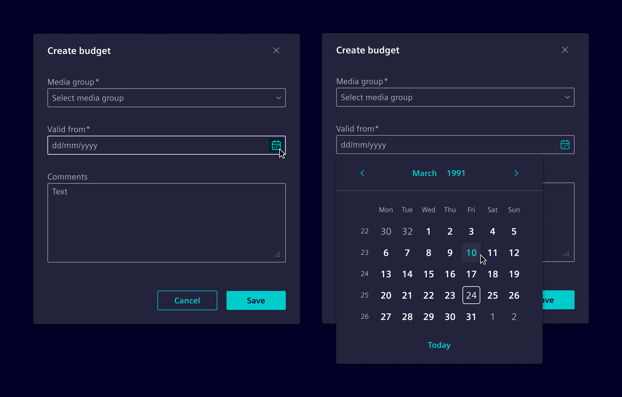
When to use
- To collect absolute date and time inputs.
- For scheduling tasks.
- In forms.
- To select date ranges for generating reports or viewing historical data.
- For relative date selection, use date range filter.
Best practices
- Ensure the format of dates and times adheres to the user's locale settings. See localization for more details.
- Ensure placeholders are also localized to match the user's regional settings (e.g., "MM/DD/YYYY").
- When required, validation can be set for all time inputs.
- Provide clear and concise labels for input fields.
Design
Basic anatomy
Date pickers and date-time pickers consist of an optional input field and a calendar view. The input field allows users to manually type dates and times. When needed, the calendar view opens for visual selection, making this structure common across all variants.
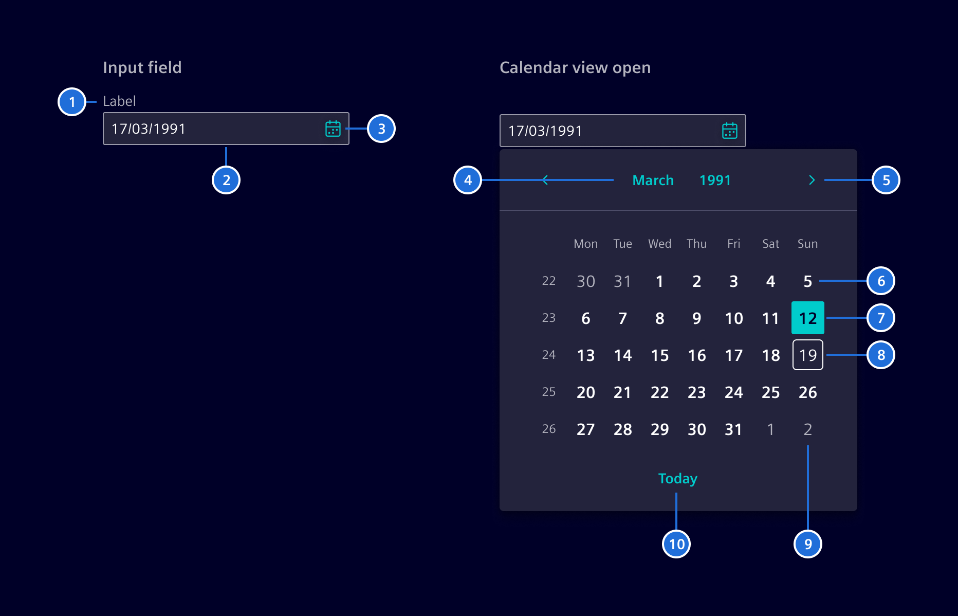
- Label (optional), 2. Input, 3. Calendar button, 4. Month & Year control, 5. Previous and Next month control, 6. Default day, 7. Selected day, 8. Current day, 9. Off month day, 10. Today control
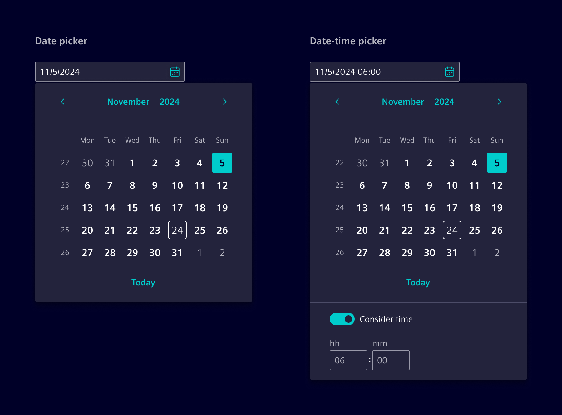
Single date and date-time picker
The single date picker allows users to select a specific date, either by typing in the input field or using the calendar view. When the time option is enabled, users can also select a specific time.
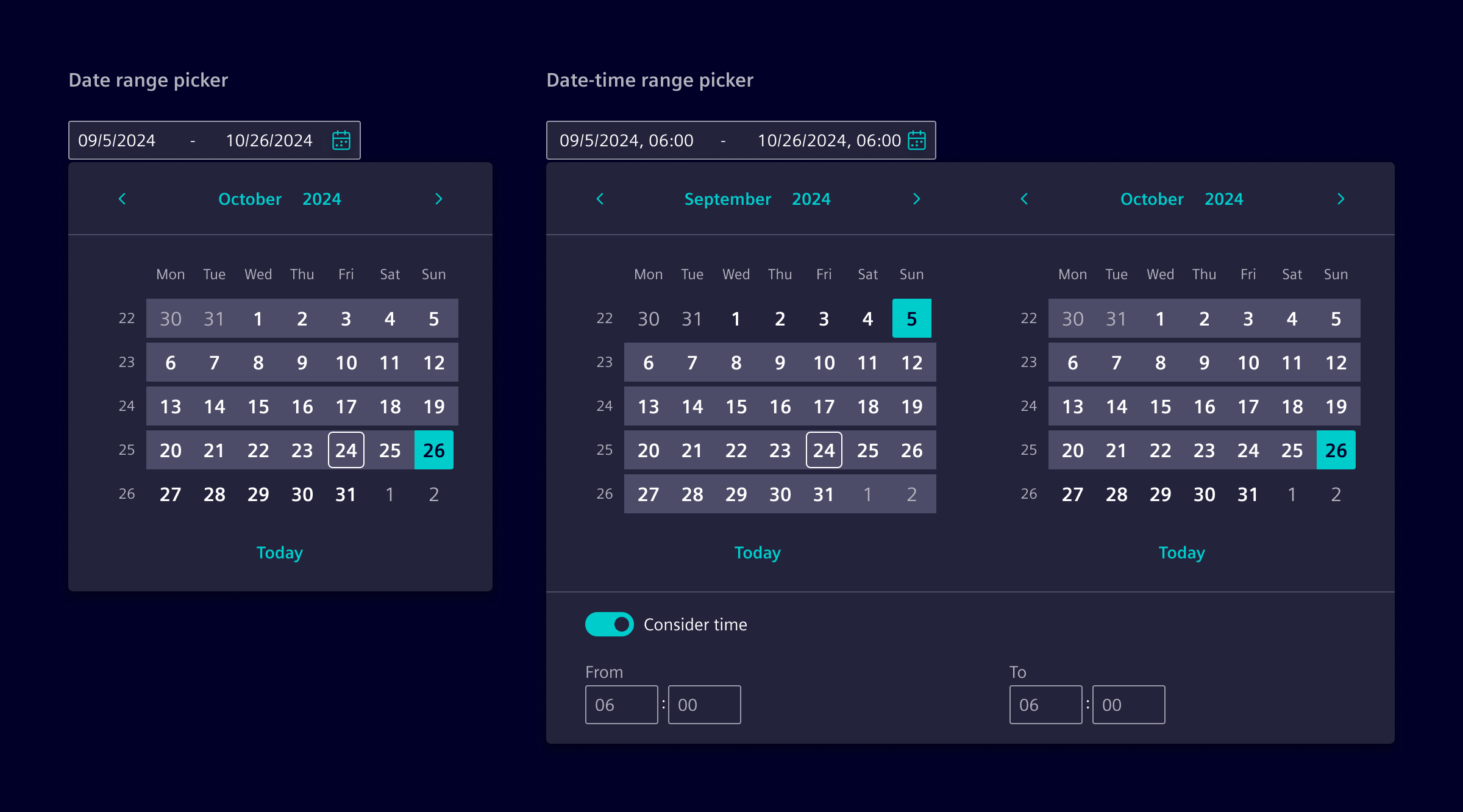
Date and date-time range picker
The date range picker enables users to choose a start and end date. When the time option is enabled, a two-month view layout is used.
Time picker
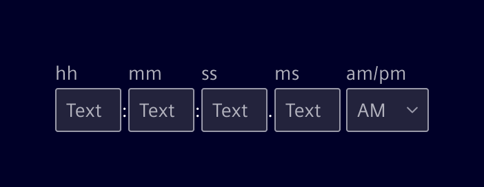
The time picker is a component with separate input fields for individually setting units of time measurement (e.g., hh, mm, …). Minutes, seconds, and milliseconds are optional and can be configured to show or hide as needed.
Code
The datepicker and timepicker components are highly configurable. The datepicker optionally includes the timepicker.
The SiDatepickerComponent, SiTimepickerComponent, as well as the SiDatepickerDirective, to attach the datepicker component to a HTML input element, are provided by the SiDatepickerModule Angular module.
Usage
Datepicker can be imported using the module
import { SiDatepickerModule } from '@siemens/element-ng/datepicker';

@NgModule({
  imports: [SiDatepickerModule, ...]
})
or as a standalone component:
import {
  SiDateInputDirective,
  SiDatepickerComponent,
  SiDatepickerDirective,
  SiDateRangeComponent
} from '@siemens/element-ng/datepicker';

@Component({
  imports: [
    SiDateInputDirective,
    SiDatepickerComponent,
    SiDatepickerDirective,
    SiDateRangeComponent,
    ...
  ]
})
Datepicker without time
The datepicker component can be added to any view. Bidirectional binding of the date object is provided by the date property. The configuration is handled by the config object as documented in the API.
Datepicker with time control
- Setting
showTimein the config will display the timepicker within the date picker. - A switch enables the user to include (
Consider time) the time or not (Ignore time). - Initial switch enablement is controlled by the
disabledTimeflag and changes are emitted by thedisabledTimeChangeoutput property. - Use the
mandatoryTimeflag to hide the switch.
Datepicker with date range
The si-datepicker allows to pick date ranges. Use the two-way binded property dateRange and set enableDateRange: true in configuration.
Input element with datepicker
The SiDatepickerDirective attaches the datepicker to an HTML input element. Without any additional configuration, the Angular locale date formatter is used to write the selected date into the input field. Changes of the input field are also parsed and used to set the date in the datepicker. Optionally, you can provide a custom date and time format using the config object.
The directive implements the Angular ControlValueAccessor and can be used in Angular Forms.
Input element with date range picker
The SiDateRangeComponent component is a custom component which can be used to use datepicker as range selector.
The component implements the Angular ControlValueAccessor and can be used in Angular Forms.
Timepicker
The timepicker component is a custom component with individual input fields for setting the parts of the time individually, like hours, and minutes. It implements the ControlValueAccessor and can be used in Angular Forms.
SiDatepickerComponent API Documentation
si-datepicker Input Properties
| Name | Type | Default | Description |
|---|---|---|---|
| activeHover ¶ | Cell | The cell which which has the mouse hover. | |
| calendarWeekLabel ¶ | TranslatableString | $localize`:@@SI_DATEPICKER.CALENDAR_WEEK_LABEL:Calendar week` | Aria label for week number column |
| config ¶ | DatepickerConfig | {} | Object to configure the datepicker. |
| date ¶ | Date | The selected date of the datepicker. Use for initialization and for bidirectional binding. | |
| dateRange ¶ | DateRange | The selected date range of the datepicker. Use for initialization and for bidirectional binding. | |
| dateRangeRole ¶ | RangeType | Role of this calendar when a date range is displayed across two calendars. | |
| disabledTime ¶ | boolean | false | Disabled the optional visible time picker. |
| focusedDate ¶ | Date | The date which is currently focused Compare to the selected date or range the calendar requires to have one element to focus. | |
| hideCalendar ¶ | boolean | false | Whether the calendar is hidden while retaining the optional timepicker. |
| hideTimeToggle ¶ | boolean | false | Option to hide the time switch. |
| initialFocus ¶ | boolean | false | Set initial focus to calendar body. |
| maxMonth ¶ | Date | Optional input to control the maximum month the datepicker can show and the user can navigate. The maxMonth can be smaller than the maxDate This option enables the usage of multiple datepickers next to each other while the more left calendar always shows a earlier month the the more right one. | |
| minMonth ¶ | Date | Optional input to control the minimum month the datepicker can show and the user can navigate. The minMonth can be larger than the minDate This option enables the usage of multiple datepickers next to each other while the more left calendar always shows a earlier month the the more right one. | |
| nextLabel ¶ | TranslatableString | $localize`:@@SI_DATEPICKER.NEXT:Next` | Aria label for the next button. Needed for a11y. |
| previousLabel ¶ | TranslatableString | $localize`:@@SI_DATEPICKER.PREVIOUS:Previous` | Aria label for the previous button. Needed for a11y. |
| rangeType ¶ | RangeType | 'START' | Use this to force date range operation to select either start date or end date. |
| time12h ¶ | boolean | undefined | Enable/disable 12H mode in timepicker. Defaults to locale |
| timepickerLabel ¶ | string | Optional timepicker label. |
Output Properties
| Name | Type | Description |
|---|---|---|
| activeHoverChange ¶ | Cell | The cell which which has the mouse hover. |
| configChange ¶ | DatepickerConfig | Object to configure the datepicker. |
| dateChange ¶ | Date | The selected date of the datepicker. Use for initialization and for bidirectional binding. |
| dateRangeChange ¶ | DateRange | The selected date range of the datepicker. Use for initialization and for bidirectional binding. |
| disabledTimeChange ¶ | boolean | Disabled the optional visible time picker. |
| focusedDateChange ¶ | Date | The date which is currently focused Compare to the selected date or range the calendar requires to have one element to focus. |
| rangeTypeChange ¶ | RangeType | Use this to force date range operation to select either start date or end date. |
Attributes and Methods
| Name | Type | Default | Description |
|---|---|---|---|
| focusActiveCell() ¶ | () => void | Focus the active cell in view. The function is required to transfer the focus from input to the active date cell. |
SiDateRangeComponent API Documentation
si-date-range Common interface for form item controls. Controls that should be connected to SiFormItemComponent must implement this interface and must be provided using the SI_FORM_ITEM_CONTROL token.
Input Properties
| Name | Type | Default | Description |
|---|---|---|---|
| ariaLabelCalendarButton ¶ | TranslatableString | $localize`:@@SI_DATEPICKER.CALENDAR_TOGGLE_BUTTON:Open calendar` | Aria label of the date-range calendar toggle button. |
| autoClose ¶ | boolean | false | Automatically close overlay on date selection. |
| disabled ¶ | boolean | false | Whether the date range input is disabled. |
| endDatePlaceholder ¶ | TranslatableString | $localize`:@@SI_DATEPICKER.END_DATE_PLACEHOLDER:End date` | Placeholder of the end date input. |
| endTimeLabel ¶ | TranslatableString | $localize`:@@SI_DATEPICKER.END_TIME_LABEL:To` | Form label of the start timepicker. |
| errormessageId ¶ | string | ${this.id()}-errormessage | This ID will be bound to the aria-describedby attribute of the date-range. Use this to reference the element containing the error message(s) for the date-range. It will be picked by the SiFormItemComponent if the date-range is used inside a form item. |
| id ¶ | string | __si-date-range-${SiDateRangeComponent.idCounter++} | |
| readonly ¶ | boolean | false | Whether the date range input is readonly. |
| scrollStrategy ¶ | ScrollStrategy | defaultConnectedOverlayScrollStrategy() | Optional CDK scroll strategy used for the datepicker overlay. |
| siDatepickerConfig ¶ | DatepickerInputConfig | { enableDateRange: true } | Date range component configuration. |
| startDatePlaceholder ¶ | TranslatableString | $localize`:@@SI_DATEPICKER.START_DATE_PLACEHOLDER:Start date` | Placeholder of the start date input. |
| startTimeLabel ¶ | TranslatableString | $localize`:@@SI_DATEPICKER.START_TIME_LABEL:From` | Form label of the start timepicker. |
| value ¶ | DateRange | Set the date-range object displayed in the control. The input can be used if the control is used outside Angular forms. |
Output Properties
| Name | Type | Description |
|---|---|---|
| disabledTimeChange ¶ | boolean | Emits an event to notify about disabling the time from the range picker. When time is disable, we construct a pure date objects in UTC 00:00:00 time. |
| siDatepickerClose ¶ | CloseCause | Output event on closing datepicker e.g. by clicking backdrop or escape key. |
| siDatepickerConfigChange ¶ | DatepickerInputConfig | Date range component configuration. |
| siDatepickerRangeChange ¶ | (DateRange | undefined) | Emits on the date range value changes. |
| valueChange ¶ | DateRange | Set the date-range object displayed in the control. The input can be used if the control is used outside Angular forms. |
Attributes and Methods
| Name | Type | Default | Description |
|---|---|---|---|
| (readonly) labelledby ¶ | string | ... | ID that should be assigned to the label element inside the SiFormItemComponent . If the target control is not of type input, select or button, it cannot be referenced by a label. Instead, aria-labelledby must be used to create a reference to a label. In such a case, an implementation of SiFormItemControl must provide the id of the label in labelledby . SiFormItemComponent will apply the id to the label so that it can be used inside the control to reference it in the aria-labelledby attribute. |
SiTimepickerComponent API Documentation
si-timepicker Common interface for form item controls. Controls that should be connected to SiFormItemComponent must implement this interface and must be provided using the SI_FORM_ITEM_CONTROL token.
Input Properties
| Name | Type | Default | Description |
|---|---|---|---|
| disabled ¶ | boolean | false | All input fields will be disabled if set to true. |
| errormessageId ¶ | string | ${this.id()}-errormessage | This ID will be bound to the aria-describedby attribute of the timepicker. Use this to reference the element containing the error message(s) for the timepicker. It will be picked by the SiFormItemComponent if the timepicker is used inside a form item. |
| hideLabels ¶ | boolean | false | Hide the labels of the input fields. |
| hoursAriaLabel ¶ | TranslatableString | $localize`:@@SI_DATEPICKER.HOURS:Hours` | |
| hoursLabel ¶ | TranslatableString | 'hh' | Visible label for the hours input. |
| hoursPlaceholder ¶ | string | 'hh' | Placeholder for the hours input. |
| id ¶ | string | __si-timepicker-${SiTimepickerComponent.idCounter++} | |
| max ¶ | Date | A maximum time limit. The date part of the date object will be ignored. | |
| meridians ¶ | string[] | Custom labels for the AM and PM options. | |
| meridiansAriaLabel ¶ | TranslatableString | $localize`:@@SI_DATEPICKER.PERIOD:Period` | |
| meridiansLabel ¶ | TranslatableString | 'am/pm' | Visible label for the AM/PM selector. |
| millisecondsAriaLabel ¶ | TranslatableString | $localize`:@@SI_DATEPICKER.MILLISECONDS:Milliseconds` | |
| millisecondsLabel ¶ | TranslatableString | 'ms' | Visible label for the milliseconds input. |
| millisecondsPlaceholder ¶ | string | 'ms' | Placeholder for the milliseconds input. |
| min ¶ | Date | A minimum time limit. The date part of the date object will be ignored. | |
| minutesAriaLabel ¶ | TranslatableString | $localize`:@@SI_DATEPICKER.MINUTES:Minutes` | |
| minutesLabel ¶ | TranslatableString | 'mm' | Visible label for the minutes input. |
| minutesPlaceholder ¶ | string | 'mm' | Placeholder for the minutes input. |
| readonly ¶ | boolean | false | Whether the time inputs are read-only. |
| secondsAriaLabel ¶ | TranslatableString | $localize`:@@SI_DATEPICKER.SECONDS:Seconds` | |
| secondsLabel ¶ | TranslatableString | 'ss' | Visible label for the seconds input. |
| secondsPlaceholder ¶ | string | 'ss' | Placeholder for the seconds input. |
| showMeridian ¶ | boolean | Show time in 12-hour period including the select to toggle between AM/PM. | |
| showMilliseconds ¶ | boolean | false | Whether the milliseconds input is displayed. |
| showMinutes ¶ | boolean | true | Whether the minutes input is displayed. |
| showSeconds ¶ | boolean | false | Whether the seconds input is displayed. |
Output Properties
| Name | Type | Description |
|---|---|---|
| inputCompleted ¶ | void | Emits when the user presses Enter in the final time input. |
| isValid ¶ | boolean | Emits whether the entered time components form a valid time. |
| meridianChange ¶ | string | Emits the selected meridian when it changes. |
Attributes and Methods
| Name | Type | Default | Description |
|---|---|---|---|
| (readonly) labelledby ¶ | string | ... | ID that should be assigned to the label element inside the SiFormItemComponent . If the target control is not of type input, select or button, it cannot be referenced by a label. Instead, aria-labelledby must be used to create a reference to a label. In such a case, an implementation of SiFormItemControl must provide the id of the label in labelledby . SiFormItemComponent will apply the id to the label so that it can be used inside the control to reference it in the aria-labelledby attribute. |
SiDatepickerDirective API Documentation
[siDatepicker] siDatepicker Base directive for date input fields.
Input Properties
| Name | Type | Default | Description |
|---|---|---|---|
| autoClose ¶ | boolean | false | Automatically close overlay on date selection. Do not use this behavior with config showTime = true, because it will close the overlay when the user change one of the time units. |
| disabled ¶ | boolean | false | Whether the date range input is disabled. |
| errormessageId ¶ | string | ${this.id()}-errormessage | This ID will be bound to the aria-describedby attribute of the date-input. Use this to reference the element containing the error message(s) for the date-input. It will be picked by the SiFormItemComponent if the date-input is used inside a form item. |
| id ¶ | string | si-date-input-${SiDateInputDirective.idCounter++} | |
| readonly ¶ | boolean | false | Whether the date range input is readonly. |
| siDatepickerConfig ¶ | (DatepickerInputConfig | undefined) | {} | Configuration object for the datepicker. |
| siDatepickerScrollStrategy ¶ | ScrollStrategy | defaultConnectedOverlayScrollStrategy() | Optional CDK scroll strategy used for the datepicker overlay. |
Output Properties
| Name | Type | Description |
|---|---|---|
| dateChange ¶ | (Date | undefined) | Emits a new date value on input field value changes. |
| siDatepickerClose ¶ | CloseCause | Output event on closing datepicker e.g. by clicking backdrop or escape key. |
| siDatepickerConfigChange ¶ | (DatepickerInputConfig | undefined) | Configuration object for the datepicker. |
| siDatepickerDisabledTime ¶ | boolean | Emits an event to notify about disabling the time from the datepicker. When time is disable, we construct a pure date object in UTC 00:00:00 time. |
| stateChange ¶ | void | Emits an event on state changes e.g. readonly, disable, ... . |
| validationChange ¶ | void |
Attributes and Methods
| Name | Type | Default | Description |
|---|---|---|---|
| ngOnChanges(...) ¶ | (changes: { autoClose: false, disabled: SimpleChange<Signal<boolean>>, disabledInput: false, errormessageId: ${this.id()}-errormessage, id: si-date-input-${SiDateInputDirective.idCounter++}, ngAfterViewInit: SimpleChange<() => void>, ngOnChanges: SimpleChange<(changes: { readonly autoClose?: SimpleChange<boolean> \| undefined; ngAfterViewInit?: SimpleChange<() => void> \| undefined; touch?: SimpleChange<() => void> \| undefined; ... 19 more ...; onDisabledTime?: SimpleChange<...> \| undefined; }) => void>, onDisabledTime: SimpleChange<(disabledTime: boolean) => void>, readonly: false, registerOnChange: SimpleChange<(fn: any) => void>, registerOnTouched: SimpleChange<(fn: () => void) => void>, registerOnValidatorChange: SimpleChange<(fn: () => void) => void>, setDisabledState: SimpleChange<(isDisabled: boolean) => void>, show: SimpleChange<(initialFocus: boolean = false) => void>, siDatepickerConfig: {}, siDatepickerDisabledTime: SimpleChange<OutputEmitterRef<boolean>>, stateChange: SimpleChange<OutputEmitterRef<void>>, touch: SimpleChange<() => void>, useExternalTrigger: SimpleChange<(element: ElementRef<HTMLElement>) => void>, validate: SimpleChange<(c: AbstractControl) => (ValidationErrors | null)>, validationChange: SimpleChange<OutputEmitterRef<void>>, validatorOnChange: SimpleChange<() => void>, writeValue: SimpleChange<(value: (string | Date | null)) => void> }) => void | A callback method that is invoked immediately after the default change detector has checked data-bound properties if at least one has changed, and before the view and content children are checked. Parameters
| |
| registerOnTouched(...) ¶ | (fn: () => void) => void | @description: Registers a callback function that is called by the forms API on initialization to update the form model on blur. When implementing registerOnTouched in your own value accessor, save the given function so your class calls it when the control should be considered blurred or "touched".@usageNotes: ### Store the callback function The following example stores the provided function as an internal method. registerOnTouched(fn: any): void { this._onTouched = fn; } On blur (or equivalent), your class should call the registered function to allow the forms API to update itself: host: { '(blur)': '_onTouched()' }Parameters
| |
| registerOnValidatorChange(...) ¶ | (fn: () => void) => void | @description: Registers a callback function to call when the validator inputs change. Parameters
| |
| validate(...) ¶ | (c: AbstractControl) => (ValidationErrors | null) | @description: Method that performs synchronous validation against the provided control. Returns A map of validation errors if validation fails, otherwise null. Parameters | |
| writeValue(...) ¶ | (value: (string | Date | null)) => void | @description: Writes a new value to the element. This method is called by the forms API to write to the view when programmatic changes from model to view are requested. @usageNotes: ### Write a value to the element The following example writes a value to the native DOM element. writeValue(value: any): void { this._renderer.setProperty(this._elementRef.nativeElement, 'value', value); }Parameters |
Types Documentation
| Represents a translatable string. This can either be a translation key, e.g. ACTIONS.EDIT that will be automatically translated when displayed on the UI or a pre-translated string, e.g. Edit . Equivalent to a normal string in usage and functionality. |
|---|
| | ||||||||||||||||||||||||||||||||||||
|---|---|---|---|---|---|---|---|---|---|---|---|---|---|---|---|---|---|---|---|---|---|---|---|---|---|---|---|---|---|---|---|---|---|---|---|---|
|
| |
|---|
| |
|---|
| |
|---|
| Variable |
|---|
| | ||||||||||||||||||||||||||||||||||||||
|---|---|---|---|---|---|---|---|---|---|---|---|---|---|---|---|---|---|---|---|---|---|---|---|---|---|---|---|---|---|---|---|---|---|---|---|---|---|---|
|
| | |||||
|---|---|---|---|---|---|
|
| Common interface for form item controls. Controls that should be connected to SiFormItemComponent must implement this interface and must be provided using the SI_FORM_ITEM_CONTROL token. | |||||
|---|---|---|---|---|---|
|
| | ||||
|---|---|---|---|---|
|
| Interface for form error mapper. It resolves a key to either a translatable string or function which is called with the validation error for its key and should return a translatable string. | |
|---|---|
| |
| Function The error mapper is used to resolve an angular validation error to a TranslatableString . It will be merged with already existing error mappers. | ||
|---|---|---|
|
| | ||||||
|---|---|---|---|---|---|---|
|
| | ||||||||||||||||||||||||||
|---|---|---|---|---|---|---|---|---|---|---|---|---|---|---|---|---|---|---|---|---|---|---|---|---|---|---|
| ||||||||||||||||||||||||||
| ||||||||||||||||||||||||||
| ||||||||||||||||||||||||||
|
| Deprecated: This component should no longer be used. When providing a form wide error mapper, use the provideFormValidationErrorMapper . When using the column layout, use the form-col-layout classes.For a custom breakpoint use the SCSS mixin: | |||||||||||
|---|---|---|---|---|---|---|---|---|---|---|---|
| |||||||||||
| |||||||||||
| |||||||||||
|
| | ||||||||||||
|---|---|---|---|---|---|---|---|---|---|---|---|---|
| ||||||||||||
| ||||||||||||
|
Except where otherwise noted, content on this site is licensed under MIT License.