Date range filter
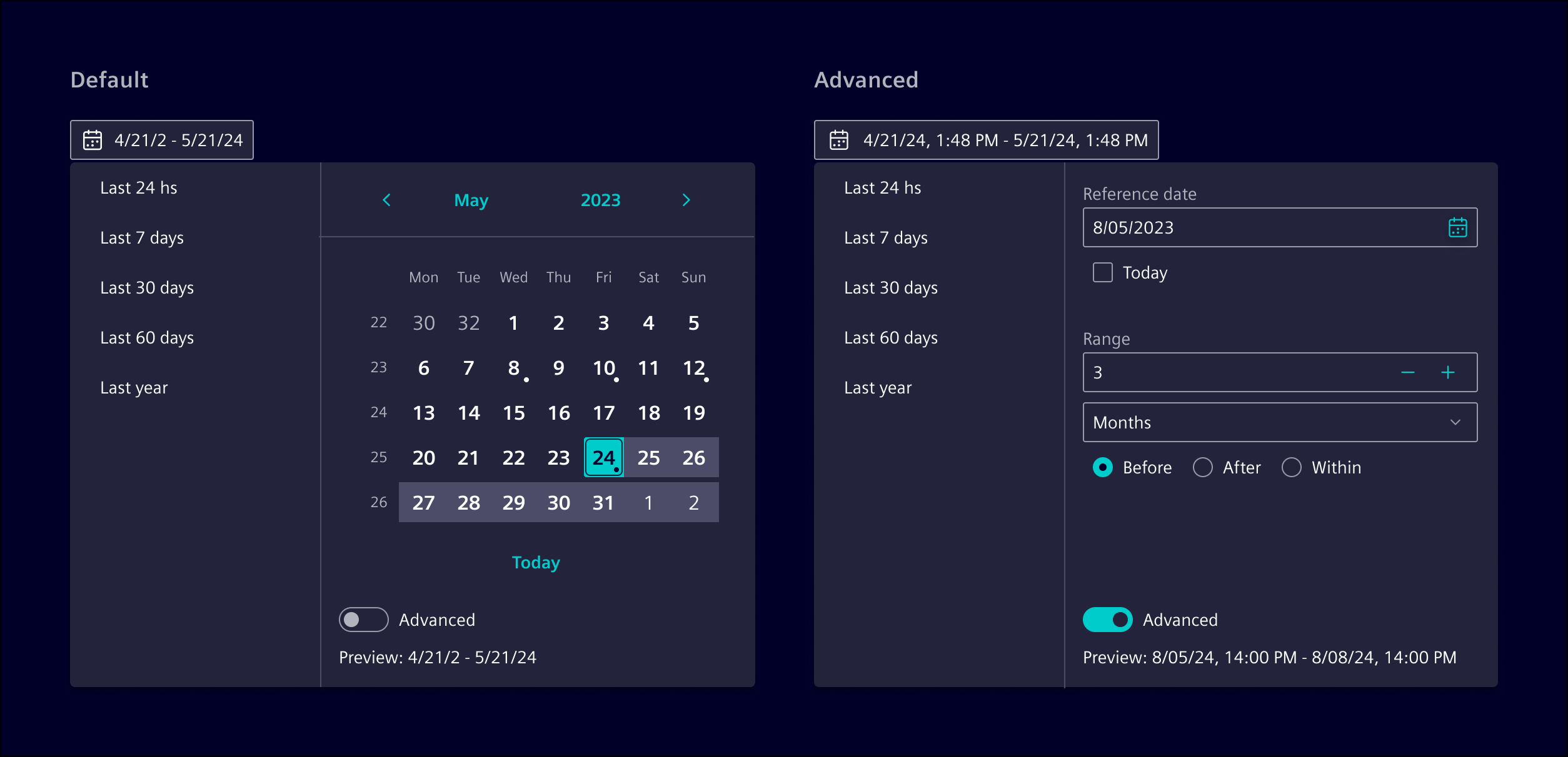
Date range filter allows users to select specific date intervals, either by choosing two absolute dates or by defining a relative range based on a reference point.
Usage
The date range filter provides options for both absolute and relative dates.
Users can select specific dates using either the calendar mode or the input mode.
It is possible to switch to an advanced mode to access relative date functions, which use offsets to specify dates in relation to a reference point (e.g., 7 days before or 1 month after now).
Additionally, it includes optional presets for quick access to common periods like "Last 7 days" or "Next month.
When to use
- For complex date filtering scenarios or in dashboards.
- When the use case requires flexibility in selecting periods relative to a reference date/time (e.g., "5 days before").
- When the use case involves advanced filtering capabilities, such as combining today or now with relative ranges.
- To offer users quick access to common preset ranges.
- Use a date picker if simpler date selections are required.
Best practices
- Use it in combination with input button.
- Use “Enter date” or the date format (i.e., MM/DD/YYYY) as placeholder.
- Configure presets according to the use case.
- If there are more than 10 presets, consider adding a search function.
Design
Date selection
For straightforward date selection, users can select absolute dates. This can be done in one of two modes:
- Calendar mode: Users select dates from a calendar interface, ideal for a visual approach.
- Input mode: Users manually enter dates and optionally use a calendar. Use this mode when both date and time need to be specified.
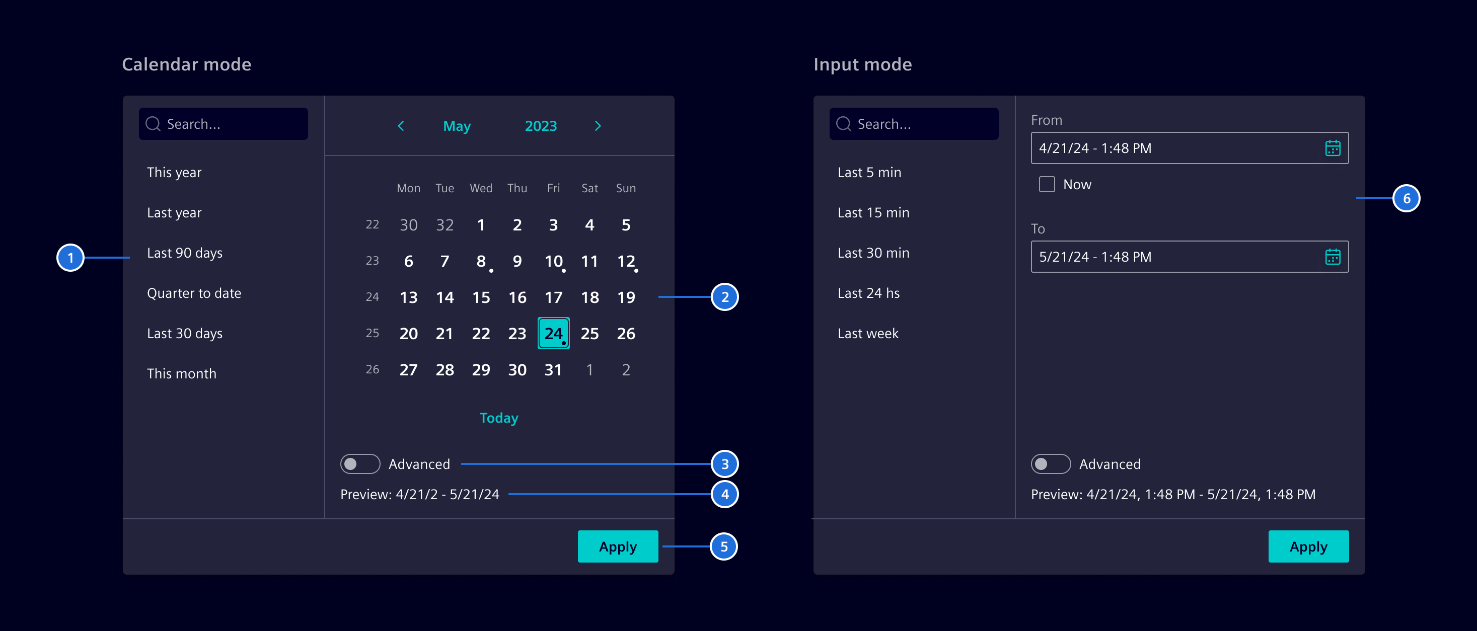
- Presets (optional), 2. Calendar, 3. Advanced control , 4. Preview, 5. Apply button (optional), 6. Date picker controls
Advanced functions
Advanced function provides flexibility with relative dates. Users can select dates relative to a reference point (e.g., "5 days before today").
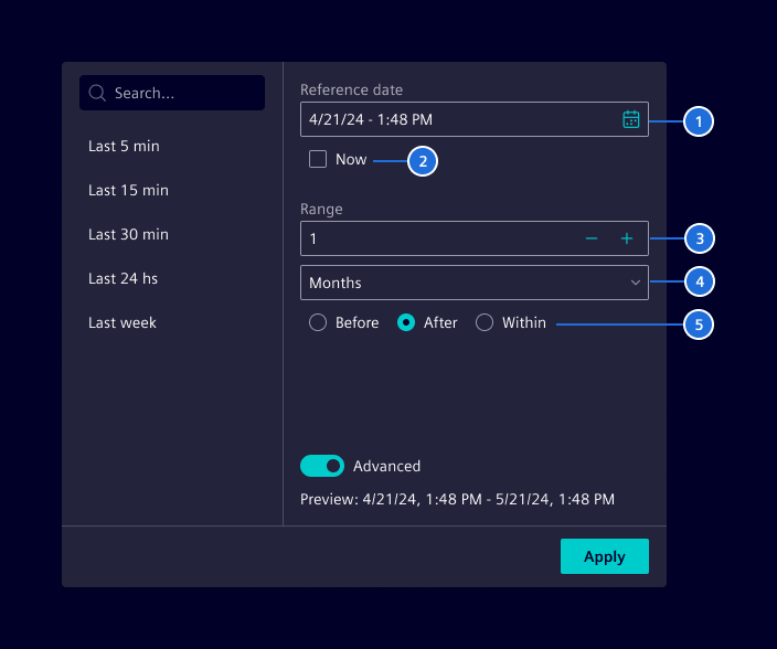
- Reference date, 2. Anchor to today/now, 3. Range value, 4. Time scale, 5. Offset period
Code
The SiDateRangeFilter component supports selecting date/time ranges for filtering use cases that occur for example in dashboard applications. The component provides the date/time interval object DateRangeFilter by:
- Selecting two absolute dates.
- Selecting a date as a reference point and a range definition like
5 days beforeor2 weeks after. - Using
todayornowin combination with a range definition.
In addition, the component offers a configurable list of named preset range definitions.
Usage
import { SiDateRangeFilterComponent } from '@siemens/element-ng/date-range-filter';

@Component({
  imports: [SiDateRangeFilterComponent, ...]
})
Usage within popup
When using as a filter in a popup for a dashboard, use the button styled as an input, by using the btn-input CSS style.
SiDateRangeFilterComponent API Documentation
si-date-range-filter Input Properties
| Name | Type | Default | Description |
|---|---|---|---|
| advancedLabel ¶ | TranslatableString | $localize`:@@SI_DATE_RANGE_FILTER.ADVANCED:Advanced` | label for the "advanced" switch |
| afterLabel ¶ | TranslatableString | $localize`:@@SI_DATE_RANGE_FILTER.AFTER:After` | label for the "After" toggle |
| applyLabel ¶ | TranslatableString | $localize`:@@SI_DATE_RANGE_FILTER.APPLY:Apply` | label for the "apply" switch |
| basicMode ¶ | ("input" | "calendar") | 'calendar' | Determines whether to show input fields or a date-range calendar in basic mode. When time selection is enabled, this has no effect and input fields are always shown. |
| beforeLabel ¶ | TranslatableString | $localize`:@@SI_DATE_RANGE_FILTER.BEFORE:Before` | label for the "Before" toggle |
| dateLabel ¶ | TranslatableString | $localize`:@@SI_DATE_RANGE_FILTER.DATE:Date` | label for "Date" field / radio button |
| datepickerConfig ¶ | DatepickerInputConfig | Base configuration on how the dates should be displayed, parts of it may be overwritten internally. | |
| datePlaceholder ¶ | TranslatableString | $localize`:@@SI_DATE_RANGE_FILTER.DATE_PLACEHOLDER:Select date` | Placeholder for date fields |
| enableTimeSelection ¶ | boolean | false | Determines if time is selectable or only dates |
| fromLabel ¶ | TranslatableString | $localize`:@@SI_DATE_RANGE_FILTER.FROM:From` | label for the "Reference point" title |
| hideAdvancedMode ¶ | boolean | false | Hides the advanced mode if input allows |
| nowLabel ¶ | TranslatableString | $localize`:@@SI_DATE_RANGE_FILTER.NOW:Now` | label for the "Now" checkbox |
| presetLabel ¶ | TranslatableString | $localize`:@@SI_DATE_RANGE_FILTER.PRESETS:Presets` | label for the "search" input |
| presetList ¶ | DateRangePreset[] | List of preset time ranges. When not present or empty, the preset section won't show | |
| presetSearch ¶ | boolean | true | Determines if there's a search field for the preset list |
| previewLabel ¶ | TranslatableString | $localize`:@@SI_DATE_RANGE_FILTER.PREVIEW:Preview` | label for the "Preview" title |
range ¶ | DateRangeFilter | The filter range object | |
| rangeEndDateMissingLabel ¶ | TranslatableString | $localize`:@@SI_DATE_RANGE_FILTER.SELECT_RANGE_END:Select end date` | label for the "select end date" in preview |
| rangeLabel ¶ | TranslatableString | $localize`:@@SI_DATE_RANGE_FILTER.RANGE:Range` | label for the "Range" title |
| refLabel ¶ | TranslatableString | $localize`:@@SI_DATE_RANGE_FILTER.REF_POINT:Reference point` | label for the "Reference point" title |
| reverseInputFields ¶ | boolean | false | Reverses the order of the from/to fields |
| scrollStrategy ¶ | ScrollStrategy | defaultConnectedOverlayScrollStrategy() | Optional CDK scroll strategy used for the preset overlay. |
| searchLabel ¶ | TranslatableString | $localize`:@@SI_DATE_RANGE_FILTER.SEARCH:Search` | label for the "search" input |
| selectRangeLabel ¶ | TranslatableString | $localize`:@@SI_DATE_RANGE_FILTER.SELECT_RANGE_LABEL:Select date range` | label when range is not defined in the preview |
| showApplyButton ¶ | boolean | false | Determines whether to show the 'Apply' button |
| todayLabel ¶ | TranslatableString | $localize`:@@SI_DATE_RANGE_FILTER.TODAY:Today` | label for the "Today" checkbox |
| toLabel ¶ | TranslatableString | $localize`:@@SI_DATE_RANGE_FILTER.TO:To` | label for the "Reference point" title |
| unitLabel ¶ | TranslatableString | $localize`:@@SI_DATE_RANGE_FILTER.UNIT:Unit` | label for the "Unit" select |
| valueLabel ¶ | TranslatableString | $localize`:@@SI_DATE_RANGE_FILTER.VALUE:Value` | label for the "value" number input |
| withinLabel ¶ | TranslatableString | $localize`:@@SI_DATE_RANGE_FILTER.WITHIN:Within` | label for the "Within" toggle |
Output Properties
| Name | Type | Description |
|---|---|---|
| applyClicked ¶ | void | Event fired when the apply button has been clicked |
| rangeChange ¶ | DateRangeFilter | The filter range object |
SiDateRangeCalculationService API Documentation
Service to transform and calculate with DateRangeFilter objects.
Attributes and Methods
| Name | Type | Default | Description |
|---|---|---|---|
| removeTime(...) ¶ | (date: Date) => Date | Utility to reset the time attributes to 0 (hours/minutes/seconds/milliseconds). Parameters
| |
| resolveDateRangeFilter(...) ¶ | (filter: DateRangeFilter, options: ResolveDateRangeOptions) => ResolvedDateRange | Calculates the start and end dates of a DateRangeFilter. Returns The resolved result in form of a ResolvedDateRange object. Parameters
|
Types Documentation
| Represents a translatable string. This can either be a translation key, e.g. ACTIONS.EDIT that will be automatically translated when displayed on the UI or a pre-translated string, e.g. Edit . Equivalent to a normal string in usage and functionality. |
|---|
| | ||||||||||||||||||||||||||||||||||||||
|---|---|---|---|---|---|---|---|---|---|---|---|---|---|---|---|---|---|---|---|---|---|---|---|---|---|---|---|---|---|---|---|---|---|---|---|---|---|---|
|
| |
|---|
| | ||||
|---|---|---|---|---|
|
| | ||||||||||||||||||||||||||||||||||||
|---|---|---|---|---|---|---|---|---|---|---|---|---|---|---|---|---|---|---|---|---|---|---|---|---|---|---|---|---|---|---|---|---|---|---|---|---|
|
| Simple DateRangeFilter preset based on offset from now | ||||
|---|---|---|---|---|
|
| Advanced DateRageFilter preset with custom calculation | |||||
|---|---|---|---|---|---|
|
| |
|---|
| | ||||
|---|---|---|---|---|
|
| | |||
|---|---|---|---|
|
Except where otherwise noted, content on this site is licensed under MIT License.