Color picker
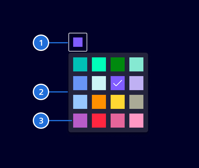
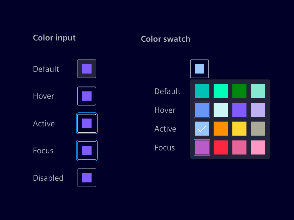
The color picker is an input element for selecting a color from a set of predefined swatches.
Usage
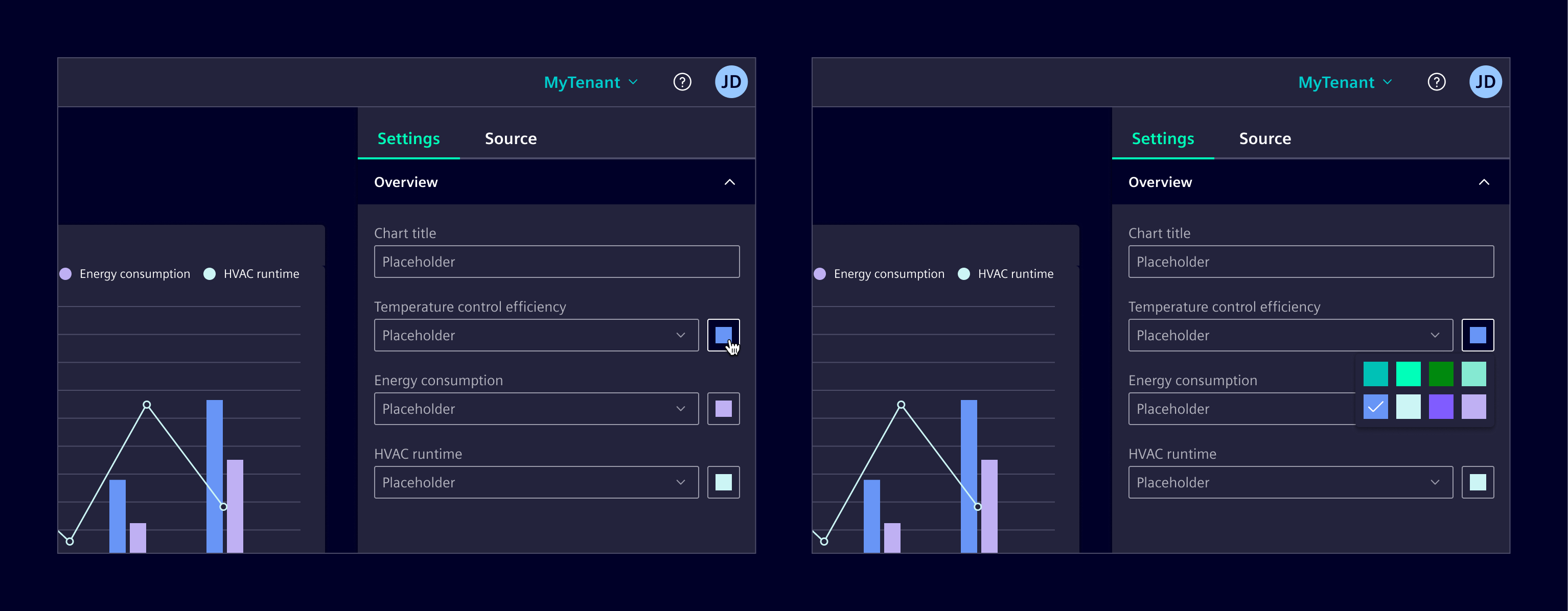
This component enables users to select a color from a customizable set of swatches. The specific colors and the number of swatches can be adjusted according to the use case.
When to use
- When users need the flexibility to customize colors to suit their specific preferences or needs.
- When color selection is integral to the user’s workflow, such as in dashboards, or customization interfaces.
Best practices
- Limit the number of swatches to avoid overwhelming users.
- When using the component for dashboards or chart configurations, use the palette defined for data visualization.
- Any color from the Element palette can be used, but be mindful of the context and how colors are applied.
- Carefully consider the palette offered to users, ensuring it aligns with the context and use case.
Code
The color picker component allows users to choose a color from a predefined palette. The color picker component can also be used within forms. All element colors are available for being used in the color palette. For their names see:
By default the data visualization palette is used. UX recommends only using colors from that palette. To modify the color palette use the respective input and provide the token names without the leading $:
<si-color-picker
  [colorPalette]="['si-sys-color-data-categorical-1']"
  color="si-sys-color-data-categorical-1"
/>
To use custom colors that are not part of element you need to provide them as CSS variables for dark and light in the global style sheet:
:root {
  --my-custom-color: #116671;
}

:root.app--dark {
  --my-custom-color: #da1611;
}
Then provide the variable name without the leading -- in the color palette:
<si-color-picker [colorPalette]="['my-custom-color']" color="my-custom-color" />
Usage
import { SiColorPickerComponent } from '@siemens/element-ng/color-picker';

@Component({
  imports: [SiColorPickerComponent, ...]
})
SiColorPickerComponent API Documentation
si-color-picker Input Properties
| Name | Type | Default | Description |
|---|---|---|---|
| ariaLabel ¶ | TranslatableString | $localize`:@@SI_COLOR_PICKER.SELECTED_LABEL:Selected color {{color}}` | Aria label for the color input button. |
| autoClose ¶ | boolean | false | Specifies whether the color popup should automatically close on a color selection. |
| color ¶ | string | The selected color. | |
| colorPalette ¶ | string[] | The first 16 colors of the Element data color palette. | The color palette to choose the colors from. As colors, only valid CSS variable names omitting the -- prefix or Element color tokens omitting the $ prefix are supported.Note: If custom CSS variables are provided, they need to be defined for both light and dark mode. |
| colorPaletteAriaLabel ¶ | TranslatableString | $localize`:@@SI_COLOR_PICKER.PALETTE_LABEL:Color palette` | Aria label for the color palette. |
| disabled ¶ | boolean | false | Specifies whether the color picker component is disabled. |
| scrollStrategy ¶ | ScrollStrategy | defaultConnectedOverlayScrollStrategy() | Optional CDK scroll strategy used for the color picker overlay. |
Output Properties
| Name | Type | Description |
|---|---|---|
| colorChange ¶ | string | The selected color. |
Types Documentation
| Represents a translatable string. This can either be a translation key, e.g. ACTIONS.EDIT that will be automatically translated when displayed on the UI or a pre-translated string, e.g. Edit . Equivalent to a normal string in usage and functionality. |
|---|
Except where otherwise noted, content on this site is licensed under MIT License.