Value dashboard widget
Value dashboard widget displays key information and offers interactive features for direct user interaction.
Usage
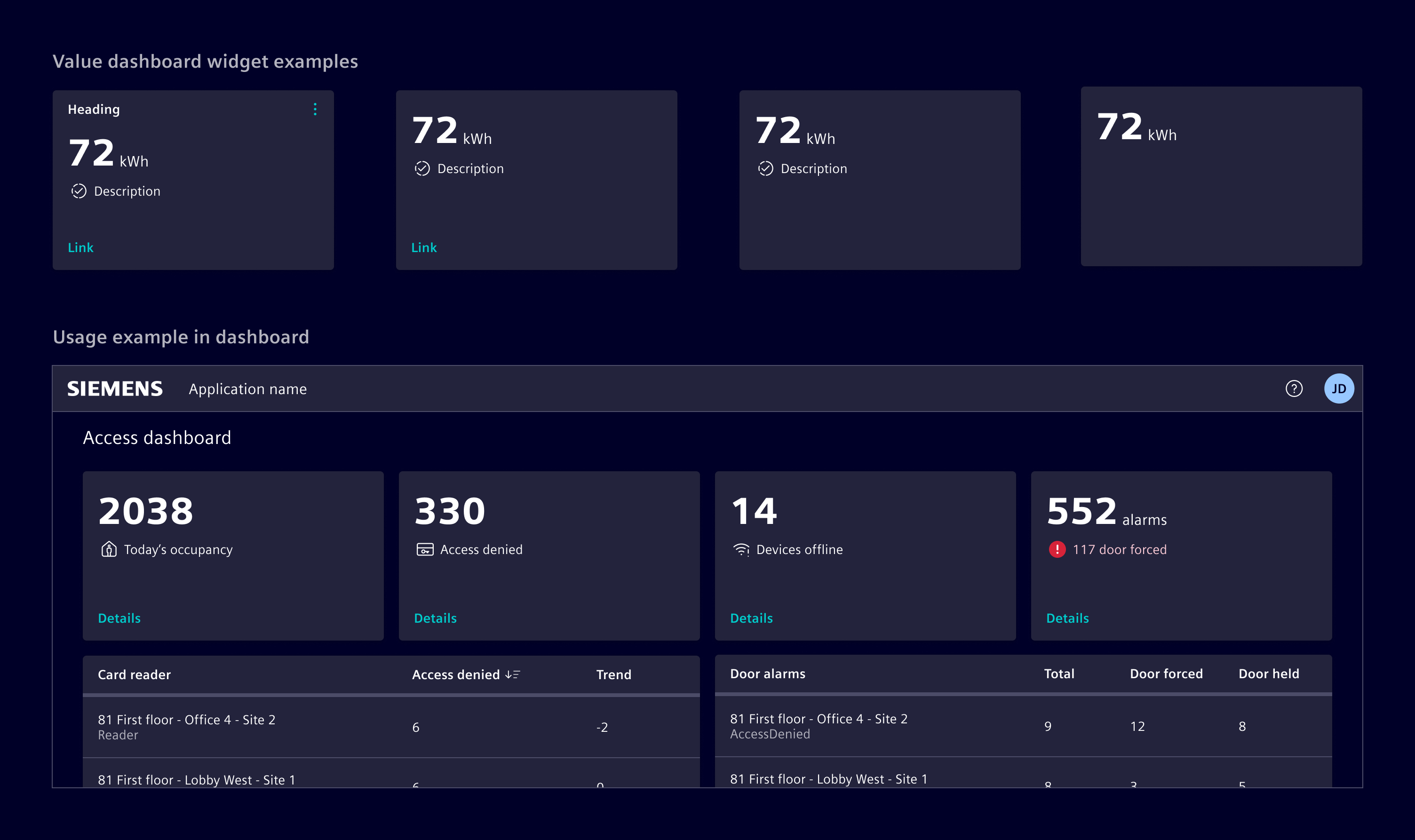
The value dashboard widget displays key information, such as numerical values, and optionally include icons or indicators that highlight its nature or status.
It can include:
- A description to offer a clearer context.
- Links for navigation.
- Actionable items, like buttons or menus, to directly initiate tasks.
When to use
- In dashboards and tile layouts.
- To provide an at-a-glance overview of key metrics or information.
- To present actionable cards that lead to more detailed content or follow-up actions.
Best practices
- Display only the most relevant data.
- Prevent overcrowding by limiting the number of actions or visual elements.
- Include actions that are clearly related to the data shown.
- Maintain a design that is consistent with the overall dashboard.
- Optimize for performance to ensure responsiveness and a smooth user experience.
- Use skeleton to represent its loading state.
Design
Elements
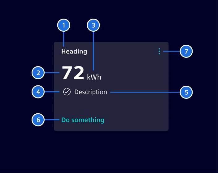
- Heading, 2. Value, 3. Unit, 4.Icon/indicator, 5. Description, 6. Call-to-action (CTA), 7. Content Action Bar
With the exception of the Value (2), all items are optional.
Variants
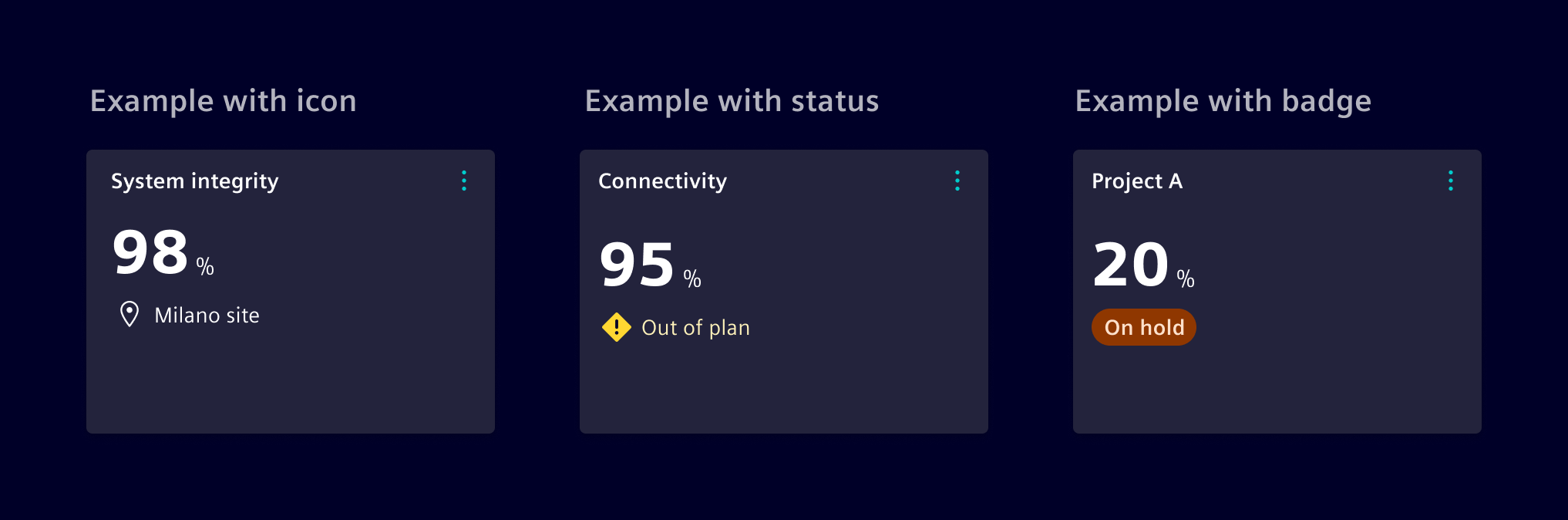
The icon/indicator can be adapted to show an icon, status or a badge.
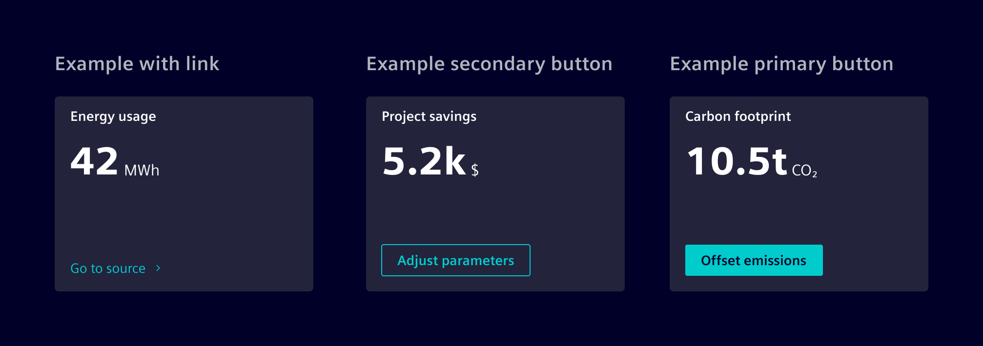
Value Dashboard Widget supports calls-to-action (CTAs), such as a buttons or links.
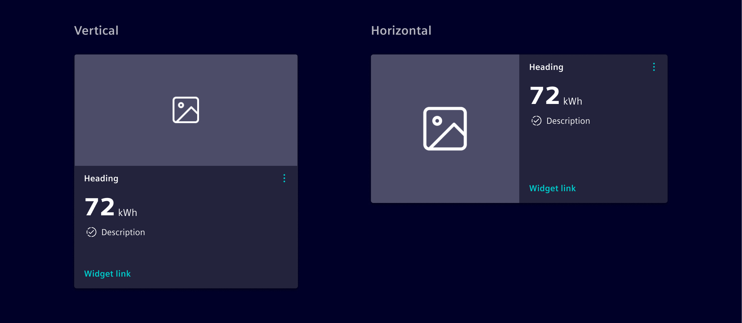
It is also possible to add an image, which can be configured to be either vertical or horizontal. The image size can be adapted according to the need.
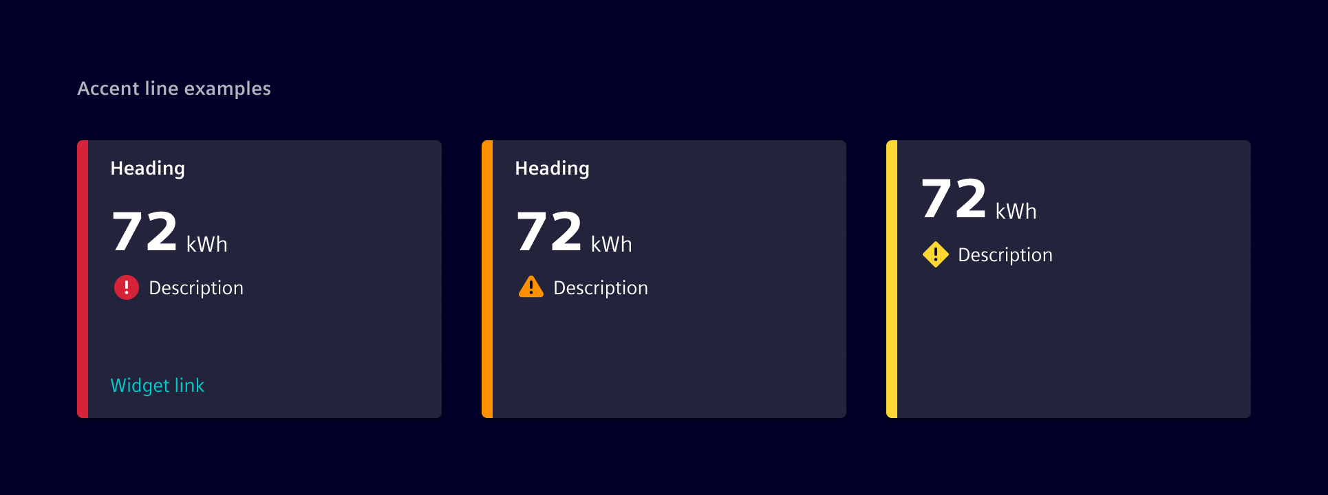
The widget can include an accent line, which acts as a status indicator to highlight critical information.
When there’s only one status, the accent line alone is enough to convey the message. For multiple statuses, the accent line should be combined with a status icon to give extra context.
If there’s a single status, the accent line alone is sufficient. For multiple statuses, pair the line with an appropriate icon to provide additional context.
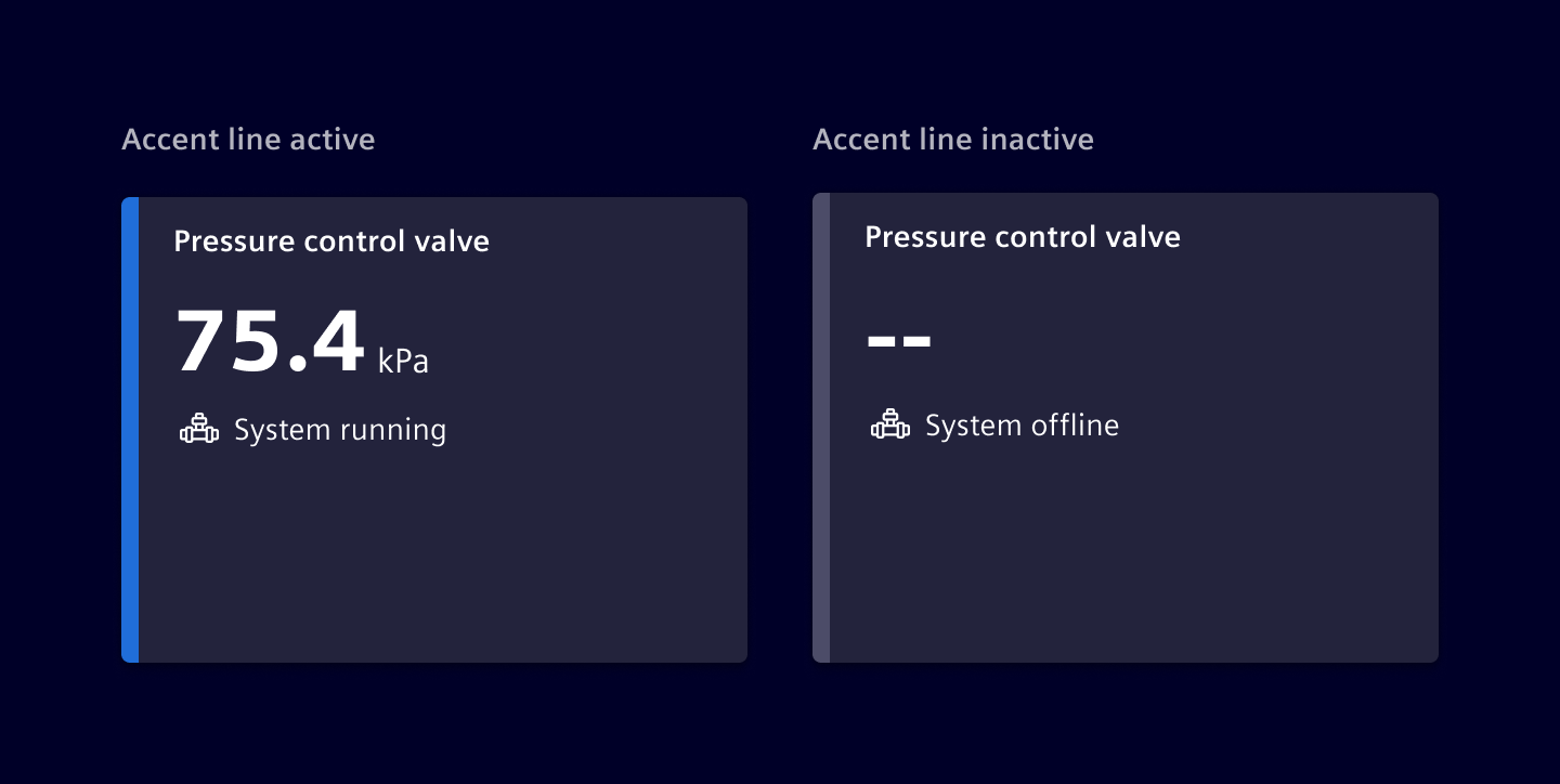
The accent line can also switch to a neutral color. This is useful for special cases where it represents a dynamic state, like showing whether something is on/off or active/inactive.
Ensure the status is not communicated solely through color; pair the line with appropriate text, icons, or other visual cues when needed.
Responsive behavior
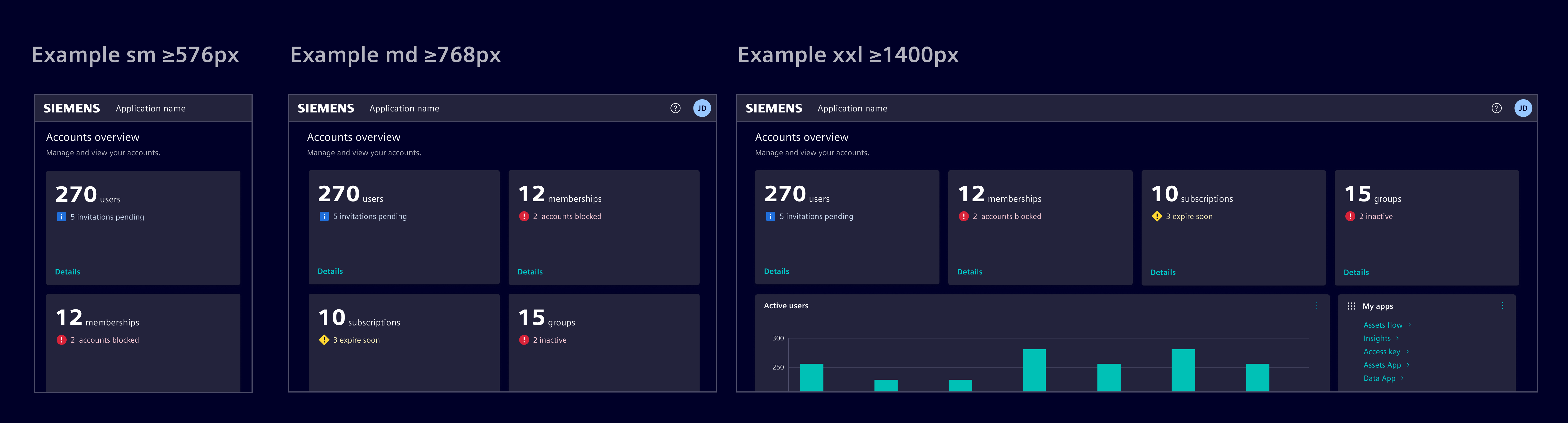
To achieve harmonious layouts, adjust the width of the Value Widget as required, ensuring a consistent height throughout. it's designed to span a minimum of 3 columns and adjusts responsively to screen size changes, with stacking for adaptability.
Code
The value widget is implemented by CSS classes and the usage of other Element components.
Component usage
To simplify the usage and reduce the code, Element offers a Angular component as wrapper with streamlined inputs.
import { SiValueWidgetComponent } from '@siemens/element-ng/dashboard';

@Component({
  :
  imports: [SiValueWidgetComponent]
})
SiValueWidgetComponent API Documentation
si-value-widget Is a dynamic UI component that not only displays information, but also includes embedded actions which the user can interact with to perform tasks directly related to the card's content. Actions might include editing settings, initiating processes, or deleting resources.
The actionable widget turns data representation into an interactive hub, streamlining the user's tasks and decisions associated with the card's content.
This component is a wrapper using the .si-value-widget CSS classes and the <si-card> component. For more configuration options, use the CSS classes directly.
Input Properties
| Name | Type | Default | Description |
|---|---|---|---|
| accentLine ¶ | AccentLineType | Optional accent line | |
| description ¶ | TranslatableString | Short description of the value. A description is mandatory to show an icon. Only visible if value is available. | |
| disableAutoLoadingIndicator ¶ | boolean | false | Option to disable automatic start of skeleton loading indication. |
| heading ¶ | TranslatableString | Value widget header text. | |
| icon ¶ | string | The element icon name. Only visible if value is available. | |
| imgAlt ¶ | TranslatableString | Alt text for a provided image. | |
| imgDir ¶ | ("horizontal" | "vertical") | 'vertical' | Defines if an image is placed on top or start (left) of the card. |
| imgObjectFit ¶ | ("fill" | "none" | "contain" | "cover" | "scale-down") | 'scale-down' | Sets the image object-fit CSS property. |
| imgObjectPosition ¶ | string | Sets the image object-position CSS property. | |
| imgSrc ¶ | string | Image source for the card. | |
| initialLoadingIndicatorDebounceTime ¶ | number | 300 | Initial delay time in milliseconds before enabling loading indicator. Only used once initially during construction. |
| link ¶ | Link | Link that leads the user to more information or triggers and action. The link.title is displayed. The title will be translated. | |
| primaryActions ¶ | (MenuItem | ContentActionBarMainItem)[] | [] | Input list of primary action items. Supports up to 4 actions and omits additional ones. |
| secondaryActions ¶ | (MenuItem | MenuItem)[] | [] | Input list of secondary action items. |
| showLoadingIndicator ¶ | boolean | false | Input to start and stop the skeleton loading indication. |
| status ¶ | EntityStatusType | Show a status icon instead of the icon . | |
| unit ¶ | TranslatableString | The unit of the value (e.g. kWh or users). Only visible if value is available. | |
| value ¶ | TranslatableString | The main value to be displayed. If no value is set, the skeleton indicates the loading of the value. Disable the automatic loading mechanism by setting SiValueWidgetComponent.disableAutoLoadingIndicator . |
CSS class usage
For more flexibility and control, use the CSS classes directly in the <si-card> component.
<si-card
  [heading]="'Heading'"
  [primaryActions]="primaryActions"
  [secondaryActions]="secondaryActions"
>
  <div class="card-body" body>
    <span class="si-value-widget-value">Value</span>
    <span class="si-value-widget-unit">Unit</span>
    <div class="si-value-widget-description text-warning">
      <si-icon class="icon" icon="element-checked" />
      <span>Description</span>
    </div>
  </div>
  <div class="card-footer" footer>
    <a [siLink]="simplActionLink">Do something</a>
  </div>
</si-card>
Value widget body component
The body of the <si-value-widget> is implemented in the component <si-value-widget-body>. You can use it for compositions.
SiValueWidgetBodyComponent API Documentation
si-value-widget-body The body of the <si-value-widget> . Useful for compositions.
Input Properties
| Name | Type | Default | Description |
|---|---|---|---|
| description ¶ | TranslatableString | Short description of the value. A description is mandatory to show an icon. Only visible if value is available. | |
| disableAutoLoadingIndicator ¶ | boolean | false | Option to disable automatic start of skeleton loading indication. |
| icon ¶ | string | The element icon name. Only visible if value is available. | |
| initialLoadingIndicatorDebounceTime ¶ | number | 300 | Initial delay time in milliseconds before enabling loading indicator. Only used once initially during construction. |
| showLoadingIndicator ¶ | boolean | false | Input to start and stop the skeleton loading indication. |
| status ¶ | EntityStatusType | Show a status icon instead of the icon . | |
| unit ¶ | TranslatableString | The unit of the value (e.g. kWh or users). Only visible if value is available. | |
value ¶ | (TranslatableString | undefined) | The main value to be displayed. If no value is set, the skeleton indicates the loading of the value. Disable the automatic loading mechanism by setting SiWidgetBodyBaseComponent.disableAutoLoadingIndicator . |
Attributes and Methods
| Name | Type | Default | Description |
|---|---|---|---|
| ngOnChanges() ¶ | () => void | A callback method that is invoked immediately after the default change detector has checked data-bound properties if at least one has changed, and before the view and content children are checked. | |
| (readonly) showLoadingIndicator ¶ | Signal<boolean> | ... |
Types Documentation
| |
|---|
| Represents a translatable string. This can either be a translation key, e.g. ACTIONS.EDIT that will be automatically translated when displayed on the UI or a pre-translated string, e.g. Edit . Equivalent to a normal string in usage and functionality. |
|---|
| | ||||||||||
|---|---|---|---|---|---|---|---|---|---|---|
|
| |
|---|
| |
|---|
| |
|---|
| |
|---|
| | ||||||||||
|---|---|---|---|---|---|---|---|---|---|---|
|
| | |||||||||||
|---|---|---|---|---|---|---|---|---|---|---|---|
|
| | |||||||||||
|---|---|---|---|---|---|---|---|---|---|---|---|
|
| Represents a menu item that navigates using the Angular Router. Requires a configured Angular Router. | |||||||||||
|---|---|---|---|---|---|---|---|---|---|---|---|
|
| | ||||||||||
|---|---|---|---|---|---|---|---|---|---|---|
|
| | |||
|---|---|---|---|
|
| | |||||||||||
|---|---|---|---|---|---|---|---|---|---|---|---|
|
| | |||
|---|---|---|---|
|
| | ||
|---|---|---|
|
| |
|---|
| | ||||||||
|---|---|---|---|---|---|---|---|---|
|
| Implement and provide this to an SiMenuFactoryComponent to receive trigger events. | |||||||
|---|---|---|---|---|---|---|---|
| |||||||
|
| Used in events emitted from SiLinkActionService | |||
|---|---|---|---|
|
| | |||||||||||||||||||||||||||
|---|---|---|---|---|---|---|---|---|---|---|---|---|---|---|---|---|---|---|---|---|---|---|---|---|---|---|---|
| |||||||||||||||||||||||||||
| |||||||||||||||||||||||||||
|
| | |||||||
|---|---|---|---|---|---|---|---|
| |||||||
| |||||||
|
Except where otherwise noted, content on this site is licensed under MIT License.