Usage
The timeline dashboard widget displays time-sensitive data and ordered events, allowing users to view key updates without leaving the current page.
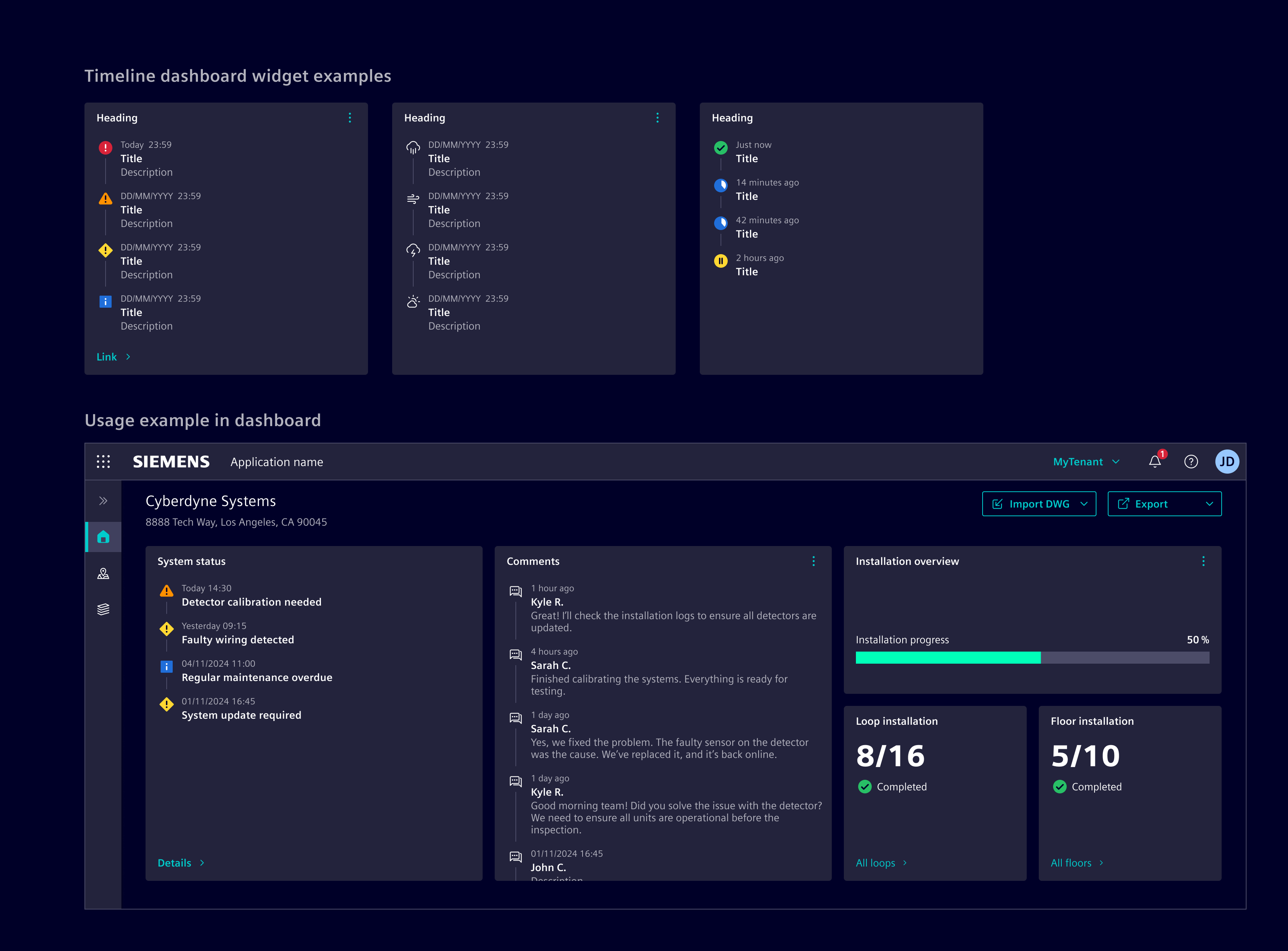
When to use
- In dashboards and tile layouts.
- When displaying frequently updated chronological data.
- When users need an at-a-glance overview of past and present events.
- To highlight time-sensitive updates, such as comments, milestones, or activities.
Best practices
- Use appropriate timestamps, such as full dates for history and relative time (e.g., "2 hours ago") for recent events.
- Use the footer link to direct users to more detailed information about the timeline items.
- Make effective use of indicators (icons or status) to provide quick visual cues about the nature of each event.
- Ensure that the timeline is regularly updated with accurate and relevant information, to maintain user trust.
- Use empty state to represent empty values.
Design
Elements
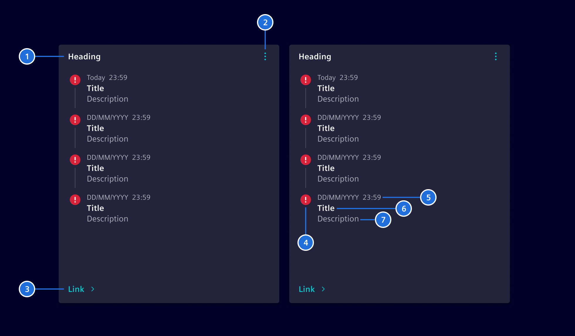
- Heading, 2. Header action (optional), 3. Footer link (optional), 4. Indicator, 5. Timestamp, 6. Title, 7. Description (optional), 8. Action (optional)
The indicator displays an icon or status. The header action can support any action as needed.
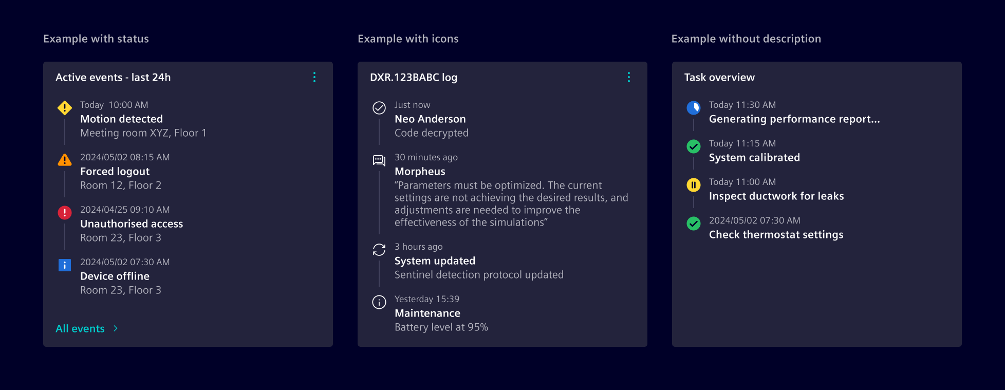
Content overflow is managed with an internal scrollbar, and the widget height can be configured to either full or fixed height to fit layout requirements.
This component is flexible enough to accommodate additional options, allowing for tailored solutions.
Item actions
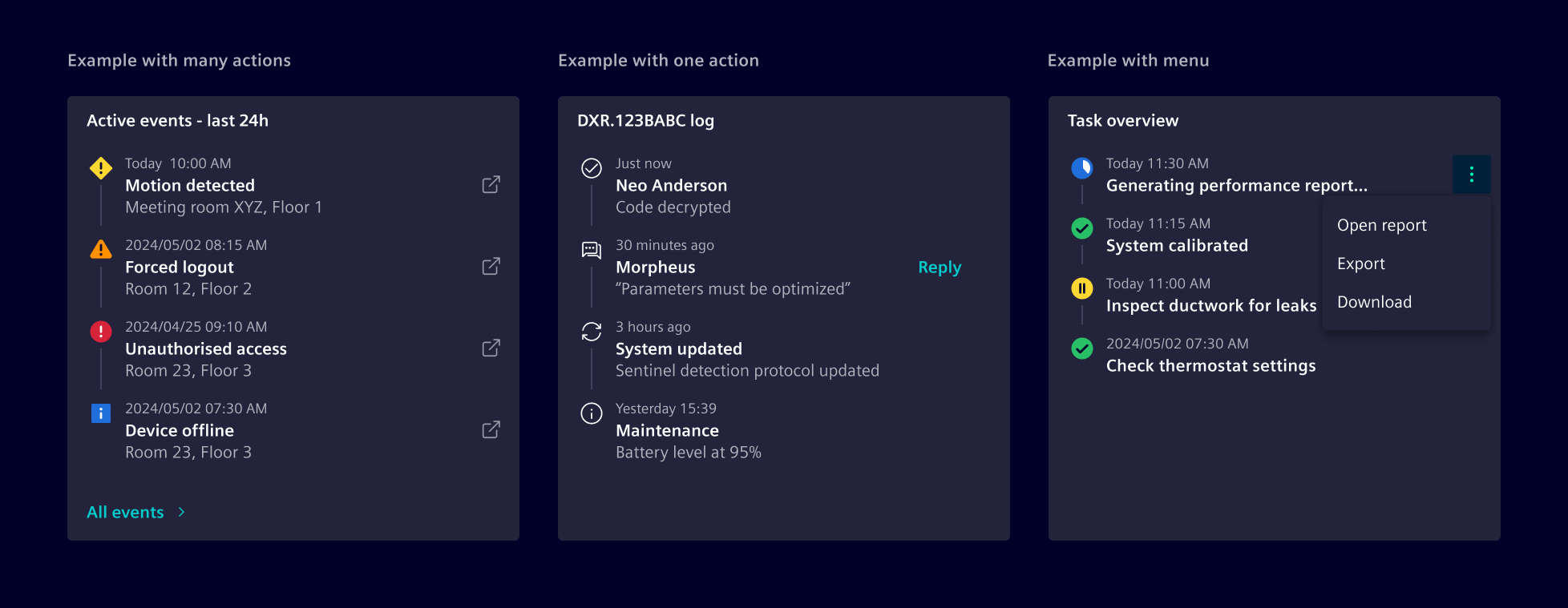
Each timeline item can have an associated action, which can be configured to navigate to the related item or perform additional operations (e.g., update or redo). If multiple actions are available, they should be collapsed into a menu.
Code
We support the timeline widget in two ways:
- Angular components that are configured by data objects to support minimum effort on the application development.
- HTML and CSS-based to support maximum flexibility.
To simplify the usage and reduce the code, Element offers a Angular component as wrapper with streamlined inputs. The component is a wrapper around the card and the <si-timeline-widget-body>.
import { SiTimelineWidgetComponent } from '@siemens/element-ng/dashboard';


@Component({
  :
  imports: [SiTimelineWidgetComponent]
})
selector
si-timeline-widget
| Name | Type | Default | Description |
ngOnInit()
| () => void | | A callback method that is invoked immediately after the default change detector has checked the directive's data-bound properties for the first time, and before any of the view or content children have been checked. It is invoked only once when the directive is instantiated. |
(readonly) showLoadingIndicator
| Signal<boolean> | ... | |
Timeline widget body component
The body of the <si-timeline-widget> is implemented in the component <si-timeline-widget-body>. You can use it for compositions.
SiTimelineWidgetBodyComponent API Documentation
selector
si-timeline-widget-body
Input Properties
Attributes and Methods
| Name | Type | Default | Description |
ngOnChanges()
| () => void | | A callback method that is invoked immediately after the default change detector has checked data-bound properties if at least one has changed, and before the view and content children are checked. |
ngOnInit()
| () => void | | A callback method that is invoked immediately after the default change detector has checked the directive's data-bound properties for the first time, and before any of the view or content children have been checked. It is invoked only once when the directive is instantiated. |
(readonly) showLoadingIndicator
| Signal<boolean> | ... | |
CSS class usage
For more flexibility and control, use the CSS classes directly in the <si-card> component.
Types Documentation
| Properties | A function that will be invoked when clicking on the menu item. When passed as a string, use together with SiLinkActionService to receive events. This is meant for repetitive things in lists/tables/etc.
action?: (string | (param: any) => any) | A boolean that lets the link know whether it is disabled or not.
disabled?: boolean | Defines a href URI that the menu item will be linked to. Will be used to set the href attribute of the a element. Will only be used if link and function is not set.
href?: string | A boolean that lets the link know whether it is active or not. It is useful when action() is executed instead of link route.
isActive?: boolean | Defines the link of the menu item within the application using the angular router link concept. Accepts an array of any as per [routerLink API definition] https://angular.dev/api/router/RouterLink .
link?: (string | any[]) | The target attribute specifies where to open the linked document. If no target is specified, the link will open in the current tab.
target?: string | The title of the menu item. Can be either the title to be displayed or the translation key.
title?: TranslatableString | The optional tooltip of the link. Can be either the text to be displayed or the translation key.
tooltip?: TranslatableString | |
 