List dashboard widget
List dashboard widget provides a quick-glance overview of list items, offering users a shortcut to view and access key information directly.
Usage
The list dashboard widget is used for presenting lists in a compact format, allowing users to scan and interact with items quickly. It optionally allows search and sorting. It can include:
- Brief descriptions to provide context.
- Links for direct navigation.
- Actionable items for quick task initiation.
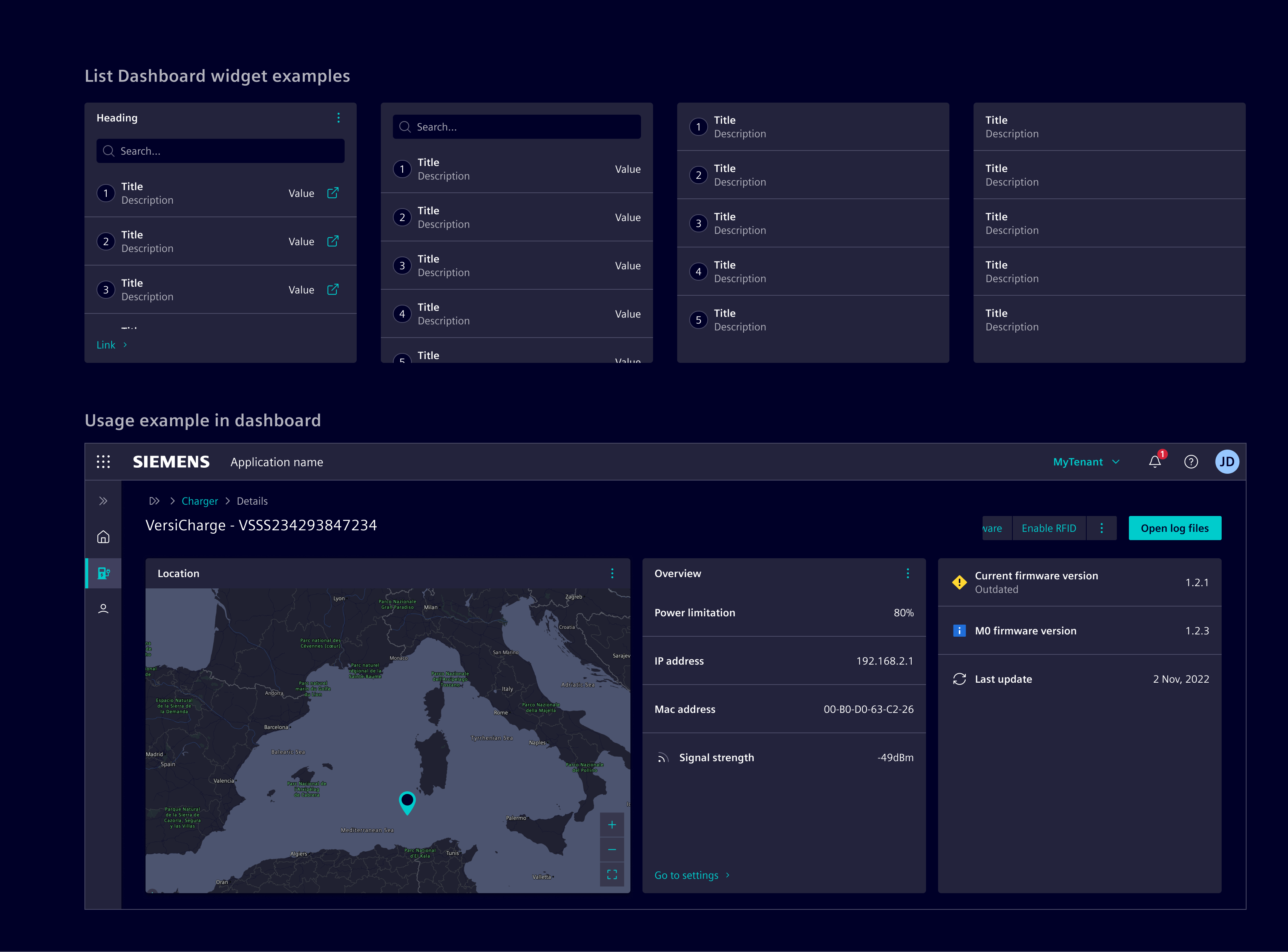
When to use
- In dashboards and tile layouts.
- To provide a ranked or organized list of items.
- When users need quick access to key information without navigating away.
- To summarize essential metrics, statuses, or items at a glance.
- When displaying frequently updated data in a compact format.
Best practices
- Prioritize relevant information.
- Limit additional elements (e.g., badges or actions) to avoid visual clutter and improve readability.
- Enable sorting and search for lists with more than a few items to simplify navigation.
- Use empty state to represent empty values.
Design
Elements
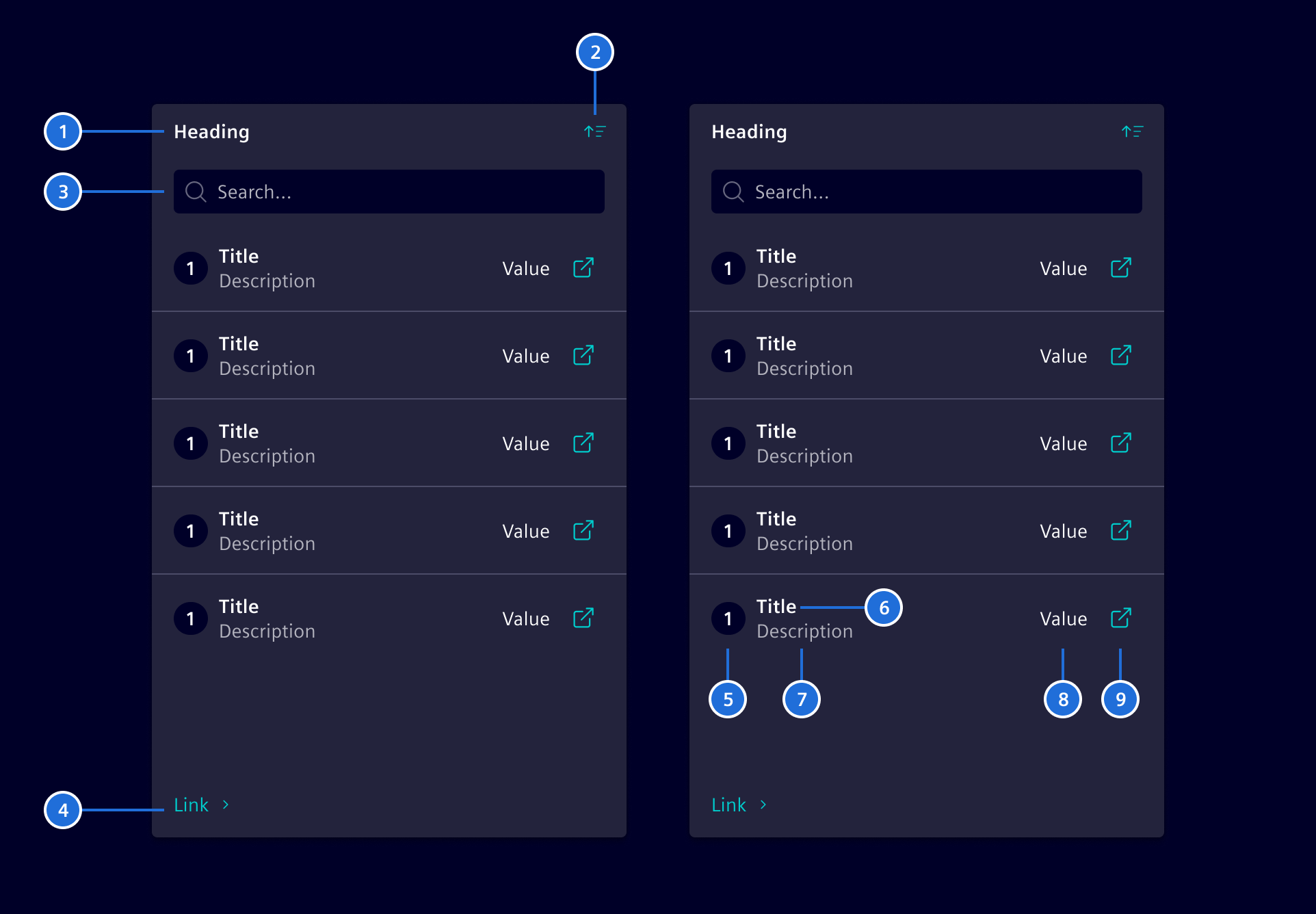
- Heading, 2. Action, 3. Search, 4. Footer link, 5. Indicator, 6. Row title, 7. Description, 8. Value, 9. Row action
With the exception of the Row title (6), all items are optional.
Variants
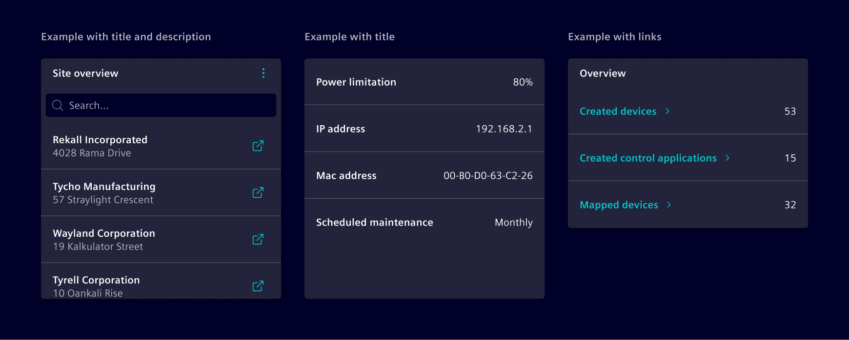
Each item can display a title or a link, with an optional description.
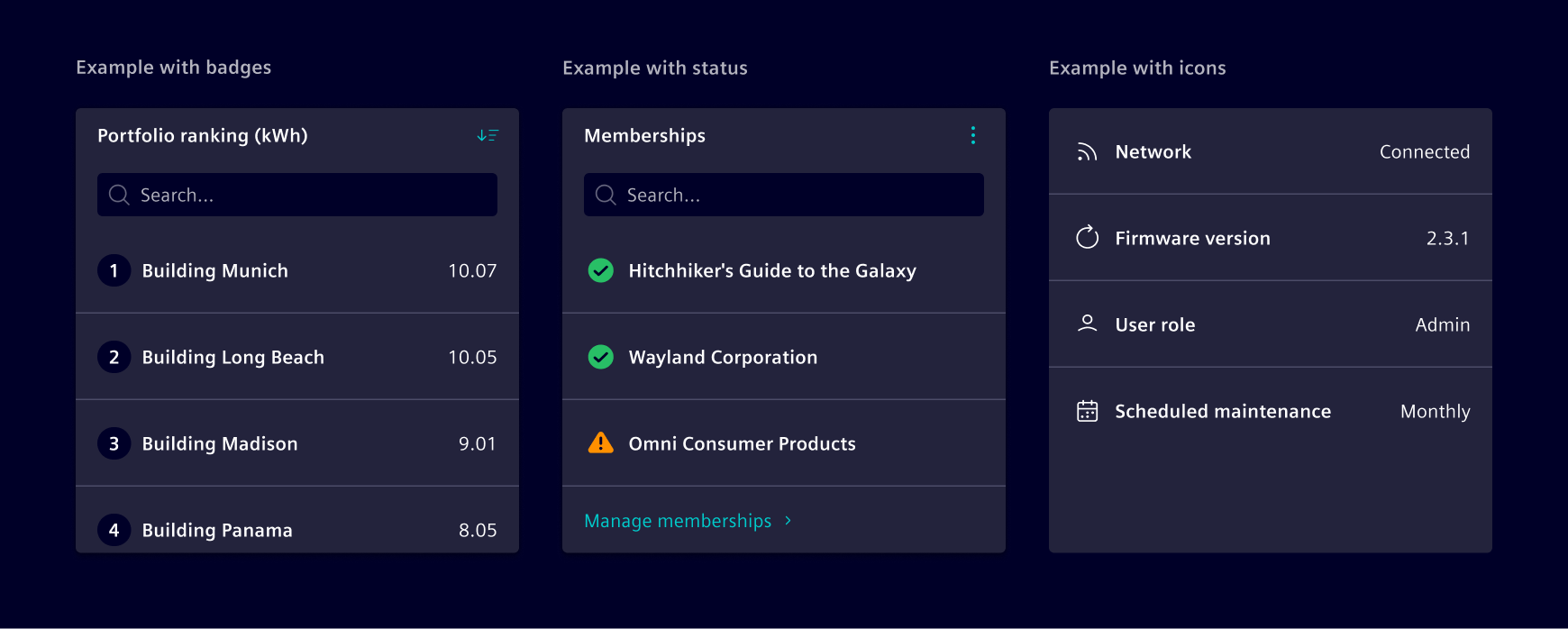
The indicator can be customized to show an icon, status or a badge.
The header action supports sorting items and other actions as needed. Content overflow is managed with an internal scrollbar, and the widget height can be configured to either full or fixed height according to layout needs.
This component is flexible enough to accommodate additional options, allowing for tailored solutions.
Code
We support the list widget in two ways:
- Angular components that are configured by data objects to support minimum effort on the application development.
- HTML and CSS-based to support maximum flexibility.
List widget component
To simplify the usage and reduce the code, Element offers a Angular component as wrapper with streamlined inputs. The component is a wrapper around the card and the <si-list-widget-body>.
import { SiListWidgetComponent } from '@siemens/element-ng/dashboard';

@Component({
  :
  imports: [SiListWidgetComponent]
})
Add the empty state component by content projection with the empty-state slot.
<si-list-widget search [heading]="'Heading'" [value]="items">
  <si-empty-state empty-state [icon]="'element-info'" [heading]="'No buildings found.'" />
</si-list-widget>
SiListWidgetComponent API Documentation
si-list-widget The <si-list-widget> supports an easy composition of links and actions with support for skeleton loading indicator, wrapped in a card.
Input Properties
| Name | Type | Default | Description |
|---|---|---|---|
| accentLine ¶ | AccentLineType | Optional accent line | |
| compareFn ¶ | (a: SiListWidgetItem, b: SiListWidgetItem) => (number | undefined) | ( a: SiListWidgetItem, b: SiListWidgetItem ) => { const aLabel = typeof a.label === 'object' ? a.label.title! : a.label; const bLabel = typeof b.label === 'object' ? b.label.title! : b.label; return aLabel.localeCompare(bLabel); } | Compare function of for two SiListWidgetItem s that is used to sort the array of items. The default compares the item labels by using the string localeCompare() function.@param: first SiListWidgetItem of the comparison.@param: second SiListWidgetItem of the comparison.Returns A value < 0 if a is smaller, > 0 if b is smaller, otherwise 0 . |
| disableAutoLoadingIndicator ¶ | boolean | false | Option to disable automatic start of skeleton loading indication. |
| filterFn ¶ | (item: SiListWidgetItem, searchTerm: string) => (boolean | undefined) | ( item: SiListWidgetItem, searchTerm: string ) => { const aLabel = typeof item.label === 'object' ? item.label.title! : item.label; return aLabel.toLowerCase().includes(searchTerm.toLowerCase()); } | Filter function that is used to filter down the list items when the user enters a term in the search bar. Default function. @param: The item be checked if it matches the searchTerm. @param: The string the user typed in the search bar. Returns true if the searchTerm matches the item and the item shall be kept in the list. |
| heading ¶ | TranslatableString | List widget heading. | |
| initialLoadingIndicatorDebounceTime ¶ | number | 300 | Initial delay time in milliseconds before enabling loading indicator. Only used once initially during construction. |
| link ¶ | Link | Optional footer link for the list widget | |
| numberOfLinks ¶ | number | 6 | The number of skeleton progress indication rows. |
| search ¶ | boolean | false | Enables the search functionality. |
| searchPlaceholderLabel ¶ | TranslatableString | $localize`:@@SI_LIST_WIDGET.SEARCH_PLACEHOLDER:Search…` | label for the "search placeholder" name |
| showLoadingIndicator ¶ | boolean | false | Input to start and stop the skeleton loading indication. |
| sort ¶ | SortOrder | Set ASC of ascending sorting, DSC for descending sorting and undefined for no sorting. | |
| sortAscendingLabel ¶ | TranslatableString | $localize`:@@SI_LIST_WIDGET.SORT_ASCENDING:Sort ascending` | |
| sortDescendingLabel ¶ | TranslatableString | $localize`:@@SI_LIST_WIDGET.SORT_DESCENDING:Sort descending` | |
value ¶ | (SiListWidgetItem[] | undefined) | The main value to be displayed. If no value is set, the skeleton indicates the loading of the value. Disable the automatic loading mechanism by setting SiWidgetBodyBaseComponent.disableAutoLoadingIndicator . |
Output Properties
| Name | Type | Description |
|---|---|---|
| sortChange ¶ | SortOrder | Set ASC of ascending sorting, DSC for descending sorting and undefined for no sorting. |
Attributes and Methods
| Name | Type | Default | Description |
|---|---|---|---|
| ngOnInit() ¶ | () => void | A callback method that is invoked immediately after the default change detector has checked the directive's data-bound properties for the first time, and before any of the view or content children have been checked. It is invoked only once when the directive is instantiated. | |
| (readonly) showLoadingIndicator ¶ | Signal<boolean> | ... |
List widget body component
The body of the <si-list-widget> is implemented in the component <si-list-widget-body>. You can use it for compositions.
SiListWidgetBodyComponent API Documentation
si-list-widget-body The <si-list-widget-body> implements the body of the that can be used for composition within other components.
Input Properties
| Name | Type | Default | Description |
|---|---|---|---|
| compareFn ¶ | (a: SiListWidgetItem, b: SiListWidgetItem) => (number | undefined) | ( a: SiListWidgetItem, b: SiListWidgetItem ) => { const aLabel = typeof a.label === 'object' ? a.label.title! : a.label; const bLabel = typeof b.label === 'object' ? b.label.title! : b.label; return aLabel.localeCompare(bLabel); } | Compare function of for two SiListWidgetItem s that is used to sort the array of items. The default compares the item labels by using the string localeCompare() function.@param: first SiListWidgetItem of the comparison.@param: second SiListWidgetItem of the comparison.Returns A value < 0 if a is smaller, > 0 if b is smaller, otherwise 0 . |
| disableAutoLoadingIndicator ¶ | boolean | false | Option to disable automatic start of skeleton loading indication. |
| filterFn ¶ | (item: SiListWidgetItem, searchTerm: string) => (boolean | undefined) | ( item: SiListWidgetItem, searchTerm: string ) => { const aLabel = typeof item.label === 'object' ? item.label.title! : item.label; return aLabel.toLowerCase().includes(searchTerm.toLowerCase()); } | Filter function that is used to filter down the list items when the user enters a term in the search bar. Default function. @param: The item be checked if it matches the searchTerm. @param: The string the user typed in the search bar. Returns true if the searchTerm matches the item and the item shall be kept in the list. |
| initialLoadingIndicatorDebounceTime ¶ | number | 300 | Initial delay time in milliseconds before enabling loading indicator. Only used once initially during construction. |
| link ¶ | Link | Optional footer link for the list widget | |
| numberOfLinks ¶ | number | 6 | The number of skeleton progress indication rows. |
| search ¶ | boolean | false | Enables the search functionality. |
| searchPlaceholderLabel ¶ | TranslatableString | $localize`:@@SI_LIST_WIDGET.SEARCH_PLACEHOLDER:Search…` | label for the "search placeholder" name |
| searchText ¶ | string | '' | Current search term used to filter the displayed list items. |
| showLoadingIndicator ¶ | boolean | false | Input to start and stop the skeleton loading indication. |
| sort ¶ | SortOrder | Enable ascending and descending SiListWidgetItem sorting. If enabled, items are initially ascending sorted. | |
| value¶ | (SiListWidgetItem[] | undefined) | The main value to be displayed. If no value is set, the skeleton indicates the loading of the value. Disable the automatic loading mechanism by setting SiWidgetBodyBaseComponent.disableAutoLoadingIndicator . |
Output Properties
| Name | Type | Description |
|---|---|---|
| searchTextChange ¶ | string | Current search term used to filter the displayed list items. |
Attributes and Methods
| Name | Type | Default | Description |
|---|---|---|---|
| ngOnInit() ¶ | () => void | A callback method that is invoked immediately after the default change detector has checked the directive's data-bound properties for the first time, and before any of the view or content children have been checked. It is invoked only once when the directive is instantiated. | |
| (readonly) showLoadingIndicator ¶ | Signal<boolean> | ... |
CSS class usage
For more flexibility and control, use the CSS classes directly in the <si-card> component.
Types Documentation
| |
|---|
| Represents a translatable string. This can either be a translation key, e.g. ACTIONS.EDIT that will be automatically translated when displayed on the UI or a pre-translated string, e.g. Edit . Equivalent to a normal string in usage and functionality. |
|---|
| | ||||||||||
|---|---|---|---|---|---|---|---|---|---|---|
|
| Defines the sort order. |
|---|
| Interface for objects to configure the the list widget. | ||||||||
|---|---|---|---|---|---|---|---|---|
|
| |
|---|
Except where otherwise noted, content on this site is licensed under MIT License.