Link dashboard widget
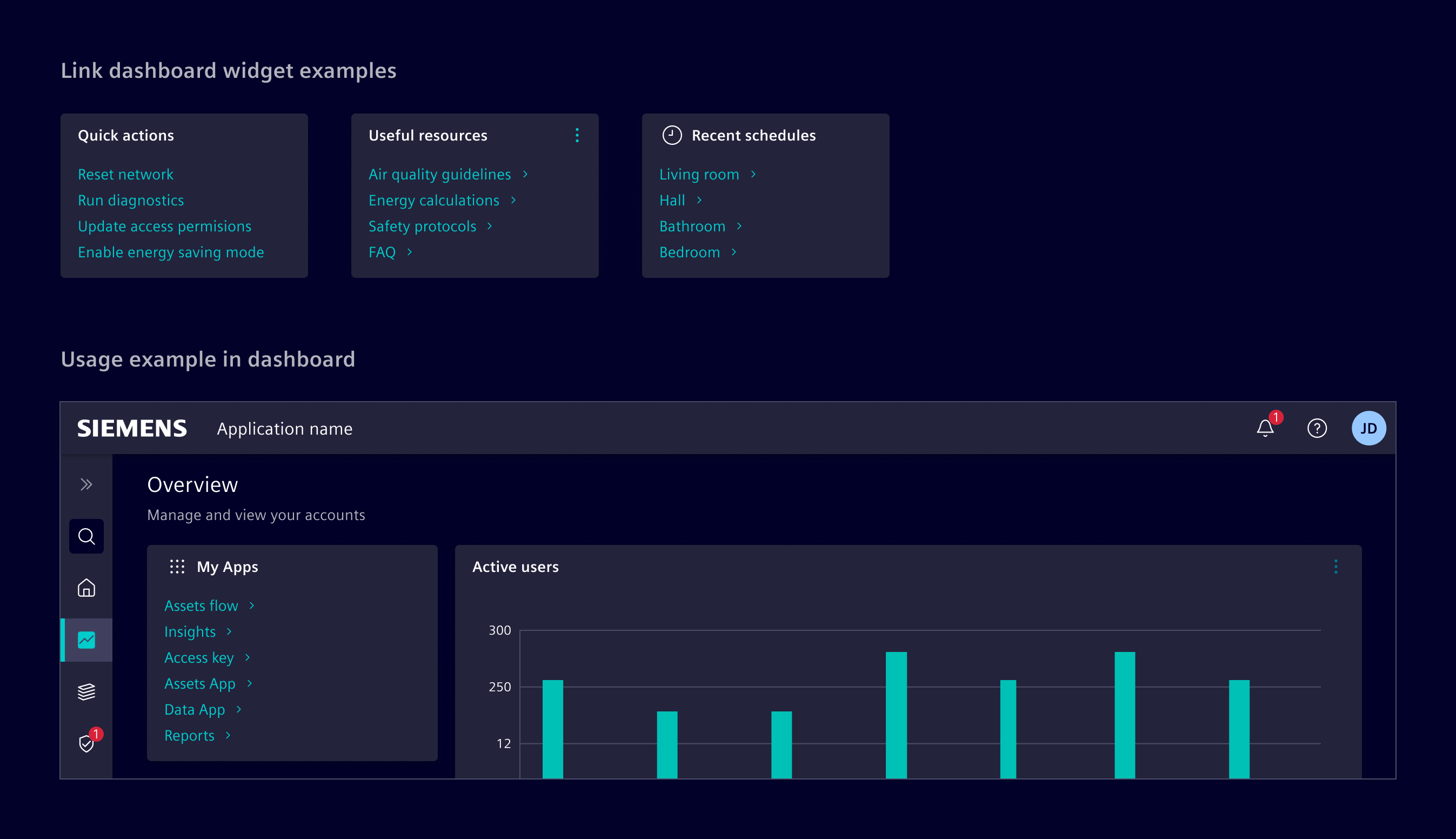
Link dashboard widget is a list of links that provides quick access to frequently used functions, pages, or external resources.
Usage
When to use
- In dashboards and tile layouts.
- To provide a list of navigation or action links.
Best practices
- Prevent overcrowding by keeping the number of links between 2 and 6.
- Keep labels short and clear, directly indicating the link's purpose and destination.
- Arrange links by their relevance or frequency of use to facilitate quick access.
- Use skeleton to represent its loading state.
Code
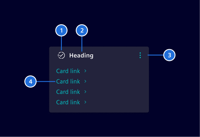
The link widget is implemented by CSS classes and the usage of other Element components.
Component usage
To simplify the usage and reduce the code, Element offers a Angular component as wrapper with streamlined inputs. The component should be used together with the card.
import { SiLinkWidgetComponent } from '@siemens/element-ng/dashboard';

@Component({
  :
  imports: [SiLinkWidgetComponent]
})
SiLinkWidgetComponent API Documentation
selector
si-link-widget The <si-link-widget> supports an easy composition of links and actions with support for skeleton loading indicator.
Input Properties
| Name | Type | Default | Description |
|---|---|---|---|
| disableAutoLoadingIndicator ¶ | boolean | false | Option to disable automatic start of skeleton loading indication. |
| initialLoadingIndicatorDebounceTime ¶ | number | 300 | Initial delay time in milliseconds before enabling loading indicator. Only used once initially during construction. |
| numberOfLinks ¶ | number | 3 | The number of skeleton progress indication rows. |
| showLinkIcons ¶ | boolean | false | Option to enable trailing link arrow icons for each link. |
| showLoadingIndicator ¶ | boolean | false | Input to start and stop the skeleton loading indication. |
value ¶ | (Link[] | undefined) | The main value to be displayed. If no value is set, the skeleton indicates the loading of the value. Disable the automatic loading mechanism by setting SiWidgetBodyBaseComponent.disableAutoLoadingIndicator . |
Attributes and Methods
| Name | Type | Default | Description |
|---|---|---|---|
| ngOnChanges() ¶ | () => void | A callback method that is invoked immediately after the default change detector has checked data-bound properties if at least one has changed, and before the view and content children are checked. | |
| ngOnInit() ¶ | () => void | A callback method that is invoked immediately after the default change detector has checked the directive's data-bound properties for the first time, and before any of the view or content children have been checked. It is invoked only once when the directive is instantiated. | |
| (readonly) showLoadingIndicator ¶ | Signal<boolean> | ... |
CSS class usage
For more flexibility and control, use the CSS classes directly in the <si-card> component.
Types Documentation
| | ||||||||||
|---|---|---|---|---|---|---|---|---|---|---|
|
| Represents a translatable string. This can either be a translation key, e.g. ACTIONS.EDIT that will be automatically translated when displayed on the UI or a pre-translated string, e.g. Edit . Equivalent to a normal string in usage and functionality. |
|---|
Except where otherwise noted, content on this site is licensed under MIT License.