Skip to content

Dashboard

A dashboard is a visual representation of different data and information sources, that provides a summarized overview of multiple key performance indicators such as metrics, trends and other insights.

Usage

The purpose of a dashboard is helping users to monitor, measure and analyze relevant data from different sources in a at-a-glance fashion.

They provide a quick and easy way to track performance metrics and identify areas for improvement, enabling users to make informed decisions based on real-time data.
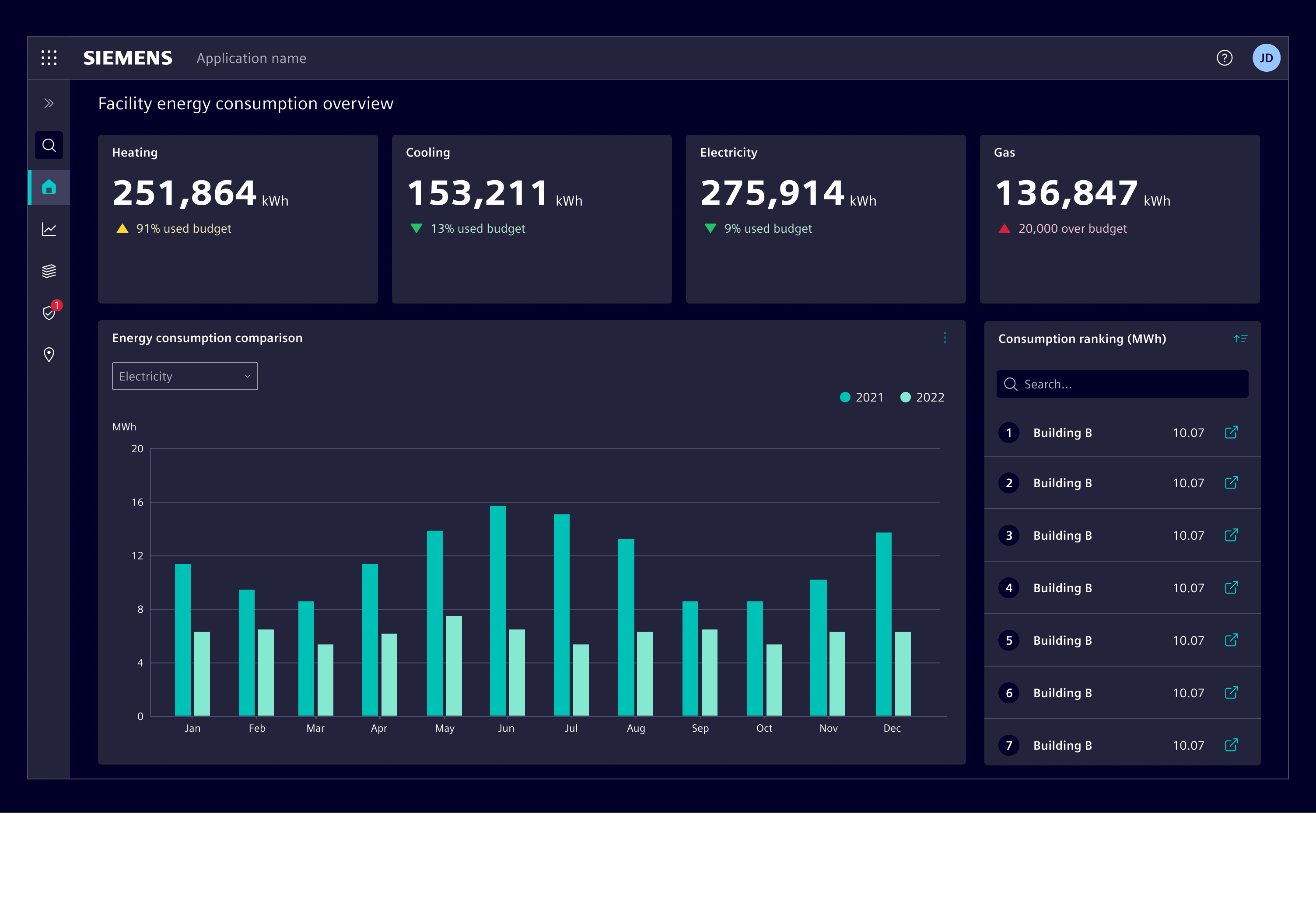
Dashboard

Dashboards vary significantly depending on the context in which they are used. Before starting to design a dashboard, it is important to understand the purpose and the goals it aims to achieve. This will help to identify the key metrics and information that need to be displayed.

Best practices

  • Keep it simple. Avoid clutter caused by too much information or showing irrelevant metrics.
  • Choose the right visualizations to represent the data. See the charts chapter.
  • Use color to draw attention to important information. Avoid using too many different colors or using them in a way that is visually distracting.
  • Use real-time data to ensure that the dashboard is up-to-date and provides the most recent information.
  • Use consistent units throughout the dashboard to ensure that the data is easily comparable among itself.
  • Use either global (affecting all widgets) or local (affecting only one widget) filters, not both simultaneously.

Design

Elements
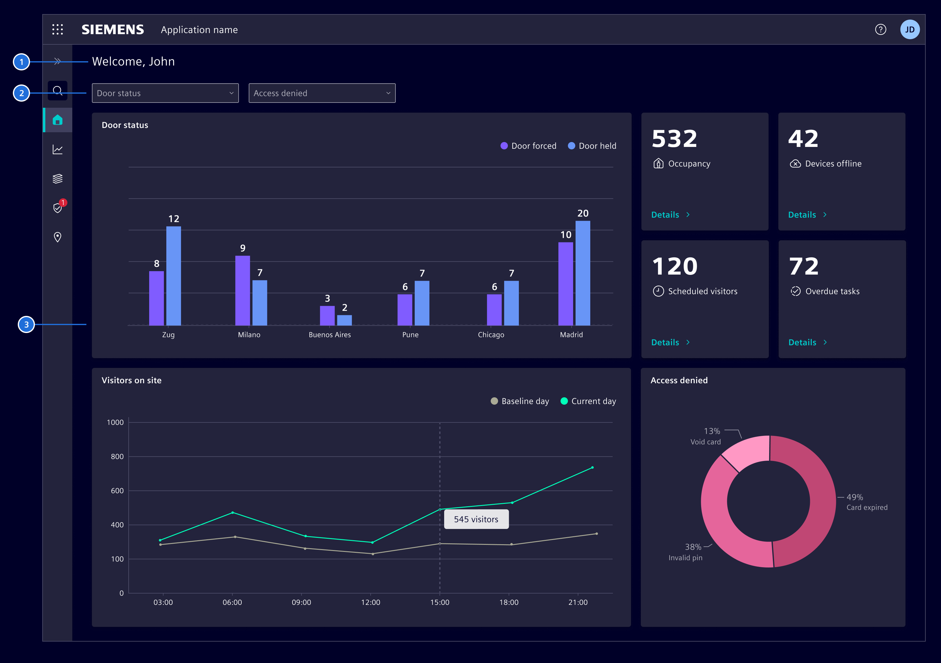
Dashboard elements

  1. Title (optional): A brief and descriptive name of the whole dashboard.
  2. Dashboard options (optional): Is the area located just bellow the title that contains filters, menus and other interactive elements that allow users to perform actions affecting the whole dashboard.
  3. Content area: Is the main area of the dashboard where the actual data, charts, graphs and other visualizations are displayed.

Progressive disclosure

Avoid overwhelming users with all the information being display at once by revealing it gradually and as needed. When dealing with large amount of content, it is better to display a summary or overview of the data with the option to expand or drill down to see further details.
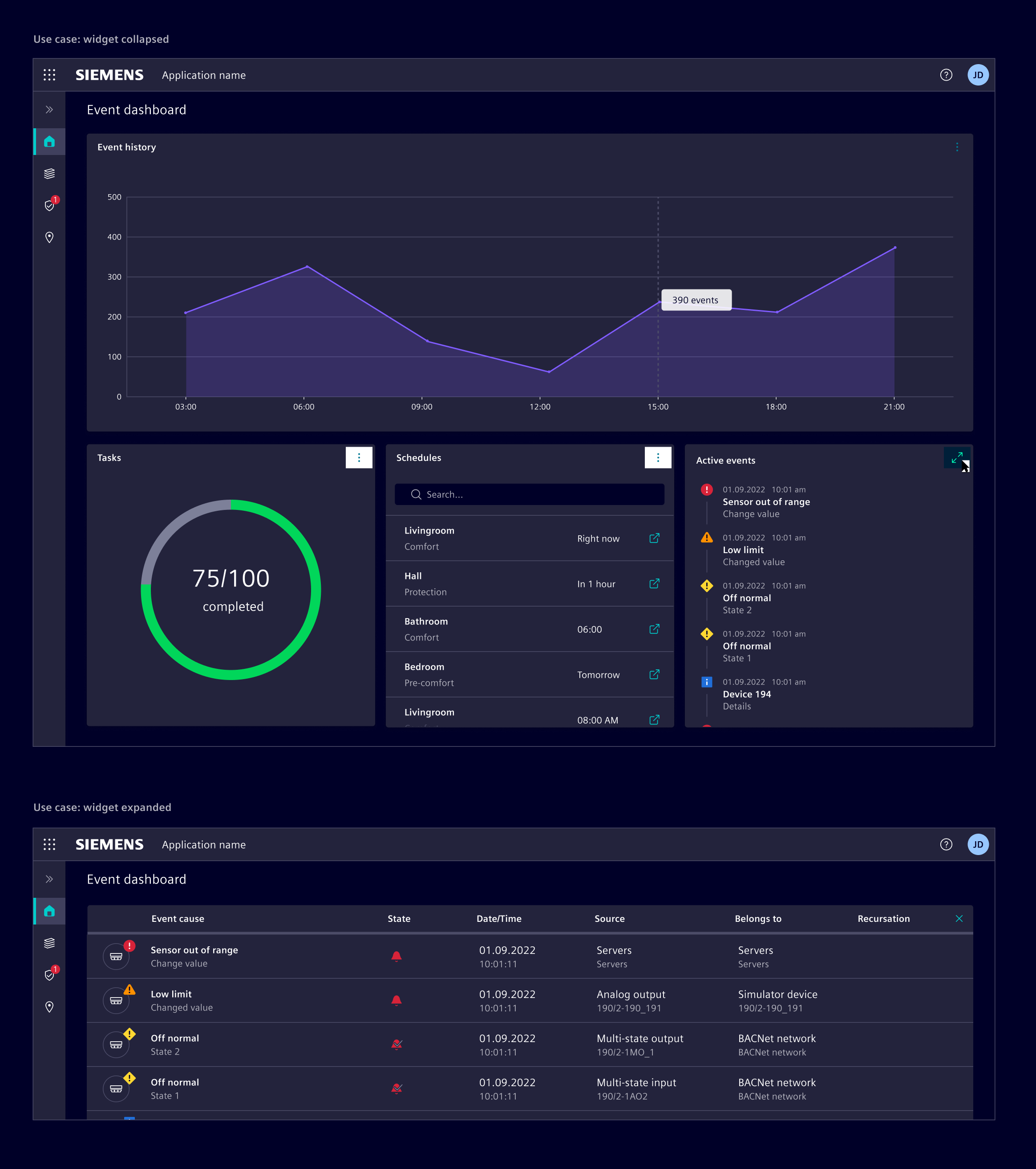
Dashboard expand

Layout

  • Place the most important items in areas where the viewer's eye will naturally look first. In left-to-right/LTR languages, this is typically the top-left corner of the screen, followed by the center of the screen.
  • Place related items close to each other. This helps to create visual groupings and organizes information for the viewer.
  • Charts should be sized and proportioned based on their importance and relevance.

See the flexible dashboards chapter for dashboards with user customizable content.

Code

The SiDashboardModule consists of a SiDashboardComponent and the SiDashboardCardComponent. The SiDashboardCardComponent extends the SiCardComponent and adds expand and restore functionality. The dashboard works with content-projection slots to configure the layout, e.g. a Bootstrap grid.

The module has its own entry point to reduce the overall bundle size.

Usage

import {
  SiDashboardCardComponent,
  SiDashboardComponent
} from '@siemens/element-ng/dashboard';

@Component({
  :
  imports: [
    :
    SiDashboardCardComponent,
    SiDashboardComponent,
    :
  ]
})

Custom header

The heading input renders a plain page title. To show additional context like a description or page actions, project a custom header using the header attribute, as shown in the example above. The custom header replaces the default heading.

Build the custom header according to the page header guidelines using the .si-layout-header CSS classes. Add the .si-layout-top-element CSS class to the title to reserve space for the vertical navigation and the side panel in the mobile viewport.

<si-dashboard>
  <div class="si-layout-header" header>
    <h2 class="si-layout-title si-layout-top-element">Dashboard</h2>
    <p class="si-layout-subtitle">Description</p>
    <si-content-action-bar
      class="si-layout-actions"
      viewType="expanded"
      [primaryActions]="pageActions"
    />
  </div>
  <ng-container menubar>...</ng-container>
  <ng-container dashboard>...</ng-container>
</si-dashboard>

SiDashboardComponent API Documentation

selector
si-dashboard

Input Properties

Name Type Default Description
enableExpandInteractions
boolean false Opt-in to enable expand interaction for all cards.
heading
TranslatableString Heading for the dashboard page.

To show a custom header instead, e.g. with a description or page actions, project it using the header attribute. The heading is ignored in that case.
hideMenubar
boolean false Option to hide the menu bar.
sticky
boolean true Option to turn off the sticky behavior of the heading and menu bar.

Attributes and Methods

Name Type Default Description
expand(...)
(card: SiDashboardCardComponent) => void Expands the provided card to full size in the dashboard.

Parameters
(readonly) isExpanded
boolean false Is true if a card is expanded.
restore()
() => void Restores the expanded card to it's previous position.

SiDashboardCardComponent API Documentation

selector
si-dashboard-card

Input Properties

Name Type Default Description
actionBarTitle
TranslatableString '' Optional setting of html title attribute for the content action bar. Helpful for a11y when only one action is configured in expand mode.
actionBarViewType
ViewType 'collapsible' The view type of the content action bar of the card. Default is collapsible for dashboards. However, in some cases you might need to change to expanded or mobile .
actionParam
any A param that will be passed to the action in the primary/secondary actions. This allows to re-use the same primary/secondary action arrays across rows in a table.
enableExpandInteraction
boolean false Option to enable and show the UI controls for card expand functionality. Expand and restore action items will be added to the content action bar. The expand resizing has to be implemented by the container of the card.
expandText
TranslatableString $localize`:@@SI_DASHBOARD.EXPAND:Expand` Description of expand button & action.
heading
TranslatableString Card header text.
imgAlt
TranslatableString Alt text for a provided image.
imgDir
("horizontal" | "vertical" | undefined) 'vertical' Defines if an image is placed on top or start (left) of the card.
imgObjectFit
("fill" | "none" | "contain" | "cover" | "scale-down" | undefined) 'scale-down' Sets the image object-fit CSS property.
imgObjectPosition
string Sets the image object-position CSS property.
imgSrc
string Image source for the card.
primaryActions
(MenuItem | ContentActionBarMainItem)[] [] Input list of primary action items. Supports up to 4 actions and omits additional ones.
restoreText
TranslatableString $localize`:@@SI_DASHBOARD.RESTORE:Restore` Description of cancel button & action.
secondaryActions
(MenuItem | MenuItem)[] [] Input list of secondary action items.
showMenubar
boolean true Used in combination with si-dashboard to show filters when a card is expanded or not.
subHeading
TranslatableString Card secondary header text.

Output Properties

Name Type Description
expandChange
boolean Emitter for size state change

Attributes and Methods

Name Type Default Description
(readonly) displayContentActionBar
Signal<boolean> ... Returns true when primary or secondary actions are set.
(readonly) enableExpandInteractionComputed
Signal<boolean> ...
expand()
() => void Expand the dashboard card.
(readonly) isExpanded
WritableSignal<boolean> false Whether the card is currently expanded.
restore()
() => void Restore the dashboard card to the original, non-expanded state.

Types Documentation

Represents a translatable string. This can either be a translation key, e.g. ACTIONS.EDIT that will be automatically translated when displayed on the UI or a pre-translated string, e.g. Edit . Equivalent to a normal string in usage and functionality.
("collapsible" | "expanded" | "mobile")
Properties
Action that called when the item is triggered. A function will be called, a string will be dispatched to the SiMenuActionService .
action: (string | (actionParam: any, source: this) => void)
Badge that is rendered after the label.
badge?: (string | number) from badge
Color of the badge (not iconBadge).
badgeColor?: string from badgeColor
Whether the menu item id disabled.
disabled?: boolean from disabled
Optional icon that will be rendered before the label.
icon?: string from icon
Badge (always red) that is attached to the icon. If value===true, an empty red dot will be rendered.
iconBadge?: (string | number | boolean) from iconBadge
ID that will be attached to the DOM node.
id?: string from id
Label that is shown to the user.
label: TranslatableString from label
type: "action"
Properties
Action that called when the item is triggered. A function will be called, a string will be dispatched to the SiMenuActionService .
action: (string | (actionParam: any, source: this) => void)
Badge that is rendered after the label.
badge?: (string | number) from badge
Color of the badge (not iconBadge).
badgeColor?: string from badgeColor
Whether the checkbox is checked.
checked: boolean
Whether the menu item id disabled.
disabled?: boolean from disabled
Optional icon that will be rendered before the label.
icon?: string from icon
Badge (always red) that is attached to the icon. If value===true, an empty red dot will be rendered.
iconBadge?: (string | number | boolean) from iconBadge
ID that will be attached to the DOM node.
id?: string from id
Label that is shown to the user.
label: TranslatableString from label
type: "checkbox"
Properties
Badge that is rendered after the label.
badge?: (string | number) from badge
Color of the badge (not iconBadge).
badgeColor?: string from badgeColor
Submenu items for this menu item.
children: MenuItem[]
Whether the menu item id disabled.
disabled?: boolean from disabled
Optional icon that will be rendered before the label.
icon?: string from icon
Badge (always red) that is attached to the icon. If value===true, an empty red dot will be rendered.
iconBadge?: (string | number | boolean) from iconBadge
ID that will be attached to the DOM node.
id?: string from id
Label that is shown to the user.
label: TranslatableString from label
type: "group"
Properties
Items that are part of the radio group.
children: [ MenuItemHeader, ...(MenuItemRadio | MenuItemHeader | MenuDivider)[] ]
type: "radio-group"
Properties
Action that called when the item is triggered. A function will be called, a string will be dispatched to the SiMenuActionService .
action: (string | (actionParam: any, source: this) => void)
Badge that is rendered after the label.
badge?: (string | number) from badge
Color of the badge (not iconBadge).
badgeColor?: string from badgeColor
Whether the radio is checked.
checked: boolean
Whether the menu item id disabled.
disabled?: boolean from disabled
Optional icon that will be rendered before the label.
icon?: string from icon
Badge (always red) that is attached to the icon. If value===true, an empty red dot will be rendered.
iconBadge?: (string | number | boolean) from iconBadge
ID that will be attached to the DOM node.
id?: string from id
Label that is shown to the user.
label: TranslatableString from label
type: "radio"
Properties
The label of the header.
label: string
type: "header"
Properties
type: "divider"
Properties
Badge that is rendered after the label.
badge?: (string | number)
Color of the badge (not iconBadge).
badgeColor?: string
Whether the menu item id disabled.
disabled?: boolean
Optional icon that will be rendered before the label.
icon?: string
Badge (always red) that is attached to the icon. If value===true, an empty red dot will be rendered.
iconBadge?: (string | number | boolean)
ID that will be attached to the DOM node.
id?: string
Label that is shown to the user.
label: TranslatableString
Implement and provide this to an SiMenuFactoryComponent to receive trigger events.
Constructor
() => {}
Methods
Will be called by SiMenuFactoryComponent if an action is defined with a string instead of a function.
Parameters
item: (MenuItemAction | MenuItemCheckbox | MenuItemRadio)
actionParam?: any
Used in events emitted from SiLinkActionService
Properties
param: any
extends SiCardBaseDirective
Class
▶
Constructor
() => {} from SiCardBaseDirective.constructor
Properties
Optional setting of html title attribute for the content action bar. Helpful for a11y when only one action is configured in expand mode.
actionBarTitle: InputSignal<TranslatableString> = ''
The view type of the content action bar of the card. Default is collapsible for dashboards. However, in some cases you might need to change to expanded or mobile .
actionBarViewType: InputSignal<ViewType> = 'collapsible'
A param that will be passed to the action in the primary/secondary actions. This allows to re-use the same primary/secondary action arrays across rows in a table.
actionParam: InputSignal<any> = ...
In case the card uses an image and horizontal direction is used we set flex row direction.
classCardHorizontal: Signal<boolean> from SiCardBaseDirective.classCardHorizontal = ...
Returns true when primary or secondary actions are set.
displayContentActionBar: Signal<boolean> = ...
Card header text.
heading: InputSignal<(TranslatableString | undefined)> from SiCardBaseDirective.heading = ...
Alt text for a provided image.
imgAlt: InputSignal<(TranslatableString | undefined)> from SiCardBaseDirective.imgAlt = ...
Defines if an image is placed on top or start (left) of the card.
imgDir: InputSignal<("horizontal" | "vertical" | undefined)> from SiCardBaseDirective.imgDir = 'vertical'
Sets the image object-fit CSS property.
imgObjectFit: InputSignal<("fill" | "none" | "contain" | "cover" | "scale-down" | undefined)> from SiCardBaseDirective.imgObjectFit = 'scale-down'
Sets the image object-position CSS property.
imgObjectPosition: InputSignal<(string | undefined)> from SiCardBaseDirective.imgObjectPosition = ...
Image source for the card.
imgSrc: InputSignal<(string | undefined)> from SiCardBaseDirective.imgSrc = ...
Input list of primary action items. Supports up to 4 actions and omits additional ones.
primaryActions: InputSignal<(MenuItem | ContentActionBarMainItem)[]> = []
Input list of secondary action items.
secondaryActions: InputSignal<(MenuItem | MenuItem)[]> = []
Card secondary header text.
subHeading: InputSignal<(TranslatableString | undefined)> from SiCardBaseDirective.subHeading = ...
Constructor
() => {}
Properties
cards: BehaviorSubject<SiDashboardCardComponent[]> = ...
Subject containing the current dashboard cards as a list.
cards$: Observable<SiDashboardCardComponent[]> = this.cards.asObservable()
Methods
Registers a new dashboard card.
Parameters
card: SiDashboardCardComponent
Removes a registered dashboard card.
Parameters
card: SiDashboardCardComponent
Constructor
() => {}
Properties
Parameter passed to triggered menu item actions.
actionParam: InputSignal<unknown> = ...
Menu items to render. Supports legacy and current menu item models.
items: InputSignal<(readonly (MenuItem | MenuItem)[] | undefined)> = ...
linkActionService: (SiLinkActionService | null) = ...
menuActionService: (SiMenuActionService | null) = ...
Methods
Parameters
item: (MenuItem | MenuItem)
(item: (MenuItem | MenuItem)) => item is MenuItem
Parameters
item: (MenuItem | MenuItem)
Parameters
item: MenuItem
Parameters
item: (MenuItemAction | MenuItemCheckbox | MenuItemRadio)
(index: number, item: (MenuItem | MenuItem)) => (string | number)
Parameters
index: number
item: (MenuItem | MenuItem)
Constructor
() => {}
Properties
Observable which emits the link and param to run the action on.
action$: Observable<LinkAction> = this.actionSubject.asObservable()
actionSubject: Subject<LinkAction> = ...
Methods
(link: Link, param: any) => void
Emit a new link and param pair to run the action on.
Parameters
param: any

Except where otherwise noted, content on this site is licensed under MIT License.