Menu
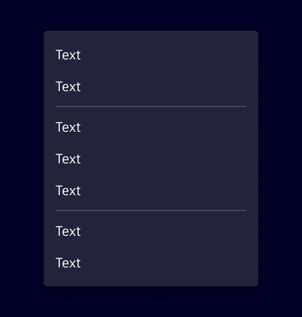
Menus display a list of actions related to a specific element or context.
Usage
Menus open from a trigger, such as a buttons or right-click, and show actions related to the current context.
When to use
- When users need to perform several actions on the same content.
- For actions that are not used frequently and don't need to be permanently visible.
- To keep the interface clean by grouping secondary actions in one place.
- If there is one action only, use button or link instead
Best practices
- Order actions by importance, with the most relevant ones at the top.
- Group related actions and separate the groups with dividers.
- Move less important actions to a submenu.
- Keep disabled actions visible so users know the action exists but is currently unavailable.
- Avoid more than two levels of nested submenus.
Design
Elements
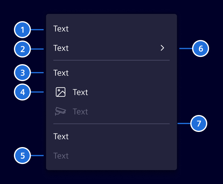
1. Item with submenu, 2. Section title, 3. Item with icon, 4. Divider
Selection
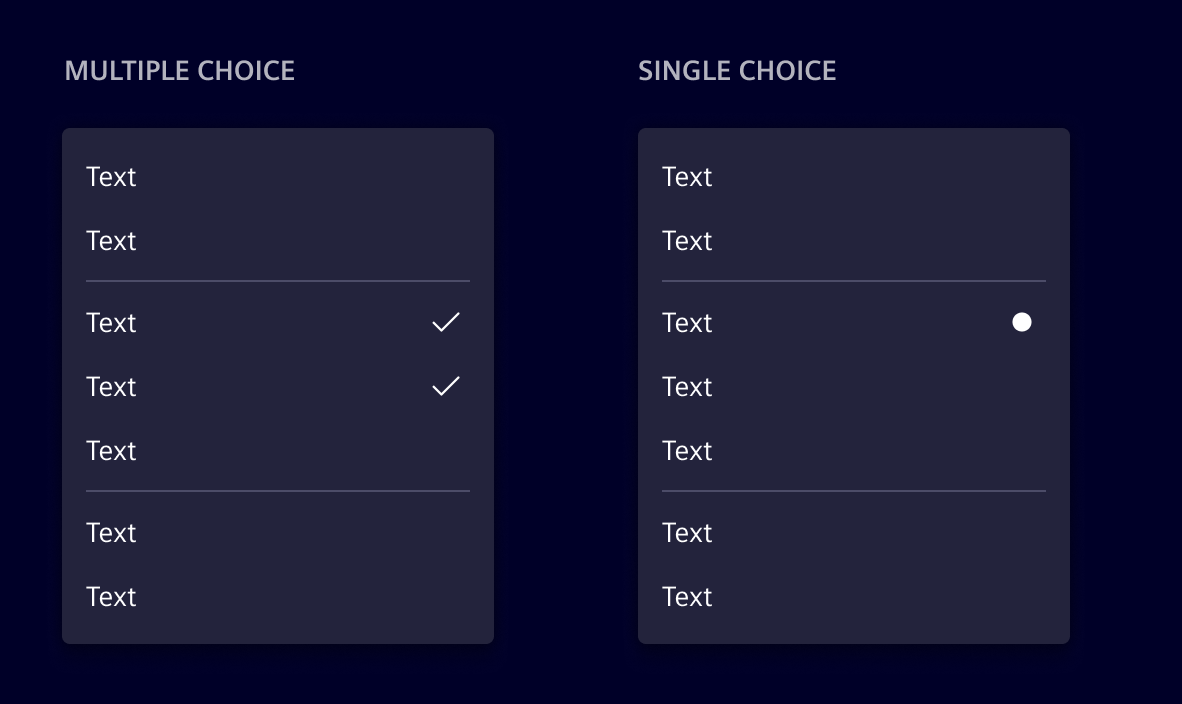
Menus can include selectable items with single choice or multiple choice.
- Use single choice when only one option can be active at a time.
- Use multiple choice when users can enable or disable several options independently.
Code
Important API changes
With Element v45, the si-menu has been completely re-implemented to feature a declarative API style based on the CDK Menu. If you are migrating from the old si-menu-legacy, you might want to consider using the si-menu-factory, which provides a more compatible model-driven API.
The si-menu has a declarative API and an additional si-menu-factory which accepts MenuItem[]. It is built around the CDK Menu using Angular's hostDirective feature. Due to this:
CdkMenuTriggeris required to open the menuCdkMenuItemcan be used directly if proper styling is applied (helpful for special use cases)
Usage of the declarative API
Usage of the factory API
si-menu-bar
The si-menu-bar is a horizontal menu that is based on the CdkMenuBar.
While being visually similar to the si-content-action-bar it has two differences:
si-menu-barhas a declarative APIsi-menu-barhas no responsive behavior
In general, we recommend using the si-content-action-bar over the si-menu-bar.
SiMenuItemComponent API Documentation
si-menu-item, a[si-menu-item], button[si-menu-item] Input Properties
| Name | Type | Default | Description |
|---|---|---|---|
| badge ¶ | (string | number) | Content displayed in the menu item's badge. | |
| badgeColor ¶ | string | 'secondary' | Color variant of the menu item's badge. |
| disabled ¶ | boolean | false | Whether the menu item is disabled. |
| icon ¶ | string | Icon displayed before the menu item label. | |
| iconBadgeDot ¶ | (string | number | boolean | undefined) | false | Whether to show a dot badge on the icon. A string or number is shown as dot content. |
Output Properties
| Name | Type | Description |
|---|---|---|
| (readonly) triggered ¶ | EventEmitter<void> | If this MenuItem is a regular MenuItem, outputs when it is triggered by a keyboard or mouse event. |
SiMenuItemCheckboxComponent API Documentation
si-menu-item-checkbox, button[si-menu-item-checkbox] Input Properties
| Name | Type | Default | Description |
|---|---|---|---|
| badge ¶ | (string | number) | Content displayed in the menu item's badge. | |
| badgeColor ¶ | string | 'secondary' | Color variant of the menu item's badge. |
| checked ¶ | boolean | Whether the element is checked | |
| disabled ¶ | boolean | false | Whether the menu item is disabled. |
| icon ¶ | string | Icon displayed before the menu item label. | |
| iconBadgeDot ¶ | (string | number | boolean | undefined) | false | Whether to show a dot badge on the icon. A string or number is shown as dot content. |
Output Properties
| Name | Type | Description |
|---|---|---|
| (readonly) triggered ¶ | EventEmitter<void> | If this MenuItem is a regular MenuItem, outputs when it is triggered by a keyboard or mouse event. |
SiMenuItemRadioComponent API Documentation
si-menu-item-radio Input Properties
| Name | Type | Default | Description |
|---|---|---|---|
| badge ¶ | (string | number) | Content displayed in the menu item's badge. | |
| badgeColor ¶ | string | 'secondary' | Color variant of the menu item's badge. |
| checked ¶ | boolean | Whether the element is checked | |
| disabled ¶ | boolean | false | Whether the menu item is disabled. |
| icon ¶ | string | Icon displayed before the menu item label. | |
| iconBadgeDot ¶ | (string | number | boolean | undefined) | false | Whether to show a dot badge on the icon. A string or number is shown as dot content. |
Output Properties
| Name | Type | Description |
|---|---|---|
| (readonly) triggered ¶ | EventEmitter<void> | If this MenuItem is a regular MenuItem, outputs when it is triggered by a keyboard or mouse event. |
SiMenuFactoryComponent API Documentation
si-menu-factory Input Properties
| Name | Type | Default | Description |
|---|---|---|---|
| actionParam ¶ | unknown | Parameter passed to triggered menu item actions. | |
| items ¶ | readonly (MenuItem | MenuItem)[] | Menu items to render. Supports legacy and current menu item models. |
CdkMenuTrigger API Documentation
A directive that turns its host element into a trigger for a popup menu.
It can be combined with cdkMenuItem to create sub-menus. If the element is in a top level
MenuBar it will open the menu on click, or if a sibling is already opened it will open on hover.
If it is inside of a Menu it will open the attached Submenu on hover regardless of its sibling
state.
Input Properties
| Name | Type | Description |
|---|---|---|
| cdkMenuPosition ¶ | ConnectedPosition[] | A list of preferred menu positions to be used when constructing the FlexibleConnectedPositionStrategy for this trigger's menu. |
| cdkMenuTriggerData ¶ | unknown | Context data to be passed along to the menu template |
| cdkMenuTriggerFor ¶ | (TemplateRef<unknown> | null) | Template reference variable to the menu this trigger opens |
| cdkMenuTriggerTransformOriginOn ¶ | (string | null) | Selector for the element on which to set the transform origin once the menu is open. This makes it easier to implement animations that start from the attachment point of the menu. |
Output Properties
| Name | Type | Description |
|---|---|---|
| (readonly) cdkMenuClosed ¶ | EventEmitter<void> | Emits when the attached menu is requested to close |
| (readonly) cdkMenuOpened ¶ | EventEmitter<void> | Emits when the attached menu is requested to open |
Attributes and Methods
| Name | Type | Description |
|---|---|---|
| close() ¶ | () => void | Close the opened menu. |
| getMenu() ¶ | () => (Menu | undefined) | Get a reference to the rendered Menu if the Menu is open and rendered in the DOM. |
| (readonly) injector ¶ | Injector | The DI injector for this component. |
| isOpen() ¶ | () => boolean | Whether the attached menu is open. |
| open() ¶ | () => void | Open the attached menu. |
CdkContextMenuTrigger API Documentation
A directive that opens a menu when a user right-clicks within its host element. It is aware of nested context menus and will trigger only the lowest level non-disabled context menu.
Input Properties
| Name | Type | Description |
|---|---|---|
| cdkContextMenuDisabled ¶ | boolean | Whether the context menu is disabled. |
| cdkContextMenuPosition ¶ | ConnectedPosition[] | A list of preferred menu positions to be used when constructing the FlexibleConnectedPositionStrategy for this trigger's menu. |
| cdkContextMenuTriggerData ¶ | unknown | Context data to be passed along to the menu template |
| cdkContextMenuTriggerFor ¶ | (TemplateRef<unknown> | null) | Template reference variable to the menu this trigger opens |
| cdkContextMenuTriggerTransformOriginOn ¶ | (string | null) | Selector for the element on which to set the transform origin once the menu is open. This makes it easier to implement animations that start from the attachment point of the menu. |
Output Properties
| Name | Type | Description |
|---|---|---|
| (readonly) cdkContextMenuClosed ¶ | EventEmitter<void> | Emits when the attached menu is requested to close |
| (readonly) cdkContextMenuOpened ¶ | EventEmitter<void> | Emits when the attached menu is requested to open |
Attributes and Methods
| Name | Type | Description |
|---|---|---|
| close() ¶ | () => void | Close the currently opened context menu. |
| (readonly) injector ¶ | Injector | The DI injector for this component. |
| isOpen() ¶ | () => boolean | Whether the attached menu is open. |
Types Documentation
| |
|---|
| | ||||||||||
|---|---|---|---|---|---|---|---|---|---|---|
|
| | ||||||||||
|---|---|---|---|---|---|---|---|---|---|---|
|
| Represents a menu item that navigates using the Angular Router. Requires a configured Angular Router. | |||||||||||
|---|---|---|---|---|---|---|---|---|---|---|---|
|
| | |||||||||||
|---|---|---|---|---|---|---|---|---|---|---|---|
|
| | |||
|---|---|---|---|
|
| | |||||||||||
|---|---|---|---|---|---|---|---|---|---|---|---|
|
| | |||||||||||
|---|---|---|---|---|---|---|---|---|---|---|---|
|
| | |||
|---|---|---|---|
|
| | ||
|---|---|---|
|
| | ||||||||
|---|---|---|---|---|---|---|---|---|
|
| Represents a translatable string. This can either be a translation key, e.g. ACTIONS.EDIT that will be automatically translated when displayed on the UI or a pre-translated string, e.g. Edit . Equivalent to a normal string in usage and functionality. |
|---|
| Implement and provide this to an SiMenuFactoryComponent to receive trigger events. | |||||||
|---|---|---|---|---|---|---|---|
| |||||||
|
| Used in events emitted from SiLinkActionService | |||
|---|---|---|---|
|
| | ||||||||||
|---|---|---|---|---|---|---|---|---|---|---|
|
| | |||||||
|---|---|---|---|---|---|---|---|
| |||||||
| |||||||
|
Except where otherwise noted, content on this site is licensed under MIT License.