Help button
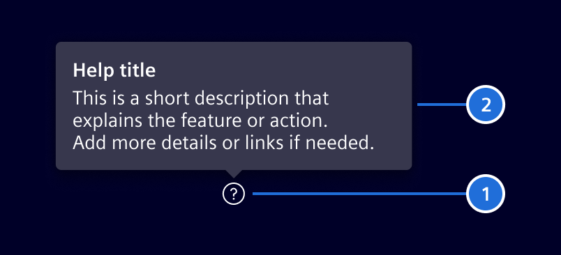
The help button provides immediate, contextual assistance via a popover.
Usage
It is designed to help users understand specific actions or features on the current page without navigating away. The button uses the element-help icon and is typically placed near form labels or interactive elements that require clarification.
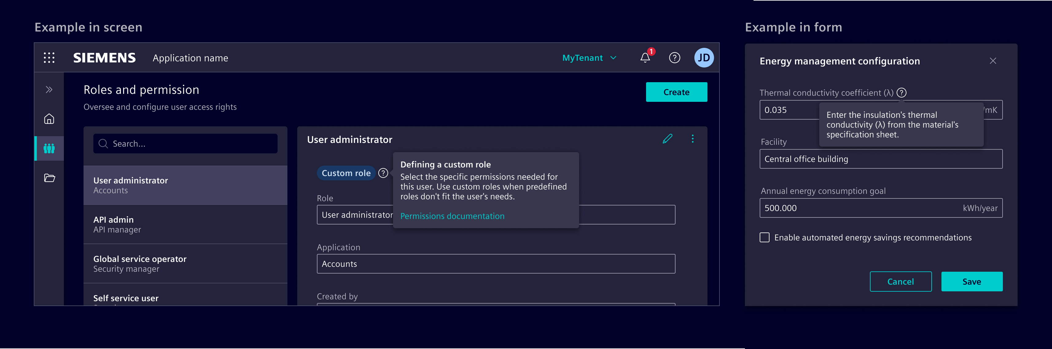
When to use
- When users may need clarification about a specific field, feature, or action.
- In forms, dashboards, or complex workflows.
Best practices
- Keep content short and focused on the immediate context.
- Include links to more detailed information only when necessary.
- Position the help button to the right of the element it supports (or left for RTL languages).
- Avoid overusing help buttons across a page. When more complex or detailed information is required, refer to the other help patterns.
Except where otherwise noted, content on this site is licensed under MIT License.