Usage
The content action bar groups contextually related actions that serve a common purpose within a specific content area. For example, actions such as 'Edit', 'Delete', and 'Share' are used to manage specific pieces of content, like documents or images.
The content action bar groups primary and secondary actions and adjusts to the available space.
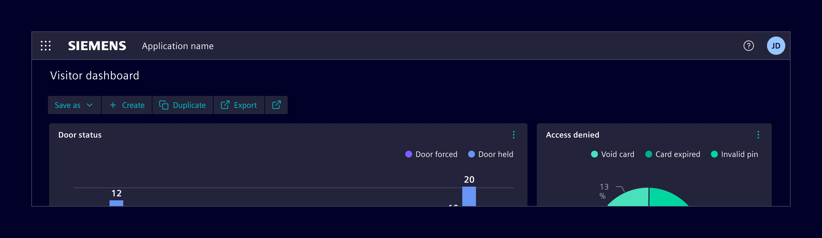
When to use
- When multiple actions that are closely related and need to be presented together.
- When an action stands alone or does not relate to other actions, use a regular button.
- If the primary requirement is simply to have a menu that remains consistently collapsed, use a tertiary circle button with a menu.
Design
Elements
The content action bar includes primary actions, which are always visible and prioritized, and optional secondary actions, which can be accessed through a menu.
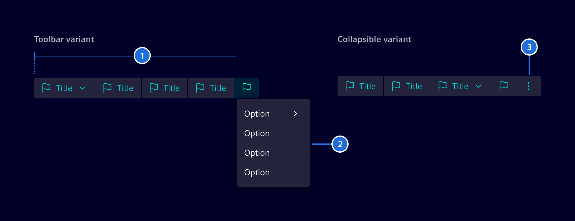
- Primary actions, 2. Secondary actions (optional), (4) Close button
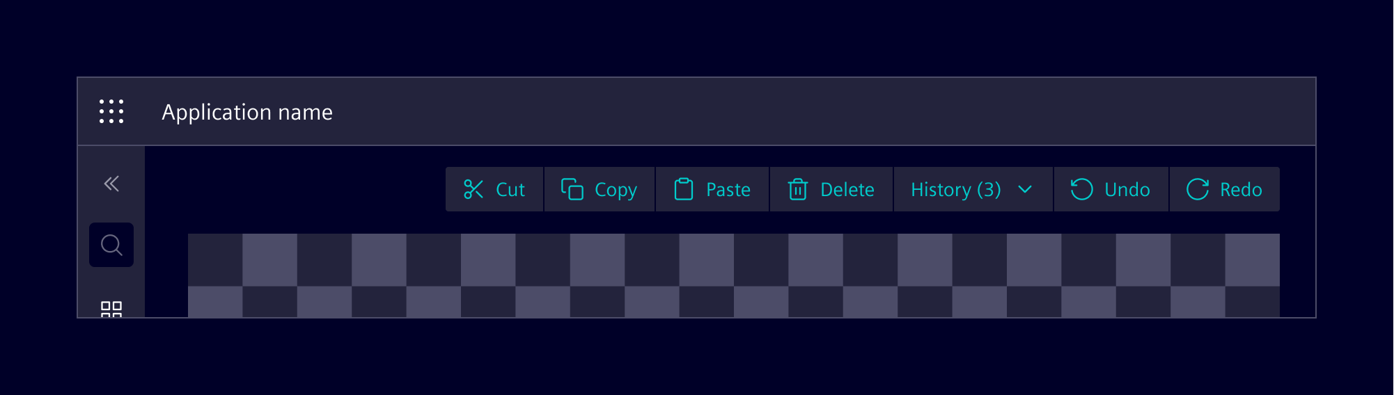
The content action bar includes standard and dropdown buttons. Standard buttons can display text, icons, or both, while dropdowns support text or text with icons.
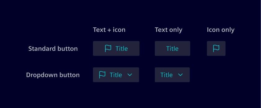
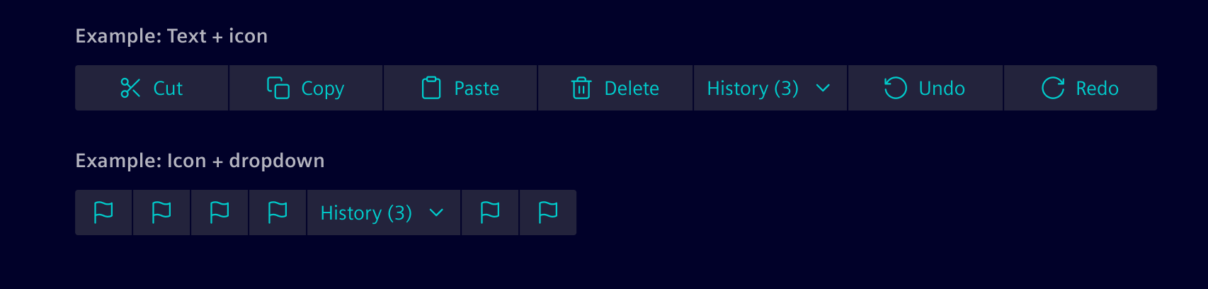
Icons should be used as needed; however, avoid mixing text-with-icon buttons with icon-only buttons whenever possible.
Variants
The content action bar can be set to behave in two main ways, depending on the layout needs:
In the expanded/toolbar variant, all actions are always displayed, providing consistent visibility and quick access. This configuration is useful when actions need to be readily available, such as in editors or builder interfaces (e.g., a floor plan editor or dashboard builder).
Collapsible
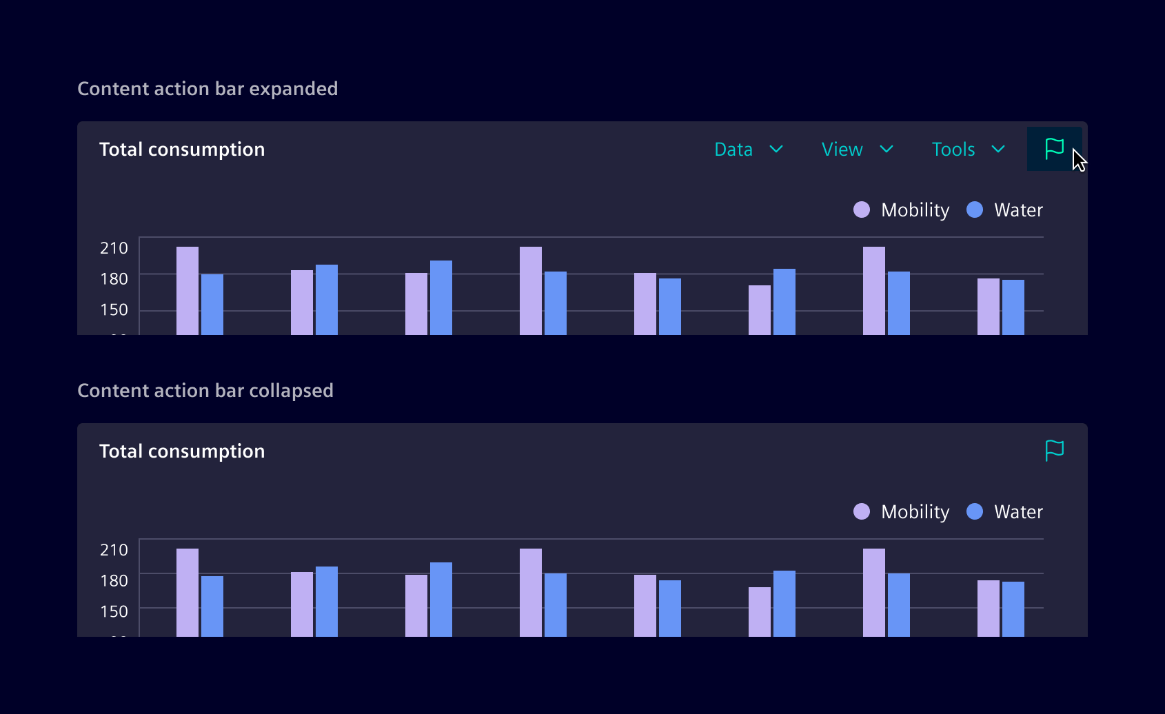
In the collapsible variant, users can expand the content action bar as needed to reveal the available options. Pressing the close button will collapse all actions under a menu. This setup allows for a more compact layout when space is limited or when actions are needed less frequently.
Responsive behavior
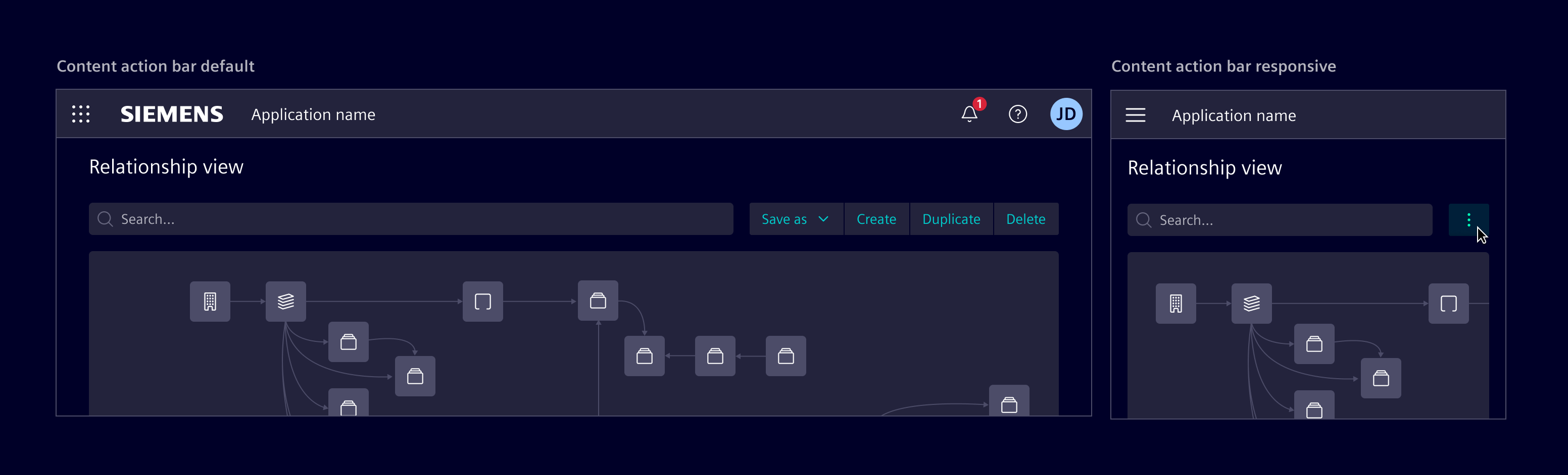
When the screen size is reduced, actions can automatically collapse into a menu in both the Toolbar and Collapsible variants. If the primary requirement is simply to have a menu that remains consistently collapsed, use a tertiary circle button with a menu.
Code
It can be used in one of three variations pointed out in Design section by providing related viewType input as collapsible, expanded or mobile. View type expanded is default.
Usage
import { SiContentActionBarComponent } from '@siemens/element-ng/content-action-bar';

@Component({
  imports: [SiContentActionBarComponent, ...]
})
Action bar configuration
Configure the content action bar with MenuItems as primary and secondary actions. You can configure an Angular router or a href target as well as a custom action. Sub-menus are supported by the items property.
Action item states
Use the MenuItem states disabled, isActive, badge and badgeColor for configuration of item states. Use semantic bootstrap colors like warning or success as badgeColor.
Use the MenuItem property icon to provide icons for all primary actions.
SiContentActionBarComponent API Documentation
selector
si-content-action-bar
Input Properties
| Name | Type | Default | Description |
actionParam
| any | | A param that will be passed to the action in the primary/secondary actions. This allows to re-use the same primary/secondary action arrays across rows in a table. |
disabled
| boolean | false | Disables the whole content-action-bar. |
boolean | false | Option to remove all icons from dropdown menus of the content action bar.
Some apps provide only few actions with icons, located in the set of primary actions. The icons are visible in the collapsible and expanded view type. On reduced space, primary actions are relocated in the same dropdown menu as the secondary actions. The dropdown menu can look unbalanced, if a large number of secondary actions without icons are presented with few actions with icons. This option balances the look and feel by removing all icons from actions in the dropdown menu. |
primaryActions
| readonly (MenuItem | ContentActionBarMainItem)[] | | List of primary actions. Supports up to 4 actions and omits additional ones. |
secondaryActions
| readonly (MenuItem | MenuItem)[] | | List of secondary actions. |
toggleItemLabel
| TranslatableString | $localize`:@@SI_CONTENT_ACTION_BAR.TOGGLE:Show actions` | Toggle icon aria-label, required for a11y |
viewType
| ViewType | 'expanded' | Selection of view type as 'collapsible', 'expanded' or 'mobile'. |
Types Documentation
| Properties | A function that will be invoked when clicking on the menu item. When passed as a string, use together with SiLinkActionService to receive events. This is meant for repetitive things in lists/tables/etc.
action?: (string | (param: any) => any) | A boolean that lets the link know whether it is disabled or not.
disabled?: boolean | Defines a href URI that the menu item will be linked to. Will be used to set the href attribute of the a element. Will only be used if link and function is not set.
href?: string | A boolean that lets the link know whether it is active or not. It is useful when action() is executed instead of link route.
isActive?: boolean | Defines the link of the menu item within the application using the angular router link concept. Accepts an array of any as per [routerLink API definition] https://angular.dev/api/router/RouterLink .
link?: (string | any[]) | The target attribute specifies where to open the linked document. If no target is specified, the link will open in the current tab.
target?: string | The title of the menu item. Can be either the title to be displayed or the translation key.
title?: TranslatableString | The optional tooltip of the link. Can be either the text to be displayed or the translation key.
tooltip?: TranslatableString | |